Intelligent AI Insights Newsletter Landing Page Template
Pulse is a modular card grid landing page template built for generative AI newsletters targeting technical decision-makers. It combines a live-data dashboard hero, animated proof cards, sample issue previews, and community social proof into a single high-converting page. The dark-mode terminal aesthetic, chartreuse call-to-action elements, and sticky email capture work together to turn skeptical visitors into subscribers.
by Rocket studio
Quick summary
Pulse is a single-page, card grid landing page template designed for a generative AI newsletter audience of ML engineers, startup founders, and investors. It opens with an animated dashboard hero, moves through stacked proof cards, sample issue previews, and community threads, then closes with a full-width email capture. Every section is built to generate trust before asking for a subscription.
Who this template is for
Pulse is designed for publishers, founders, and community builders who produce a data-rich weekly newsletter in the generative AI space. It suits anyone who needs to convert a technically sophisticated audience that will not respond to vague promises. The template works especially well when your newsletter leads with hard numbers, model benchmarks, pricing shifts, and adoption curves rather than opinion.
- ML engineers who compare inference costs and need a credible signal source
- Startup founders and team leads tracking which AI models are gaining enterprise traction
- Investors and business leaders who consume vast amounts of pitch content and want one curated briefing
What problem this template solves
Most newsletter landing pages fail technically minded readers. They rely on generic hero copy, weak social proof, and a single above-the-fold call to action that asks for an email before earning it. For a generative AI audience, that approach produces low conversion rates and high bounce.
Pulse solves this by front-loading proof before the ask. The page builds credibility through a data-first scroll sequence: animated metrics, sample headlines, brand citations, and community screenshots all appear before the email field. Data-driven decision making becomes visible on the page itself, not buried in a "why subscribe" paragraph.
- Replaces vague benefit copy with hard, ai generated proof metrics visible from the first scroll
- Removes decision friction by letting visitors browse unlocked archive links before committing
- Keeps sales teams, founders, and technical readers engaged with a terminal-style visual rhythm that feels native to their tools
What you get with this template
Pulse ships as a fully structured, single-page layout with every section pre-built and ready to customize. You get a coherent design system, a defined animation behavior for each card block, and a clear conversion architecture from top to bottom.
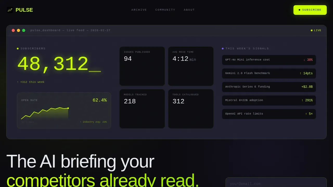
- An animated hero dashboard with a live-ticking subscriber counter, open-rate sparkline, and scrolling story ticker
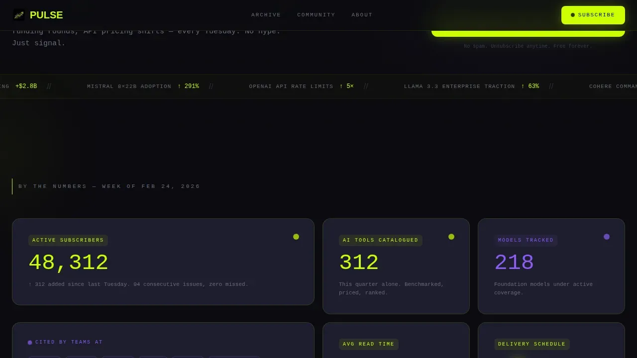
- A modular bento grid of ai powered proof cards covering tools catalogued, brand citations, average read time, and issue count
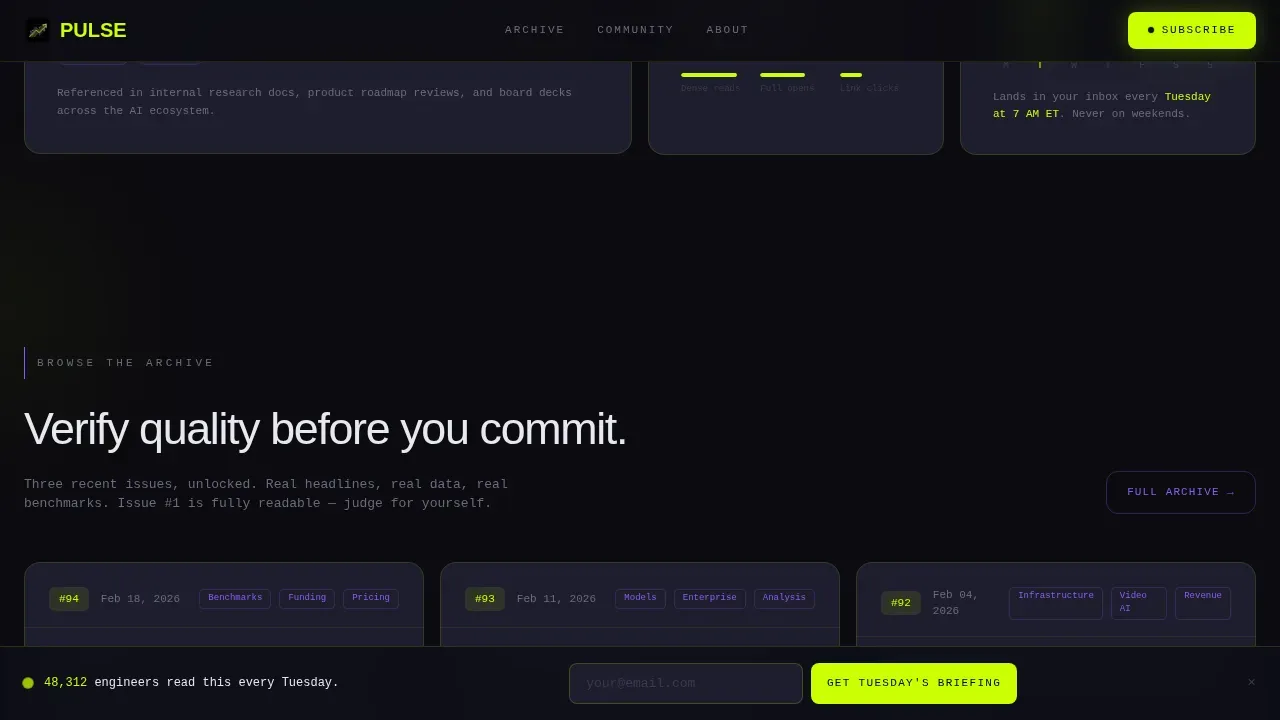
- Sample issue preview cards with blurred body text and visible headlines, plus three unlocked archive links as article link anchors
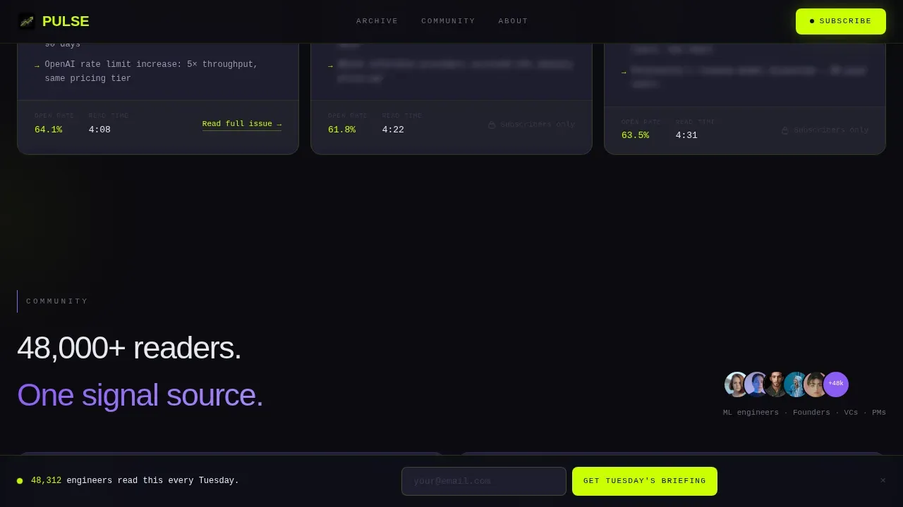
- Community and social proof cards styled with violet accents, Slack-style thread displays, and subscriber logo rows
- A sticky bottom email capture bar that appears after the third card row, plus a full-width email capture closer at the bottom
Feature list
Pulse is built around a defined set of page capabilities that serve a single newsletter objective: convert a skeptical technical audience into committed weekly subscribers.
Animated Dashboard Hero
The hero section fills the viewport with a stylized analytics interface. A subscriber count ticks upward past 48,000 in monospaced type, an open-rate sparkline holds at 62%, and a horizontal ticker scrolls this week's top three stories with model names and percentage gains. Each element refreshes at a different speed so the eye never fully settles. This design signals real data insights and positions the newsletter as a live, always-updating source.
Modular Proof Card Bento Grid
Below the hero, a card grid reveals ai generated statistics as the visitor scrolls. Each card animates into position with a micro-slide entry, and numeric values count up on intersection. Cards display key metrics such as tools catalogued, cited brands, average read time, and total issue count. The accumulation effect makes the volume of data-driven value feel undeniable without requiring long paragraphs.
Sample Issue Preview with Archive Access
Three sample cards show blurred newsletter body text alongside visible bold subject lines and headlines. Below each card, an article link connects to an unlocked past issue so visitors can verify quality before subscribing. Providing a preview of existing content is one of the most effective ways to increase engagement and conversion rate for newsletter landing pages.
Community and Social Proof Section
This section uses violet accent cards to display Slack-style community thread screenshots, member counts, and subscriber logos from recognizable brands. The visual language shifts slightly from the data section to signal belonging and discussion. Community proof appeals to the audience's instinct to join a room where important conversations are already happening.
Sticky Email Capture Bar
A persistent email input bar appears after the third card row and stays anchored to the bottom of the viewport. The primary call-to-action label reads "Get Tuesday's Briefing." By the time the bar is visible, the visitor has already seen subscriber counts, open rates, brand logos, and sample headlines, so the email field feels like a natural next step rather than a cold ask.
Full-Width Email Capture Closer
The page closes with a full-width section repeating the email capture. This final section reinforces the newsletter's format and frequency, setting clear expectations before the visitor subscribes. A secondary path invites visitors to browse the archive, giving skeptics one more chance to verify quality before committing.
Page sections overview
| Section | Purpose |
|---|---|
| Hero Dashboard | Displays animated subscriber metrics, open-rate sparkline, and story ticker to establish instant credibility |
| Proof Card Grid | Reveals key metrics and brand citations through count-up animated modular cards |
| Sample Issue Preview | Shows newsletter headlines and blurred body with archive links for pre-subscription quality checks |
| Community Social Proof | Displays Slack-style threads, member counts, and subscriber logos using violet accent cards |
| call to action Closer Full-Width | Captures subscriber email with a repeated full-width form and secondary archive browse path |
| Sticky Bottom Bar | Anchors a persistent email input after card row three for always-visible conversion access |
| Footer | Delivers navigation and legal links in a horizontal flow layout |
Design & branding system
Pulse uses an Acid Digital color system built to feel like a dark-mode integrated development environment at 2 a.m. The palette is deliberate and aggressive: void black backgrounds push electric chartreuse into the foreground at an almost uncomfortable luminance, while cool interface gray gives each card its own depth plane. Brand colors are applied with strict role assignments so every accent carries meaning.
- Void black (#0B0B0F) as the base background, cool interface gray (#1E1E2E) for card surfaces, electric chartreuse (#CAFF04) for all primary call-to-action elements and live data highlights, and synthetic violet (#8B5CF6) for community and social proof accents
- JetBrains Mono for all numeric data, metrics readouts, and terminal-style displays; Manrope for headlines and descriptive copy, creating a clear hierarchy between machine output and human language
- Dynamic Motion theme with staggered card reveals, count-up animations on scroll intersection, horizontal ticker scroll in the hero, and a cursor glow effect that reinforces the terminal aesthetic
Mobile & speed optimization
The template is built desktop-first to match the workstation habits of ML engineers and investors, but it includes full mobile support so the page remains usable across all screen sizes. Mobile design is essential given that a significant share of web traffic arrives from mobile devices, even for technical audiences. The layout reflows cleanly from a multi-column card grid to a single-column stack.
- The sticky email capture bar and all call-to-action buttons remain fully accessible on smaller viewports without overlapping content
- Card animations are lightweight and intersection-triggered, which keeps the experience smooth as the visitor scrolls through the proof sequence
- The monospaced data elements and bold headline typography scale predictably across breakpoints, maintaining legibility without layout shifts
How this template helps you convert
Pulse is structured around a deliberate conversion sequence. The page never asks for an email before it has earned the right to ask. Every scroll event delivers another proof signal until the email field feels inevitable rather than intrusive.
- The hero dashboard opens with live-feeling metrics that create immediate credibility, then the bento grid fills with ai generated proof cards covering subscriber count, open rate, brand citations, and tools catalogued, building a compounding case for the newsletter's actionable insights before any call to action appears.
- The sticky bar activates after the third card row, at the point when the visitor has already processed subscriber data, brand logos, and sample headlines, making the conversion rate on that input field significantly higher than a cold above-the-fold ask would achieve.
- The full-width closer repeats the email capture with a secondary archive browse option, allowing users who are still on the fence to self-qualify through past issues rather than leaving without converting.
Other information about this template
Pulse is a single-page template built for the generative AI newsletter and community niche, with a clear focus on data-driven decision making and technical audience credibility. Several additional details are worth knowing before you start customizing.
- Newsletter creation with this template benefits from defining newsletter objectives and important metrics upfront, so you can populate the hero dashboard and proof cards with numbers that match your actual publication data
- The template supports ai powered newsletter creation workflows where teams generate draft copy using simple prompts and then refine subject lines and key takeaways in a writing tool such as Google Docs before publishing
- AI tools that use natural language processing and natural language output can feed summary content directly into the sample issue cards, allowing users to generate preview text quickly
- The free tier and free plan pricing structure of your chosen email platform can be referenced in the page's frequently asked question or footer copy, helping set audience preferences around cost before they subscribe
- Team leads and business leaders who manage newsletter strategy will find the proof card layout easy to update with fresh data each quarter, keeping the page's insights consistent with current publication metrics
- Tableau Pulse offers a useful reference point for understanding how data-driven analytics platforms approach personalized insights delivery. Tableau Pulse delivers real-time, personalized insights directly to users where they work, and Tableau Pulse automatically explains the "why" behind changes in data, not just the "what," helping everyone understand the context of metrics. Tableau Pulse uses AI to monitor key metrics and deliver insights in natural language, acting as a personalized news feed for KPIs. Tableau Pulse integrates the robust capabilities of Tableau Pulse directly into Salesforce applications, and Tableau Pulse provides role-based analytics without separate dashboards for every department, improving signal-to-noise ratio. Tableau Pulse allows users to customize which metrics they follow, ensuring personalization without fragmentation. Tableau Pulse's personalization layer lets every user hand-pick which signals deserve their attention, improving engagement. Tableau Pulse provides a frictionless way to unleash generative AI-driven analytics, with a quick setup that delivers immediate value, and Tableau Pulse helps organizations quickly implement a generative AI solution and begin realizing tangible business benefits. Tableau Pulse's integration with Slack allows users to receive daily or weekly Pulse digests, aggregating key insights for the metrics they follow. These patterns around push-model delivery and personalized metric feeds mirror the editorial philosophy behind Pulse as a newsletter product
- The page architecture described in Pulse aligns with established principles for high-converting landing pages: the above-the-fold section carries a specific benefit-driven headline, social proof uses hard numbers early, and a single prominent call-to-action button with high contrast catches the visitor's eye
- AI capabilities built into modern newsletter tools, including natural language processing and machine learning algorithms, allow teams to generate subject lines, synthesize data from multiple data sources, and maintain a consistent brand voice across issues
- Revenue growth and total sales data from your product or community can be surfaced as proof metrics inside the bento grid cards, giving the page's conversion sequence additional business value for readers who care about outcomes
- The template's advanced features, including count-up animations, a scrolling ticker, and a sticky call-to-action bar, are built to increase engagement by creating a page that feels alive rather than static
- Website traffic analytics and click rates from your newsletter platform can be used to populate the hero dashboard with numbers that reflect your actual publication performance, making the page's proof sequence genuinely credible rather than ai generated placeholder data
- Pre-built templates like Pulse save significant setup time compared to building from scratch, allowing users to focus on content strategy and audience growth from day one
- Prompt engineering for newsletter content generation can be used alongside this template to quickly create draft copy for the sample issue preview cards
- The free plan tier of the platform you build on may limit certain animation or component behaviors, so reviewing platform-level feature availability before customizing advanced animation features is recommended
- End users visiting the page on mobile devices will see a fully responsive layout, consistent with the template's mobile support design intention
Theme
Dynamic Motion
Creative direction
Stats-First Impact
Color system
Acid Digital
Style
Card Grid (Modular)
Direction
Click-Through
Page Sections
Animated Dashboard Hero with Live Metrics
Modular Bento Proof Card Grid
Sample Issue Preview with Archive Links
Community and Social Proof Cards
Sticky Email Capture Bar and Full-width Closer
Related questions
What kind of newsletter is Pulse designed for?
Can I update the hero dashboard metrics with my own data?
Does the template include live email capture functionality?
Is Pulse suitable for a new newsletter with no subscribers yet?
How does the page guide visitors toward subscribing without feeling pushy?



