Pest Control Mobile App Landing Page Template
Swarm is a split-screen landing page template built for a pest control mobile app. It pairs a live-style API code snippet with an interactive map overlay to show the app's intelligence in action. The Tech Glass visual identity, Feature Matrix scroll structure, and app-store click-through flow make it a sharp, credible page for tech-forward pest control services.
by Rocket studio
Quick summary
Swarm is a single-page, split-screen landing page template designed for a pest control mobile app. It uses a Tech Glass visual style and a Feature Matrix scroll structure to walk visitors through how the app identifies pests, predicts infestations, and dispatches licensed technicians. Every section builds trust before directing visitors to download the app.
Who this template is for
This template is built for app developers, pest control companies, and digital product teams launching a smart pest control mobile app. It speaks directly to three real user types the app serves.
- Homeowners who have discovered signs of an infestation and want a fast, technology-driven solution.
- Property managers handling pest complaints across multiple rental units who need a reliable dispatch system.
- Short-term rental hosts who require discreet, rapid pest resolution between guest stays.
What problem this template solves
Most pest control service pages feel dated and generic. They list phone numbers and vague promises, but they never show the product working. Visitors arrive anxious and leave unconvinced.
- There is no visual proof of how the app works, so skeptical users bounce before downloading.
- The page does not speak to the specific frustrations of property managers or hosts, only to generic homeowners.
- There is no clear path from interest to the app store without a form or friction point.
What you get with this template
You get a fully structured, single-page layout that walks visitors from the first scroll to the app-store download button. Every section is designed to demonstrate the app's intelligence visually, not just describe it in text.
- A split-screen header showing a live-style API response alongside the app's map interface.
- A Feature Matrix scroll structure with alternating left-right panels for each core app capability.
- A sticky bottom bar call to action and an inline demo simulation to capture hesitant visitors before they leave.
Feature list
This template includes six purpose-built layout components drawn directly from the product brief.
Split-Screen Header with Code Snippet
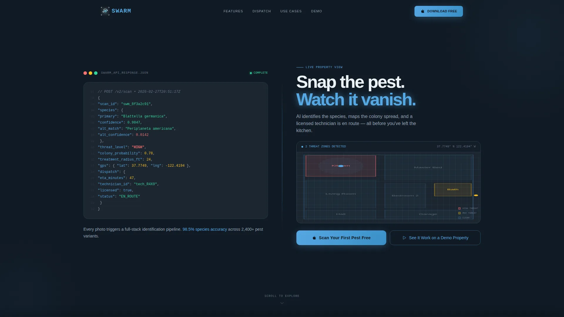
The header divides the viewport evenly. The left panel displays a syntax-highlighted code block showing the app's real API response, including species confidence scores, threat level classification, and a GPS-pinned treatment radius. Text animates line by line, as if the server is responding in real time.
Live Map Overlay Panel
The right side of the header renders the same API data as a glowing residential floorplan map. The identified pest pulses in sky-blue, making the connection between raw data and visual output immediate and intuitive.
Feature Matrix Scroll Sections
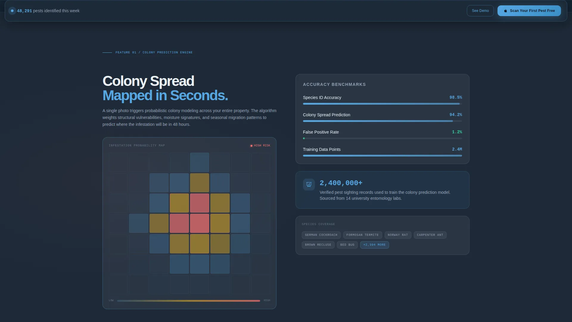
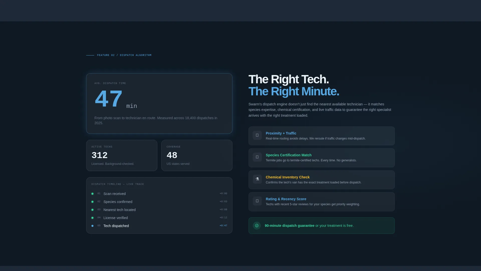
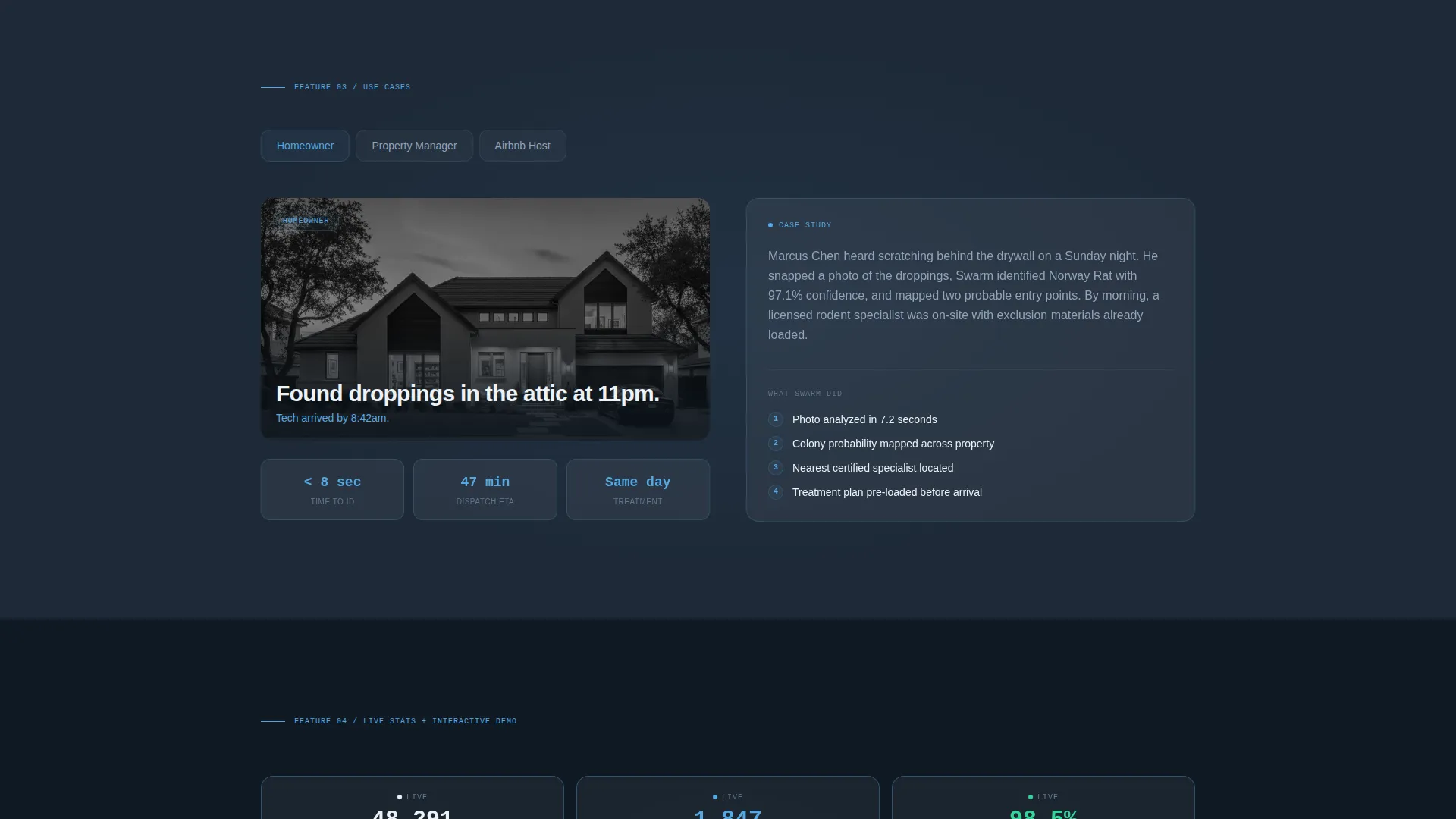
After the header, each scroll section splits the screen between a core app feature and its supporting technical proof. Panels alternate orientation with each section, creating a diagonal reading rhythm that keeps the eye moving and the confidence building.
Sticky App Store call to action Bar
A persistent bottom bar appears after the second scroll section and follows the visitor down the page. The primary call to action reads "Scan Your First Pest Free" and routes through a smart interstitial that detects the visitor's operating system and redirects to the correct app store.
Inline Demo Simulation
A secondary call to action labeled "See It Work on a Demo Property" triggers an interactive simulation directly on the page. Visitors tap a sample floorplan and watch the app respond, converting hesitant browsers into confident downloaders through hands-on experience.
Live Pest Counter
A running counter near the bottom of the page displays the number of pests identified that week. This social-proof element adds urgency and reinforces the app's active, real-world use without requiring any testimonial copy.
Page sections overview
| Section | Purpose |
|---|---|
| Split-screen header | Introduces the API code snippet alongside the live map overlay |
| Colony Prediction panel | Shows the heat-map visualization with accuracy benchmarks |
| Technician Dispatch panel | Demonstrates the matching algorithm with an animated dispatch counter |
| Sticky call to action bar | Persists after second scroll to drive app-store click-throughs |
| Demo simulation section | Lets visitors interact with a sample floorplan to see the app respond |
| Live pest counter | Builds social proof with a running total of pests identified |
Design & branding system
The template uses a Tech Glass visual identity built on the Slate and Sky color system. Every surface carries depth and contrast, referencing the feel of a premium mobile interface viewed at dusk.
- Deep graphite slate (#1E2A38) anchors all backgrounds, frosted glass white (#EDF2F7) layers translucent cards above the dark ground, and open-sky blue (#56A8E2) activates all buttons and interactive states.
- Polished steel mid-tone (#4A5568) fills secondary surfaces and dividers, while syntax-highlighted code blocks use the same palette to keep the technical content visually cohesive.
- Frosted card components float above backgrounds with a faint translucent layer, giving the layout a sense of physical depth without relying on heavy drop shadows.
Mobile & speed optimization
The template is designed with a mobile-first mindset because the product it promotes is a mobile app. Visitors arriving from app-store ad campaigns or social links are likely on a phone, so the layout must perform cleanly at every screen size.
- The split-screen layout stacks vertically on smaller screens so neither the code panel nor the map overlay becomes cramped or unreadable.
- The sticky call to action bar is sized and positioned for thumb reach, making the app-store redirect easy to trigger on a phone without precise tapping.
- Animations such as the line-by-line code reveal and the pulsing pest indicator are kept lightweight so they run smoothly on mid-range mobile devices.
How this template helps you convert
The entire page is structured as a progressive confidence sequence. Each section adds a layer of proof before the visitor ever sees a download prompt.
- The split-screen header establishes technical credibility immediately by showing the API response and the map output side by side, so visitors understand the intelligence behind the app before reading a single marketing line.
- The Feature Matrix scroll sections build cumulative trust by proving each capability with visual benchmarks, dispatch counters, and real data-point references rather than describing features in abstract terms.
- The inline demo simulation removes the final barrier by letting skeptical visitors experience the app's logic directly on the page, turning passive scrollers into active participants who are already invested before they tap the download button.
Other information about this template
This template fits comfortably within the pest control digital presence category and is suited to technology-forward positioning in the pest control mobile app niche.
- The page type is a landing page. It is a single-page, section-led flow with no internal navigation links or multi-page routing.
- The creative direction is a Feature Matrix, meaning features are presented as paired visual and technical proof blocks rather than simple icon-and-text cards.
- The header concept is a Code Snippet, a design choice that signals developer confidence and algorithmic rigor to a tech-aware audience.
- The landing page direction is Click-Through, meaning there are no form fields. The sole conversion goal is routing visitors to the correct app store.
- The template is built for the Technology category, and its visual identity, interaction patterns, and copy structure all reflect that positioning.
Theme
Tech Glass
Creative direction
Feature Matrix
Color system
Slate & Sky
Style
Split Screen (50/50)
Direction
Click-Through
Page Sections
Split-screen Header with Code Snippet
Live Map Overlay Panel
Feature Matrix Scroll Structure
Sticky App Store Call to Action Bar
Inline Demo Simulation
Live Pest Identification Counter
Related questions
Does this template include any form fields or lead capture?
Can I adjust the color palette to match a different brand?
How does the sticky call to action bar behave on mobile devices?
Is the inline demo simulation connected to a live backend?
Who is the intended visitor for this landing page?



