Design System & Component Library Professional Website Template
Swatch is a bento grid landing page template built for a digital color engine that turns a single hex code into a full production-ready palette. It showcases palette generation, accessibility scoring, contrast ratios, and design token export through a live-data header and a feature-dense scrolling layout. The template is designed to convert fast-moving builders without friction.
by Rocket studio
Quick summary
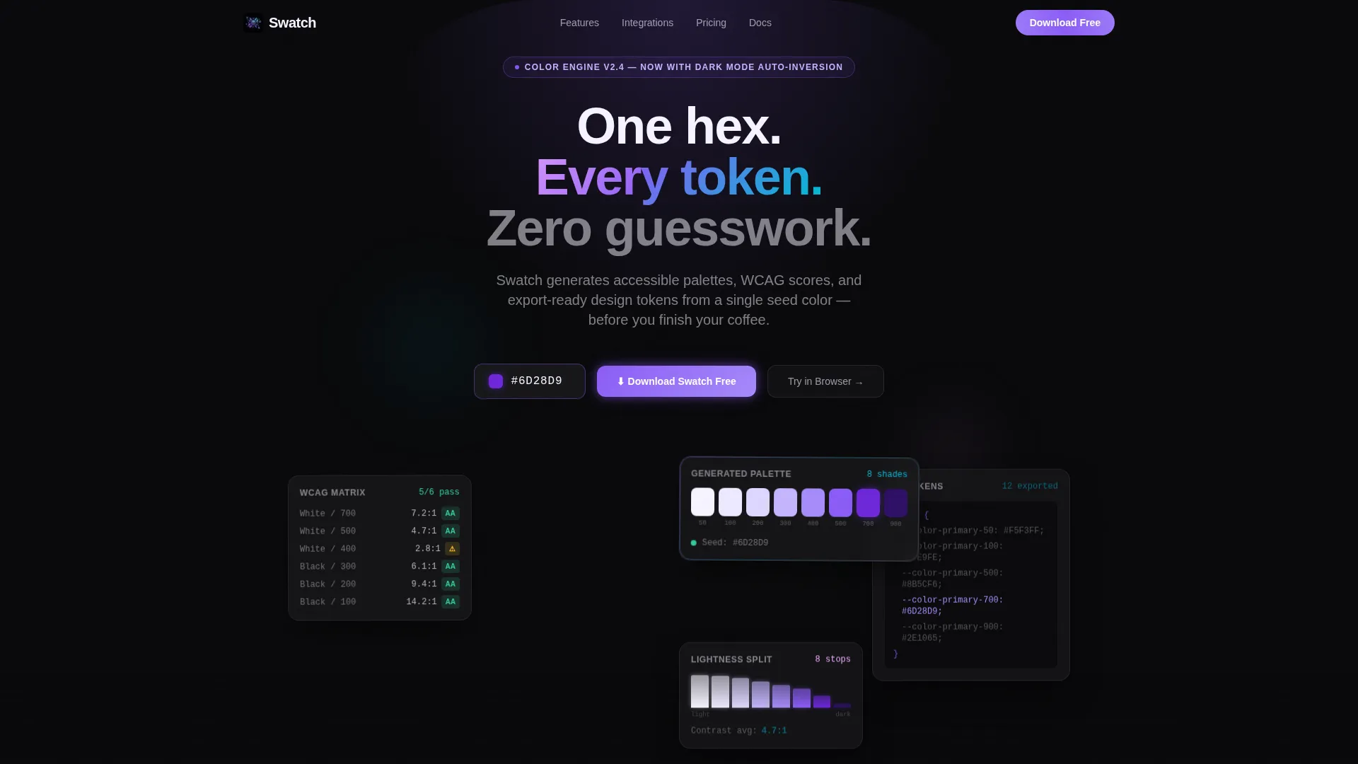
Swatch is a single-page bento grid landing page template designed for a color system and palette tool. The header opens mid-generation, showing a live stats dashboard with swatches, contrast scores, and token previews already running. Every scroll section adds capability proof through micro-visualizations, driving visitors toward a one-tap app download with zero form friction.
Who this template is for
This template speaks directly to people who build and ship design infrastructure fast. It is built for practitioners who need to prove the value of a color tool in seconds, not minutes.
- Solo founders building minimum viable products who need a color system they can trust immediately
- Design system leads managing component libraries across large engineering teams
- Front-end developers who want WCAG compliance (Web Content Accessibility Guidelines compliance) confirmed without manually checking browser dev tools
What problem this template solves
Color system pages often show static swatches and leave visitors guessing whether the tool is fast or powerful. This template solves that by making the data the visual hero from the first pixel.
- Visitors lose trust when a landing page shows illustrations instead of the actual product in motion
- Developers and designers need to see accessibility scores and token output before they commit to installing anything
- A fragmented layout with slow-building scroll sections kills the sense of velocity that tools like this depend on
What you get with this template
You get a fully structured bento grid landing page that mirrors the speed and precision of the tool itself. Every section is designed to carry proof, not decoration.
- A stats dashboard header with a live hex input, eight palette swatches, a WCAG contrast matrix, a lightness distribution chart, and a token export preview in CSS custom properties
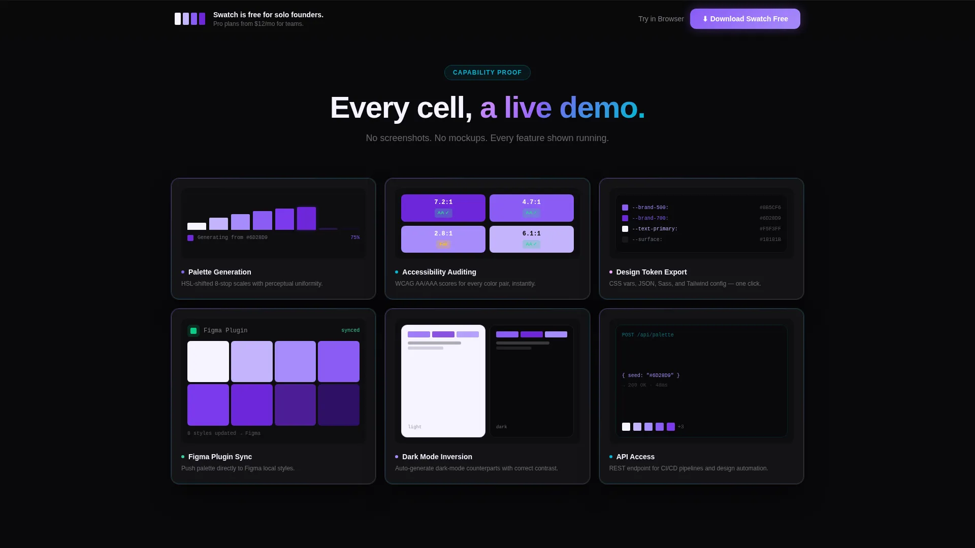
- A 3x2 feature grid with micro-visualizations covering palette generation, accessibility auditing, token export, plugin sync, dark mode inversion, and API access
- A sticky bottom bar call to action and an OS-detecting download button, plus a secondary browser demo path for visitors not ready to install
Feature list
This section walks through the core capabilities baked into the template layout and interaction design.
Live Stats Dashboard Header
The header opens with a hex input field pre-filled with a seed color and radiates outward into bento cards. Each card shows a live output state: palette swatches with labels, a contrast matrix with passing and warning indicators, a color distribution pie chart, and a CSS token export preview. Numbers appear mid-count to communicate the tool is already working when the visitor arrives.
Bento Grid Feature Matrix
Below the header, a 3x2 grid turns each cell into a capability demonstration rather than a static icon panel. Micro-visualizations replace generic icons, giving each feature immediate visual evidence. The grid covers six core capabilities in a scannable, parallel layout that rewards both quick skimmers and deep readers.
Competitor Workflow Comparison Row
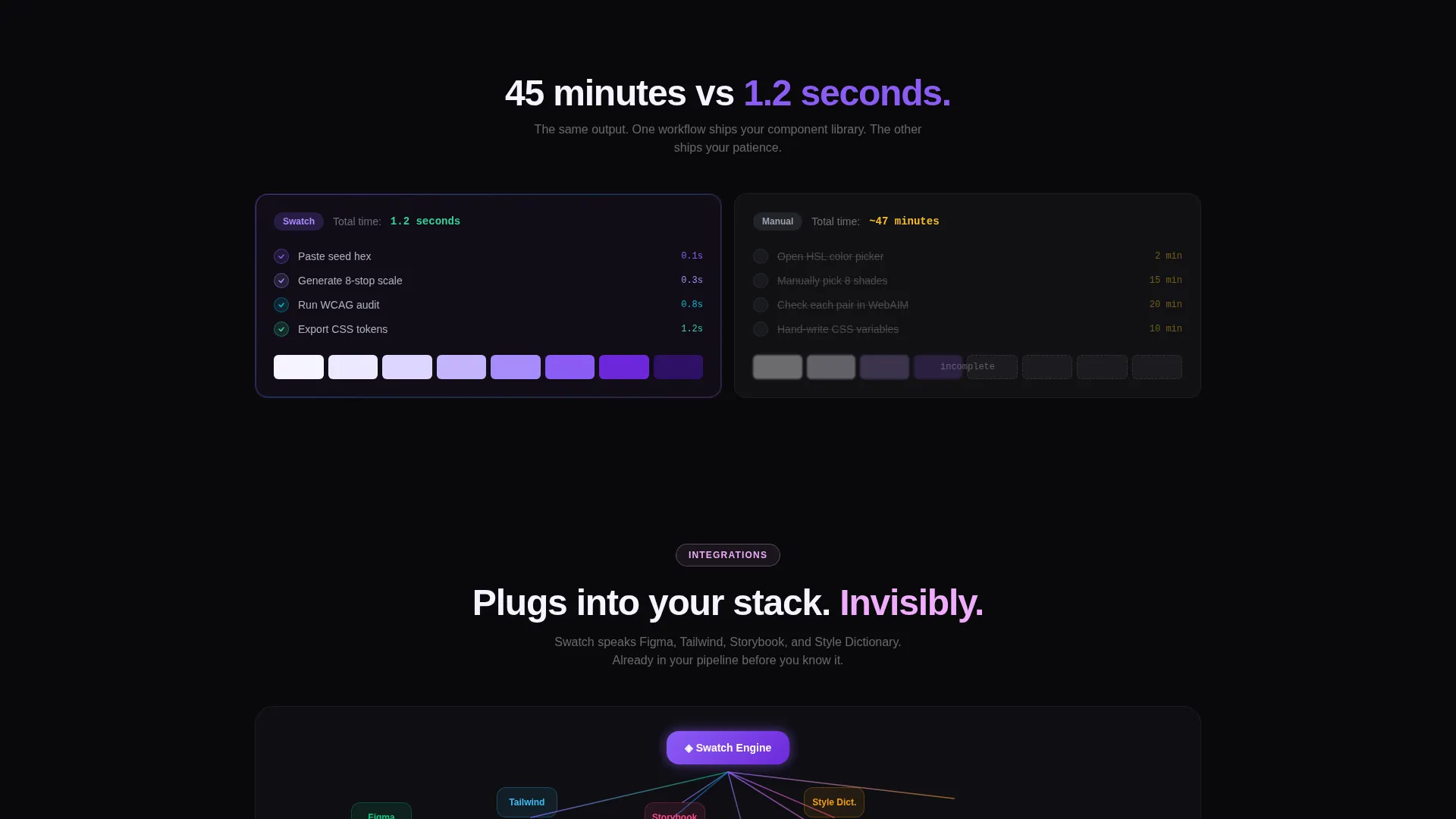
A dedicated 2x1 row places the tool's output side by side with a manual workflow. This section provides direct, visual contrast between the two approaches without requiring any explanatory copy to carry the argument. The comparison builds confidence efficiently at the midpoint of the scroll.
Integration Showcase Section
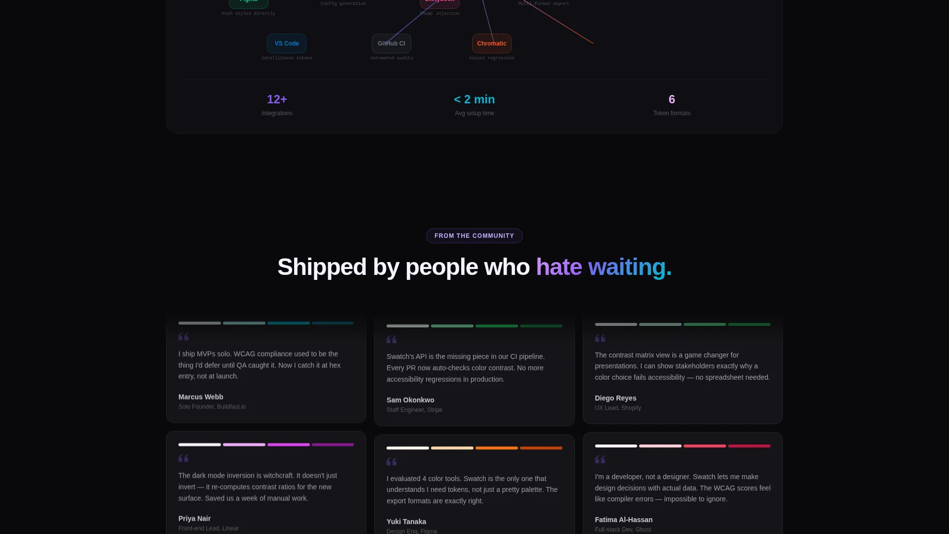
A full-width bento cell displays integration connection points with animated connection lines. This section communicates compatibility with design and development toolchains in a single visual pass. The animated treatment reinforces the velocity theme without requiring the visitor to read a feature list.
OS-Aware Download call to action
The primary call to action detects the visitor's operating system and adjusts button copy accordingly, showing either a Mac-specific or Windows-specific label. The button appears first as a glowing pill inside the header dashboard, then resurfaces as a sticky bottom bar after the second scroll section. No email gate or form field stands between the visitor and the download.
Secondary Browser Demo Path
Alongside the primary download path, a "Try in Browser" option gives visitors a lower-commitment entry point. This secondary call to action links to a web demo, reducing the barrier for visitors who are evaluating the tool before committing to a local install.
Page sections overview
| Section | Purpose |
|---|---|
| Stats Dashboard Header | Opens mid-generation with hex input, palette swatches, contrast matrix, lightness chart, and CSS token preview |
| 3x2 Feature Grid | Demonstrates six capabilities through micro-visualizations in a parallel bento layout |
| Workflow Comparison Row | Side-by-side view contrasting tool output against a manual design process |
| Integration Showcase Cell | Full-width section showing toolchain compatibility with animated connection lines |
| Sticky Download Bar | Resurfaces the primary call to action after the second scroll section with OS-aware copy |
Design & branding system
The visual identity follows a Startup Velocity theme using an AI Iridescent color system. The palette is built for high contrast and clarity on a near-black canvas, with each accent color pulling a specific functional role rather than serving a decorative purpose.
- Void black (#09090B) as the primary canvas, holographic violet (#8B5CF6) for primary actions and glowing accents, shifted cyan (#06B6D4) for secondary data highlights, soft iridescent pink (#F0ABFC) for hover states and micro-interactions, and near-white pearl (#F5F3FF) for body typography
- No stock imagery and no illustrations; all visual interest comes from live data states, contrast matrices, and color swatches rendered as functional user interface elements
- The overall aesthetic feels like light refracting through a prism on a matte black surface, clean and precise, with each color holding a clear role in the information hierarchy
Mobile & speed optimization
The bento grid layout is structured to remain readable and scannable as viewport widths change. The data-dense header adapts without losing its core visual logic.
- Bento cells reflow and resize to maintain legibility on smaller screens without hiding key data elements
- The sticky bottom bar call to action remains accessible throughout the scroll on mobile, keeping the primary action reachable at all times
- Micro-visualizations inside each feature cell are contained within defined grid boundaries, preventing overflow on narrow viewports
How this template helps you convert
This template is engineered to earn the download click before the visitor reaches the bottom of the page. Every layout decision reduces friction and builds proof progressively.
- The header shows the tool already working, so the visitor's first impression is competence and speed rather than a marketing promise
- Each scroll section adds a new layer of capability evidence through live data states and direct workflow comparisons, compounding trust with every cell
- The OS-aware download button with no form gate removes the last point of friction, making the path from interested visitor to active user as short as possible
Other information about this template
This template is categorized under Design System and Component Library within the Documentation and Support category, making it well-suited for teams building or marketing a color system and palette page. It sits at the intersection of developer tooling and design infrastructure, which means it serves both visual and technical audiences on the same page.
- The template is built on a Bento Grid layout style, which naturally supports dense information display without overwhelming the visitor
- The color system and palette page niche benefits from showing real output data in the hero section rather than abstract product claims
- This template can support customization of the seed hex, swatch count, token format labels, and integration logo set to match the specific tool being marketed
Theme
Startup Velocity
Creative direction
Feature Matrix
Color system
AI Iridescent
Style
Bento Grid
Direction
App Download
Page Sections
Live Hex Input Dashboard Header
Six-cell Capability Feature Grid
Side-by-side Workflow Comparison
Animated Integration Showcase
Os-aware Download Button
Secondary Browser Demo Path
Related questions
Does this template include working color generation logic?
Can I update the seed hex and palette swatches shown in the header?
Is the OS-aware download button pre-configured?
Who is this landing page template designed for?
Can I swap the integration logos in the showcase section?



