Cloud-Native Enterprise Software Premium Professional Website Template
Swipe is a split-screen landing page template built for a cloud-native point-of-sale system. It features an interactive Feature Tab Switcher header, a scrolling Feature Matrix layout, and a freemium trial conversion flow. The Monochrome Steel color system and sharp 50/50 structure give it the confident, functional feel of a product already running in production.
by Rocket studio
Quick summary
Swipe is a single-page landing page template for a browser-based point-of-sale product. The 50/50 split-screen layout pairs live user interface previews with sharp feature copy at every scroll step. Three interactive header tabs let visitors explore Checkout, Inventory, and Reports before a single word of sales copy appears. The result is a page that earns the click by showing the product first.
Who this template is for
This template is designed for teams launching or marketing a cloud-native point-of-sale product. It speaks directly to the operators who will use such a system every day.
- Coffee shop and cafe owners managing one or more locations from a single dashboard
- Pop-up and market vendors who need a lightweight, hardware-free checkout terminal
- Franchise operators rolling out a consistent checkout experience across many storefronts
What problem this template solves
Most point-of-sale landing pages describe features without showing the product. Visitors leave before they understand what the software actually does. This template puts the live interface front and center so the product sells itself.
- Buyers cannot evaluate a POS system they have never seen running
- Generic marketing pages fail to connect with operators at different business scales
- A buried call-to-action after paragraphs of text loses the visitor before conversion
What you get with this template
You get a fully structured, single-page layout built around the Swipe POS use case. Every section has a clear job, and no section is decorative.
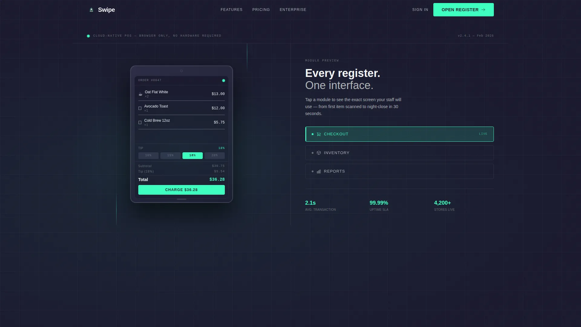
- A Feature Tab Switcher header with a rendered tablet showing three switchable module screens
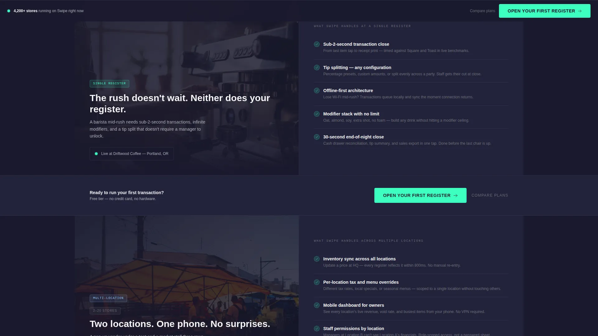
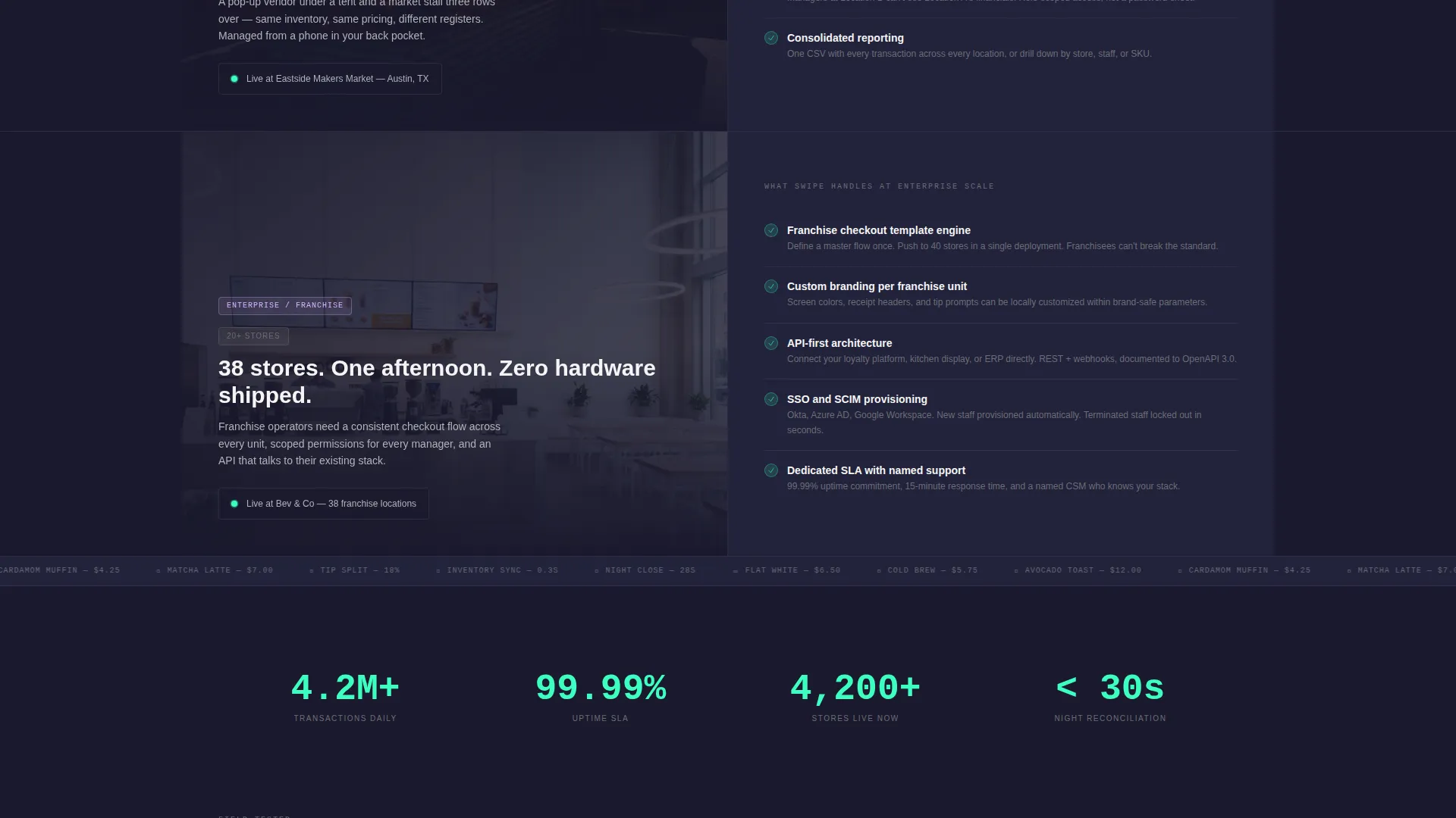
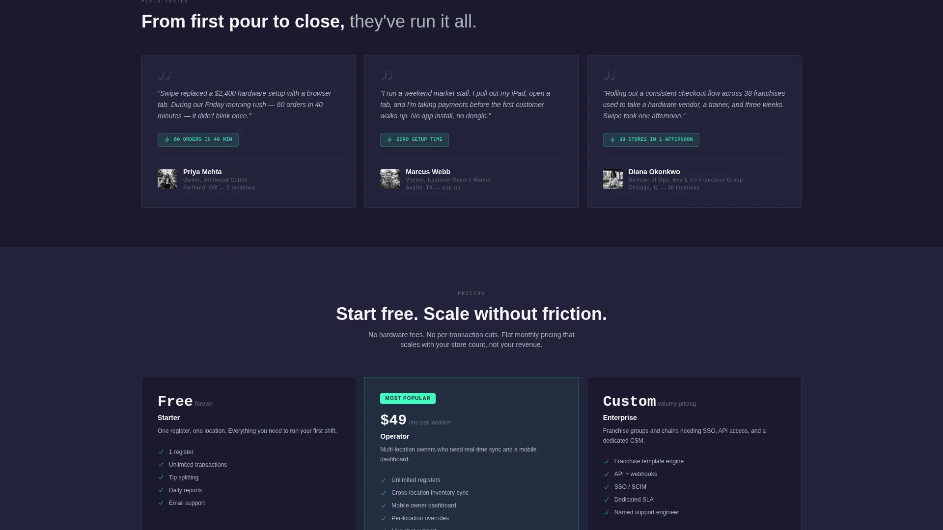
- A scrolling Feature Matrix that moves through single-register, multi-location, and enterprise tiers
- A two-step freemium trial form with a primary call-to-action and a sticky bottom bar
Feature list
This template is built around a precise set of layout and interaction components drawn directly from the brief.
Interactive Tab Switcher Header
The header divides the screen 50/50. The left half displays a rendered tablet mounted on a sleek stand. The right half holds three tabs labeled Checkout, Inventory, and Reports. Clicking any tab swaps the tablet screen in real time, showing animated totals, a live stock grid, or a revenue dashboard for that module.
Scrolling Feature Matrix Layout
The main body of the page stacks capability against use-case scenario as the visitor scrolls. Each section splits the screen between a visual scene on the left and a tight feature grid on the right. The complexity escalates naturally from a single register to multi-location to enterprise scale.
Freemium Trial Conversion Flow
The primary call-to-action button reads "Open Your First Register" and appears after the second feature section. It also pins to a bottom bar for persistent visibility. Clicking opens a two-step form: email and business name on screen one, then location count and current POS provider on screen two. No credit card field is included.
Secondary Plan Comparison Link
A text link reading "Compare all plans" sits beneath the primary call-to-action. It serves the enterprise buyer who needs to review pricing tiers before committing to a trial, without interrupting the main conversion path.
Tiered Scenario Storytelling
The Feature Matrix sections use visual scenes to anchor each capability tier. A barista mid-rush, a market vendor under a tent, and a franchise map with glowing location pins each frame the exact operator context before the feature grid appears on the right.
Page sections overview
| Section | Purpose |
|---|---|
| Tab Switcher Header | Showcases Checkout, Inventory, and Reports modules on a rendered tablet |
| Feature Matrix: Single Register | Introduces core POS capabilities for a single-location operator |
| Feature Matrix: Multi-Location | Demonstrates inventory sync and multi-site management for growing businesses |
| Feature Matrix: Enterprise | Presents consistent checkout rollout tools for franchise-scale operators |
| Primary call to action Block | Drives trial sign-up with the "Open Your First Register" button after section two |
| Two-Step Trial Form | Collects email, business name, location count, and current POS provider |
| Sticky Bottom Bar | Keeps the primary call-to-action visible throughout the full page scroll |
Design & branding system
The template uses a Monochrome Steel palette that feels like the inside of a server rack. Every surface is functional, and color only appears where it signals an active state.
- Core colors are forge black (#1A1A2E), brushed aluminum (#B0B3B8), and panel white (#F4F4F5) for all structural surfaces
- Electric mint (#3DFFC0) is reserved exclusively for interactive states, active tabs, and live user interface indicators
- The Directory and Discovery theme keeps the layout clean, grid-based, and free of decorative elements
Mobile & speed optimization
The 50/50 split-screen layout is structured to reflow cleanly on smaller screens. The tablet rendering and tab interactions are designed to work as well on a handheld device as on a desktop monitor.
- The split columns stack vertically on mobile so tab content and visuals remain readable without horizontal scrolling
- Interactive tab states and the sticky bottom bar are built to function on touch interfaces used by vendors and operators on the go
How this template helps you convert
This template is built around a single principle: show the product before asking for anything. The conversion path follows that logic from the first scroll to the final form.
- The interactive tab header lets visitors experience three core modules before reading any feature copy, building product confidence early.
- The tiered Feature Matrix maps the visitor's own operation onto a relevant scenario, so the decision to try the product feels self-directed rather than pushed.
- The two-step trial form removes friction by asking only for business context and skipping any payment details, making the first step feel low-risk.
Other information about this template
This template is categorized under Technology and Cloud-Native Enterprise Software. It is built specifically for the cloud-native POS niche and is designed to match the intent of operators evaluating browser-based point-of-sale solutions.
- The template style is Split Screen (50/50), matching the visual language of modern SaaS product pages
- The header concept is the Feature Tab Switcher, a pattern common in enterprise software marketing that lets prospects self-navigate by module
- The landing page direction follows a Freemium/Trial model, which is well-suited to POS products where hands-on experience drives purchase decisions
- The theme is Directory and Discovery, meaning the layout guides visitors through a structured capability map rather than a narrative story
Theme
Directory & Discovery
Creative direction
Feature Matrix
Color system
Monochrome Steel
Style
Split Screen (50/50)
Direction
Freemium/Trial
Page Sections
Feature Tab Switcher Header
Scrolling Feature Matrix
Freemium Trial Conversion Flow
Tiered Scenario Visual Scenes
Secondary Plan Comparison Link
Related questions
Can I customize the tab content for a different POS product?
Does the two-step form require a payment processor connection?
How does the sticky bottom bar behave on mobile?
Is this template suitable for both a single cafe and a large franchise?



