Swipe - Powerful Travel POS Landing Page Template
Swipe is a bold brutalist landing page template built for travel point-of-sale software. It leads with a live calculator, data-grid panels, and transaction-receipt testimonials. Designed for tour operators, airport retailers, and adventure outfitters, every section proves value through raw numbers before asking for a click.
by Rocket studio
Quick summary
Swipe is a single-page, stats-first landing page template for a travel point-of-sale system. It opens with a brutalist calculator block, then drills through benchmark grids, currency matrices, and cost sliders. The goal is simple: let the math do the selling. Every scroll layer is denser, more specific, and harder to argue with.
Who this template is for
This template is built for travel and hospitality software companies that need to prove their product before asking for a signup. It speaks directly to operators who live inside transaction data every day.
- Tour operators and multi-city guide companies who need offline payment capability
- Duty-free and airport retail managers reconciling value-added tax (VAT) across closing shifts
- Adventure outfitters and surf school owners processing payments on ruggedized or field devices
What problem this template solves
Travel point-of-sale businesses lose potential customers when they lead with features instead of proof. Visitors who process thousands of transactions daily need to see numbers, not stock photos of smiling travelers.
- Traditional landing pages bury the cost comparison behind long-form copy and contact forms
- Multi-currency operators need to immediately see fee breakdowns and processing speeds before committing to a demo
- Offline-capable and multi-jurisdiction tools are hard to explain without showing the math in real time
What you get with this template
You get a fully structured, single-page dashboard layout that earns the click before it asks for one. Every section is purposeful, data-forward, and styled for maximum legibility under harsh reading conditions.
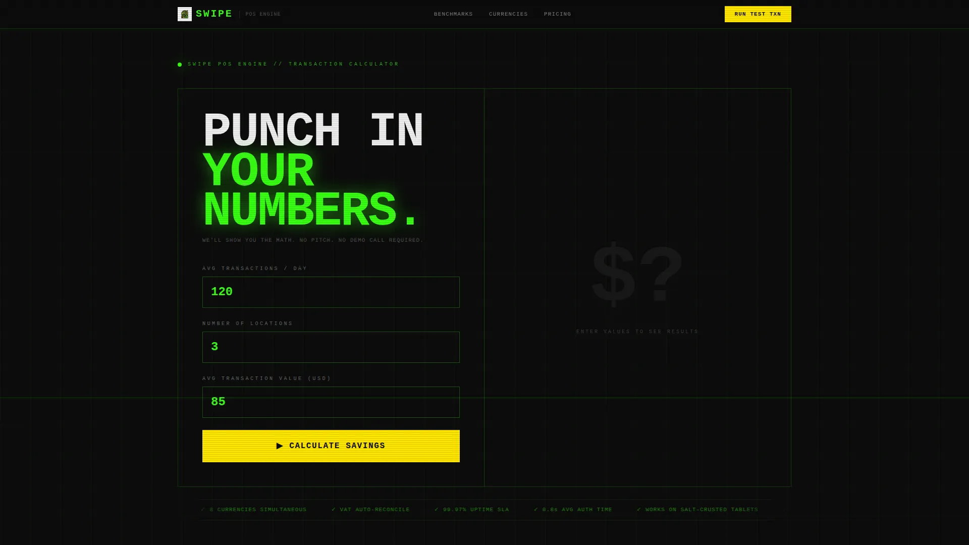
- A brutalist calculator header that projects savings, fees, and speed benchmarks on demand
- Scrollable data-grid panels covering transaction benchmarks, currency conversion, uptime figures, and cost-per-swipe sliders
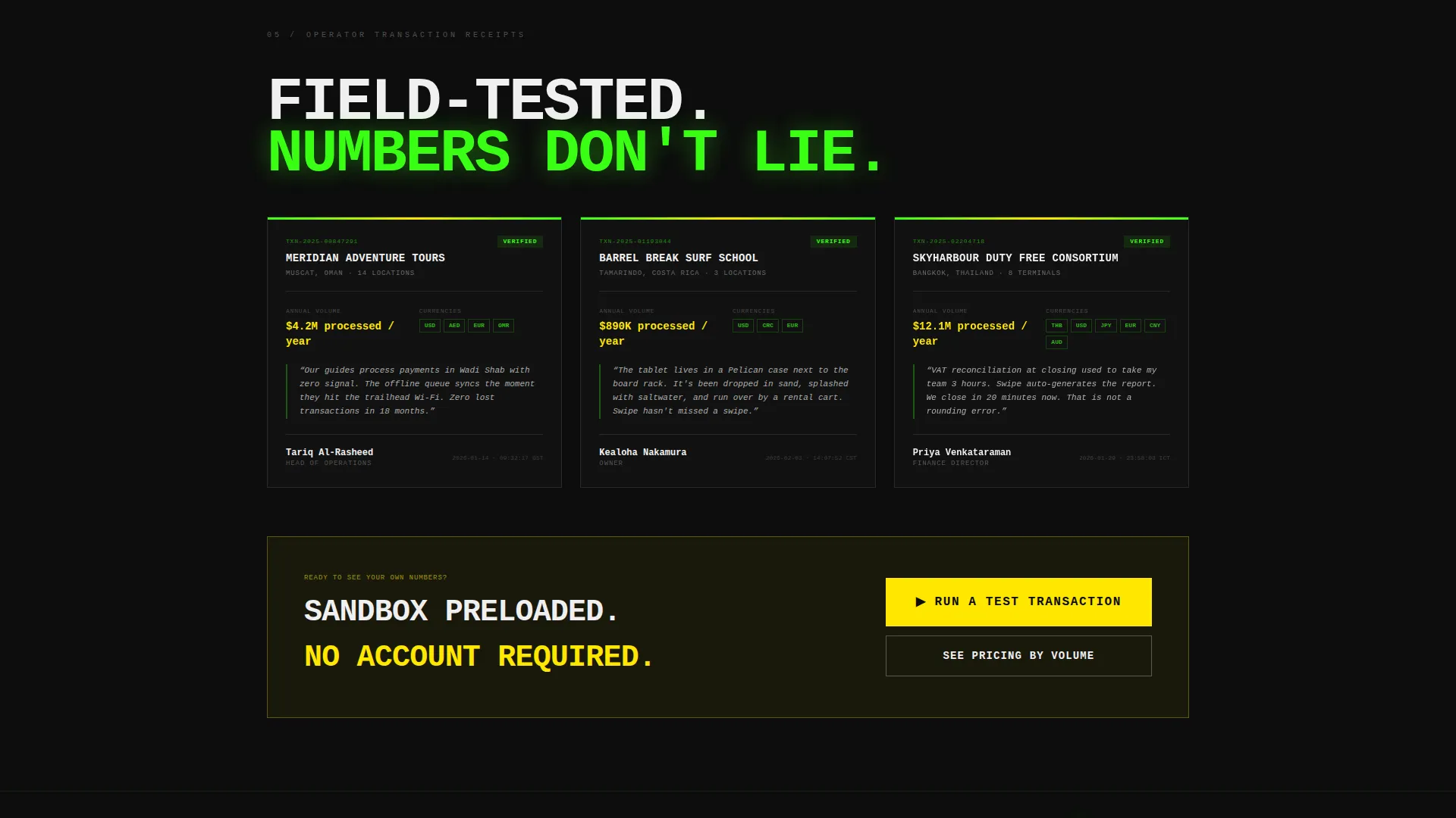
- Transaction-receipt-style testimonial blocks showing operator name, location, volume, and quote
- Three strategically placed calls to action: after the calculator, after the benchmarks, and as a persistent bottom bar
Feature list
This template delivers a focused set of purpose-built components. Each one is designed to replace persuasion copy with verifiable data displays.
Live Calculator Header Block
Visitors enter their average daily transactions, number of locations, and primary currencies. On submit, the viewport fills with projected savings, fee comparisons, and processing speed benchmarks rendered as massive typographic figures.
Scrollable Data Grid Panels
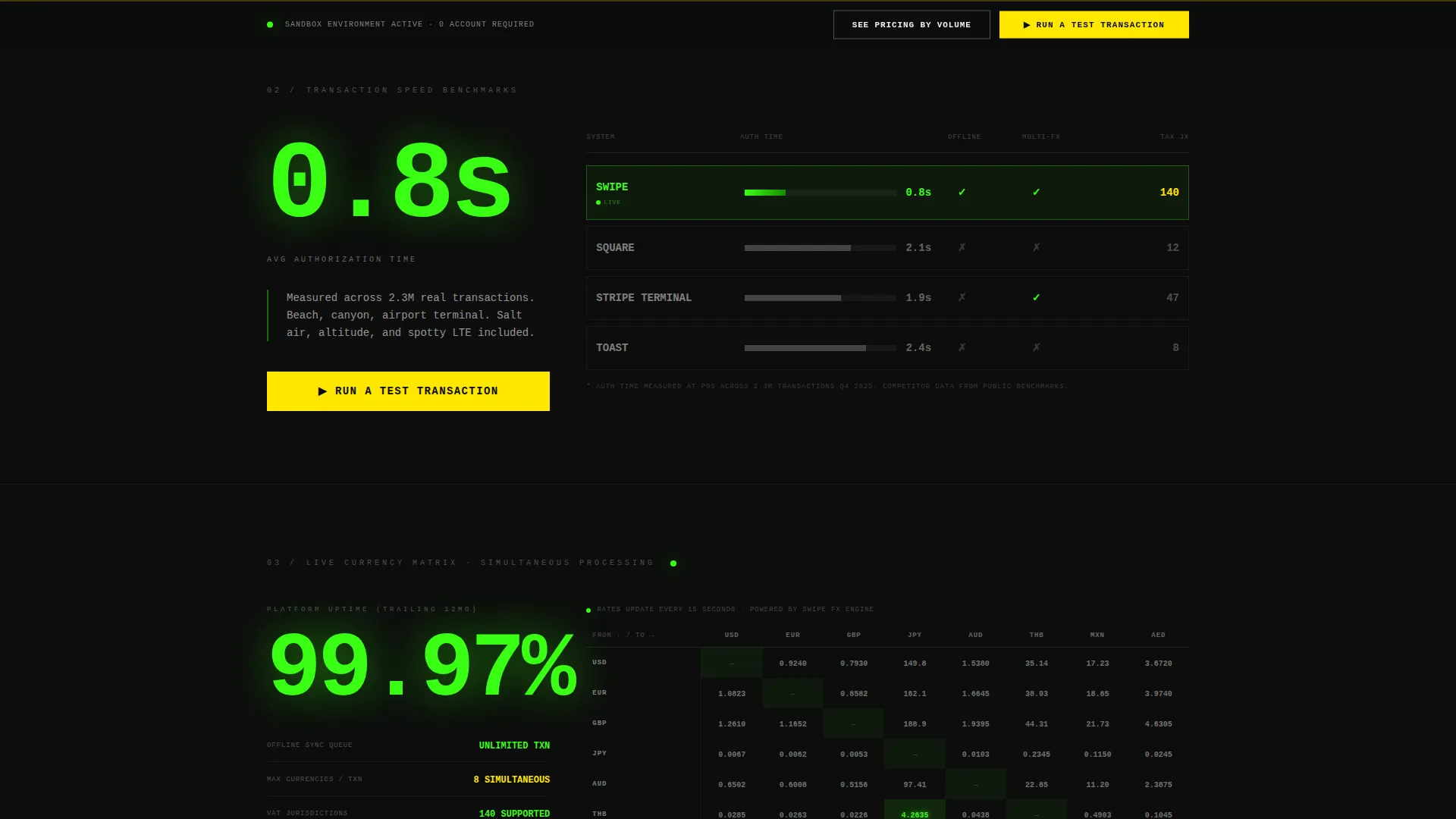
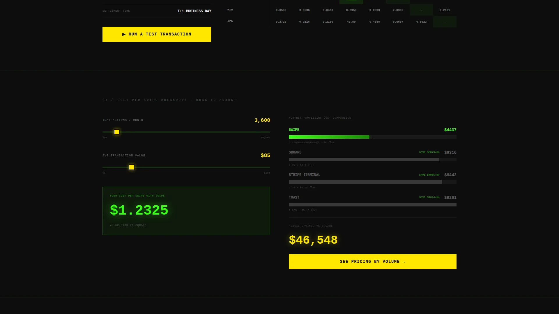
Each scroll depth unlocks a new panel. The panels include transaction speed benchmarks against three named competitors, a live currency conversion matrix, uptime percentage in large-format numerals, and a cost-per-swipe breakdown tied to interactive sliders.
Transaction Receipt Testimonials
Customer quotes are styled as printed transaction receipts. Each block shows the operator name, location, volume processed, and a direct quote. The format reinforces the product's core identity and makes social proof feel native to the interface.
Persistent Call-to-Action Bar
A fixed bottom bar carries the primary call to action throughout the entire page scroll. It never disappears, ensuring the path to the sandbox demo environment is always one tap away.
Tiered Pricing Path
A secondary call-to-action link connects visitors to a volume-based pricing grid. This gives high-volume operators a direct route to cost comparisons without interrupting the primary demo conversion flow.
Bold Brutalist Visual System
The template uses terminal black, radiation green, hazard yellow, cold interface gray, and white monospaced type. Green highlights live data, yellow marks interactive elements and calls to action, and the black background makes every number glow against the screen.
Page sections overview
| Section | Purpose |
|---|---|
| Calculator Input Block | Let visitors punch in transaction volume and see projected savings instantly |
| Calculator Results Display | Detonate the viewport with fee comparisons and speed benchmarks |
| Transaction Speed Benchmarks | Compare processing performance against three named competitors in a data grid |
| Currency Conversion Matrix | Show live multi-currency rates relevant to the visitor's declared currencies |
| Uptime Display Panel | Present uptime percentage as massive typographic figures for instant credibility |
| Cost-Per-Swipe Slider | Let visitors adjust volume sliders and watch the cost breakdown update in real time |
| Receipt Testimonials | Display operator social proof as styled transaction receipts with volume data |
| Primary call to action Block | Push visitors to the sandbox demo after the benchmarks section |
| Persistent Bottom Bar | Keep the primary call to action visible at every scroll depth |
| Secondary Pricing Link | Route high-volume visitors to the tiered volume pricing grid |
Design & branding system
The visual identity is Bold Brutalist with an Acid Digital color system. Nothing is decorative. Every color carries a specific functional role, and the layout is built to be read fast under pressure.
- Terminal black (#0D0D0D) bleeds edge to edge as the base; radiation green (#39FF14) dominates data callouts and live figures; hazard yellow (#FFE600) marks every interactive hotspot and call to action
- Cold interface gray (#1A1A2E) provides structural depth behind panels; white (#F0F0F0) monospaced type ensures every number is impossible to misread at any size
- Typography scales aggressively for impact: uptime figures and benchmark results render at display size to land like a stock ticker in full panic mode
Mobile & speed optimization
The template layout is designed to stay legible and functional on smaller screens used in field conditions. Surf school tablets, guide phones in canyons, and airport kiosk displays are all real use contexts for the product being sold.
- Full-bleed black background and high-contrast green-and-yellow type remain readable on low-brightness or glare-exposed screens
- Interactive elements including the calculator, sliders, and persistent call-to-action bar are sized for touch input without requiring pinch or zoom
How this template helps you convert
The entire page is structured as a progressive proof sequence. Visitors do not reach a call to action until the template has already made the case in numbers.
- The calculator header forces active engagement before any scroll occurs, creating a personalized result the visitor generated themselves, making the projected savings feel credible and owned
- Each subsequent data grid panel adds a new layer of evidence, so by the time the visitor reaches the primary call to action, they have already seen speed benchmarks, currency data, uptime figures, and cost-per-swipe comparisons
- The no-form approach removes all friction: the primary call to action lands directly in a sandbox terminal preloaded with sample inventory and multi-currency scenarios, so commitment feels like exploration rather than obligation
Other information about this template
This template is built for travel software companies competing in a crowded point-of-sale market where buyers are skeptical and data-literate. It is designed to outperform standard hero-and-form layouts by leading with proof.
- The template style is Dashboard and Data Grid, making it a strong fit for any travel software or software-as-a-service (SaaS) product that can demonstrate value through live metrics
- The creative direction is Stats-First Impact, meaning every visual decision prioritizes data legibility over aesthetic decoration
- The header concept is a Calculator and Estimator, a proven high-engagement pattern for transactional software landing pages
- The landing page direction is Click-Through, with no embedded lead form; the conversion event is a direct click into a demo environment
- This template sits within the Technology category, Travel Software and SaaS subcategory, and the Travel POS System niche
Theme
Bold Brutalist
Creative direction
Stats-First Impact
Color system
Acid Digital
Style
Dashboard/Data Grid
Direction
Click-Through
Page Sections
Live Calculator Header Block
Scrollable Data Grid Panels
Transaction Receipt Testimonials
Persistent Call-to-action Bar
Tiered Pricing Path
Bold Brutalist Visual System
Related questions
Does this template include a contact form or lead capture form?
Can I use this template if my product supports only one currency?
What makes the testimonial format different from a standard review block?
How many calls to action does this template include?
Is this template suited for software products that include offline payment modes?



