Dental Software Professional Website Template
The Swipe Instant Dental Payment Processing landing page template is a dark-themed, split-screen single-page layout built for fintech dental payment platforms. It combines a frosted-glass hero, three interactive scroll sections, and a full-width app download call to action. Designed for DSO operators, solo practitioners, and office managers, it turns complex insurance and co-pay flows into a compelling, interactive pitch.
by Rocket studio
Quick summary
The Swipe template is a high-impact dental landing page designed for a payment processing app targeting dental offices. It opens with a split-screen dark glass hero, flows through a Practice Mode Explorer, a live fee calculator, and a transaction layer diagram, then closes with a full-width app download call to action. Every scroll section rewards interaction.
Who this template is for
This landing page is purpose-built for fintech companies and payment platforms serving the dental industry. It speaks directly to operations-side buyers who feel the daily weight of billing friction. The target audience is specific and the layout reflects their reality.
- DSO (Dental Service Organization) operations managers running thirty or more locations on legacy point-of-sale systems who need a fast, clear pitch for procurement approval
- Solo practitioners still sending paper statements and spending roughly eleven hours a week on accounts receivable who want a frictionless solution fast
- Office managers at busy dental clinics who juggle insurance splits, patient co-pays, and recurring treatment plan billing every single day
What problem this template solves
Dental payment platforms have a real communication problem. The product is technically impressive, but the pitch often falls flat on a generic landing page with no interaction and no proof of speed. Potential patients of the platform, meaning the buyers evaluating it, arrive skeptical and leave unconvinced. This dental landing page template closes that gap.
- Traditional landing page examples in the fintech-dental space rely on static screenshots and long copy blocks, giving visitors no feel for the actual product before they commit
- DSO procurement buyers and office managers are busy professionals who need to see their own numbers reflected back at them, not a generic value proposition built for a different dental clinic type
- Without a high converting landing page structure, platforms lose visitors who were genuinely interested but never reached the call to action because the page gave them no reason to stay
What you get with this template
You get a complete, ready-to-customize dental landing page built around five distinct scroll sections and a sticky bottom bar call to action. Every section is interactive by design. The layout is mobile-first, dark-themed, and built to convert visitors before they ever install the app.
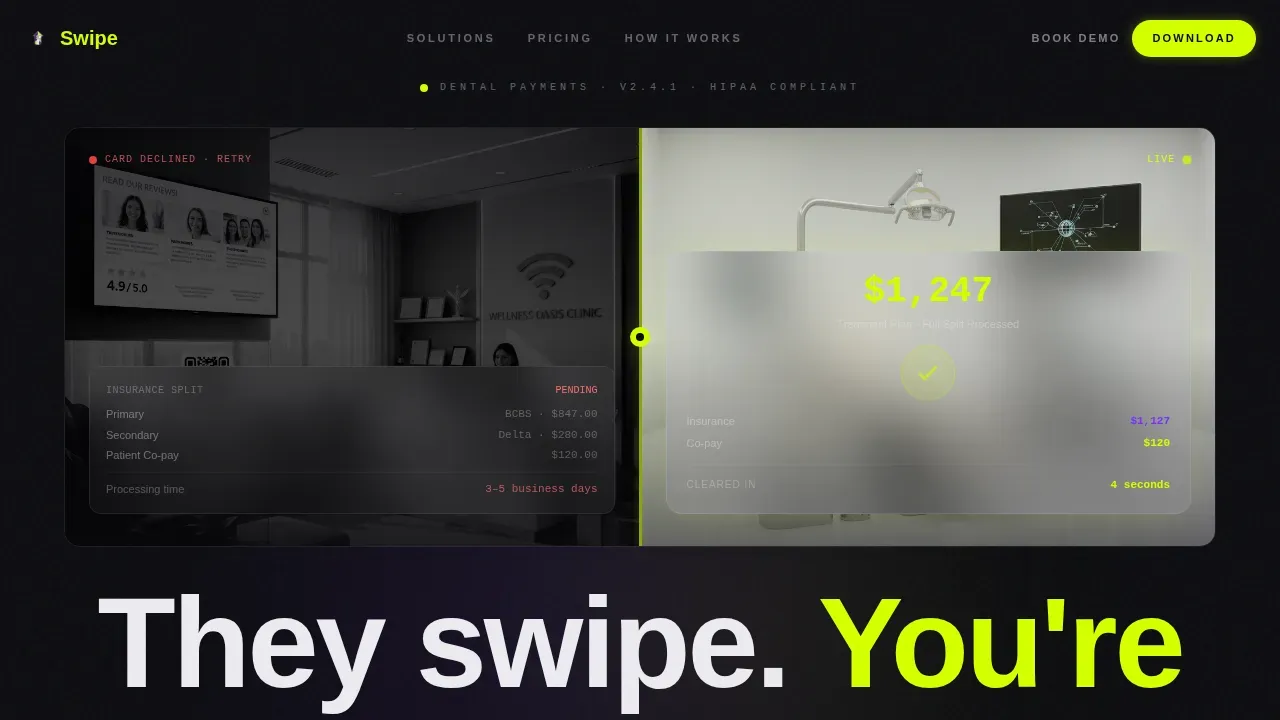
- A split-screen hero section with two frosted-glass dark panels, a desaturated "before" scene on the left and an illuminated "after" phone screen on the right, separated by a breathing chartreuse divider line and a six-word fade-in headline
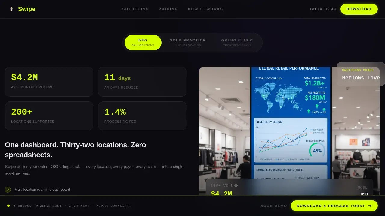
- Three interactive body sections including a Practice Mode Explorer with DSO, Solo Practice, and Ortho Clinic toggles that reflow the page with different data; a live fee calculator with a draggable volume slider and animated cost and savings bars; and a tap-to-reveal isometric transaction diagram showing each payment layer in sequence
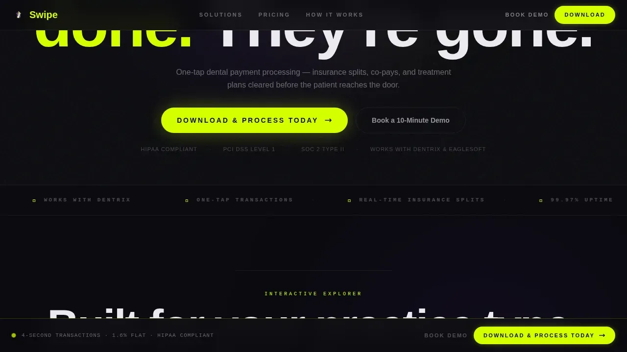
- A social proof and app download closer section with metrics, customer testimonials, and a full-width call to action block featuring paired App Store and Google Play badges, plus a secondary "Book a 10-Minute Demo" path for enterprise DSO buyers
Feature list
This dental landing page template is packed with purpose-built components. Each one maps to a specific friction point in the dental payments buying journey.
Split-Screen Dark Glass Hero
The hero image area uses two translucent frosted-glass panels side by side. The left panel shows a desaturated monochrome dental clinic checkout scene. The right panel glows with a completed payment confirmation screen. A thin chartreuse divider breathes between them. A compelling headline fades in across both panels after two seconds: six words, zero clutter. This hero image approach uses visual storytelling to immediately demonstrate the before-and-after contrast of the product.
Practice Mode Explorer Toggle
Section two is an interactive mode switcher. Visitors toggle between DSO, Solo Practice, and Ortho Clinic modes. The entire dental landing page reflows with mode-appropriate transaction volumes, dashboard screenshots, and fee structures for each dental clinic type. This gives each segment of the target audience a personalized view without requiring a new landing page per audience. It is a strong lead generation tool because it keeps visitors engaged long enough to self-identify.
Live Fee Calculator
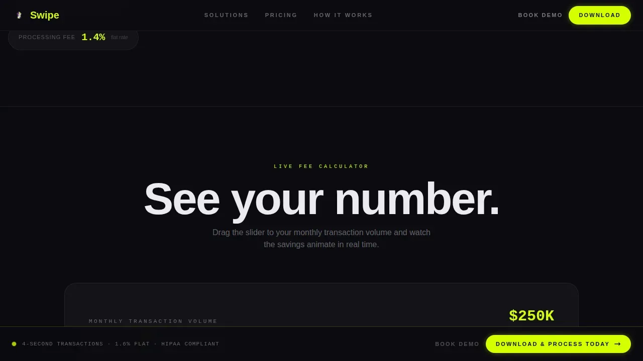
Section three is a draggable slider calculator. Visitors set their monthly transaction volume and watch processing costs, legacy processor savings, and annual recapture figures animate in real time. Chartreuse data bars climb against violet baselines. This is the key element that makes this a high converting landing page: by the time the visitor reaches the call to action below, they have already seen their own savings number. The calculator replaces a generic value proposition with a personalized one.
Isometric Transaction Layer Diagram
Section four is a tap-to-reveal payment flow explorer. An isometric diagram breaks a single dental payment into its component layers: patient tap, tokenization, insurance split, and provider deposit. Each node lights up in sequence as the visitor taps through. This interactive diagram gives potential clients a working mental model of how the platform handles online transactions, reducing skepticism before the download call to action.
Sticky App Download Call to Action Bar
A persistent bottom bar appears after the hero section scrolls out of view and stays on screen throughout the entire page. It carries the primary call to action, "Download and Process Today," with App Store and Google Play badges rendered in chartreuse outline on void black. This strategic placement means the call to action is always easily accessible without interrupting the interactive scroll experience.
Social Proof and Demo Booking Closer
The final section combines processing metrics, named dental service organization testimonials, and patient reviews from real practice contexts. It closes with a full-width app download block and a secondary call to action path for DSO buyers who need procurement approval: "Book a 10-Minute Demo." Social proof at this stage reinforces trust signals built up across the earlier interactive sections.
Page sections overview
| Section | Purpose |
|---|---|
| Dark Glass Hero | Split-screen before-and-after contrast with fade-in headline and sticky call to action bar trigger |
| Practice Mode Explorer | Toggle-driven page reflow showing DSO, Solo Practice, and Ortho Clinic data views |
| Live Fee Calculator | Draggable volume slider with animated savings and cost bars personalized to visitor input |
| Transaction Layer Diagram | Tap-to-reveal isometric flow showing patient tap through provider deposit |
| Social Proof Closer | Metrics, testimonials, and full-width dual call to action block with demo booking path |
| Footer | Vercel-style horizontal dark theme footer with navigation and legal links |
Design & branding system
The design language is intentionally synthetic and high-contrast. Every color choice is deliberate. The palette is called Acid Digital and it feels like a notification light pulsing on a matte-black device at night: no warmth, no softness, only precision. The visual consistency across every section reinforces that this is a product built for speed.
- Color system: void black (#0B0B0F) floods every background; electric chartreuse (#D4FF00) owns all call to action elements, active state indicators, and transaction-success animations; UV violet (#7B2FFF) marks secondary actions and data visualization accents; interface white (#EAEAEF) handles all typography and data labels, keeping text clean and never touching color fields directly
- Typography: DM Sans handles all body copy and user interface headings for clean readability; JetBrains Mono handles all data labels, fee figures, and calculator output for that terminal-screen authenticity that makes numbers feel real
- Visual style direction is Startup Velocity through an Acid Digital lens: dark glass panels, clip-path reveal animations, GSAP ScrollTrigger-driven section entrances, and GPU-accelerated transforms keep every transition smooth and every element visually appealing without sacrificing the dark, synthetic tone
Mobile & speed optimization
This dental landing page is mobile-first by design. The product being sold is a mobile app, so the template prioritizes the experience that mobile visitors will have when they arrive from an ad or a referral link. The layout adapts cleanly from phone to desktop without losing its interactive depth.
- All interactive elements including the Practice Mode toggle, fee calculator slider, and tap-to-reveal diagram are designed for touch input on mobile devices, not just desktop mouse interaction, so mobile visitors get the full experience without compromise
- Performance guidance is built into the template's technical architecture: GPU-accelerated transforms only, a server and client component split to minimize render-blocking, and animation sequences that trigger on scroll so they never load until needed
How this template helps you convert
A dental landing page should guide visitors toward a clear action. This template earns that action by letting visitors play with the product's logic before they ever commit. Each scroll section builds trust and momentum in a deliberate sequence.
- The hero section creates immediate contrast by showing a broken, slow checkout scene next to a completed payment screen, giving visitors a clear value proposition in under two seconds without a single word of explanation required
- The fee calculator makes the conversion case personal by animating the visitor's own savings number in real time, so by the time the full-width call to action appears below the calculator, the visitor has already made the emotional decision to download
- Social proof, customer testimonials, and processing metrics in the final section validate that decision with evidence from real dental practices, reducing the last-mile doubt that typically costs a dental landing page its conversion
Other information about this template
This template sits at a useful intersection for dental marketing teams who want a landing page that does more than present information. It is worth understanding where this design approach fits within the broader landscape of dental landing page examples and best practices.
A dental landing page is designed to attract potential patients and guide them to take a specific action. For payment platform buyers, that action is an app download or a demo booking. The same principles that make a great dentist landing page work here: a bold headline, high quality images, social proof, trust signals, and a clear call to action. Every one of those key elements is present in this template.
High converting dental landing page design relies on trust building elements. Customer testimonials, patient reviews, and processing metrics serve that role here. Satisfied clients and satisfied patients from real dental clinic contexts are featured in the social proof section.
This template also reflects best practices seen across top landing pages in the dental technology category. Benefit focused bullet points appear in the Practice Mode Explorer section. Concise descriptions label each transaction layer in the isometric diagram. A concise headline sits above each interactive section to orient visitors before they engage.
For teams building a new landing page for a dental payment app, this template provides creative control over the entire layout without requiring custom development from scratch. The Acid Digital color system, the dark glass panel hero concept, and the Interactive Explorer creative direction are all pre-built and ready to customize.
- This template works well for dental practices and platforms covering general dentistry billing, dental implants tracking, cosmetic dentistry payment plans, and implant dentistry case financing, since the Practice Mode Explorer can showcase different transaction types and dental services side by side
- The cosmetic dentistry landing page use case is particularly well served by the fee calculator, which can reflect higher average treatment values common in cosmetic dentistry and cosmetic dentistry landing contexts
- Dental implants and implant dentistry practices with high per-case values benefit from the savings calculator's ability to show recapture on large transactions
- The template supports lead generation for dental practices seeking more patients, since the "Book a 10-Minute Demo" path captures DSO buyers early without requiring an immediate download commitment
- For teams referencing landing page examples from other dental software categories, such as scheduling appointments tools or patient communication platforms, this template's interactive structure represents a more advanced approach than stock photos and static copy
- The navigation bar in the footer follows the Vercel horizontal dark theme pattern, keeping visual consistency with the overall void black aesthetic while remaining easily accessible
- Using high quality images instead of stock photos in the hero panels will strengthen patient trust and reinforce the product's credibility with new patients and potential patients evaluating the platform
- The template can support blog post links and event details in the footer area for teams that want to extend their content strategy beyond the main dental landing page flow
- No-code platforms allow teams to customize this dental landing page template without technical skills, making it practical for office managers and marketing teams at dental clinics who need to move fast
- The Swipe Instant Dental Payment Processing Landing Page Template is listed on this marketplace as a professional landing page option for dental payment fintech teams who need a high quality, production-ready starting point
Theme
Startup Velocity
Creative direction
Interactive Explorer
Color system
Acid Digital
Style
Split Screen (50/50)
Direction
App Download
Page Sections
Split-screen Frosted Glass Hero
Practice Mode Explorer
Live Fee Calculator with Animated Bars
Tap-to-reveal Transaction Diagram
Sticky App Download Call to Action Bar
Social Proof and Demo Booking Closer
Related questions
Who is this dental landing page template designed for?
Does this template include real payment processing functionality?
What makes this a high converting landing page compared to a standard dental template?
Can I adapt this template for cosmetic dentistry or dental implants billing?
Can non-technical teams customize this dental landing page template?



