Veterinary Software Cost Calculator Website Template
The Swipe veterinary payment processing landing page template is a dark-terminal, glassmorphic single-page design built for veterinary clinics and multi-location hospital groups. It leads with a live savings estimator, flows through a modular comparison card grid, and ends at a focused rate audit form. Swipe helps practices stop losing money to excessive fees and manual reconciliation.
by Rocket studio
Quick summary
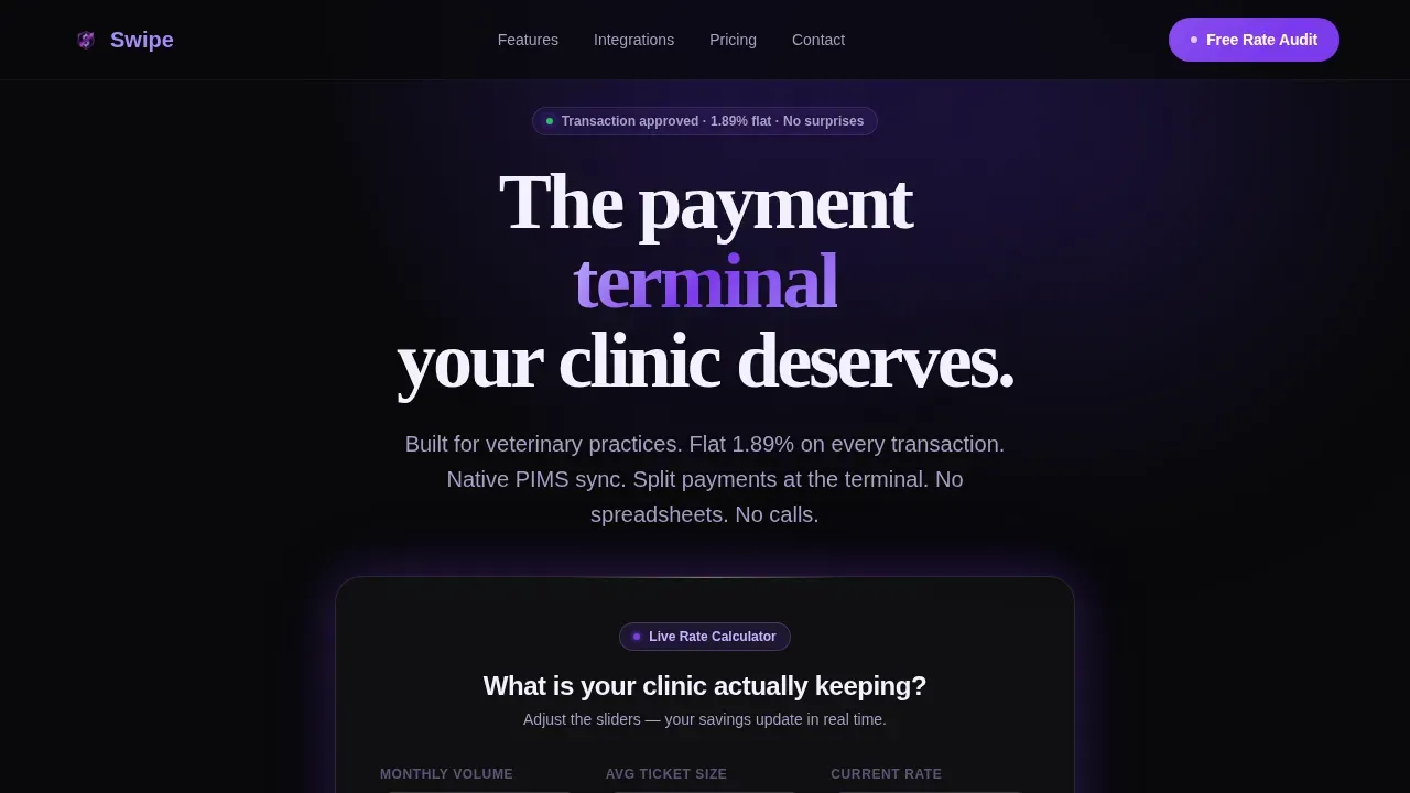
Swipe is a high-converting veterinary landing page template built for payment processing platforms targeting clinics and hospital groups. The landing page opens with an animated savings calculator, moves through a side-by-side feature comparison grid, and closes with a simple rate audit form. The design uses a dark Tech Glass aesthetic with glassmorphic cards and electric violet accents throughout.
Who this template is for
This landing page template is built for fintech and payment software companies selling into the veterinary market. It speaks directly to the people making purchasing decisions at clinics every day.
- Practice managers and clinic owners frustrated by high processing fees and reconciliation overhead
- Multi-location hospital group teams and chief financial officers managing fragmented merchant accounts
- Payment platform marketing teams who need a focused, conversion-led landing page ready to launch
What problem this template solves
Veterinary payment processing is complex. Clinics handle split payments, financing options, and multiple tender types in a single transaction, often with no unified system to support them. The result is wasted time, lost money, and staff stretched across disconnected tools.
- No single dashboard to view payments data across every clinic location
- Processing fees eating into surgical margins while reconciliation spreadsheets pile up
- Customers waiting longer at checkout because payment systems do not talk to practice software
What you get with this template
This template gives your team a complete, structured landing page built around one goal: getting clinic owners to submit a rate audit form. Every section is purposeful, and every design choice reinforces the value of switching.
- A live calculator hero that animates real-time annual savings as users type their volume and current rate
- A modular comparison card grid that stacks side-by-side capability comparisons with stagger scroll animation
- A sticky call-to-action bar, an inline hardware detail card, and a focused conversion form at the end
Feature list
This landing page template is built around a set of tightly scoped features. Each one serves the conversion goal without adding clutter.
Live Savings Estimator Hero
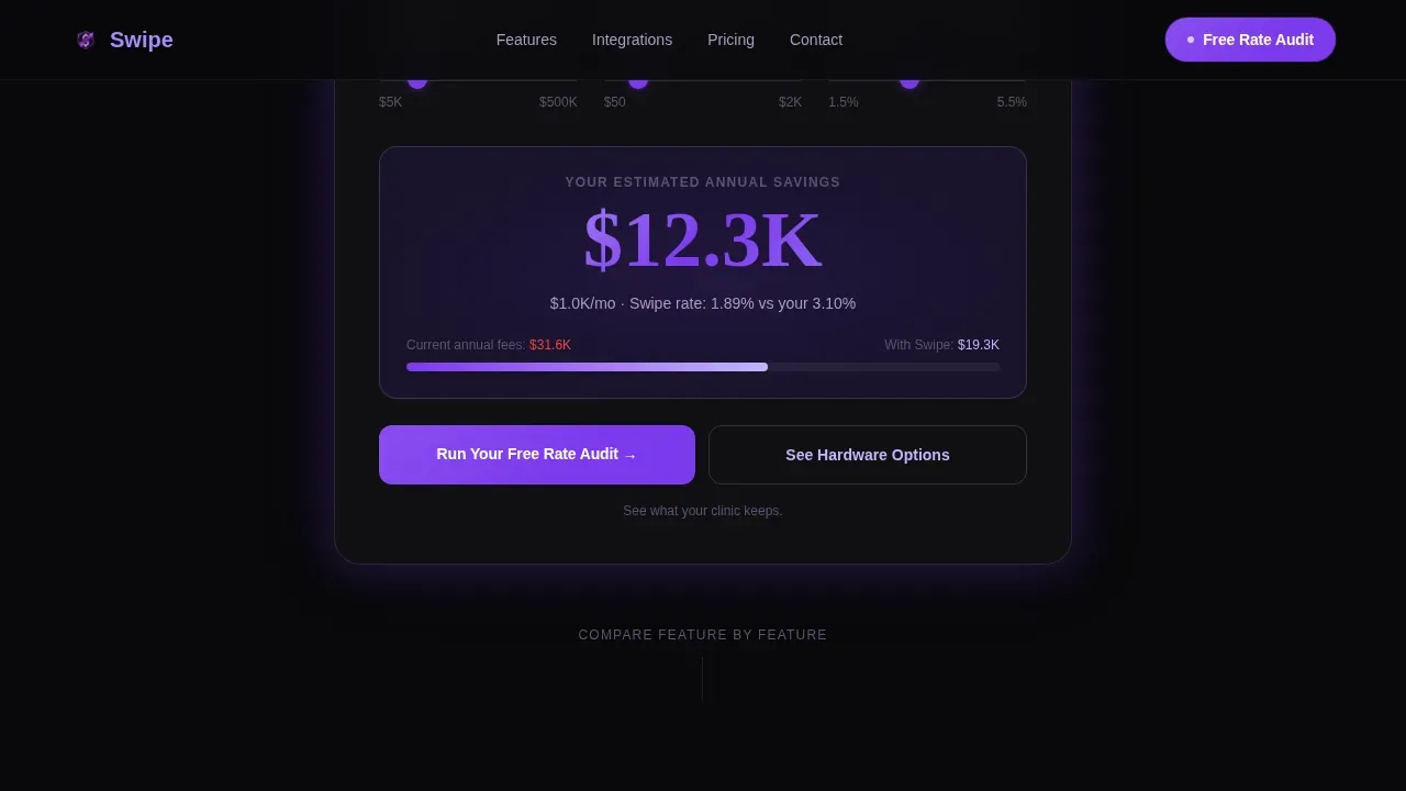
The page opens with a glassmorphic calculator card. Users punch in monthly transaction volume, average ticket size, and current processing rate. The estimated annual savings animates upward in real time, making the dollar figure the stop-scroll moment before a single word of copy is read.
Modular Comparison Card Grid
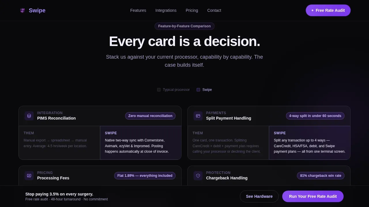
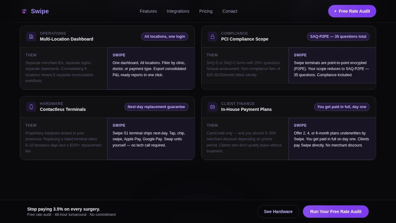
After the calculator hooks visitors with a savings number, the scroll reveals a card grid. Each card compares one capability, such as integrated practice information management system posting, payment plan flexibility, contactless hardware, chargeback handling, multi-location dashboards, or PCI compliance scope. Cards are split: competitor in muted gray, Swipe in frosted violet glass. They stagger-animate on scroll for pacing and impact.
Sticky Call-to-Action Bar
A persistent bar appears after the third card row and stays visible as visitors continue scrolling. It reinforces the primary action, "Run Your Free Rate Audit," without interrupting the reading flow. The bar helps clinics that are ready to act find the form immediately, without checking back to the top.
Inline Hardware Detail Card
A secondary path, "See Hardware Options," expands an inline card rather than routing to a new page. This keeps visitors on the landing page while they explore contactless terminal information. It reduces drop-off and lets customers find the hardware context they need without leaving the conversion flow.
Rate Audit Conversion Form
The primary form asks for clinic name, current processor from a dropdown list of major veterinary merchant providers, and monthly volume range. The form is intentionally short to maximize submission rates. Visitors arrive at the form already holding a savings estimate they believe is theirs, so they are not submitting cold.
Social Proof Section
A dedicated testimonials section displays clinic names, staff roles, and specific dollar or time savings. Testimonials from real veterinary clinics showcase improvement in cash flow and client satisfaction. This section helps potential customers trust the platform before they commit to the audit form.
Page sections overview
| Section | Purpose |
|---|---|
| Hero Calculator | Animate live savings estimate and anchor visitor attention |
| Feature Comparison Grid | Show side-by-side capability cards with stagger scroll |
| Integration and Hardware | Display practice software logos and inline hardware card |
| Social Proof | Build trust with clinic testimonials and specific savings |
| Rate Audit Form | Capture clinic name, processor, and volume for audit |
| Footer | Single-row linear footer with contact and support links |
Design & branding system
The design follows a Tech Glass theme using the Void and Violet color system. Every visual choice is intentional. The interface feels like a premium terminal screen glowing in a dark room.
- Colors: absolute void black (#09090B) as the base, deep ultraviolet (#2D1B69) for depth, frosted glass lilac (#C4B5FD) for card surfaces, and electric violet (#7C3AED) reserved for interactive states and call-to-action pulses
- Typography: DM Sans for body copy and user interface elements, Fraunces for display numerics in the calculator and savings figures
- Glassmorphic cards use semi-transparent white (#FFFFFF0A) to float over the dark field, with whitespace between cards letting each comparison land before the next one loads
Mobile & speed optimization
The landing page is designed desktop-first to match how practice managers and clinic owners work at their desks. Full mobile support is built in so the page remains usable on any device.
- Responsive layout adapts the card grid and calculator cleanly across screen sizes, keeping the landing page functional for users on mobile or tablet
- Server components handle static sections to keep rendering efficient, while client components manage the live calculator, animation triggers, and inline card expand
- GSAP ScrollTrigger drives stagger animation on card rows, counter animation on the savings estimator, and the sticky bar reveal as visitors scroll
How this template helps you convert
This landing page is engineered around a single conversion goal: the rate audit form submission. Every section builds on the one before it to move visitors from curiosity to commitment.
- The calculator creates ownership. Visitors see a savings number tied to their own inputs before any pitch begins. That number makes the form feel like protecting money they have already identified as theirs.
- The comparison grid stacks small wins. Each card is a clear, specific reason to choose Swipe over the incumbent processor. The cumulative effect of six cards is an overwhelming case made without a wall of text.
- The sticky bar and short form remove friction at the moment of decision. There is no waiting, no long intake process, and no navigation away from the page to complete the next step.
Other information about this template
This template is one of several pages and templates available for fintech and veterinary software use cases on the platform. It is built to set a high standard for veterinary landing pages in a niche where most website pages are generic and conversion-weak.
- The Swipe veterinary payment processing landing page template is listed under the Technology and Veterinary Software categories, making it easy to find for the right buyers
- Integrated payment systems allow for better tracking of transaction data across multiple clinic locations, and this landing page design reflects that value at every scroll step
- Payment security is a real concern for clinics. The design includes designated place for PCI compliance scope cards and security context within the comparison grid so visitors are never left with open questions
- Payments should sync automatically with practice management software to eliminate manual entry errors. The template makes this message clear through the feature card dedicated to integrated practice software posting
- Digital payments are increasingly common in veterinary settings. The template supports omnichannel framing including contactless, text-to-pay, and financing plan options as described in the feature cards
- The landing page design helps clinics determine whether their current processor is costing them more than it should. The calculator and audit form work together to achieve that goal
- Staff at multi-location groups can use the unified dashboard card to understand how consolidated reporting changes day-to-day operations
- Users who choose this template get a page that is ready to optimize further with real clinic testimonials and processor-specific dropdown data matched to the veterinary market
- The template supports a business model where the primary call to action is a no-cost rate audit, making it easy to provide value before any sales conversation begins
- A lot of veterinary landing page templates on the market are built for general healthcare. This one is built end-to-end for the payment processing niche, making it immediately relevant to its audience
Theme
Tech Glass
Creative direction
Feature Matrix
Color system
Void & Violet
Style
Card Grid (Modular)
Direction
Comparison/Versus
Page Sections
Live Savings Calculator Hero
Modular Comparison Card Grid
Sticky Rate Audit Call-to-action Bar
Inline Hardware Detail Card
Short Rate Audit Conversion Form
Social Proof Testimonials Section
Related questions
What sections are included in this landing page template?
Can I customize the processor dropdown in the audit form?
Is this template suitable for multi-location veterinary groups?
How does the savings calculator engage visitors before the form?
Does this landing page template support mobile users?



