Advanced Feature Flag Landing Page Template
Toggle is a dashboard-style feature flag landing page built for engineering teams who need instant control over production rollouts. It opens with animated metrics, walks through a live-feeling data grid, and drives visitors toward a CLI install. The design runs on a Midnight Blue palette that evokes a dark ops room, making every toggle and indicator feel genuinely purposeful.
by Rocket studio
Quick summary
Toggle is a single-page, dashboard-style landing page template for a feature flag platform. It leads with three scroll-triggered metric counters, moves into an interactive data grid of feature cards, and ends with a CLI install call to action. The entire experience is built to feel like a live control plane for engineering and product teams.
Who this template is for
This template is built for technical product teams that need to communicate speed, precision, and control to a developer audience. It speaks directly to the people who live inside terminals and dashboards.
- Platform engineers managing large-scale feature rollouts across distributed systems
- Product managers running A/B experiments on pricing flows and need data to back them up
- Site reliability engineers who need a visible kill switch story when latency spikes
What problem this template solves
Shipping a feature flag platform is technically impressive, but the landing page often fails to reflect that credibility. Generic hero sections and vague benefit statements do not earn the trust of an engineer who is evaluating a tool they will use in production.
- Visitors leave before reaching the call to action because the page does not demonstrate capability quickly enough
- Developer audiences distrust marketing copy without concrete numbers or visible proof of performance
- A single static screenshot cannot convey real-time responsiveness or operational confidence
What you get with this template
You get a complete, single-page layout designed to stack technical evidence at every scroll depth. Nothing on the page asks for trust before earning it.
- A Feature Tab Switcher header with three animated states: Rollout, Experiment, and Kill Switch
- Three hero-level animated metric counters that increment from zero on scroll entry
- An interactive feature card data grid with hover states, rollout percentages, and expandable deployment timelines
Feature list
This template ships with six purpose-built sections. Each one is designed to move a skeptical technical visitor one step closer to installing the CLI.
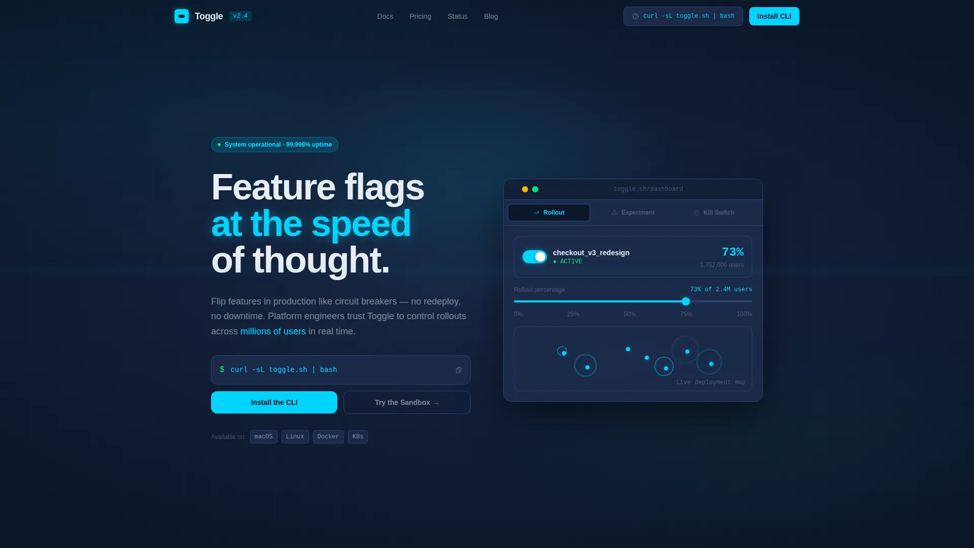
Animated Feature Tab Switcher Header
The header presents three tabs labeled Rollout, Experiment, and Kill Switch. Each tab reveals a different animated dashboard state. The active tab shows a feature flag toggling on in real time, a percentage rollout slider climbing from zero to one hundred percent, a user count ticking upward, and deployment rings rippling outward across a world map.
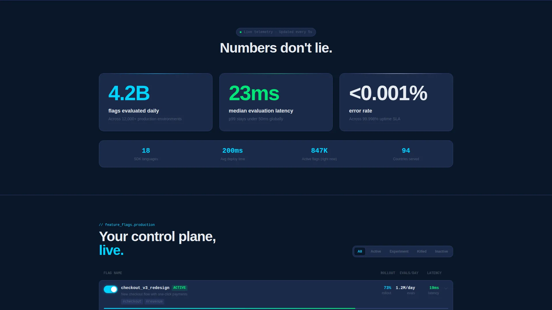
Stats-First Metric Hero
Three oversized numbers hit the viewport immediately on scroll: 4.2 billion flags evaluated daily, 23 millisecond median latency, and less than 0.001 percent error rate. Each number animates up from zero with easing on scroll entry. This section establishes technical credibility before a single line of marketing copy appears.
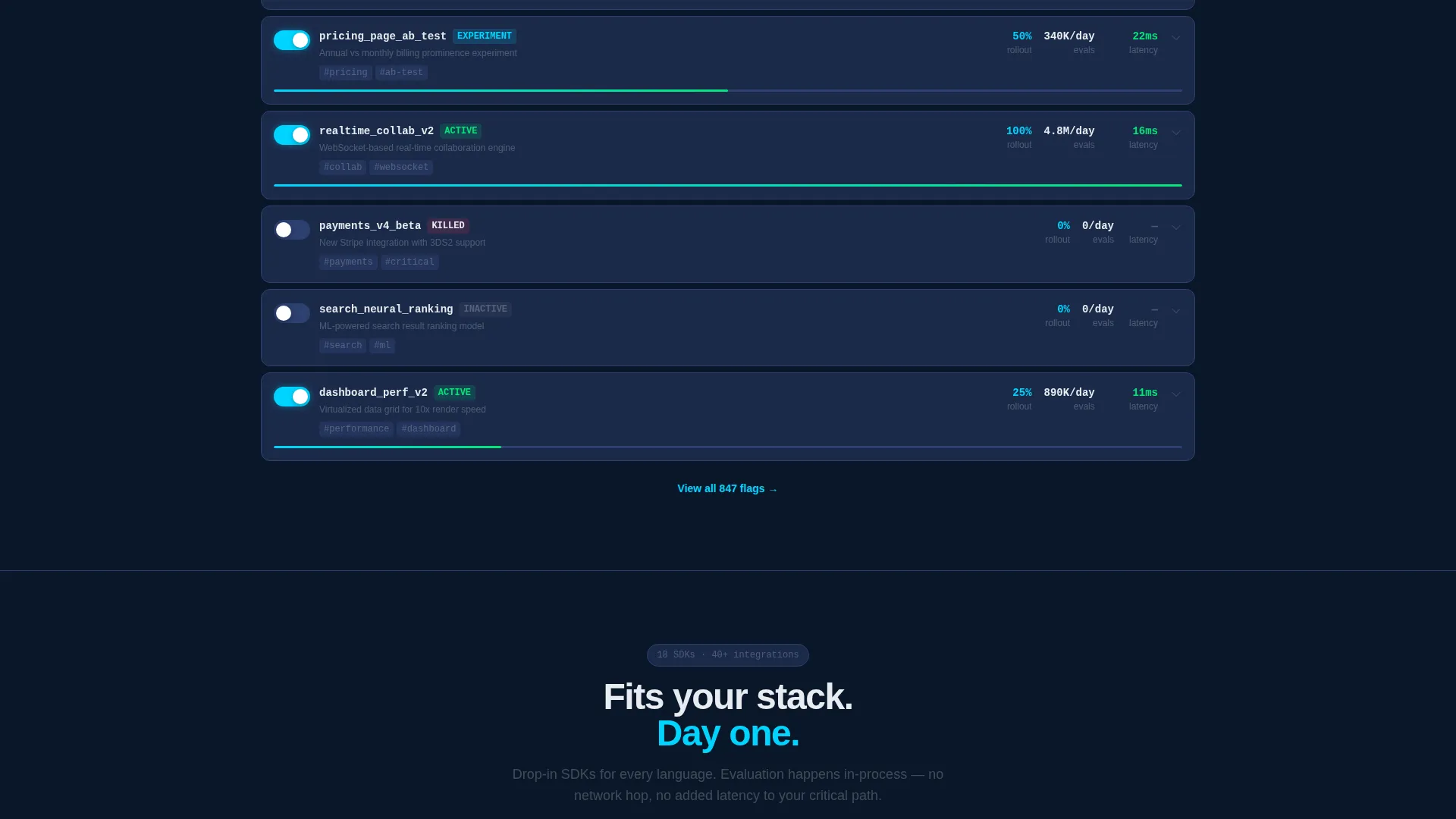
Interactive Feature Card Data Grid
Feature cards are laid out in a data grid format. Visitors can hover to reveal rollout percentages and click to expand full deployment timelines. Rows slide in like live log entries, reinforcing the sense of a system actively processing real data.
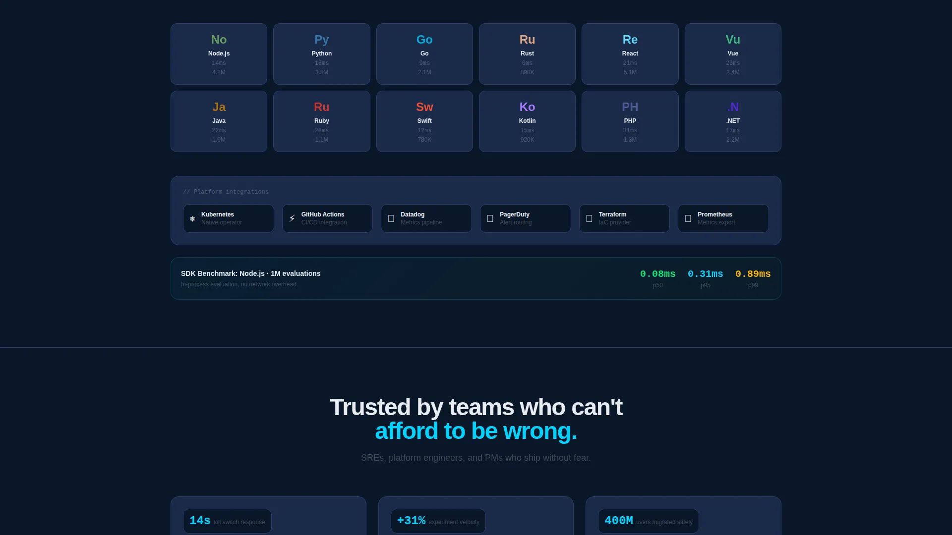
SDK Benchmarks and Integration Graph
A dedicated section presents SDK benchmark data alongside integration logos rendered as a dependency graph. This visual makes the platform's ecosystem immediately legible to engineers who want to know what it connects to before they commit.
Live Status Page Embed
A live status page section sits within the page to display real uptime indicators. This keeps the proof stack continuous across every scroll depth, adding one more layer of operational evidence.
CLI Install Call to Action
The primary call to action presents a one-line terminal command that visitors can copy directly. Platform toggles for macOS, Linux, and Docker let users select their environment instantly. A secondary path offers a zero-auth browser sandbox for visitors who want to try before they install.
Page sections overview
| Section | Purpose |
|---|---|
| Feature Tab Switcher | Animated header with three dashboard states |
| Metric Hero Block | Scroll-triggered counters for three key stats |
| Feature Card Grid | Interactive rollout cards with expandable timelines |
| SDK Benchmark Section | Technical proof via benchmark data |
| Integration Dependency Graph | Visual map of platform integrations |
| Live Status Embed | Real uptime indicators stacked as evidence |
| CLI Install call to action | Primary download path with copy-ready command |
| Sandbox Secondary call to action | Zero-auth browser playground link |
Design & branding system
The visual identity follows a Dynamic Motion theme built on a Midnight Blue color system. Every color decision reinforces the sense of a live operations environment viewed through multiple monitors in a dark room.
- Void-dark navy (#0A1628) as the primary background, deep steel (#1B2A4A) for card surfaces and data grid rows, electric cyan (#00D4FF) for active toggle states, signal white (#E8ECF1) for all body typography, and success green (#00E676) for deployment confirmation accents
- Motion is purposeful throughout: toggles snap with spring physics, numbers increment with easing, and data grid rows slide in like live log entries
- Typography and iconography are kept precise and terminal-adjacent, reinforcing technical confidence rather than decorative style
Mobile & speed optimization
The template is designed with a layout that adapts the dashboard aesthetic across screen sizes. The data grid and tab switcher are built to remain legible and interactive even when the viewport is reduced.
- Card grid reflows into a single-column stack on smaller screens without losing the dark ops visual identity
- Animated counters and motion sequences are scoped to scroll entry so they trigger correctly regardless of device context
- The CLI copy block and platform toggles remain accessible and clearly visible on mobile viewports
How this template helps you convert
The page is structured as a progressive evidence stack. By the time a visitor reaches the call to action, they have already experienced the platform's responsiveness through animation and felt the latency numbers in context.
- The animated metrics section delivers immediate credibility before any marketing claim is made, lowering resistance from a technically skeptical audience
- The interactive data grid lets visitors engage with feature cards directly, creating a hands-on impression that a static screenshot cannot replicate
- The CLI install section removes friction at the final step by providing a copy-ready terminal command and a no-login sandbox option as a parallel entry path
Other information about this template
This template is built for the feature flag platform category within the Software and SaaS space. It is designed to sit at the intersection of developer tooling and product experimentation workflows.
- The template style is classified as Dashboard and Data Grid, making it well suited for tools that present operational or telemetry data as a core part of their value story
- The creative direction is Stats-First Impact, meaning the scroll journey leads with numbers before narrative
- The landing page direction is App Download, optimized for driving CLI installs rather than form submissions or trial signups
- The theme is Dynamic Motion, which means the visual language depends on purposeful animation rather than static illustration
- This template is a strong fit for feature flag platforms, rollout management tools, experimentation infrastructure products, and similar developer control plane services
Theme
Dynamic Motion
Creative direction
Stats-First Impact
Color system
Midnight Blue
Style
Dashboard/Data Grid
Direction
App Download
Page Sections
Animated Feature Tab Switcher
Stats-first Metric Hero
Interactive Feature Card Grid
SDK Benchmarks and Integration Graph
Live Status Page Embed
CLI Install and Sandbox Call to Action
Related questions
Who is this landing page template designed for?
Can I change the metrics shown in the hero section?
Does the template include the CLI functionality itself?
How does the Feature Tab Switcher work?
Is this template suitable for a product that is not yet launched?


