AI-Powered Enterprise Software Complete Cost Calculator Website Template
Syllabus is a scroll-reveal landing page template built for an AI-powered learning management system. It opens with a live completion-rate calculator, then guides visitors through animated head-to-head comparison panels. The dark Dashboard Pro aesthetic, phosphor green metrics, and electric violet calls to action make a powerful case before a single word of sales copy is read.
by Rocket studio
Quick summary
Syllabus is a single-page, scroll-reveal landing page template designed for an AI-powered learning management system (LMS). It leads with an interactive completion-rate calculator, follows with animated versus panels, and closes with a progressive three-step audit form. Every section draws itself in as the visitor scrolls, turning data into the argument.
Who this template is for
This template is built for teams selling or showcasing an AI-powered LMS to enterprise and mid-market buyers. It speaks directly to the people who carry the weight of workforce learning outcomes.
- Learning and development (L&D) directors at mid-size software-as-a-service companies tracking completion rates across spreadsheets
- Compliance officers at healthcare networks who need audit-ready certification trails with no gaps
- People Operations leads at startups who inherited a Notion wiki and are trying to turn it into a real onboarding program
What problem this template solves
Most LMS landing pages lead with feature lists and product screenshots. Buyers have seen those pages before. They leave unconvinced because nothing connects to their specific numbers. This template flips that dynamic.
- Visitors arrive skeptical and leave with a personalized projection built from their own data
- Static comparison content fails to show the gap between old and new; animated versus panels make the gap impossible to ignore
- Long forms kill conversion before buyers are ready; the three-step progressive audit form earns commitment gradually
What you get with this template
You get a complete, ready-to-customize scroll-reveal landing page. Every component referenced in the design brief is included and production-ready.
- An interactive header calculator that accepts a visitor's current completion rate and renders a live projected improvement arc
- A series of animated head-to-head comparison panels covering engagement data, admin time, compliance speed, and learner sentiment
- A pinned electric violet call-to-action button and a gated secondary conversion path for visitors not yet ready to commit
Feature list
This template is built around a small number of high-impact components, each engineered to carry its weight in the conversion flow.
Live Completion-Rate Calculator
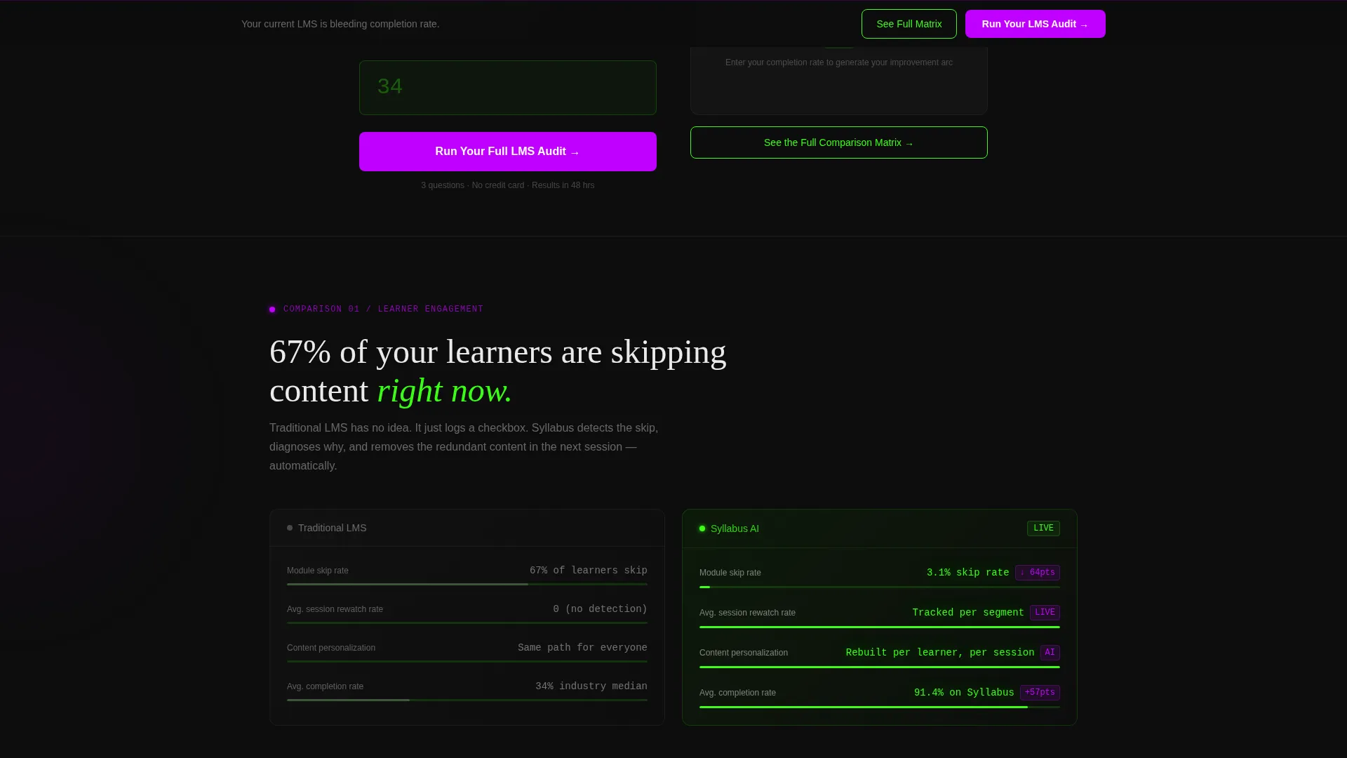
The header opens with a single input field. The visitor types their current completion rate, and the page immediately draws an animated chart projecting their improvement arc toward the platform benchmark. The tool is the hook; no hero image is needed.
Animated Stats Counter Wall
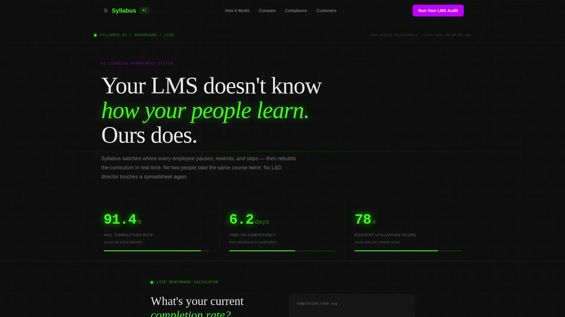
Three phosphor green counters tick upward in real time, displaying specific platform benchmarks: average completion rate, time-to-competency in days, and content utilization score. The numbers feel precise because they are, which signals credibility before the visitor reads a single headline.
Scroll-Reveal Comparison Panels
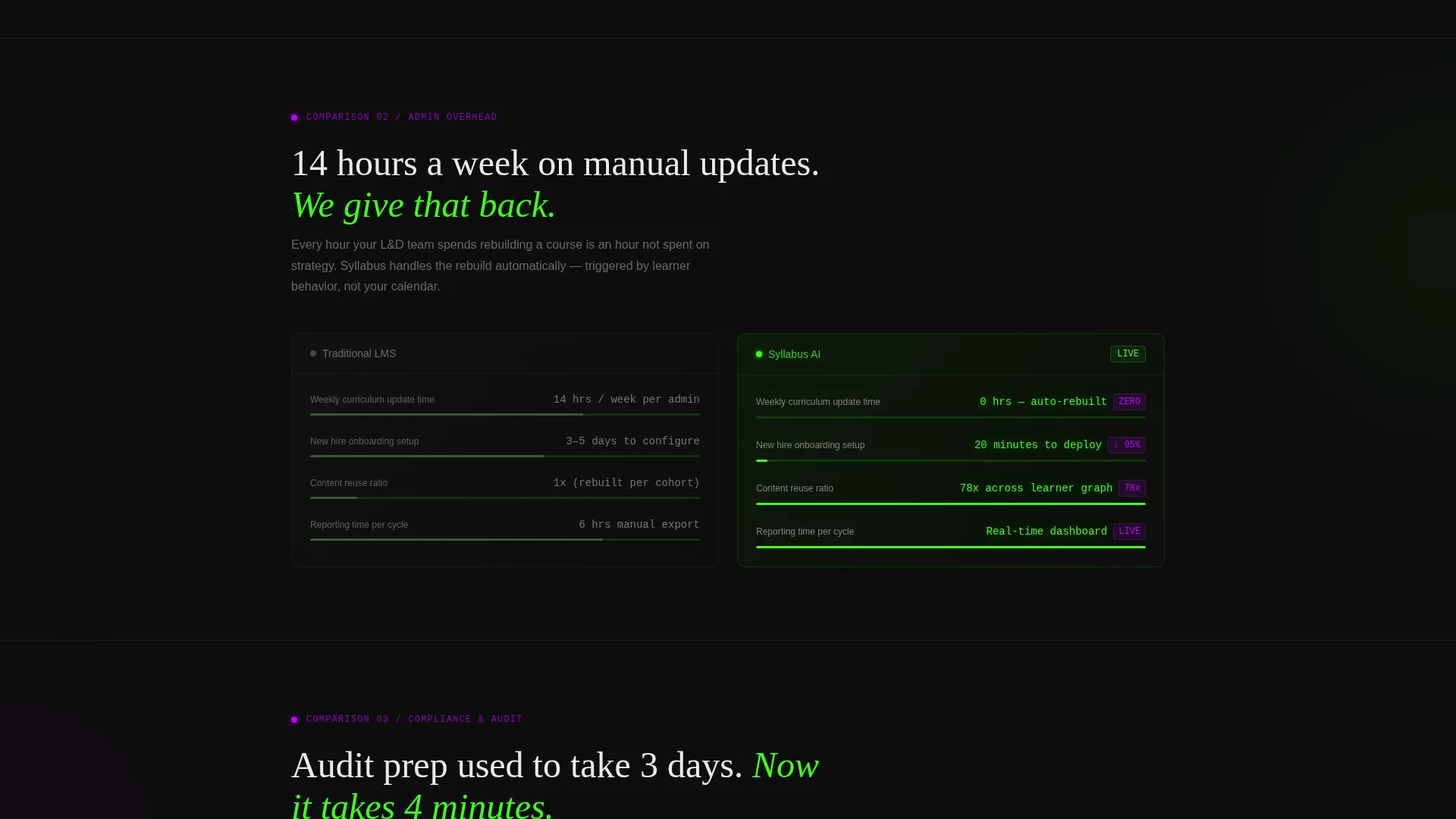
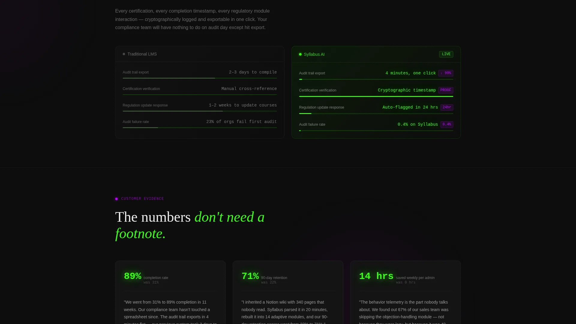
Each section enters the viewport by drawing itself in from zero. Left-side panels show traditional LMS data in muted gray. Right-side panels show AI-powered results in phosphor green with climbing animated metrics. Visitors peel back the argument layer by layer as they scroll.
Progressive Three-Step Audit Form
The primary call to action opens a three-step form. Step one presents a dropdown of current LMS options. Step two asks for team size and annual training hours. Step three captures a work email. Each step appears only after the previous one is completed, reducing abandonment.
Pinned Viewport Call-to-Action Button
After the third scroll section, the "Run Your LMS Audit" button pins itself to the bottom of the viewport. It stays visible without interrupting the reading experience, so the conversion option is always one click away without feeling aggressive.
Gated Comparison Matrix Download
A secondary conversion path offers a downloadable PDF comparison matrix behind a single email field. This captures visitors who are in research mode and not yet ready for the full audit form, broadening the conversion funnel without requiring extra pages.
Page sections overview
| Section | Purpose |
|---|---|
| Stats Counter Wall | Opens with three animated phosphor green metric counters to establish credibility immediately |
| Completion Rate Calculator | Interactive input that renders a personalized projected improvement arc in real time |
| Engagement Data Panel | First versus comparison: traditional LMS engagement versus AI-powered engagement metrics |
| Admin Time Panel | Second versus comparison: manual administration hours saved with adaptive curriculum |
| Compliance Audit Panel | Third versus comparison: certification audit speed and trail completeness side by side |
| Learner Sentiment Panel | Fourth versus comparison: learner satisfaction scores closing the argument |
| Pinned call to action Bar | Persistent "Run Your LMS Audit" button anchored to the viewport bottom after scroll section three |
| Three-Step Audit Form | Progressive multi-step form triggered by the primary call to action for qualified lead capture |
| Comparison Matrix Gate | Secondary email-gated download path for research-stage visitors |
Design & branding system
The visual identity follows a Dashboard Pro theme powered by the Acid Digital color system. The palette evokes a developer console mid-deployment: dark, electric, and precise.
- Void black (#0D0D0D) dominates all backgrounds and section dividers, keeping focus on the data
- Terminal phosphor green (#39FF14) drives progress bars, animated counters, active states, and metric highlights throughout the comparison panels
- Electric violet (#BF00FF) marks every call-to-action element and comparison differentiator to draw the eye at decision moments
- Interface white (#EAEAEA) handles all body typography and card surfaces, staying breathable against the dark backgrounds
Mobile & speed optimization
The scroll-reveal animations and calculator interaction are designed to work within a single-page layout that performs cleanly across screen sizes.
- Progressive reveal animations are tied to viewport entry, so content loads and draws in only when it reaches the visible area
- The three-step audit form is structured as a sequential flow, keeping each step lightweight and easy to complete on a small screen
- The pinned call-to-action bar is sized and positioned to remain usable on mobile without covering critical content
How this template helps you convert
This template is built around a Comparison/Versus conversion strategy. The visitor generates their own evidence before reaching any sales claim.
- The calculator personalizes the page immediately. A visitor who enters their own completion rate sees a projection tied to their number, not a generic promise, which creates a reason to keep scrolling.
- Each animated comparison panel raises the stakes progressively. By the fourth panel, the case has been made across four distinct dimensions: engagement, administration, compliance, and learner satisfaction.
- The dual conversion paths capture buyers at different stages. The full audit form targets decision-ready visitors; the gated PDF matrix captures research-stage visitors who need more time.
Other information about this template
This template is built to serve the AI-powered LMS category, where buyers are increasingly comparing platforms before committing to a demo. It is suitable for teams positioning against legacy enterprise learning platforms as well as lighter-weight tools like manual wikis used as makeshift onboarding systems.
- The template style is Scroll Reveal (Progressive), meaning each section animates into view as the visitor scrolls rather than loading all content at once
- The creative direction is Calculator/Tool First, a conversion approach that uses interactive proof before persuasive copy
- The header concept is a Stats/Metrics wall, designed to signal authority through specificity rather than photography or illustration
- The landing page direction is Comparison/Versus, structuring the entire narrative as a side-by-side case against the status quo
Theme
Dashboard Pro
Creative direction
Calculator/Tool First
Color system
Acid Digital
Style
Scroll Reveal (Progressive)
Direction
Comparison/Versus
Page Sections
Live Completion-rate Calculator
Animated Stats Counter Wall
Scroll-reveal Comparison Panels
Progressive Three-step Audit Form
Pinned Viewport Call to Action Button
Gated Comparison Matrix Download
Related questions
Who is the target buyer for this template?
Can I customize the comparison metrics shown in the panels?
How does the three-step audit form work?
Is the secondary conversion path separate from the main audit form?
What makes the Calculator/Tool First approach effective for this use case?



