AI for Higher Education Directory Website Template
Syllabus is a higher education AI content landing page template built for enrollment marketing directors, community college communications teams, and provost offices. It uses a modular card grid layout, an Acid Digital color system, and a metrics-wall header to demonstrate platform competence at a glance. Every section is designed to move visitors toward a live product demo click.
by Rocket studio
Quick summary
Syllabus is a single-page, card-grid landing page template for a higher education AI content platform. It opens with an oversized stats wall, flows through use-case cards, before/after proof, and benchmark data, then closes on a bold click-through call to action. The design is Acid Digital: terminal black, electric chartreuse, and crisp white card surfaces.
Who this template is for
This template was built for teams selling or showcasing AI writing tools to higher education audiences. It speaks directly to the people who live inside program catalogs, accreditation cycles, and enrollment deadlines.
- Enrollment marketing directors managing catalogs of 100 or more programs at four-year institutions
- Community college communications teams of two doing the content workload of twelve
- Provost offices and academic affairs staff who need accreditation-ready copy on short notice
What problem this template solves
Higher education content teams are under-resourced and over-committed. A 200-program catalog does not write itself, and generic marketing copy does not pass muster with accreditation reviewers or faculty committees. This template addresses that gap head-on by structuring a landing page around proof, volume, and speed.
- No single page layout exists that combines institutional credibility signals with AI platform marketing in one coherent flow
- Most SaaS landing pages feel too startup-casual for a provost audience or too corporate-stiff for a small community college team
- Visitors need to see evidence before they click, and this template leads with metrics, then case cards, then social proof in a logical sequence
What you get with this template
You get a fully structured, single-page layout ready to adapt for any higher education AI content platform. Every section is planned, sequenced, and styled so you can drop in real copy and launch.
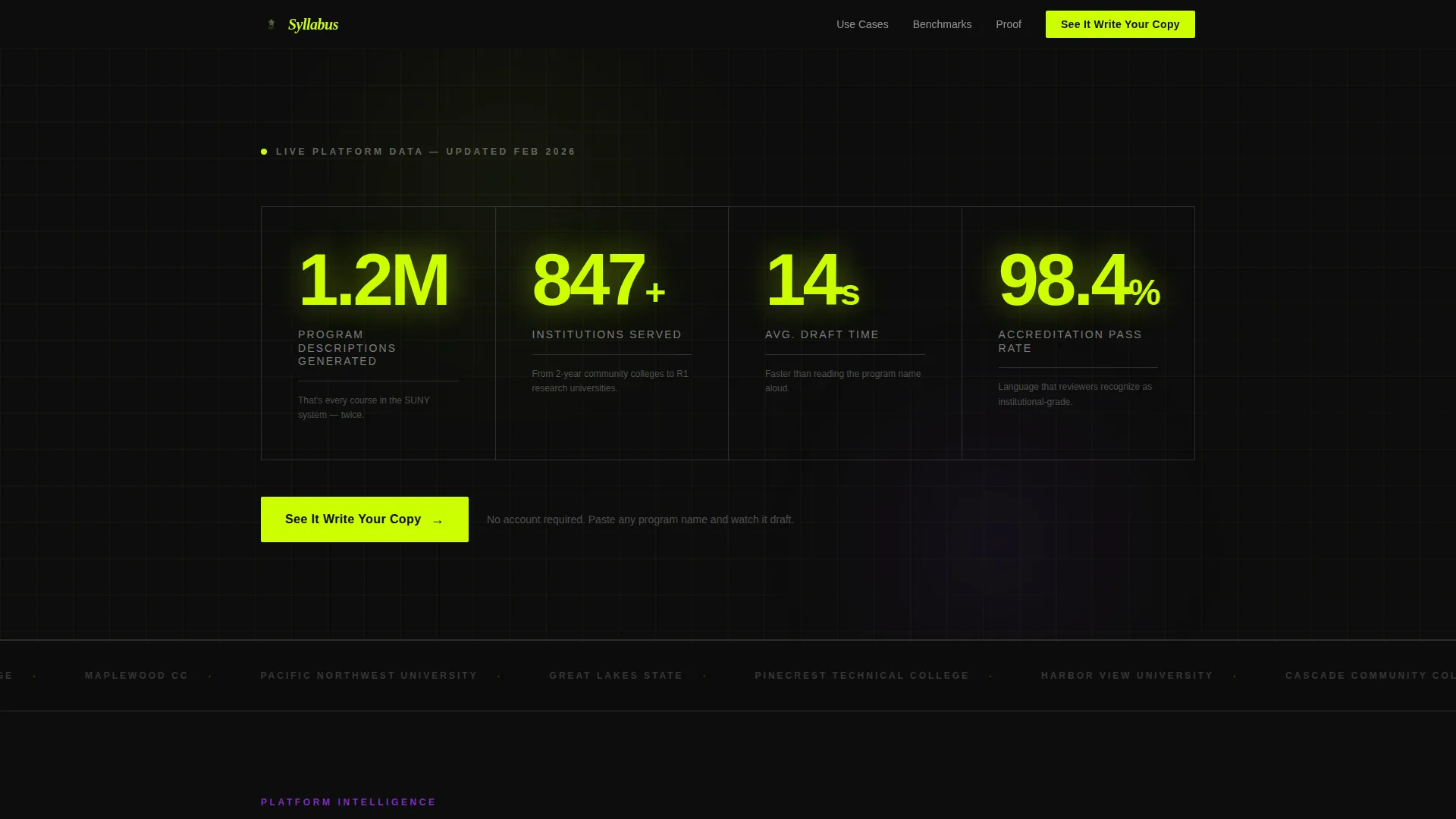
- A metrics-wall header with live-counter-style stats in oversized chartreuse type on terminal black
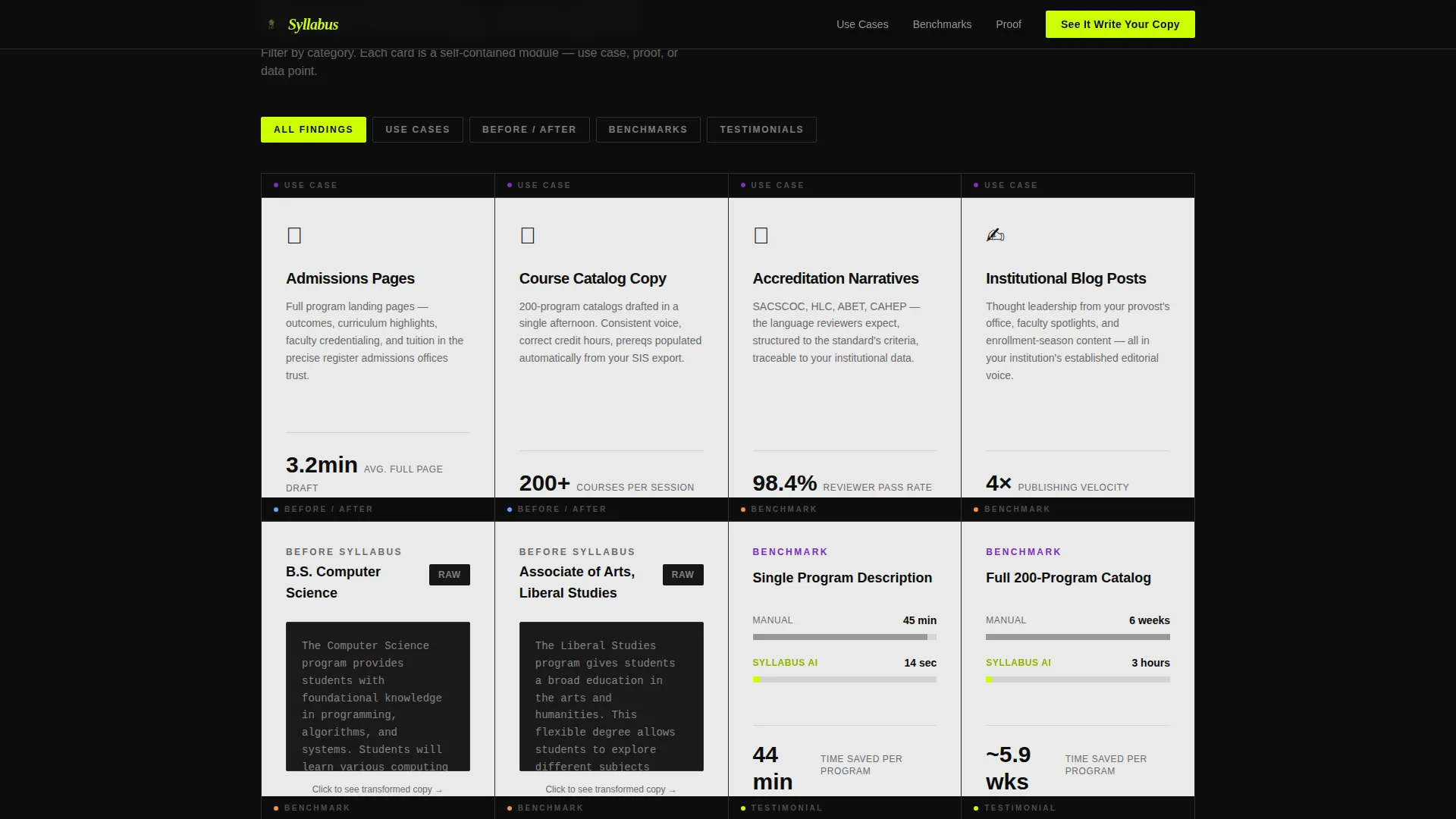
- A modular card grid covering use cases, before/after transformations, benchmark comparisons, and testimonials
- A sticky mobile call-to-action bar and a full-width closing call-to-action section anchoring the final conversion push
Feature list
This template is built around a specific set of structural and visual features drawn directly from the project brief. Each one serves a clear purpose in the enrollment marketing conversion flow.
Metrics Wall Header
The header panel spans the full width and displays live-counter-style statistics in oversized chartreuse numerals against terminal black. Each figure carries a one-line white subtext that translates the number into human context, making the data immediately legible and emotionally resonant for a time-pressured enrollment director.
Modular Card Grid Layout
Content is organized into self-contained card modules that sit on data-stream white (#EAEAEA) surfaces against the dark page body. Cards are designed to be scannable, category-tagged with synthetic violet (#7B2FBE), and expandable on hover, so visitors can move through evidence at their own pace.
Before/After Content Cards
Dedicated card pairs show raw institutional prose transformed into polished AI-assisted output. This section does the selling without a word of traditional marketing copy, letting the quality difference speak for itself to an audience that reads critically.
Benchmark Comparison Cards
Side-by-side data cards compare manual writing time against AI-assisted draft time, giving enrollment marketing directors a concrete cost-and-effort argument they can bring to a budget conversation. The data format mirrors industry report conventions familiar to higher ed administrators.
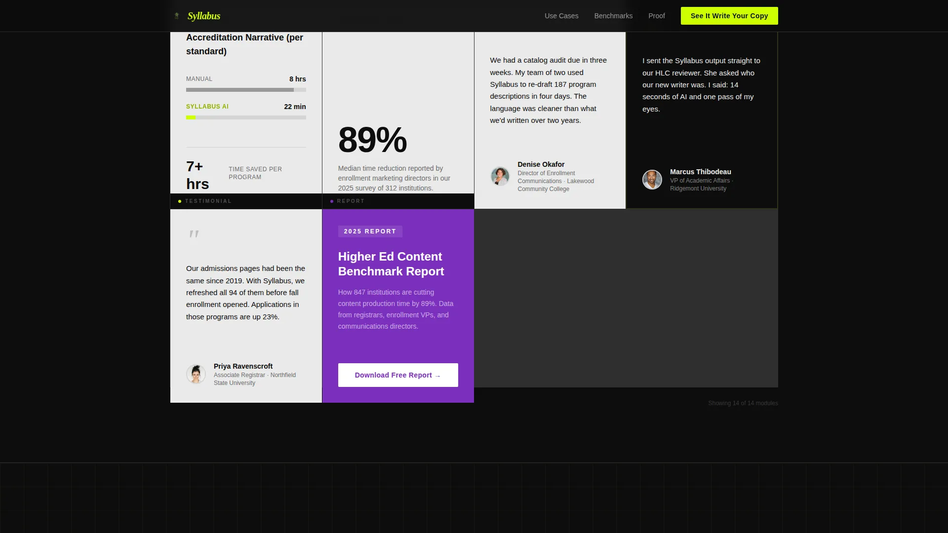
Testimonial Grid
A curated row of testimonial cards features voices from registrars, Vice Presidents of Enrollment, and Communications Directors. Each card is a named, titled source, which carries institutional weight with an audience trained to evaluate citations and authority.
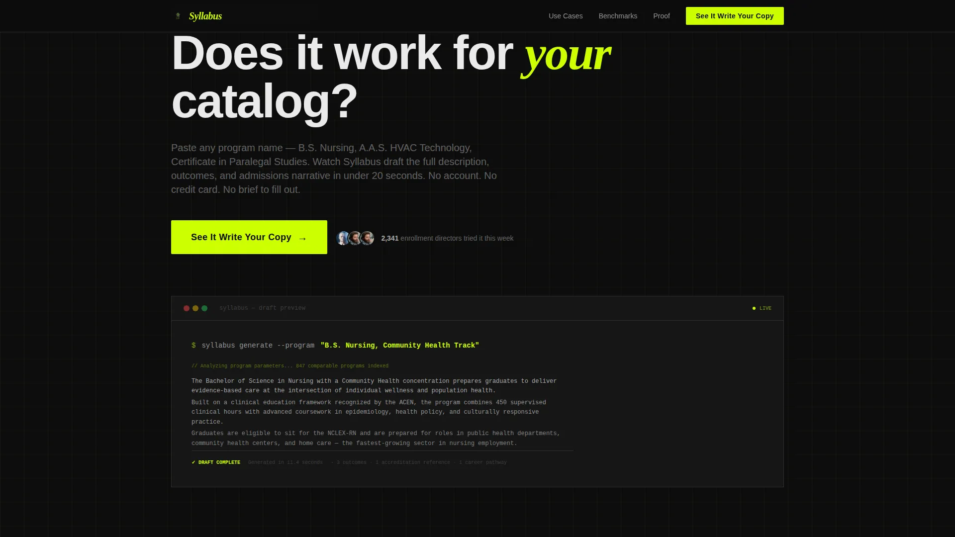
Click-Through Call-to-Action System
The primary call to action, "See It Write Your Copy," appears in chartreuse on black in the header, repeats as a sticky bar on mobile, and anchors the final full-width closing section. There is no form on this page. Every click routes directly to a live demo environment.
Page sections overview
| Section | Purpose |
|---|---|
| Metrics Wall Header | Opens with proof-of-scale stats and the primary call to action |
| Use-Case Cards Grid | Shows admissions pages, catalog copy, accreditation narratives, and blog post use cases |
| Before/After Cards | Demonstrates prose quality improvement with side-by-side card pairs |
| Benchmark Cards | Compares manual writing time versus AI-assisted output with cost and effort data |
| Testimonials Grid | Builds trust through named registrars and enrollment VP voices |
| Closing call to action Section | Full-width conversion anchor repeating the primary click-through action |
| Linear Footer | Single-row footer with navigation and secondary download link |
Design & branding system
The visual identity follows an Acid Digital aesthetic, styled to feel like a code editor running on a dark monitor in a well-lit room. Every color has a job, and nothing is purely decorative.
- Core palette: electric chartreuse (#CCFF00) for calls to action and key metrics, deep terminal black (#0D0D0D) for the page body, synthetic violet (#7B2FBE) for category tags and section dividers, and data-stream white (#EAEAEA) for card surfaces
- Typography pairing: DM Sans for body copy and interface labels, Fraunces for display headings and italic accent moments, creating a contrast between editorial authority and digital precision
- Card depth is achieved through color contrast alone, with white cards floating against the dark body without shadow layering
Mobile & speed optimization
The template is built desktop-first, matching the 7 a.m. dashboard habits of enrollment directors working at large screens. Mobile behavior is handled through a focused sticky element rather than a full redesign.
- A sticky bottom call-to-action bar persists on mobile so the primary conversion path is always visible regardless of scroll position
- Static content sections use server-side rendering approaches, while animation layers such as GSAP ScrollTrigger counters and staggered card reveals are scoped to client-side components to keep initial load lean
- Card hover expansions and category tag filtering are built as lightweight interactive states that do not block the reading experience
How this template helps you convert
This template is built around a single conversion goal: earning the click to a live product demo. Every structural decision is designed to reduce hesitation and increase confidence before that click happens.
- The metrics wall leads with volume and speed data that answer the visitor's first subconscious question: does this platform actually work at scale? Chartreuse numbers at oversized size are hard to ignore and impossible to skim past.
- The card grid then layers use-case proof, quality demonstration, and peer validation in a sequence that mirrors how a skeptical institutional buyer naturally evaluates a new tool, moving from curiosity to evidence to trust.
- The sticky mobile call-to-action bar and the full-width closing section ensure the conversion action is always one tap or click away, no matter how deep into the page a visitor has scrolled.
Other information about this template
This template is categorized under Technology and the AI for Higher Education subcategory, designed specifically for the higher education AI content writer niche. It is built as a Click-Through landing page, meaning the entire page flow is optimized for a single outbound action rather than an on-page form fill.
- The secondary conversion path is a violet-tagged card offering a downloadable 2025 Higher Ed Content Benchmark Report, capturing email addresses for a nurture sequence without interrupting the primary demo click flow
- The Directory and Discovery theme means the page scrolls like a sector briefing, with each row of cards tightening the case toward an executive summary conclusion, a format immediately legible to administrators accustomed to accreditation and audit documents
- Animation is set to medium-high intensity using GSAP ScrollTrigger for counter animations and staggered card reveals, giving the page a live-data dashboard energy without sacrificing content clarity
- The template style is Card Grid (Modular), making individual sections easy to reorder, remove, or replace as platform metrics and testimonials are updated over time
Theme
Directory & Discovery
Creative direction
Industry Report
Color system
Acid Digital
Style
Card Grid (Modular)
Direction
Click-Through
Page Sections
Live Metrics Wall Header
Modular Card Grid System
Before/after Proof Cards
Benchmark Comparison Cards
Named Testimonial Grid
Click-through Call to Action System
Related questions
Who is the primary audience for this landing page template?
Does this template include a lead capture form?
Can I update the statistics displayed in the metrics wall header?
What makes this template suitable for a higher education audience specifically?
Is the card grid layout easy to adapt as platform data and testimonials change?



