Online Course Platform Reviews Website Template
Syllabus is a masterclass-style online course landing page template built for platforms that teach real-world expertise. It uses a modular card grid layout, an institutional Slate & Sky color system, and a Hero's Journey scroll structure to guide visitors from first impression to freemium signup. The design combines authority-driven metrics, free lesson previews, and transformation-focused testimonials in one focused page.
by Rocket studio
Quick summary
Syllabus is a single-page masterclass landing page template designed for online learning platforms that lead with practitioner expertise. The layout follows a modular card grid structure. A full-width metrics header anchors authority instantly. The scroll guides visitors through four narrative stages, ending at a low-friction freemium signup form that asks only for an email address.
Who this template is for
This template suits founders and product teams building a premium online course platform. It is especially well-matched to platforms where the instructors are working professionals, not academic generalists.
- Online learning platform builders targeting mid-career professionals who want applied, practitioner-led instruction
- Corporate learning and development managers looking for a polished course catalogue page to present to stakeholders
- Independent course creators or cohort-based learning businesses positioning their curriculum as elite and results-driven
What problem this template solves
Most online course landing pages struggle to earn trust quickly. They lead with stock photography, vague taglines, and buried pricing. Visitors who have already sampled shallow video tutorials elsewhere arrive skeptical. This template solves the credibility gap by leading with hard institutional data before asking for anything.
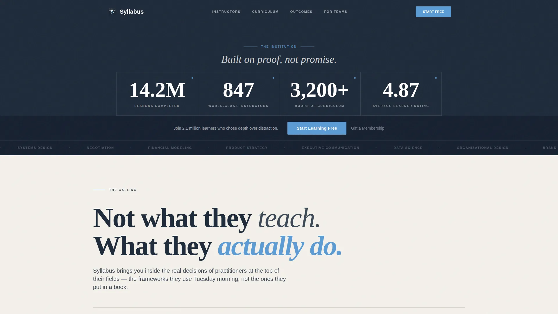
- The metrics header replaces generic hero images with real platform numbers, establishing scale and trust in the first viewport
- The layered card grid separates social proof, content previews, and outcomes into distinct visual moments, so visitors process each proof point clearly
- The minimal freemium form removes the credit card barrier that causes drop-off on course platform pages
What you get with this template
You get a fully structured, single-page masterclass landing page built around a clear narrative arc. Every card row and section has a defined purpose within the scroll story.
- A full-width stats and metrics header with four displayed platform figures set in large serif typography against deep slate
- Four thematic card rows following the Hero's Journey structure: instructor introduction, free lesson preview, learner testimonials with career title progressions, and a completion dashboard mockup
- A sticky bottom conversion bar that appears after the second scroll, alongside a primary call-to-action button and a secondary gift membership text link
Feature list
This template includes the following built-in design and layout capabilities drawn directly from the source brief.
Full-Width Metrics Header
The header spans the full page width and displays four platform statistics at large scale: lessons completed, active instructors, total curriculum hours, and average learner rating. Metrics are separated by thin vertical rules and set in a refined serif typeface against deep academic slate. A primary call-to-action button is embedded directly inside this bar.
Hero's Journey Card Grid
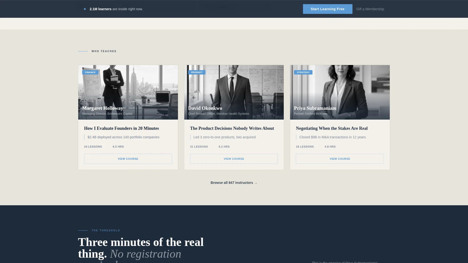
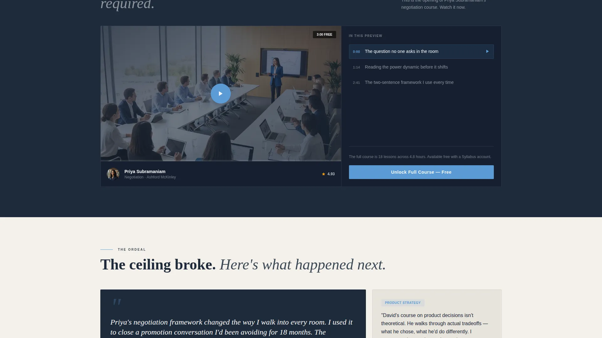
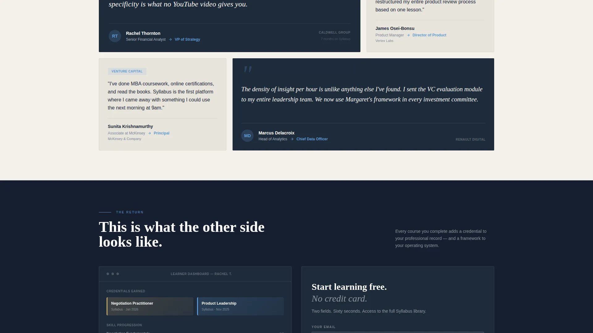
The page is structured around four named scroll stages. "The Calling" introduces instructor cards. "The Threshold" presents a single wide free lesson preview card. "The Ordeal" shows learner testimonial cards with before-and-after professional titles. "The Return" closes with a completion dashboard mockup showing certificates, skill trees, and career outcomes.
Freemium Signup Form
The conversion form collects only two inputs: an email address and a single dropdown asking what the visitor wants to master, with eight discipline categories available. There is no credit card requirement. This low-friction approach is designed to reduce abandonment at the sign-up step.
Sticky Conversion Bar
After the visitor scrolls past the second section, a sticky bottom bar appears carrying the primary call-to-action. This ensures the signup prompt stays accessible throughout the full page scroll without interrupting the reading experience above.
Dual Conversion Paths
The primary call-to-action, "Start Learning Free," is styled in sky blue against slate. A secondary text link, "Gift a Membership," sits beneath it to serve corporate buyers and gift purchasers. Both paths are present without competing visually.
Institutional Color and Typography System
The Slate & Sky palette uses deep academic slate for headers, archival parchment as the dominant background, and open-sky blue exclusively for interactive elements such as buttons, hover states, and progress indicators. Typography is set in a refined serif for data display, giving the page the visual weight of an academic institution.
Page sections overview
| Section | Purpose |
|---|---|
| Metrics Header Bar | Establishes platform scale with four large live-style statistics and the primary call to action |
| Instructor Card Row | Introduces real-world practitioners and their professional credentials |
| Free Lesson Preview | Delivers a three-minute content taste inside a single wide card before asking for signup |
| Learner Testimonial Cards | Shows before-and-after career title progressions as specific social proof |
| Completion Dashboard Mockup | Visualizes certificates, skill trees, and career outcomes to close the narrative arc |
| Sticky Conversion Bar | Keeps the primary call to action visible after the second scroll without overlapping content |
| Freemium Signup Form | Collects email and one discipline dropdown with no credit card required |
Design & branding system
The visual identity follows an Institutional Authority theme. Every color and typography decision reinforces the feeling of a serious, credible learning environment rather than a consumer entertainment product.
- The four-color Slate & Sky palette uses deep academic slate (#1E2A3A) for headers and navigation, chalkboard charcoal (#3B4856) for supporting surfaces, archival parchment (#F4F1EB) as the primary background, and open-sky blue (#5B9BD5) reserved exclusively for interactive elements
- Sky blue appears only where visitors can take action, including buttons, hover states, and progress indicators, making every clickable element visually distinct
- Large-scale serif typography carries the metrics header, giving numerical data the architectural weight of a university founding plaque rather than a dashboard widget
Mobile & speed optimization
The modular card grid layout is built to reflow cleanly across screen sizes. Each card row is a self-contained unit, so the layout adapts without breaking the narrative sequence.
- The card grid columns stack vertically on smaller screens, preserving the Hero's Journey scroll order and keeping each proof point readable as a standalone unit
- The sticky conversion bar is designed to remain functional and non-intrusive on mobile viewports, appearing after the second scroll as it does on desktop
How this template helps you convert
The conversion architecture is built around earned trust, not pressure. Every scroll stage adds a layer of evidence before the signup form appears.
- The metrics header front-loads social proof at enormous visual scale, so the visitor understands platform credibility before reading a single course description
- The free lesson preview card delivers a tangible content sample, allowing the visitor to judge production quality and instructor depth before committing even an email address
- The freemium form removes the single biggest conversion barrier on course platform pages by requiring no credit card, only an email and one dropdown selection
Other information about this template
This template is built specifically for the masterclass-style online course platform niche, where the perceived quality of instruction is the primary purchase driver.
- The template style is Card Grid (Modular), meaning individual card rows and components can be rearranged, replaced, or extended without rebuilding the full page layout
- The Hero's Journey creative direction is a deliberate structural choice, not a decorative one. Each scroll stage escalates visitor commitment gradually
- The lp direction is Freemium/Trial, which means the page is optimized for zero-cost first-step conversion rather than direct purchase
- The header concept is Stats/Metrics, replacing a traditional hero image or video with data-led proof of platform scale
- This template fits platforms comparable in positioning to premium masterclass-style learning destinations where practitioners with real industry careers are the instructors
Theme
Institutional Authority
Creative direction
Hero's Journey
Color system
Slate & Sky
Style
Card Grid (Modular)
Direction
Freemium/Trial
Page Sections
Full-width Institutional Metrics Header
Hero's Journey Card Grid Layout
Low-friction Freemium Signup Form
Sticky Bottom Conversion Bar
Dual Conversion Path Design
Institutional Slate & Sky Color System
Related questions
Can I change the course categories in the signup dropdown?
Does this template include actual video or lesson content?
Is the sticky conversion bar visible on mobile as well as desktop?
Can this template work for a solo instructor rather than a full platform?
What makes this different from a standard online course page template?



