Syllabus - Curated Education Landing Page Template
Syllabus is a comparison table landing page built for curated education deal newsletters. It captures email subscribers with a full-bleed dark header, a competitor comparison table, and a frictionless one-field sign-up form. The design uses an AI Iridescent color palette to create a glowing, high-energy feel that turns browsing into clicking.
by Rocket studio
Quick summary
Syllabus is a single-page, click-through landing page template designed for education deal newsletters. It opens with a dramatic dark header, builds momentum through a competitor comparison table, and closes with a low-friction email capture form. The AI Iridescent color system and launch-energy layout make the subscription feel like gaining access to something exclusive.
Who this template is for
This template suits anyone running or launching a curated education deal newsletter. It is built for promoters who need to communicate value fast and earn the subscriber's trust before asking for an email address.
- Newsletter creators promoting discounted courses, bootcamps, and certifications
- Marketers targeting career-switchers, junior developers, and parents researching coding programs
- Educators or deal curators who want a polished, high-converting sign-up page
What problem this template solves
Most education newsletter sign-up pages fail to answer the visitor's core question: why should I subscribe to this one? They show a generic form with no proof, no comparison, and no sense of urgency. Syllabus solves that directly.
- Visitors leave without subscribing because they cannot see what they are signing up for
- Generic opt-in pages cannot differentiate a curated deal newsletter from a basic mailing list
- Long sign-up forms create friction that kills conversions before they happen
What you get with this template
You get a fully structured, single-page layout that moves visitors from curiosity to commitment. Every section is designed to build proof before the call to action appears.
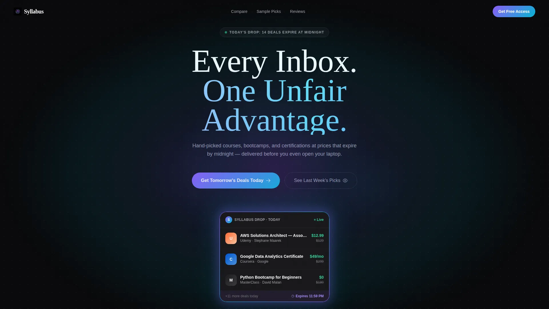
- A dark full-bleed header with a glowing deal card and oversized headline typography
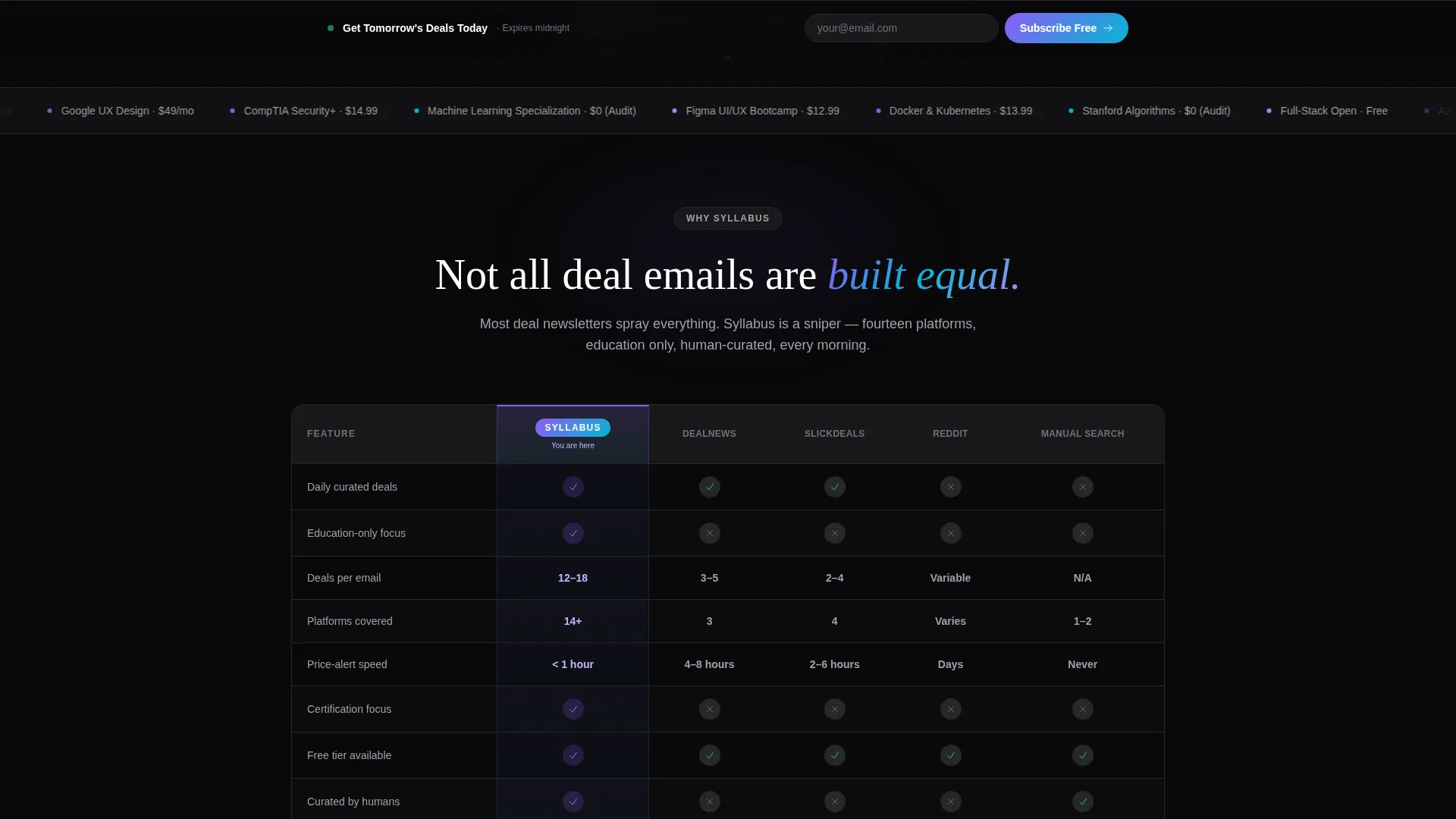
- A competitor comparison table with animated row reveals and categories like deal volume, curation depth, and price-alert speed
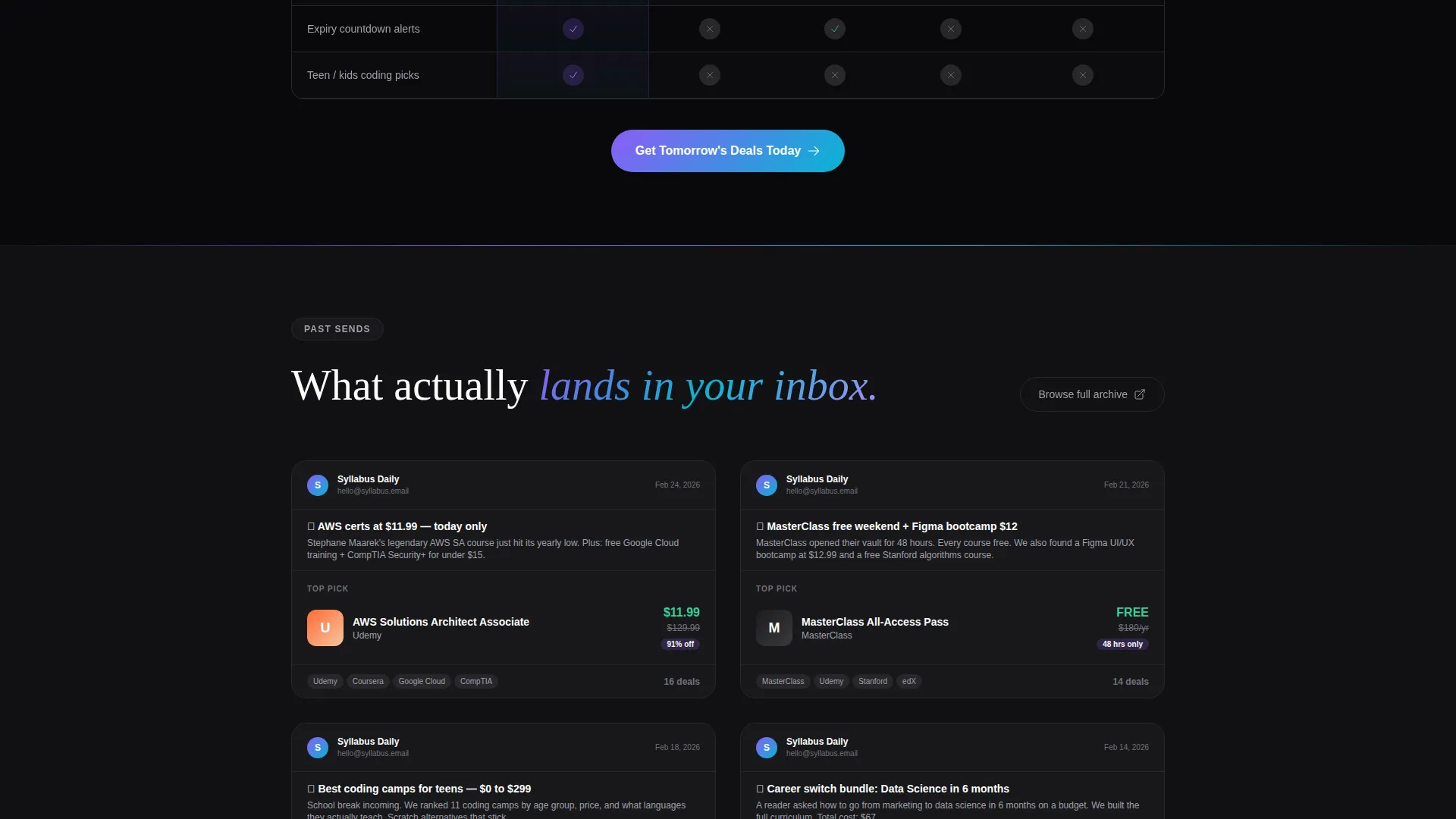
- A sample email showcase section displaying past newsletter sends in a fanned card layout
- A primary call-to-action pill button and a sticky footer bar, both requiring only an email address
- A secondary archive path labeled "See Last Week's Picks" for visitors who want proof before subscribing
Feature list
This template is built around a clear set of functional design choices. Each feature serves the goal of converting a first-time visitor into a confirmed subscriber.
Full-Bleed Dark Header with Glow Effect
A pure black viewport opens the page. A single education deal card appears center-screen with a violet-to-cyan gradient halo radiating from its edges. The headline "Every Inbox. One Unfair Advantage." sits in crisp, oversized white type. The glow pulses once, like a heartbeat, creating immediate visual tension.
Animated Competitor Comparison Table
The core section of the page is a structured comparison table. Rows animate in like items populating a live feed, building scroll momentum. Categories include deal volume, curation depth, platform coverage, and price-alert speed, giving visitors a clear, side-by-side reason to choose this newsletter.
Fanned Sample Email Showcase
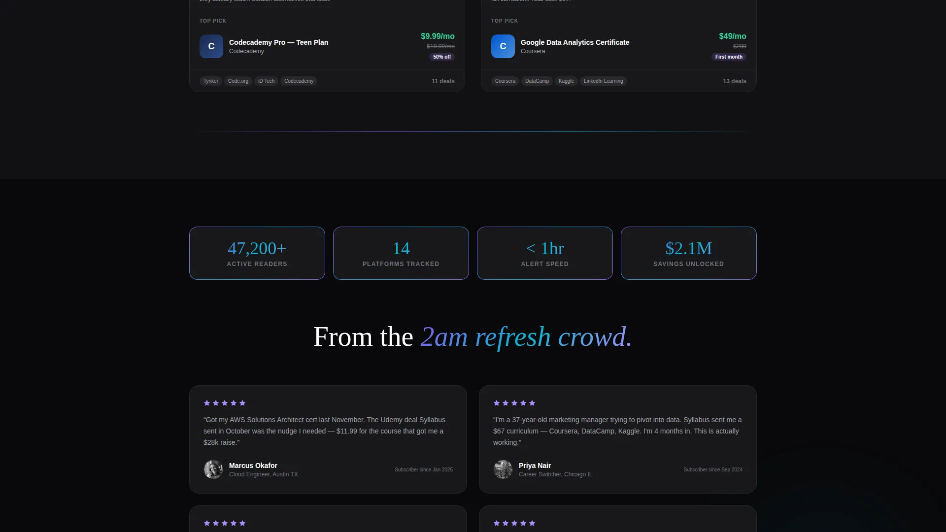
Below the comparison table, screenshots of past newsletter sends fan out like dealt cards. Each one shows real deal examples from multiple learning platforms side by side. This section turns abstract claims into visible proof of what lands in the inbox.
Frictionless One-Field Email Capture
The primary sign-up form asks for one thing: an email address. No name field, no preference survey, no multi-step flow. The "Get Tomorrow's Deals Today" call-to-action button is styled as a glowing pill button consistent with the iridescent palette.
Sticky Footer Call-to-Action Bar
A persistent footer bar repeats the sign-up prompt as visitors scroll. It ensures the conversion opportunity is always visible without interrupting the reading experience mid-scroll.
Sample Archive Secondary Path
A secondary link, "See Last Week's Picks," offers skeptical visitors a low-commitment way to evaluate the newsletter before subscribing. It reduces drop-off from visitors who need one more layer of proof.
Page sections overview
| Section | Purpose |
|---|---|
| Dark Header | Hooks visitors with a glowing deal card and bold headline |
| Comparison Table | Shows how this newsletter outperforms competitors across key metrics |
| Sample Email Showcase | Displays real past sends to prove curation quality |
| Primary call to action Button | Captures email with a single-field glowing pill form |
| Archive Secondary Path | Gives skeptics a low-friction way to browse before subscribing |
| Sticky Footer Bar | Keeps the sign-up prompt visible throughout the entire scroll |
Design & branding system
The visual identity follows a Directory and Discovery theme powered by an AI Iridescent color system. The palette is built to feel like a smartphone screen glowing face-up on a dark desk, with color shifting as the visitor scrolls.
- Void black (#09090B) as the base background, holographic violet (#8B5CF6) and shimmer cyan (#06B6D4) for glow accents and highlights
- Soft iridescent white (#F0EAFF) for card surfaces, keeping deal content legible against the dark background
- Oversized white typography on void black in the header, with crisp contrast maintained throughout all sections
Mobile & speed optimization
The layout is designed to translate the launch-energy experience to smaller screens without losing the visual intensity. The dark palette and glowing accents are particularly effective on OLED and high-contrast mobile displays.
- The comparison table is structured to remain readable on narrow screens, with row animations preserved for the scroll experience
- The sticky footer call-to-action bar is positioned to stay accessible on mobile without blocking content
- The one-field sign-up form keeps tap interactions minimal, reducing friction on touchscreen devices
How this template helps you convert
The entire page is a click-through funnel. Every design and copy decision is made to reduce the distance between landing and subscribing.
- The glowing header creates an immediate emotional hook, making the visitor feel they have arrived at something worth paying attention to before reading a single word.
- The comparison table provides rational justification for subscribing, turning a gut feeling into a supported decision backed by visible proof.
- The dual call-to-action system, combining a mid-page pill button with a persistent sticky footer, ensures the conversion moment is never more than a glance away.
Other information about this template
This template is categorized under Technology and sits within the Education Email Templates subcategory, targeting the education promotional email niche. It is well suited for operators building deal-focused newsletters around online learning platforms and course marketplaces. The Directory and Discovery theme makes it equally effective for deal aggregators and curated learning directories.
- The template style is a comparison table layout, making it practical for any newsletter that needs to differentiate itself from competitors in a crowded inbox
- The AI Iridescent color system is part of a broader design language built for high-contrast, scroll-driven pages in the technology and education space
- The Launch Energy creative direction and Dark Full-Bleed and Glow header concept are specific visual treatments designed to create urgency and forward momentum from the first viewport
Theme
Directory & Discovery
Creative direction
Launch Energy
Color system
AI Iridescent
Style
Comparison Table
Direction
Click-Through
Page Sections
Full-bleed Dark Header with Glow
Animated Competitor Comparison Table
Fanned Sample Email Showcase
One-field Frictionless Sign-up
Sticky Footer Call-to-action Bar
Sample Archive Secondary Path
Related questions
Who is this landing page template designed for?
Does the sign-up form require more than an email address?
Can I customize the comparison table categories?
What makes the design feel urgent without being aggressive?
Is this a single-page template or a multi-page website?



