Syllabus - Datadriven Education Landing Page Template
Syllabus is a dashboard-style education newsletter landing page template built for education marketers who need performance above the 28% sector open-rate average. It combines animated benchmark metrics, a segmentation-first layout, and a two-step lead capture form into one focused, data-driven page that turns skeptical visitors into qualified leads.
by Rocket studio
Quick summary
Syllabus is a single-page, dashboard-style landing page template built for education newsletter platforms. It opens with a full-viewport animated metrics wall, walks visitors through a structured data narrative, and closes with a progressive two-step lead form. Every section is designed to build evidence before asking for a commitment.
Who this template is for
This template speaks directly to the people who live inside education email data every day. If your job is measured by open rates, click-throughs, and enrollment yield, this page was designed for you.
- K-12 communications directors managing high-urgency campaigns like snow-day alerts and district announcements
- University admissions teams nurturing large applicant pools through competitive yield seasons
- Edtech growth leads running A/B tests on onboarding sequences and working to reduce subscriber churn
What problem this template solves
Most education email marketing pages rely on generic claims and stock imagery. They fail to convince data-literate buyers that a newsletter template can actually move the metrics that matter. This template replaces vague promises with visible proof.
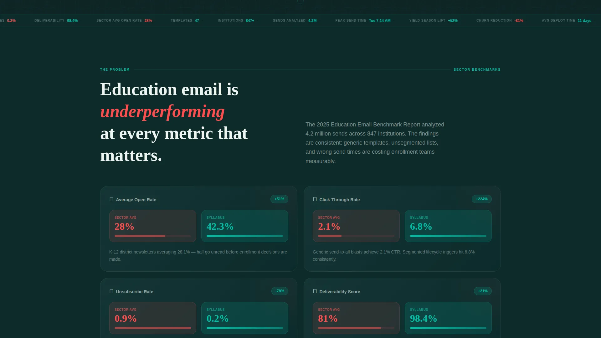
- The average education email open rate sits at 28%, and most landing pages do nothing to acknowledge or challenge that benchmark
- Buyers in K-12, higher education, and edtech need segmentation logic and lifecycle triggers built in, not added manually later
- Without structured before-and-after evidence, skeptical admissions or communications teams will not convert on a first visit
What you get with this template
You get a complete, conversion-focused landing page that presents a newsletter template engine as a credible, data-backed product. The page is structured like an industry report, handing visitors proof section by section until the form feels like a logical next step.
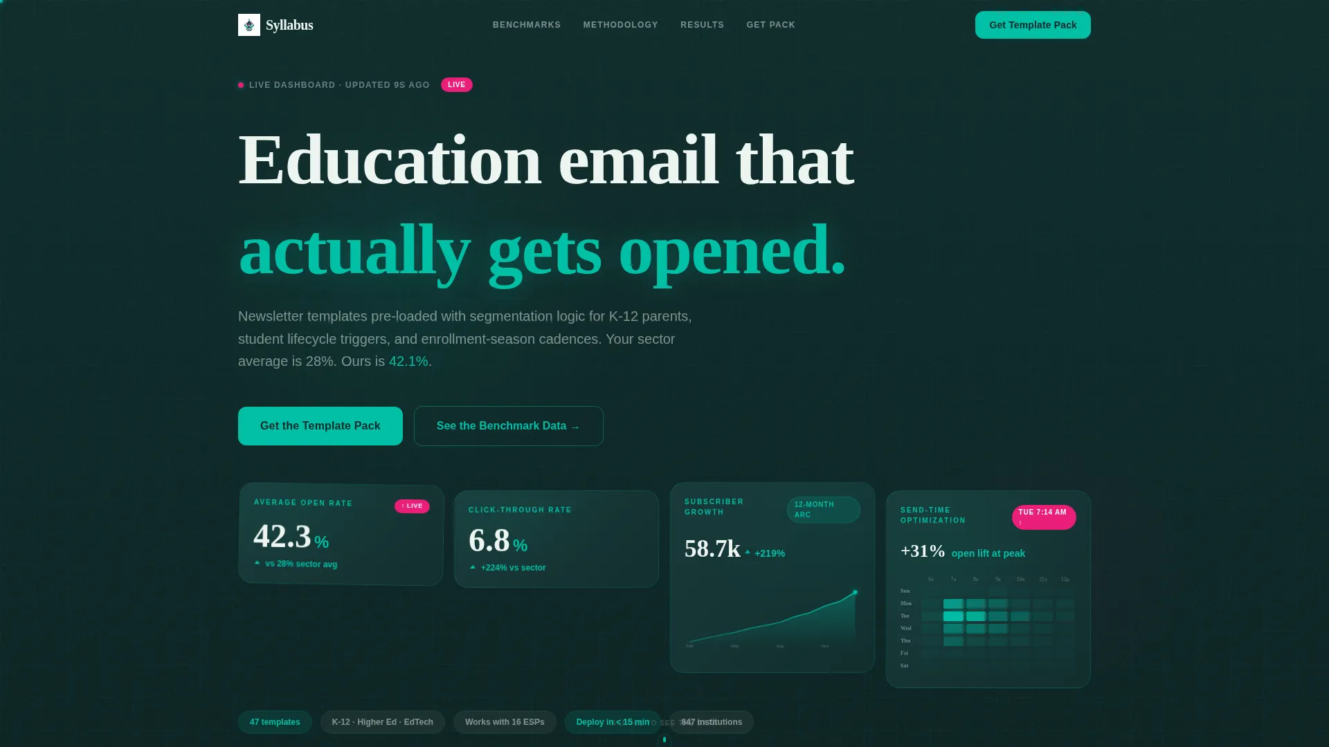
- A full-viewport animated stats wall showing live-style education email benchmarks including open rates past 42% and click-through rates above 6.8%
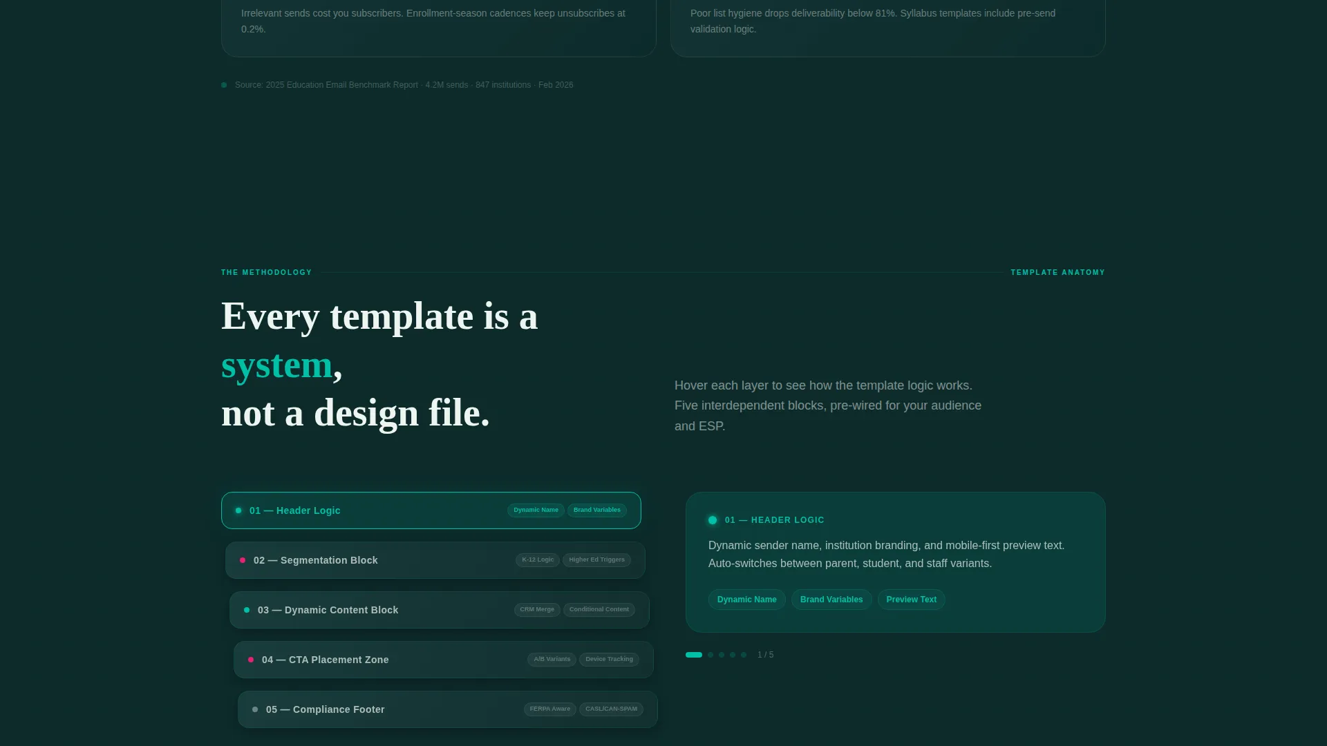
- A template anatomy diagram that explodes a newsletter into its component layers on scroll, revealing header logic, dynamic content blocks, and call-to-action placement zones
- A two-step progressive lead form capturing work email and institution type first, then list size and current email service provider in a second panel
Feature list
This template ships with a focused set of purpose-built components. Each one serves the Industry Report narrative and the lead generation goal.
Animated Benchmark Metrics Wall
The header is a full-viewport dashboard showing real education newsletter benchmarks animating upward in real time. Open rate climbs past 42%, click-through crosses 6.8%, a subscriber growth sparkline arcs across 12 months, and a send-time heatmap pulses brightest at Tuesday 7:14 AM. Numbers use spring-loaded easing curves that feel alive, not mechanical.
Problem Grid with Underperformance Indicators
Four cards present average education email benchmarks with red underperformance indicators. This section frames the status quo as a problem, giving visitors an immediate reason to keep reading and a clear contrast against the results shown further down the page.
Scroll-Triggered Template Anatomy Diagram
An animated diagram explodes a newsletter template into its component layers as the visitor scrolls. Each layer, including header logic, dynamic content blocks, and call-to-action placement zones, slides apart to reveal the structure beneath. It turns an abstract product into something a visitor can see and understand.
Before-and-After Case Study Rows
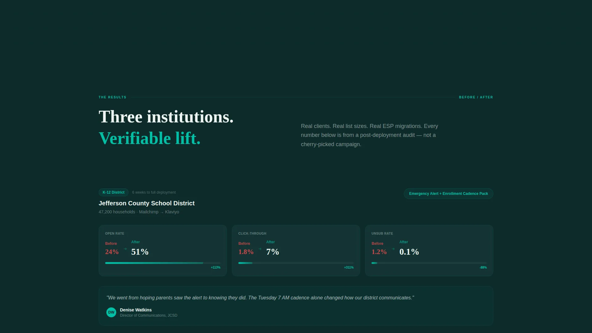
Three case study rows display results formatted as side-by-side data comparisons. Each row shows institution type, list size, and lift percentage. The format mirrors a research brief, making the results feel verifiable rather than promotional.
Two-Step Progressive Lead Form
The primary call-to-action uses a two-panel progressive form. Step one asks only for work email and institution type, keeping the initial friction low. Step two reveals fields for list size and current email service provider once the visitor is already engaged.
Gated Benchmark Report Download
A secondary conversion path offers the 2025 Education Email Benchmark Report as a downloadable PDF. It captures leads who are not ready to request the template pack but cannot resist the data. This gives the page two distinct conversion moments.
Page sections overview
| Section | Purpose |
|---|---|
| Animated Metrics Header | Opens with live benchmark data to establish credibility immediately |
| Problem Data Grid | Shows four underperformance cards to frame the core market problem |
| Template Anatomy Diagram | Visualizes newsletter component layers revealed on scroll |
| Case Study Rows | Presents before-and-after lift data across three institution types |
| Primary Lead Form | Captures qualified leads with a low-friction two-step form |
| Benchmark Report call to action | Offers gated PDF download as a secondary conversion path |
Design & branding system
The visual identity follows a Dynamic Motion theme built around the Teal Catalyst color system. The palette is designed to feel like a school's innovation lab at night, with dark surfaces lit by pulsing data.
- Core colors include deep chalkboard (#0D2B2B) for backgrounds, electric teal (#00BFA6) for primary data elements, soft chalk dust (#EDF5F0) for card surfaces, and signal magenta (#E91E78) reserved exclusively for notification badges and conversion spike indicators
- Motion is intentional throughout: metric cards use spring-eased number animations, the anatomy diagram uses scroll-triggered layer separation, and the send-time heatmap pulses with live-style intensity
- No stock photography appears on the page; the data visualizations and animated metrics serve as the sole visual heroes
Mobile & speed optimization
The dashboard layout is built to remain readable and functional across screen sizes. Animated components are designed for performance without relying on heavy assets.
- The metrics wall and data grid components reflow cleanly on smaller screens, keeping benchmark numbers legible without horizontal scrolling
- Scroll-triggered animations are scoped to their sections so they do not block or delay earlier content from loading and rendering
- The two-step form collapses into a single-column layout on mobile, maintaining a low-friction experience for visitors on phones or tablets
How this template helps you convert
The page earns its clicks by building an evidence-led case before it ever asks for anything. The conversion path is structured to feel like a research process reaching its natural conclusion.
- The animated metrics header front-loads specific, verifiable performance numbers so visitors arrive at the form already primed with proof rather than skepticism.
- The progressive two-step form reduces drop-off by asking only for work email and institution type in step one, revealing deeper qualification fields only after the visitor has already committed to the first interaction.
- The gated benchmark report download creates a second conversion moment for visitors who need more time, ensuring the page captures leads at two different stages of readiness.
Other information about this template
This template is designed for education marketers who need a landing page that speaks the same language as their buyers. A few additional details worth knowing before you use it.
- The template is categorized under Technology, with a subcategory focus on education email templates and an education newsletter template niche
- The Industry Report creative direction means the page reads like a structured data narrative, not a typical product pitch
- The Dashboard and Data Grid template style makes it well suited for any education email platform that wants to lead with performance benchmarks rather than feature lists
- The Dynamic Motion theme and Teal Catalyst color system are matched specifically to this intersection of data credibility and education brand identity
- The lead generation direction is built into the page architecture itself, not added as an afterthought
Theme
Dynamic Motion
Creative direction
Industry Report
Color system
Teal Catalyst
Style
Dashboard/Data Grid
Direction
Lead Generation
Page Sections
Animated Benchmark Metrics Wall
Problem Grid with Underperformance Cards
Scroll-triggered Template Anatomy Diagram
Before-and-after Case Study Rows
Two-step Progressive Lead Form
Gated Benchmark Report Download
Related questions
Who is this landing page template designed for?
What does the two-step lead form actually ask for?
Does the page include any imagery or stock photos?
Can this template support two separate conversion goals at once?
What makes the header different from a standard hero section?



