Higher Education Digital Presence Specialist Education Website Template
Syllabus is a dynamic, card grid landing page template built for higher education course and training platforms. It leads with animated statistics, a drifting logo bar of institutional partners, and a modular course card grid. Two conversion paths, a progressive lead form and a per-card syllabus download, work together to turn browsing professionals into enrolled learners.
by Rocket studio
Quick summary
Syllabus is a single-page, lead generation template designed for platforms that connect learners to accredited university modules, professional certifications, and corporate upskilling tracks. It opens with institutional proof, moves through animated outcome metrics, and closes with a two-step course-matching form. The layout feels like a system actively running, not a static brochure.
Who this template is for
This template is built for organizations that sell structured learning at scale. It speaks directly to buyers who need credibility fast and outcomes upfront.
- Learning and development directors managing quarterly training budgets and vendor evaluations
- Mid-career professionals researching credentials that support a specific promotion or role change
- University partnership offices looking to extend their course catalog to off-campus and corporate audiences
What problem this template solves
Most education platform pages bury their proof. They lead with stock imagery and vague mission statements, then hide completion rates and partner logos three scrolls down. By the time a visitor reaches the form, trust has already faded.
- Institutional credibility is invisible above the fold, leaving skeptical professionals unconvinced
- Outcome data is scattered or absent, making it hard for budget-holders to justify a purchase decision
- Generic contact forms feel like sales traps, which reduces form completion rates on high-intent pages
What you get with this template
You get a fully structured, single-page layout with every section prebuilt and purposefully ordered. The template is ready to customize with your own course data, partner logos, and brand copy.
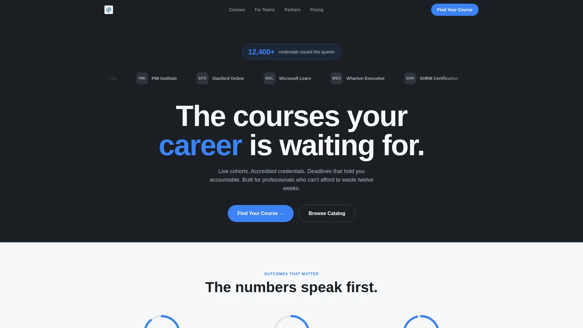
- A stat-first header section with an animated credential counter, a drifting partner logo bar, and a single bold headline
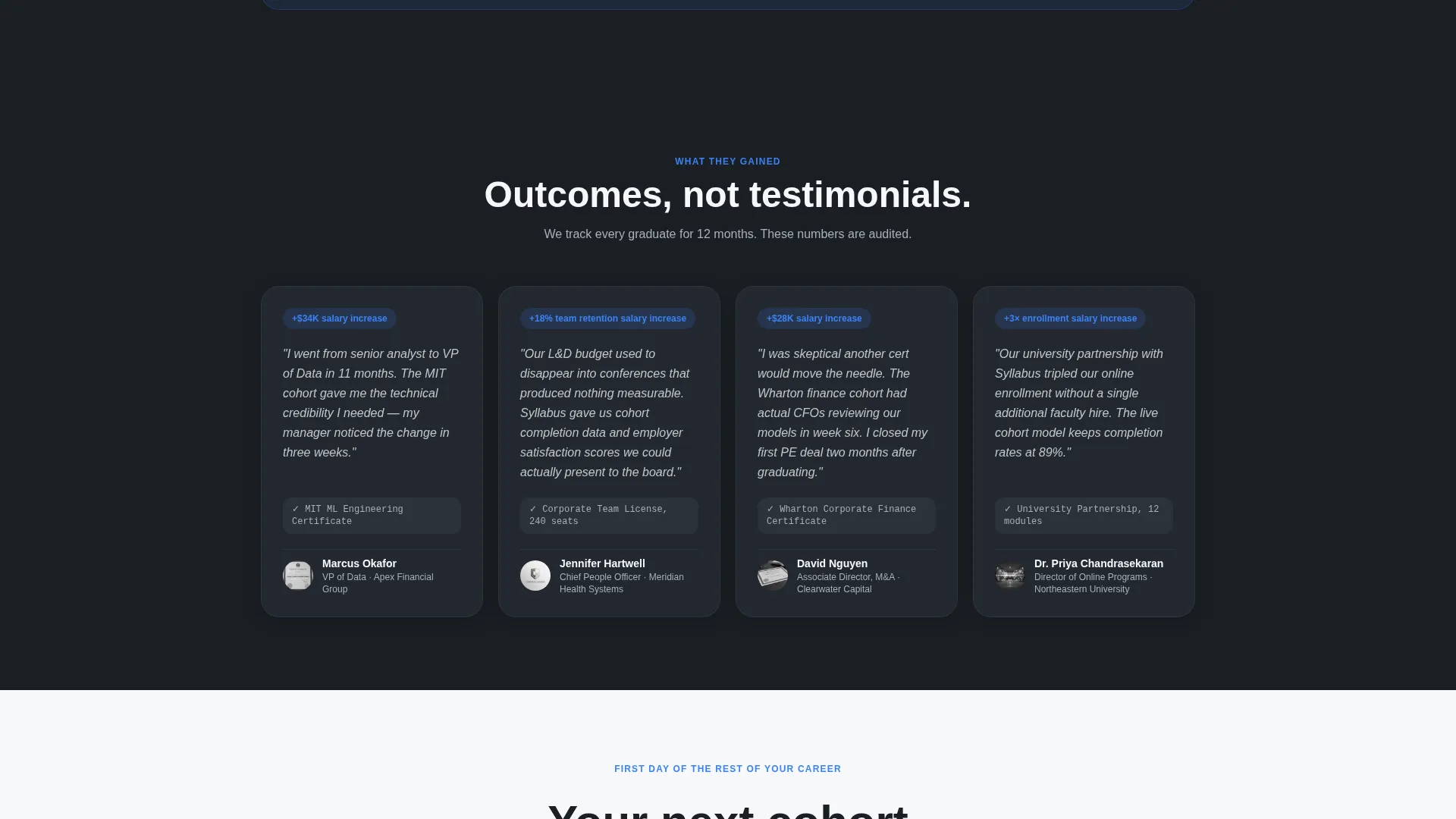
- A modular card grid that moves visitors from course categories to featured courses to student outcome testimonials
- Two conversion paths: a two-step progressive lead form and a lower-commitment per-card syllabus download gate
Feature list
This template ships with a focused set of interactive and structural components. Each one serves the platform's core job: convert a skeptical professional into a registered learner.
Animated Stat Counter Header
A single credential metric counts upward in electric blue on page load. This gives first-time visitors an immediate, specific proof point before they read a single line of copy.
Drifting Partner Logo Bar
University crests, certification body marks, and corporate partner logos scroll in a slow, perpetual drift. All logos render in monochrome steel so the visual weight stays controlled and institutional.
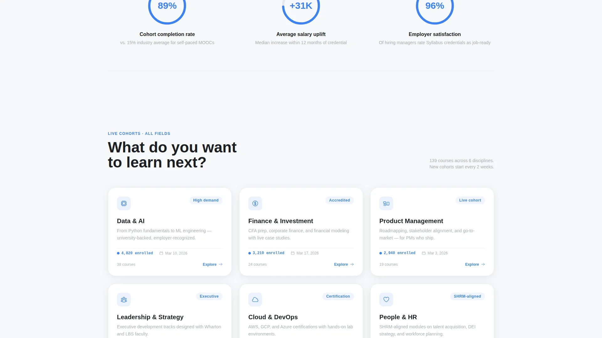
Modular Course Category Card Grid
Cards are arranged in a responsive grid and tilt gently on hover. Each card surfaces a live enrollment count and the next cohort start date, giving visitors the urgency context they need to act.
Scroll-Triggered Metrics Row
Three oversized outcome metrics animate into view with an upward spring as the visitor scrolls. Completion rate, average salary uplift, and employer satisfaction score each appear before the narrative that explains them.
Two-Step Progressive Lead Form
The primary call to action opens a two-step form. Step one captures professional field, role level, and learning goal. Step two asks for name, work email, and company size. This structure feels like a course-matching tool rather than a data-collection form.
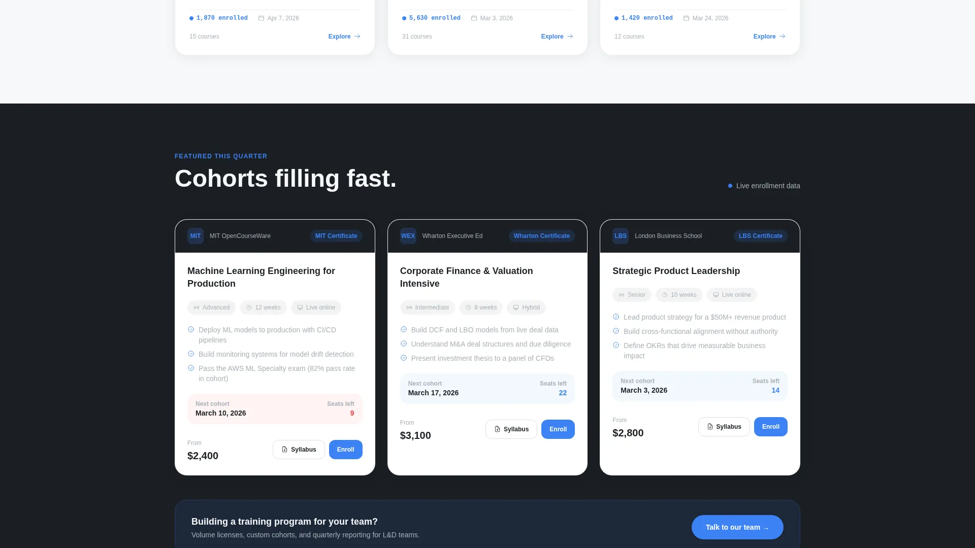
Per-Card Syllabus Download Gate
Every course card includes a secondary "Download Syllabus" entry point. It gates a PDF behind a single email field, creating a low-commitment conversion path that feeds the same lead nurture sequence as the main form.
Page sections overview
| Section | Purpose |
|---|---|
| Credential counter bar | Animates a live metric on load to establish platform scale immediately |
| Partner logo scroll | Drifts institutional logos to build trust before any copy is read |
| Hero headline | Delivers the platform value proposition in one 56px charcoal line |
| Outcome metrics row | Surfaces three animated stats to quantify learner results |
| Course category grid | Lets visitors explore subject areas via hover-tilt modular cards |
| Featured course cards | Highlights specific programs with cohort dates and enrollment counts |
| Student outcome testimonials | Raises stakes with real learner results and credential outcomes |
| Pricing or next steps | Contextualizes cost or commitment before the conversion ask |
| Sticky header call to action bar | Keeps the primary "Find Your Course" action always in view |
| Two-step lead form | Matches visitors to programs via a structured, low-pressure intake |
| Per-card download gate | Offers a PDF syllabus behind a single email field on each card |
Design & branding system
The visual identity follows a Dynamic Motion theme using a Monochrome Steel color system. Every color choice is functional. Nothing is decorative for its own sake.
- Core palette: forge-dark charcoal (#1B1F24) for primary backgrounds and headlines, brushed aluminum (#A8B0B9) for secondary text and dividers, and white-paper bright (#F7F8FA) for alternating card backgrounds
- Electric blue (#3B82F6) appears exclusively on interactive states, progress indicators, and call-to-action elements so it reads as signal every single time it appears
- Cards float on subtle box-shadows against both dark and light backgrounds, and motion is disciplined throughout: eased translations, counter-rotating progress rings, and count-up number animations
Mobile & speed optimization
The template is built with a layout-first approach that keeps the modular card grid readable and functional on smaller screens. Motion is eased rather than heavy, so transitions stay smooth across devices.
- The card grid reflows into a single-column layout on mobile so course cards remain fully legible and tappable without horizontal scrolling
- The sticky header call-to-action bar persists on mobile, keeping the primary conversion action reachable at any scroll depth
- Hover-tilt card effects fall back gracefully on touch devices so the experience degrades cleanly rather than breaking
How this template helps you convert
The page is structured around a deliberate credibility-to-commitment arc. Every section earns the next ask before making it.
- The header lands institutional proof and a live metric before asking anything, so visitors arrive at the scroll already trusting the platform's scale and legitimacy.
- The outcome metrics row quantifies what learners actually gained, giving budget-holders and mid-career professionals the evidence they need to justify the next step.
- The two-step form and the per-card download gate offer different commitment levels, so both high-intent and early-stage visitors have a natural entry point into the lead sequence.
Other information about this template
This template is categorized under Technology, with a subcategory of Higher Education Digital Presence. It is purpose-built for the higher education course and training platform niche.
- The template style is Card Grid (Modular), making it straightforward to extend with additional course rows or partner tiers as a catalog grows
- The creative direction is Stats-First Impact, meaning every new scroll section leads with a number or metric before introducing explanatory narrative
- The header concept is a Logo Bar, which is particularly effective for platforms whose credibility depends on visible institutional affiliations
- This template is well suited for platforms working with tools commonly used in higher education marketing stacks, such as course management systems, online learning marketplaces, or professional certification portals
Theme
Dynamic Motion
Creative direction
Stats-First Impact
Color system
Monochrome Steel
Style
Card Grid (Modular)
Direction
Lead Generation
Page Sections
Animated Credential Counter
Drifting Partner Logo Bar
Scroll-triggered Metrics Row
Hover-tilt Course Card Grid
Two-step Progressive Lead Form
Per-card Syllabus Download Gate
Related questions
Can I add more course cards to the grid?
How does the two-step lead form work?
Can this template be used for a corporate training catalog?
Is the syllabus download feature included on every course card?
Does the sticky header call to action appear on mobile devices?



