Bold Brutalist Education Website Builder Landing Page
Syllabus is a bold brutalist education website builder landing page template built for educators who need results fast. It combines a data-heavy bento grid layout, a scrolling logo marquee, and a three-step lead generation form into one raw, high-contrast design that turns visitors into enrolled users without a single line of custom code.
by Rocket studio
Quick summary
The Syllabus bold brutalist education website builder landing page template is purpose-built for education professionals who need a powerful web presence without the wait. Its bento grid layout showcases real data, enrollment proof, and course-builder features in a design style that commands attention. The template delivers a full lead generation flow from first scroll to form submission.
Who this template is for
This template was built for educators and education administrators who need a high-converting landing page live within hours, not weeks. It speaks directly to professionals who understand that web design should serve function before form.
- Independent course creators launching cohort-based programs who need enrollment pages fast
- K-12 department heads and corporate learning and development managers who require a training hub without waiting on a developer
- Bootcamp operators and university program coordinators who want bold, data-driven pages that stand out from the crowd
What problem this template solves
Most education websites are either too polished to feel honest or too outdated to convert. Brutalist web design solves this by stripping away unnecessary visual distractions and putting raw content front and center. The result is a brutalist website that feels credible, direct, and built to teach.
- Educators lose enrollment leads because their landing pages bury key data behind soft gradients and vague headlines
- Administrators waste weeks waiting for developers to push live simple page updates
- Course creators lack a structured layout that showcases proof, stats, and enrollment flows in one clear, scannable place
What you get with this template
You get a fully structured, single-page bento grid landing page that is ready to customize and launch. Every section serves one thing: moving the right visitor toward a clear action. The design embraces raw aesthetics, bold typography, and high contrast color choices that make every element feel intentional.
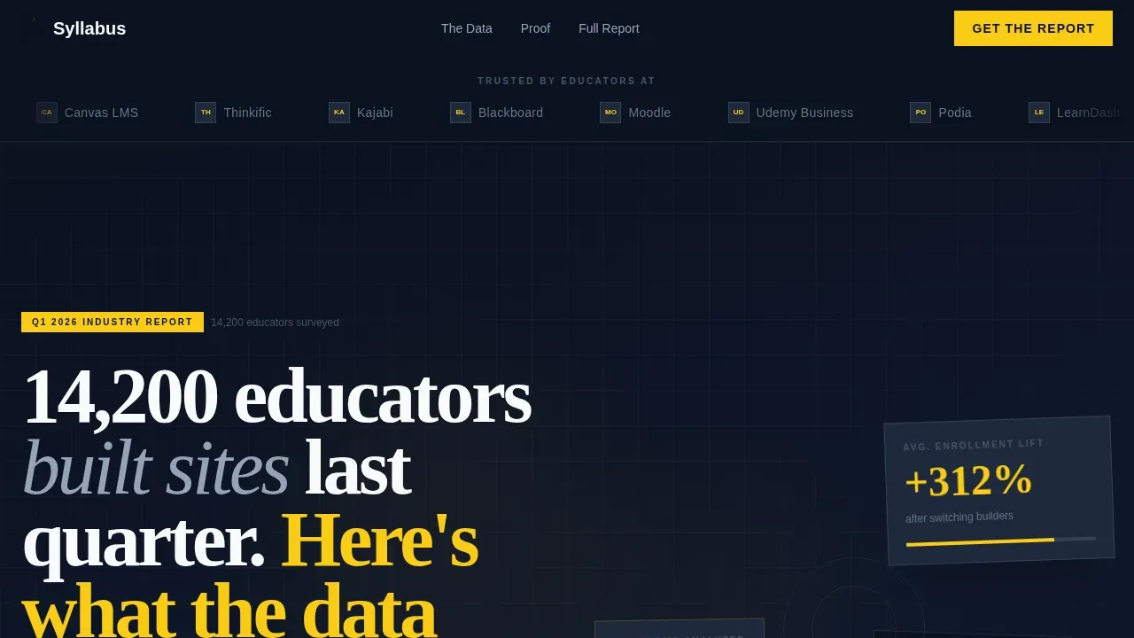
- A hero section with a scrolling logo marquee, a slab-serif brutalist headline, and floating stat cards that establish credibility immediately
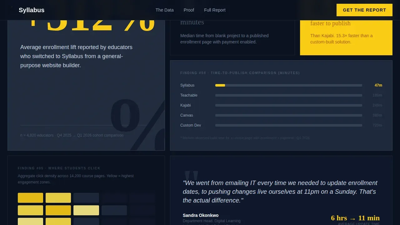
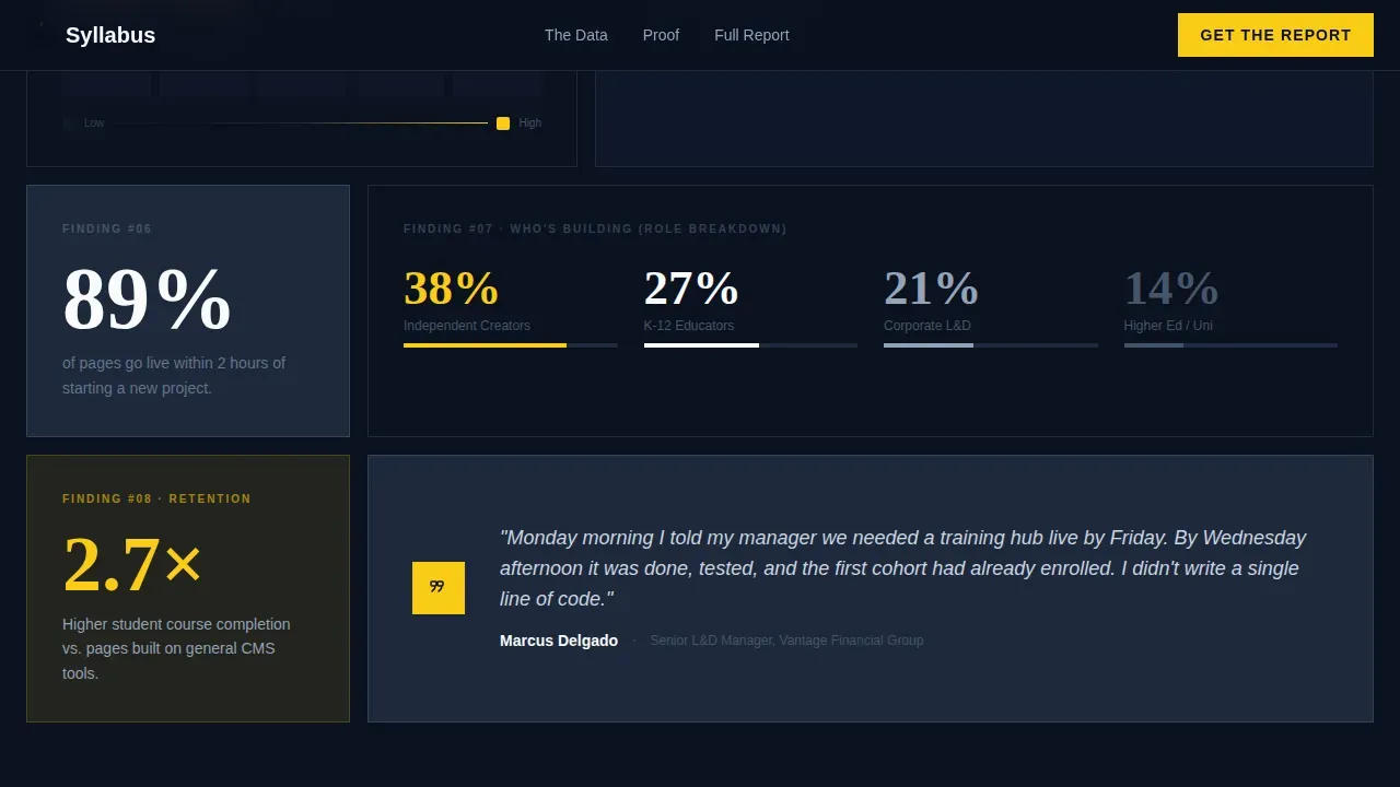
- Two bento grid sections presenting market data and product proof tiles, including a platform comparison table, enrollment lift stats, a student heatmap tile, and a pull-quote block
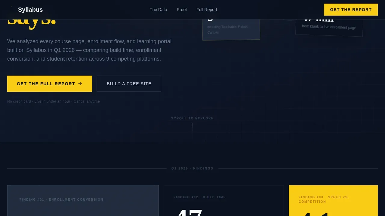
- A three-step progressive lead generation form and a secondary "Build a Free Site" call-to-action path that captures visitors at both the research and action stages
Feature list
This template packs a focused collection of web design features that work together to create a function-first, data-led landing page. Each element is chosen with purpose.
Bento Grid Data Layout
The page uses an asymmetrical bento grid where cells vary in size. Wide tiles hold charts and comparison tables. Tight single squares present one bold stat in oversized typography. This layout structure means every scroll rewards visitors with one clear finding, mimicking the rhythm of flipping through an industry research report.
Scrolling Logo Marquee Header
A slow mechanical marquee scrolls education-sector logos across a solid navy background. No illustrations, no filler images. The logos function as evidence, immediately telling visitors that recognizable institutions trust this platform. This header concept sets a credible, authoritative tone before a single body paragraph is read.
Three-Step Progressive Lead Generation Form
The lead generation section uses progressive disclosure. Users enter a work email first, then select their role, then specify institution size. Each step reveals a preview snippet of the gated report, giving visitors a reason to complete all three fields. A sticky bottom bar reinforces the primary call-to-action after the third scroll depth.
Bold Brutalist Typography System
Headlines use a heavy slab-serif typeface that lands like a rubber stamp on the page. Body copy and user interface elements use a clean humanist sans-serif. Together these fonts create a high contrast reading experience that guides users from headline to data point to form without confusion.
Midnight Blue Color System
The palette is built around a deep command-line navy as the dominant background. Chalkboard slate separates card layers. Bright classroom white handles all typography. A searing highlight yellow appears only on buttons, data callouts, and hover states. This restraint means every yellow instance functions as a visual signal that demands attention.
Stat Cards and Pull-Quote Tiles
Floating stat cards in the hero and dedicated proof tiles in the bento grid present enrollment lift figures, build time comparisons, and direct quotes from education administrators. These tiles deliver social proof without relying on imagery, keeping the design raw and the data prominent.
Page sections overview
| Section | Purpose |
|---|---|
| Logo Marquee Hero | Establish credibility with scrolling education-sector logos and a bold brutalist headline |
| Floating Stat Cards | Present key enrollment and platform data immediately below the headline |
| Bento Grid Part One | Showcase broad market data tiles including build time comparisons and platform benchmarks |
| Bento Grid Part Two | Deliver granular product proof through heatmap tiles, pull-quotes, and product metrics |
| Lead Gen Form | Capture work email, role, and institution size through a three-step progressive form |
| Secondary call to action | Offer a "Build a Free Site" path for visitors who bypass the gated report |
| Linear Footer | Close the page with a single-row footer strip |
Design & branding system
The design style is Bold Brutalist, and every visual decision follows that philosophy honestly. The web design system here was not built for decoration. It was built to inform. Brutalism in web design is characterized by raw aesthetics, heavy typography, and high contrast color systems that prioritize content above all else.
- Colors: deep navy (#0B1120) dominates every background tile; chalkboard slate (#1E293B) separates card layers; classroom white (#F8FAFC) handles all body and headline type; highlight yellow (#FACC15) appears sparingly on buttons, callouts, and hover states only
- Typography: Fraunces slab-serif for all headlines, creating bold, stamp-like impact; DM Sans for body text and user interface labels, keeping supporting copy clean and legible
- Shapes and layout rules: blocky buttons with solid color fills and no gradients or rounded corners; visible grid lines dividing bento cells; no soft drop shadows or decorative illustration anywhere on the page
Mobile & speed optimization
The template is designed desktop-first, reflecting how learning and development managers and department heads typically access research-led pages. Responsive behavior ensures the bento grid reflows cleanly on smaller screens without losing the raw, content-forward character of the brutalist design.
- Bento grid tiles restack vertically on smaller screens, preserving the one-finding-per-cell rhythm that makes the layout scannable on any device
- Minimal use of heavy image assets keeps the page light; the design relies on typography, background color, and CSS-driven shapes rather than large files
- Transition animations including marquee scroll, staggered fade-in-up reveals, and counter animations on stat cards are handled by client-side components, keeping static grid sections fast to load
How this template helps you convert
This brutalist landing page is engineered to earn trust through data before it asks for anything. Visitors who are skeptical of polished EdTech marketing respond to raw, honest proof. The page gives enough away for free that the full report feels worth an email address.
- The scrolling logo marquee and headline stat establish authority in the first viewport, so visitors stay past the hero instead of bouncing immediately
- The bento grid escalates from broad market findings to specific product proof, building a case tile by tile until the lead generation form feels like a logical next step rather than an interruption
- The dual conversion path catches two intent levels: researchers who want the gated report and ready-to-act users who click "Build a Free Site" directly, so no motivated visitor leaves the page without taking an action
Other information about this template
The Syllabus template draws direct inspiration from the history of brutalism as a design movement. The term comes from the French word "béton brut," meaning raw concrete, and the same philosophy of honest, unornamented structure drives every layout decision here. Brutalist architecture peaked in the 1950s and 1960s before fading, but web brutalism has experienced a strong revival as a reaction against overly polished modern website design.
This template is also a strong reference point among brutalism website examples for education software and B2B SaaS pages. Unlike a portfolio website focused on visual elegance, this page prioritizes function and data density. Designers and developers looking for brutalist landing inspiration will find this template showcases how brutalist web design can serve serious business goals without feeling ugly or inaccessible.
- The bento grid structure means educators can present a syllabus, enrollment data, and course proof in a format that helps students and prospects understand complex information at a glance
- Neo-brutalism principles are present here: outlined buttons for the secondary path add modern usability cues while the primary call-to-action buttons stay blocky and bold
- Wix and other platforms offer template collections in various styles, but few embrace the raw, function-first brutalist design style with this level of specificity for the education software niche
- The template is accessible to non-technical users; no custom code or developer involvement is required to customize and launch the page
- An art director or senior designer can use this template as a foundation and extend the system using the same CSS variables and font stack already built into the design
Theme
Bold Brutalist
Creative direction
Industry Report
Color system
Midnight Blue
Style
Bento Grid
Direction
Lead Generation
Page Sections
Asymmetrical Bento Grid Layout
Scrolling Logo Marquee
Three-step Progressive Lead Form
Bold Brutalist Typography System
Midnight Blue Color System
Dual Conversion Path Design
Related questions
Do I need to write code to use this template?
Can this template work for a corporate training hub or a university program page?
What makes this a brutalist landing page rather than a standard education template?
Is the three-step lead generation form included and ready to use?
Who is the primary audience this landing page is designed to attract?



