AI for Higher Education Directory Website Template
Syllabus is a dark-mode landing page template built for an AI-powered university scheduling engine. It showcases a conflict-free timetable solver that handles 40,000 student registrations, 1,200 faculty constraints, and 600 classrooms in eleven minutes. The template uses scroll-reveal sections, hard benchmark data, and a direct call-to-action flow aimed at university registrars, provosts, and IT directors.
by Rocket studio
Quick summary
Syllabus is a single-page, scroll-reveal landing page template for a higher education AI scheduling assistant. It translates a technically complex product into a focused, data-driven pitch. Every section is built around a hard number, not a headline claim. The design runs on a dark-mode, acid-digital color palette and drives visitors toward a live sandbox demo.
Who this template is for
This template is designed for teams marketing an AI-powered course scheduling platform to higher education decision-makers. It speaks directly to the people who feel the pain of manual scheduling most acutely.
- University registrars who currently manage course conflicts inside spreadsheets
- Provosts and academic operations leaders tired of defending poor schedule outcomes
- IT directors who have been asked to build an in-house scheduling tool and want a better answer
What problem this template solves
Manual university scheduling is slow, error-prone, and politically exhausting. A process that involves tens of thousands of student registrations, hundreds of faculty preferences, and hundreds of room assignments does not fit inside a spreadsheet. This template gives that problem a face and immediately shows the alternative.
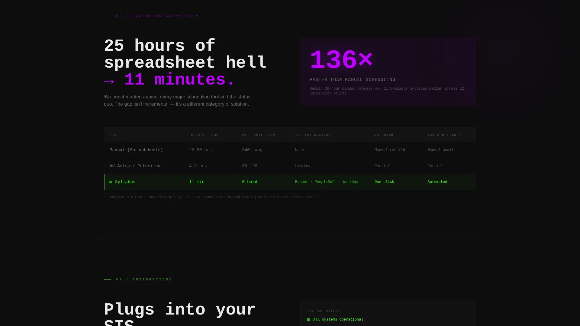
- It frames the contrast between a 25-hour manual process and an 11-minute automated solve
- It surfaces specific failure modes: room double-bookings, instructor overlaps, and compliance gaps
- It removes friction from the conversion path by skipping forms and sending visitors straight to a sandbox demo
What you get with this template
You get a fully structured, scroll-reveal landing page template ready to customize for an AI scheduling product. The layout is built to guide a technically skeptical audience from awareness to action without losing them in marketing language.
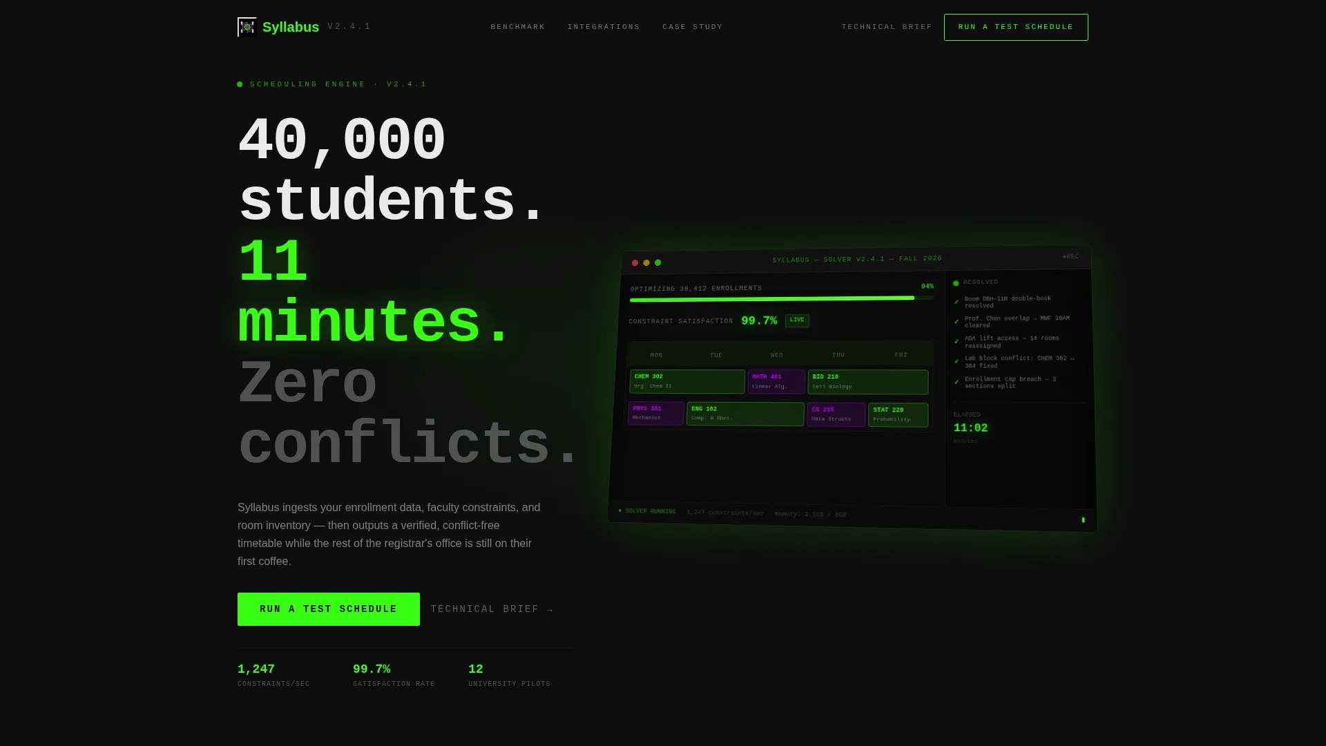
- A hero section featuring an isometric dashboard preview that shows the solver mid-run
- Four sequential scroll-reveal sections, each exposing one layer of benchmark or proof data
- A dual call-to-action system with a ghost-outlined header button and a solid acid-green conversion block
Feature list
This template includes the following built-in design and layout capabilities.
Isometric Dashboard Hero
The header renders a pixel-perfect isometric view of the scheduling solver in progress. A weekly grid fills with color-coded course blocks, a real-time progress bar reads "Optimizing 38,412 enrollments" at 94%, and a sidebar cascades green checkmarks as conflicts resolve. The entire composition glows against a pure black background.
Progressive Scroll-Reveal Layout
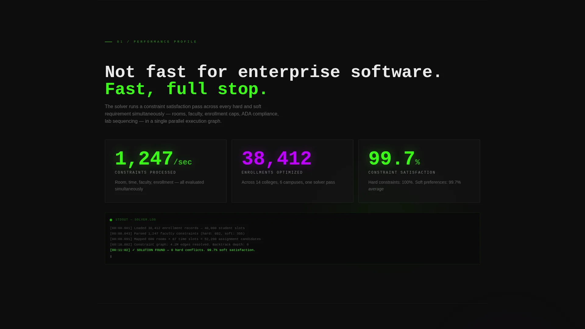
Each scroll section strips back one layer of complexity to reveal a hard metric. The sequence moves from constraints processed per second, to a benchmark comparison table, to integration logos with live API response times, to an anonymized before-and-after case study. The pacing mimics reading a technical whitepaper that keeps landing punches.
Benchmark Comparison Section
A dedicated section presents a side-by-side table comparing legacy manual scheduling (25 hours) against the Syllabus solver (11 minutes). This section is where the primary call-to-action solidifies from a ghost button into a filled acid-green block, reinforcing the speed claim at the moment of highest conviction.
Dual Call-to-Action System
The primary call-to-action, "Run a Test Schedule," appears first as a ghost-outlined button in the header and then transforms into a solid acid-green block after the benchmark section. A secondary text link, "Read the Technical Brief," runs alongside it to capture IT directors who need architecture details before booking a call.
Acid Digital Color System
The template uses a four-color system: void black (#0D0D0D) for all backgrounds, terminal phosphor green (#39FF14) for live data and success states, ultraviolet (#BF00FF) for interactive hotspots and hover states, and interface white (#EAEAEA) for body text and data labels. The result is a dark-mode IDE aesthetic that feels electric and technical.
Integration Proof Section
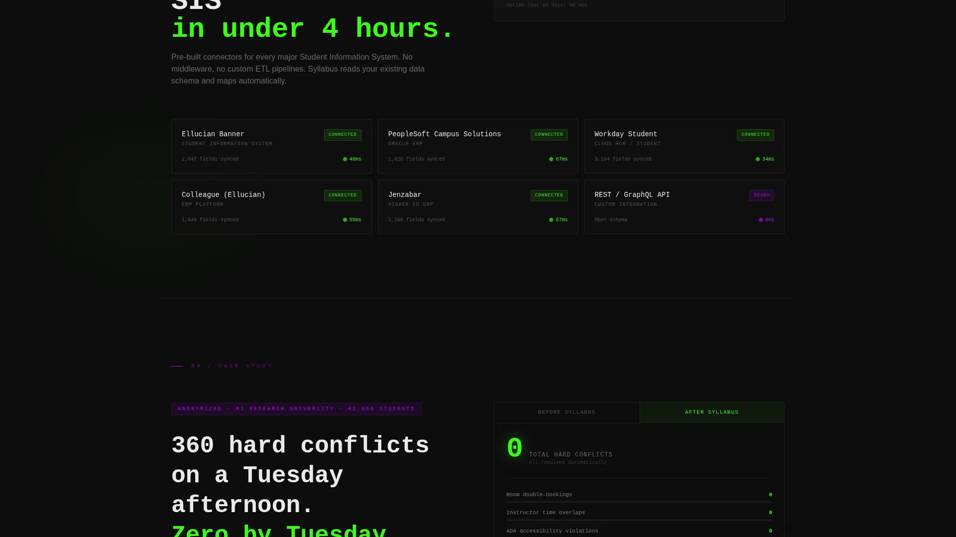
A dedicated scroll-reveal section displays integration logos alongside live API response times. This section is designed to communicate technical credibility to IT directors and registrar teams evaluating the platform's compatibility with existing systems.
Page sections overview
| Section | Purpose |
|---|---|
| Hero Dashboard Header | Visualize the solver running live with metrics and conflict resolution |
| Constraints Per Second | Reveal processing speed as the first hard data point |
| Benchmark Comparison Table | Show 25-hour manual process versus 11-minute automated solve |
| Integration Logos Row | Display system compatibility with live API response times |
| Case Study Block | Present anonymized before-and-after conflict count data |
| Primary call to action Block | Convert visitors with a solid acid-green "Run a Test Schedule" button |
| Secondary Text Link | Capture IT directors with a "Read the Technical Brief" link |
Design & branding system
The visual identity runs on what the template calls an Acid Digital color system. It is unapologetically dark, synthetic, and technical. Every color has a specific job and stays in its lane.
- Void black (#0D0D0D) dominates every background, keeping the glowing elements sharp
- Terminal phosphor green (#39FF14) marks live data, active states, and positive outcomes
- Ultraviolet (#BF00FF) signals interactive elements and hover states throughout the page
Mobile & speed optimization
The template is structured for clean rendering across screen sizes. The scroll-reveal sequencing is built to work on both desktop and mobile viewports without losing its data-forward rhythm.
- Section-by-section reveal pacing adapts naturally to vertical mobile scrolling
- The isometric dashboard hero is composed to remain legible and impactful at smaller screen widths
- Call-to-action blocks are sized and spaced to remain thumb-friendly on mobile devices
How this template helps you convert
This template is engineered specifically for a technically literate audience that needs proof before it will click anything. Every design and copy decision supports a single outcome: getting a registrar or IT director into the sandbox demo.
- The scroll-reveal structure delivers credibility incrementally, so each section earns the next one rather than asking for trust upfront
- The dual call-to-action system meets two distinct buyer types: the operational buyer ready to test now and the technical evaluator who needs documentation first
- The no-form conversion path removes the single biggest friction point for time-pressed university administrators, sending them directly to a live sandbox experience
Other information about this template
This template fits within the broader category of AI for higher education technology. It is purpose-built for teams positioning a higher education AI scheduling assistant to institutional buyers. A few additional details worth noting:
- The template style is Scroll Reveal (Progressive), meaning sections animate into view as the visitor scrolls rather than loading all at once
- The creative direction follows a Spec Sheet approach: data replaces decoration at every scroll stop
- The theme is Startup Velocity, meaning the pacing and visual energy are designed to feel like a fast-moving technical product, not a legacy software vendor
- The landing page direction is Click-Through, so there is no lead capture form on the page itself
- The header concept is Dashboard Preview, a design choice that immediately demonstrates the product rather than describing it
- This template is categorized under Technology, with a subcategory of AI for Higher Education
Theme
Startup Velocity
Creative direction
Spec Sheet
Color system
Acid Digital
Style
Scroll Reveal (Progressive)
Direction
Click-Through
Page Sections
Isometric Dashboard Hero Section
Progressive Scroll-reveal Sequence
Benchmark Comparison Table
Dual Call-to-action System
Integration Proof Section
Acid Digital Visual Identity
Related questions
Does this template include a lead capture form?
Can I replace the benchmark numbers and case study data with my own?
Who is this landing page template designed to reach?
Why does the scroll-reveal format work well for a technical product like this?
How difficult is it to adapt the Acid Digital color palette to a different brand?



