K-12 District Management Comparison Landing Page Template
The Syllabus Clear District Management Comparison Landing Page Template is a single-page, scroll-driven landing page built for K-12 EdTech platforms. It pairs a Tech Glass visual identity with a persona-toggled feature matrix, a three-step pilot sign-up form, and a floating call to action bar. District technology directors, assistant principals, and classroom teachers can each find their own clear path to sign up and start a free pilot.
by Rocket studio
Quick summary
The Syllabus template is a focused, single-page comparison landing page designed for K-12 district operations software. It uses a gunmetal-and-frosted-white Tech Glass aesthetic, a sticky persona toggle that reshapes the feature matrix for three distinct roles, and a progressive three-step form that drives free pilot sign-ups without friction. Every section accumulates evidence, guiding each visitor from curiosity to conversion in a single, confident scroll.
Who this template is for
This landing page speaks directly to the people who carry the weight of district-wide technology decisions. It addresses three distinct roles, each with a different relationship to the problem and a different threshold for trust. Effective educational landing pages segment their messaging to address specific audience needs, and that principle is baked into this template's persona toggle from the very first scroll.
- District technology directors evaluating a unified platform for thirty or more school buildings at once
- Assistant principals and school administrators who manage inherited spreadsheets and disconnected tools across multiple departments
- Classroom teachers who need to enter grades, track attendance, and send parent communications without logging into four separate systems
What problem this template solves
K-12 districts run on fragmented software stacks. Attendance lives in one system, gradebooks in another, parent communication in a third, and bus schedules somewhere else entirely. The result is wasted time, duplicated effort, and a technology environment that frustrates every role it is supposed to serve. A comparison page built around this pain point helps prospective buyers make informed decisions and understand the real difference a unified platform can make.
- Visitors arrive without a clear mental model of what they are comparing, so the persona toggle reshapes the page to show only the rows that are relevant to each role
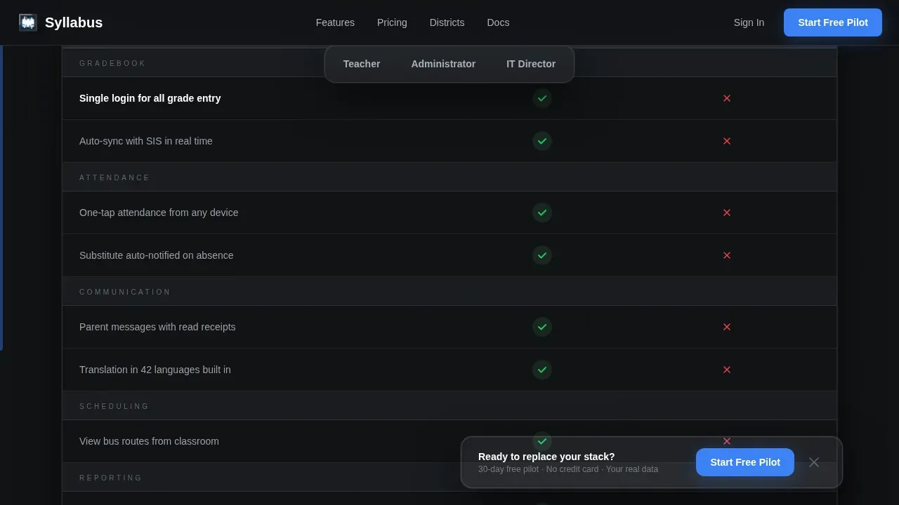
- The "typical district stack" column makes the cost of inaction visible, turning a feature list into a side-by-side argument that is hard to dismiss
- The three-step sign-up form removes every unnecessary barrier, so the path from landing on the page to starting a free pilot takes less than sixty seconds
What you get with this template
This template is a complete, production-ready landing page layout. Every section, component, and interaction described below is included in the template as delivered. The organized layout blends professional aesthetics with clear, structured information, creating a digital brochure experience that speaks directly to sophisticated educational buyers.
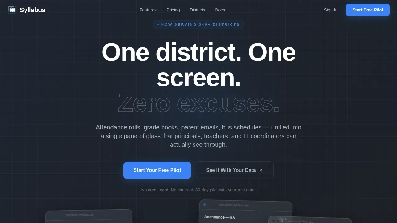
- A hero section with three parallax-drifting, frosted-glass user interface panels, a bold headline, and a primary call to action button
- A sticky persona-toggle navigation and animated comparison table with draw-on SVG checkmarks, a frosted implementation timeline breakout, a social proof section, a final conversion section with a progressive form, and a linear single-row footer
- A floating bottom bar that appears once visitors scroll past the first table section, keeping the call to action visible at every point in the scroll
Feature list
This landing page template is built around six core capabilities. Each one is designed to move a specific type of visitor one step closer to choosing to sign up and start a free pilot.
Persona-Toggle Feature Matrix
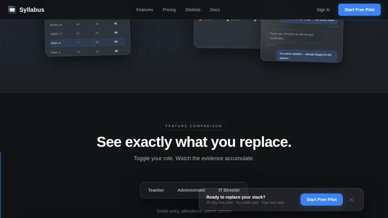
The comparison table is the heart of this landing page. A sticky horizontal navigation bar lets visitors toggle between three personas: Teacher, Administrator, and IT Director. When a visitor switches persona, the table reshapes its rows and emphasis accordingly. Each row pairs the platform's capability against the typical district stack, with micro-animations that draw checkmarks on the winning side and fade in red markers on the losing one. The scroll accumulates evidence row by row until the visual weight of green against red becomes its own argument. This approach reflects best practices for creating comparison pages: clear communication of key differentiators, user-centric design, and a layout that guides visitors toward a purchase decision.
Dark Glass Panel Hero
The hero section presents three translucent, frosted-glass rectangles floating against a deep gunmetal background. Each panel displays a live user interface fragment: a gradebook mid-entry, an attendance dashboard, and a parent-communication thread. The panels have a subtle parallax drift on scroll, with soft top-light that makes their edges glow. This grabs attention immediately and communicates the platform's value proposition before the visitor reads a single word of body copy. Placing a compelling visual above the fold ensures it is the first thing visitors see, creating a powerful first impression that keeps visitors engaged through the rest of the page.
Progressive Three-Step Pilot Form
The sign-up form is a three-step sequence. Step one asks for the school or district name. Step two presents a role selector: teacher, admin, or IT. Step three asks for a work email. No credit card language and no contract copy are visible anywhere near the form. This frictionless process reflects the principle that effective landing pages guide visitors down a clear path to a single action. The form is an essential part of the conversion architecture, and its progressive structure reduces perceived commitment at each step.
Floating Conversion Bar
Once a visitor scrolls past the first table section, a floating bottom bar appears and stays visible for the rest of the scroll. The bar carries the primary call to action: "Start Your Free Pilot." This ensures the sign-up prompt is always within reach, no matter how deep into the comparison a visitor goes. Multiple calls to action placed at the hero, after the table, and in the floating bar reflect the practice of using multiple ctas to serve visitors at different stages of their decision process.
Implementation Timeline Breakout
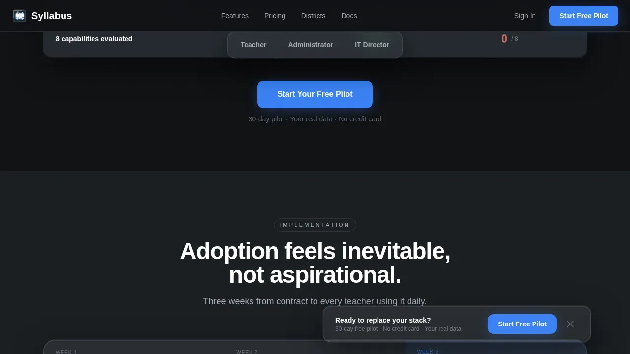
Midway through the page, a frosted-glass panel breaks out of the main table flow and displays a concrete onboarding schedule: Week 1 for roster import, Week 2 for teacher onboarding, and Week 3 for parent connection. This section answers the question every administrator asks before signing up: how long will this actually take? It makes the adoption process feel inevitable rather than aspirational, and it sets clear expectations that build trust before the visitor reaches the final call to action.
Role-Specific Social Proof Section
The social proof section presents testimonials and district adoption metrics organized by role. A technology director, an assistant principal, and a classroom teacher each provide a perspective that speaks directly to their counterpart reading the page. Highlighting user reviews on a comparison page provides additional credibility and helps potential buyers gauge overall satisfaction. Videos can significantly enhance this section; the template includes a layout slot for a short video testimonial above the metrics row, since using video on landing pages can increase conversions by up to 80%.
Page sections overview
| Section | Purpose |
|---|---|
| Hero Glass Panels | Grabs attention with three parallax user interface fragments and the primary call to action |
| Persona Toggle Nav | Lets visitors switch between Teacher, Admin, and IT Director views of the table |
| Comparison Feature Matrix | Compares platform capabilities against the typical district stack, row by animated row |
| Implementation Timeline Panel | Shows a three-week onboarding schedule to make adoption feel concrete and achievable |
| Social Proof Metrics | Displays role-specific testimonials and district adoption data to build trust |
| Final Conversion Section | Presents the progressive three-step form and the secondary demo path |
| Floating Bottom Bar | Keeps the sign-up call to action visible after the visitor scrolls past the first table |
| Single-Row Footer | Delivers quick access to links and legal text in a clean, minimal row |
Design & branding system
The visual identity follows a Tech Glass theme built on a Monochrome Steel color system. The palette feels precise, cool, and authoritative, like the inside of a well-funded district server room. Every color decision serves a functional role, and the minimalist design keeps focus on the comparison content rather than decorative elements. White space is used deliberately throughout, giving each section room to breathe and making the data in the comparison table easier to read at a glance.
- Core colors: deep gunmetal (#1B1F23) for primary backgrounds, brushed aluminum (#A8B0B8) for dividers and secondary text, frosted panel white (#E8EAED) for alternating section backgrounds, and signal blue (#3B82F6) reserved exclusively for interactive states and call to action buttons
- Typography: Manrope for all headings, DM Sans for all body text; both typefaces are clean, geometric, and highly legible at the sizes this page uses
- The dark mode palette is applied at the page level, with gunmetal as the default background and frosted white used for breakout panels; the page does not switch between light and dark mode but is designed as a dark mode experience throughout
Mobile & speed optimization
This template is designed desktop-first, reflecting the reality that district technology directors evaluate software on workstations. However, the layout is fully responsive, and every section adapts cleanly to tablet and mobile viewports. This matters because assistant principals and teachers often review tools on mobile devices, and mobile optimization is essential for educational landing pages to accommodate on-the-go evaluations.
- The persona toggle navigation collapses into a compact selector on smaller screens, keeping the comparison table accessible without horizontal scrolling
- The floating bottom bar and the three-step sign-up form are both touch-friendly, so a visitor on a phone can reach the sign-up point just as easily as one on a desktop
- Server Components handle all static sections to keep the page light; Client Components are scoped to the interactive table and the progressive form, so interactivity loads only where it is needed
How this template helps you convert
This landing page is built around a single, clear conversion goal: getting qualified district contacts to start a free pilot. Every structural decision serves that goal. Effective EdTech landing pages must instantly communicate value, establish credibility, and guide visitors toward meaningful action, and this template is organized to do exactly that from the first pixel to the footer.
- The hero section grabs attention with a visual that communicates platform value before any text is read, then delivers a direct call to action that invites visitors to sign up immediately; the persona toggle below it ensures that every visitor's learning journey through the page is relevant to their specific role, which keeps visitors engaged and reduces early exits.
- The comparison table transforms the landing page from a static brochure into a dynamic, evidence-accumulating experience; the animated checkmarks and row-by-row scroll build a case that is easier to feel than to argue against, and the implementation timeline breakout answers the adoption-risk objection before it can form.
- The final conversion section pairs the primary three-step form with a secondary "See It With Your Data" demo path, creating two conversion pathways for visitors at different stages of their buying journey; this reflects the best practice of including multiple conversion pathways to serve visitors who are ready to sign up now and those who need one more proof point first.
Other information about this template
This template is built as part of the Syllabus platform's digital marketing presence and is optimized for the specific landing page strategy of driving free pilot sign-ups in the K-12 EdTech space. It is a dedicated landing page, not a homepage or a multi-page site, which means every element on the page is in service of a single outcome. The page can support multiple languages with straightforward text substitution, making it usable for districts in bilingual communities or for vendors serving markets beyond English-only audiences.
- The template is production-ready and includes all sections, components, animations, and form steps described in the brief; no additional development is required to launch a complete, functional landing page
- Customization options include color token swaps, typography substitution, persona label edits, and row-level content changes in the comparison table, so teams can adapt the page to their specific platform without rebuilding the layout
- The page is designed to surface in search results for district technology buyers who are already in evaluation mode; a clear page title, structured content hierarchy, and descriptive section headings help search engines understand the page's purpose and relevance
- The secondary conversion path, "See It With Your Data," allows prospects to upload a sample roster in CSV format and see the dashboard populate live; this feature collapses the imagination gap between browsing and buying, and it functions as a powerful trust signal for skeptical technology directors
- The template supports the inclusion of a short video in the social proof section; a 60-to-90-second platform walkthrough placed in that slot can demonstrate the solution in action and help visitors understand its benefits faster than text alone
- Success stories from real-role personas, district adoption metrics, and outcome-driven data are all built into the social proof section layout, giving teams a clear structure for adding authentic evidence without custom design work
- Free templates in this style often lack the depth and role-specific logic that district-level buyers expect; this template is purpose-built for that audience and includes the persona toggle, animated matrix, and progressive form that generic free templates do not offer
- AI tools can be used to generate role-specific testimonial copy, populate the comparison table with platform-specific feature descriptions, or draft the implementation timeline text, accelerating the process of customizing the page for a specific product
- The page's clean design and use of white space make it straightforward for search engines to parse, and the structured layout supports good performance in search results for K-12 EdTech evaluation queries
Theme
Tech Glass
Creative direction
Feature Matrix
Color system
Monochrome Steel
Style
Comparison Table
Direction
Freemium/Trial
Page Sections
Persona-toggle Comparison Matrix
Dark Glass Panel Hero Section
Progressive Three-step Pilot Form
Floating Conversion Bottom Bar
Implementation Timeline Breakout Panel
Role-specific Social Proof Section
Related questions
Who is the primary audience for this landing page template?
What sections does the template include?
Can I customize the comparison table rows and persona labels?
Does the template include the sign-up form and the floating bar?
Is this a single landing page or a full site template?



