Syllabus - Luminous Higher Education Landing Page Template
Syllabus is a bento grid landing page template built for higher education apps. It opens with a Tuition and Aid Calculator header, flows through an asymmetric Feature Matrix, and closes with a clear app download call to action. The Tech Glass visual identity uses a Teal Catalyst color system to create a luminous, campus-atrium feel that speaks directly to students, transfer applicants, and faculty.
by Rocket studio
Quick summary
Syllabus is a single-page bento grid landing page template designed for higher education apps and digital campus platforms. It leads with a Tuition and Aid Calculator, guides visitors through a scrolling Feature Matrix of capability tiles, and drives toward an app download. The Tech Glass design system gives every section a frosted, luminous quality that feels modern and trustworthy.
Who this template is for
This template is built for teams launching or promoting a higher education app. It works equally well for institutions showcasing a student portal and for independent developers marketing a campus productivity tool.
- First-generation college students who need clear, immediate answers about tuition costs and financial aid
- Adjunct professors and faculty managing course rosters across multiple departments
- Transfer students evaluating which credits count toward a degree
What problem this template solves
Navigating higher education systems is genuinely overwhelming. Students toggle between multiple financial aid portals, faculty juggle fragmented roster tools, and no one surface brings deadlines, costs, and academic progress into one clear view. This template solves that communication gap at the landing page level.
- Visitors land without context and leave before understanding the app's value
- Abstract tuition numbers create anxiety instead of confidence
- Feature-rich apps appear complicated when presented without visual hierarchy
What you get with this template
You get a fully structured bento grid landing page with distinct, purpose-built sections ready to customize. The layout is asymmetric by design, with double-wide tiles reserved for critical features and smaller utility cells grouped for rhythm.
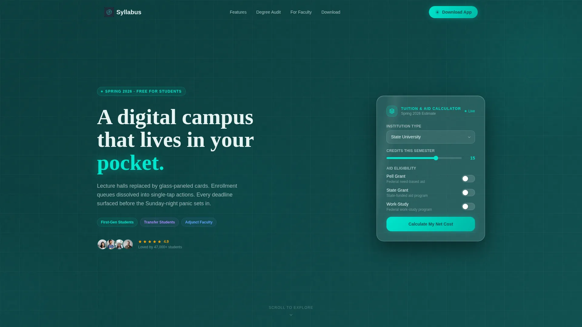
- A Tuition and Aid Calculator header card with institution type selector, credit input, and grant toggle
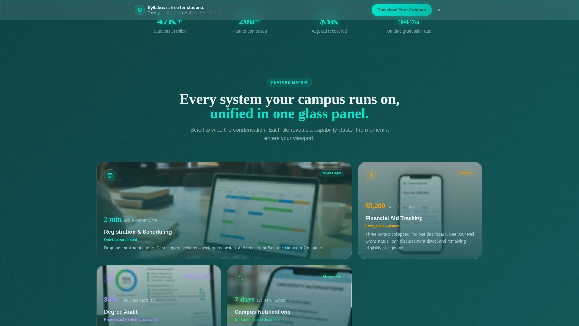
- An asymmetric Feature Matrix with frosted-to-clear scroll transitions revealing in-app screenshots
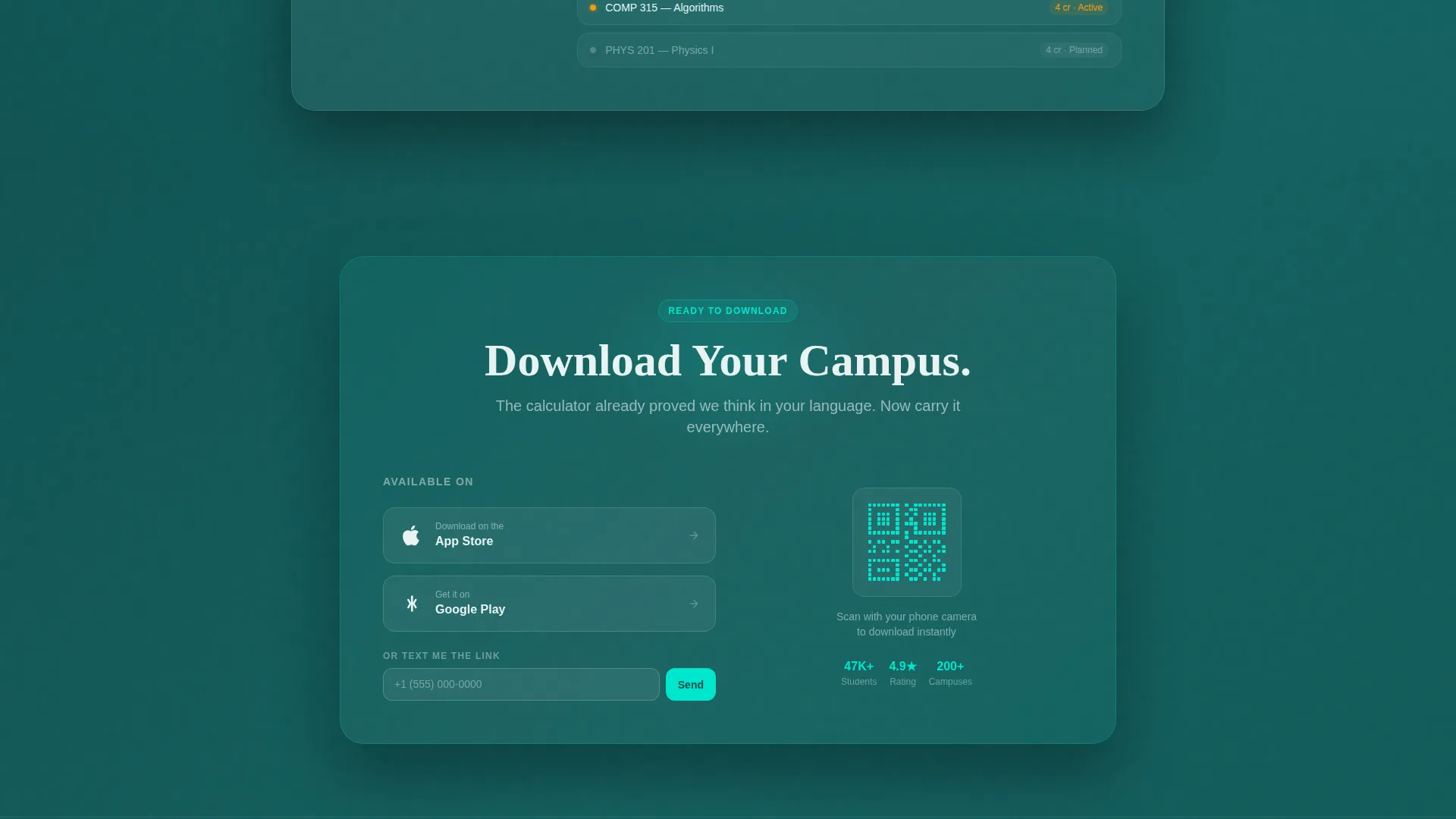
- A persistent app download bottom bar, a QR code block, and a "Text Me the Link" phone-number field
Feature list
This section covers the core functional building blocks delivered inside the template layout.
Tuition and Aid Calculator Header
Visitors select institution type (community college, state university, or private), enter expected credits, and toggle grant eligibility. The card returns an estimated semester cost, a potential aid offset, and a net figure. The result appears before the first scroll, giving the page immediate, personal utility.
Asymmetric Bento Grid Layout
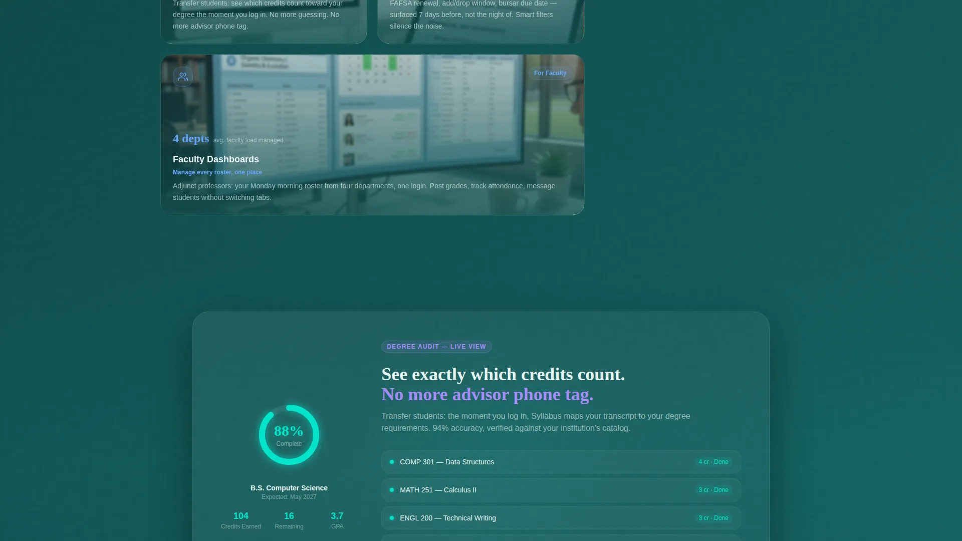
The Feature Matrix uses variably sized cells to create visual hierarchy. Critical capability clusters such as Registration and Scheduling, Financial Aid Tracking, Degree Audit, Campus Notifications, and Faculty Dashboards occupy double-wide tiles. Smaller utility features cluster together, and a full-width cinematic tile breaks the grid at a key moment.
Frosted-to-Clear Scroll Transitions
As visitors scroll through the bento grid, each tile transitions from frosted-opaque to fully transparent, exposing interface screenshots beneath. The effect mirrors wiping condensation off glass. It creates a sense of discovery and keeps scroll momentum high.
Multi-Path App Download Section
The primary call to action, "Download Your Campus," appears first inside the calculator result card and again as a persistent bottom bar after the third bento row. A QR code serves desktop visitors while the "Text Me the Link" field captures mobile intent with only a phone number required.
Cinematic Full-Width Feature Tile
A single full-width tile interrupts the bento rhythm to showcase one in-app moment: a student's degree-completion progress ring reaching 100 percent. This tile acts as an emotional proof point, making abstract feature lists feel real and motivating.
Page sections overview
| Section | Purpose |
|---|---|
| Calculator Header Card | Show tuition cost estimate before first scroll |
| Institution Type Selector | Filter results by college or university type |
| Credit and Grant Toggle | Personalize aid offset and net cost figure |
| Calculator Result Display | Surface semester cost, aid, and net number |
| Feature Matrix Grid | Present capability clusters in bento tiles |
| Registration Scheduling Tile | Highlight course registration and scheduling tools |
| Financial Aid Tracking Tile | Showcase aid status and deadline visibility |
| Degree Audit Tile | Display credit progress toward graduation |
| Campus Notifications Tile | Surface alerts, deadlines, and campus updates |
| Faculty Dashboards Tile | Show roster and department management tools |
| Cinematic Progress Tile | Display degree-completion ring hitting 100 percent |
| Primary Download call to action | Prompt app download from calculator result context |
| Persistent Bottom Bar | Reinforce download action after third bento row |
| QR Code Block | Serve desktop visitors with a scannable download link |
| Text Link Field | Capture mobile intent via phone number only |
Design & branding system
The visual identity follows a Tech Glass theme built on the Teal Catalyst color system. Every color decision references the feel of looking through a tinted campus atrium skylight: cool, translucent layers over dark structural frames with an electric teal accent pulsing at interactive moments.
- Deep lecture-hall teal (#0D4F4F) for primary backgrounds and structural framing
- Frosted glass panel (#E8F4F3) for card surfaces and bento tile fills
- Phosphor highlight (#00E5CC) for interactive states, progress indicators, and hover cues
- Chalkboard charcoal (#1A1A2E) for body text and supporting user interface elements
Mobile & speed optimization
The layout is built with mobile intent at its core. The "Text Me the Link" conversion path exists precisely because many target users, including first-generation students, are most likely to encounter this page on a phone rather than a desktop.
- Bento grid cells restack cleanly for narrow viewports without losing visual hierarchy
- The persistent bottom bar remains accessible on scroll for thumb-friendly tap targets
- The QR code block is conditionally relevant for desktop visitors and does not clutter mobile views
How this template helps you convert
The page earns trust before it asks for action. By demonstrating real utility through the calculator, the template makes the download feel like a logical next step rather than a cold request.
- The calculator delivers a personal tuition estimate immediately, anchoring the visitor's attention with a number that matters to them before any feature is mentioned
- The frosted-to-clear scroll animation builds progressive curiosity, revealing app screenshots naturally as visitors move down the page
- The "Download Your Campus" call to action appears twice in high-intent moments, with a low-friction fallback path through the "Text Me the Link" field for visitors not ready to tap immediately
Other information about this template
This template sits at the intersection of higher education digital presence and app marketing. It is categorized under Technology and is specifically designed for higher education website template use cases.
- The template style is a bento grid, a layout pattern well-suited to showcasing multiple app capabilities without overwhelming visitors
- The header concept is a Calculator or Estimator, which is particularly effective in education contexts where cost transparency directly reduces friction
- The creative direction is a Feature Matrix, meaning capability clusters are the scroll driver rather than testimonials or pricing tables
- The landing page direction targets app download as the single primary conversion goal
- The theme is Tech Glass, a visual language that communicates modernity, clarity, and digital-first institutional design
- This template is well-matched to higher education digital presence campaigns where both student-facing and faculty-facing value must be communicated on a single page
Theme
Tech Glass
Creative direction
Feature Matrix
Color system
Teal Catalyst
Style
Bento Grid
Direction
App Download
Page Sections
Tuition and Aid Calculator
Asymmetric Bento Grid Feature Matrix
Frosted-to-clear Scroll Reveal
Cinematic Full-width Progress Tile
Multi-path App Download Conversion
Related questions
Can I customize the calculator inputs for my institution?
Does this template work well for a mobile audience?
How many feature sections does the bento grid include?
Is this template suitable for a university marketing team?
What is the primary call to action on this landing page?



