Architecture Firm Software Professional Website Template
Syllabus is a hub-and-spoke landing page template built for architecture firm learning management platforms. It combines a dark Data Command visual identity with five interactive spoke sections, letting visitors explore onboarding, licensure tracking, course building, team analytics, and integrations before committing. The design is built to earn the click, not demand it.
by Rocket studio
Quick summary
Syllabus is a single-page, anchor-nav landing page template designed for architecture firm learning management software. It uses a dark mission-control aesthetic, five interactive spoke sections, and a click-through strategy that lets visitors touch the product multiple times before they ever see a call to action.
Who this template is for
This template speaks directly to the people managing professional development inside architecture firms. It is built for teams where education is tied to licensure, compliance, and firm growth.
- Learning and development directors at mid-size architecture firms managing onboarding and continuing education programs
- Studio leads and firm principals who need real-time visibility into team certifications and exam progress
- Partners overseeing license renewal cycles and mandatory continuing education hour requirements
What problem this template solves
Architecture firms struggle to track professional development across multiple credential paths at once. Revit certification tracks, LEED accreditation modules, and Architect Registration Examination (ARE) 5.0 divisions all run on different schedules with different stakeholders watching.
- No single view connects onboarding progress, licensure status, and course completion for the whole team
- Visitors to an LMS platform page often leave before understanding the product because they read about it instead of using it
- Generic SaaS landing pages fail to communicate the operational depth that firm principals and learning directors actually need
What you get with this template
You get a fully structured, dark-themed landing page that positions an architecture LMS as a live command center rather than a software brochure. Every section is designed to demonstrate capability, not just describe it.
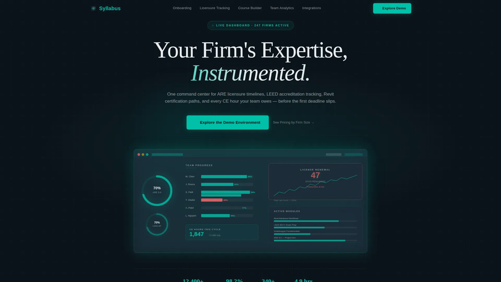
- A dark full-bleed header with a glowing teal wireframe dashboard, progress rings, a licensure countdown timer, and a staggered team roster
- Five anchor-nav spoke sections, each containing an interactive explorer component that lets visitors manipulate a feature before clicking through
- Repeating primary and secondary calls to action placed after each spoke, guiding visitors toward a demo environment without a form
Feature list
This section covers the core capabilities built into the Syllabus template and what each one delivers for the visitor experience.
Dark Full-Bleed Command Header
The header fills the entire viewport with a deep mission-control black background. From it, a glowing teal wireframe dashboard materializes, showing progress rings mid-fill, a licensure countdown timer, and module completion bars staggered across a team roster. The interface itself is the hero, and it looks like it is already running.
Fixed Anchor Navigation with Five Spokes
A fixed top navigation bar carries five labeled spokes: Onboarding, Licensure Tracking, Course Builder, Team Analytics, and Integrations. Clicking any spoke smooth-scrolls to that section's interactive explorer. The nav stays visible the entire time, giving visitors a clear map of the product without ever leaving the page.
Interactive Spoke Explorer Sections
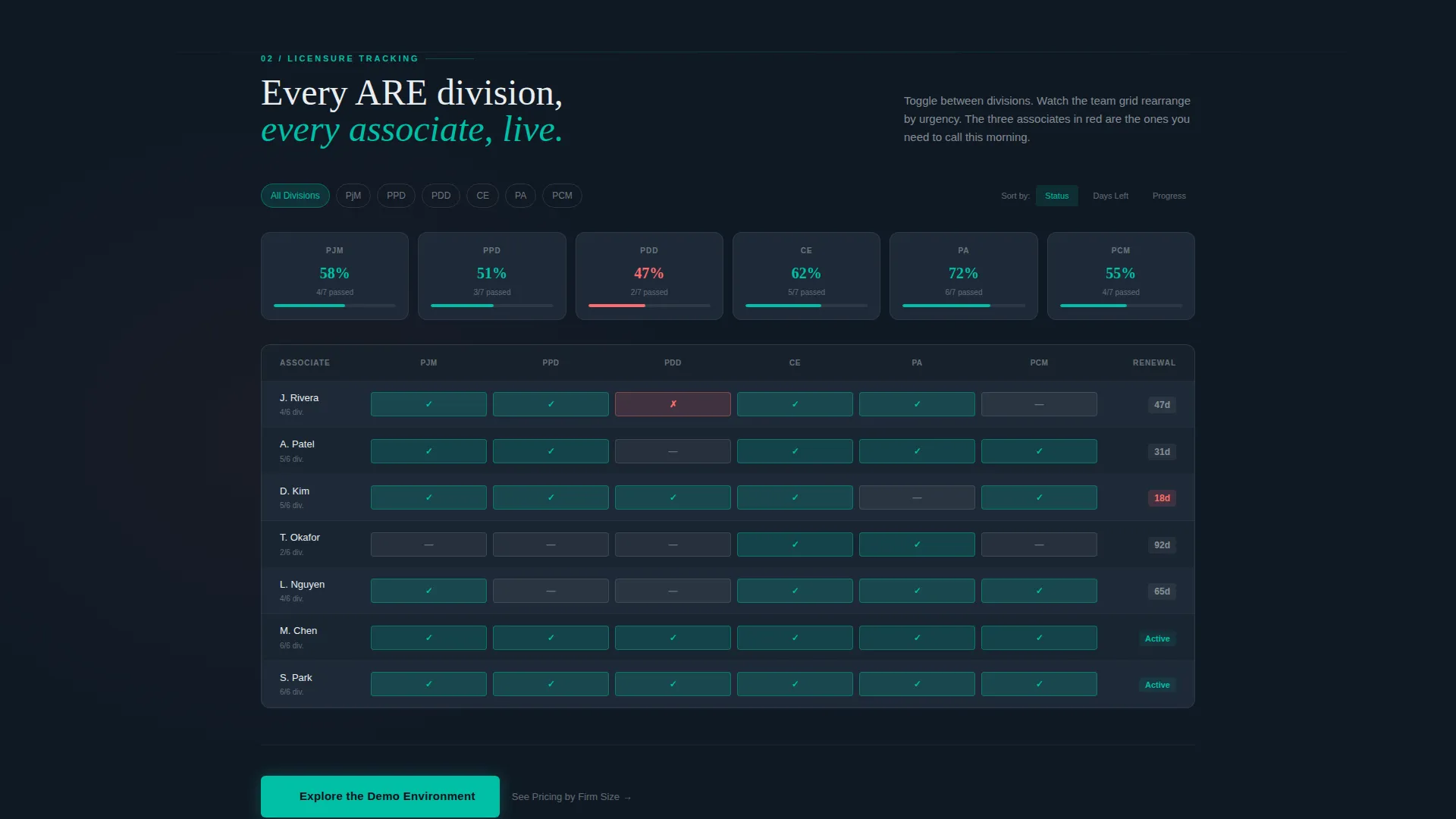
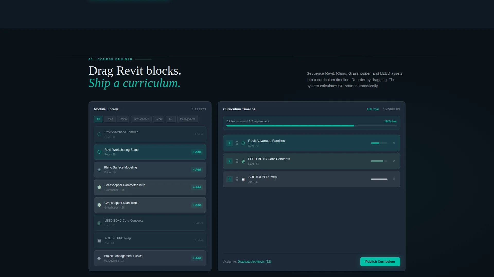
Each spoke section lets visitors interact with the feature directly. The Licensure Tracking spoke lets users toggle between ARE 5.0 divisions and watch sample team pass rates rearrange. The Course Builder spoke displays a drag-and-drop module sequencer where Revit, Rhino, and Grasshopper assets snap into a curriculum timeline.
Repeating Click-Through Call to Action
The primary call to action, "Explore the Demo Environment," appears after the second spoke and repeats at every spoke landing. It is always rendered in teal on dark, always positioned as the natural next step. A secondary text link, "See Pricing by Firm Size," sits below each primary call to action for visitors already past the discovery phase.
Teal Catalyst Color System
The color system uses deep mission-control black for backgrounds, primary teal as the live-data indicator color, cool slate for card surfaces, and catalyst white for typography and data labels. Accent coral appears only on alerts, overdue flags, and hover states, so every color in the palette carries information rather than decoration.
Licensure Tracking Toggle Component
The Licensure Tracking spoke includes a dedicated toggle that switches between ARE 5.0 division views. Visitors can watch a sample team's pass rates rearrange in real time. This interaction builds confidence in the platform's tracking capability before any account is created.
Page sections overview
| Section | Purpose |
|---|---|
| Dark Command Header | Establishes the Data Command visual identity and presents the LMS interface as a live, already-running system |
| Fixed Anchor Nav | Gives visitors instant access to all five product spokes from any scroll position |
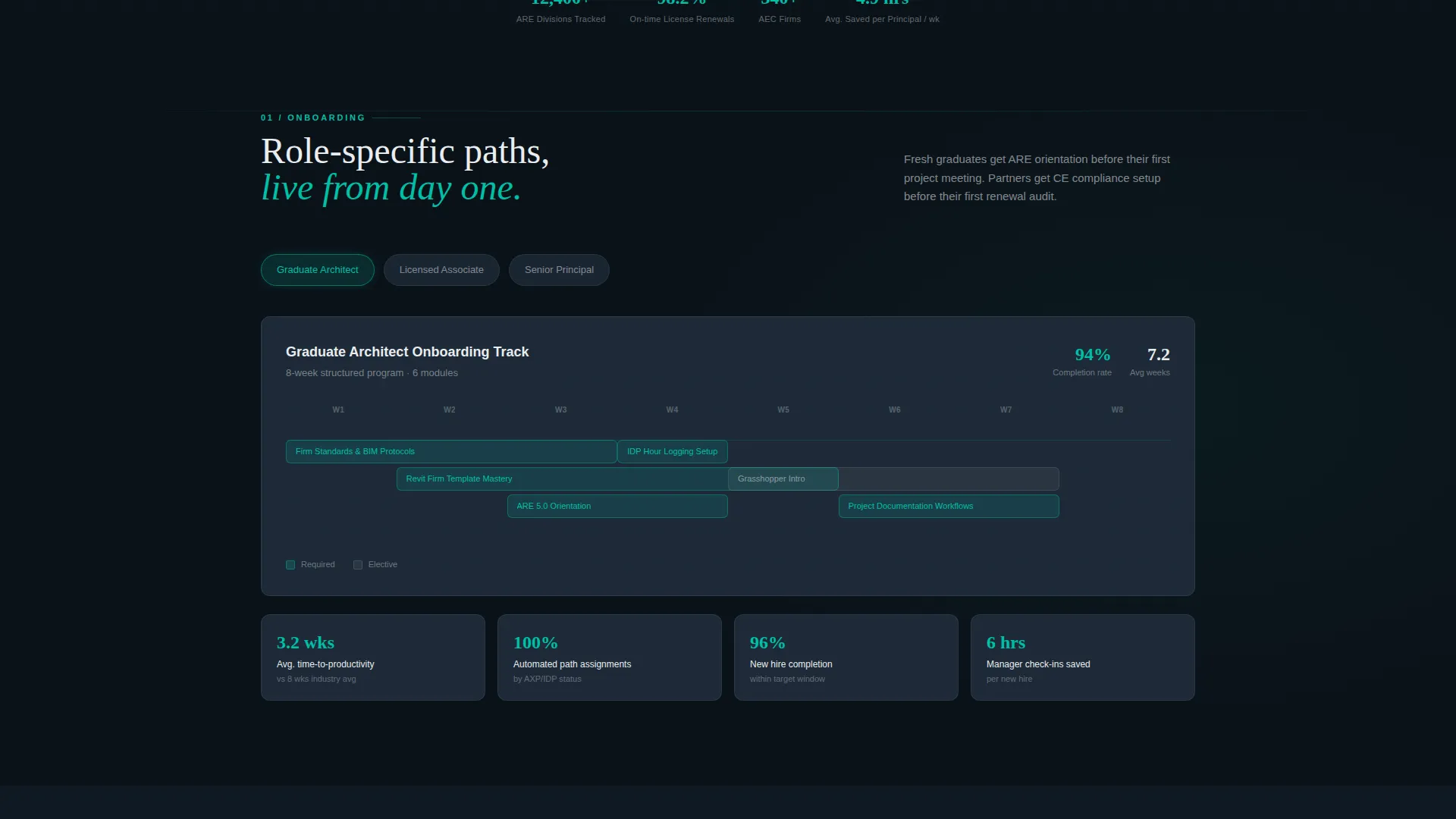
| Onboarding Spoke | Lets visitors explore how the platform handles new graduate onboarding flows |
| Licensure Tracking Spoke | Shows ARE 5.0 division toggles and sample team pass-rate views |
| Course Builder Spoke | Demonstrates the drag-and-drop module sequencer with architecture-specific assets |
| Team Analytics Spoke | Presents real-time team progress data in a dashboard-style explorer |
| Integrations Spoke | Covers how the platform connects with existing firm tools and workflows |
| Repeating call to action Blocks | Drives clicks to the demo environment after each spoke without using a form |
Design & branding system
The Teal Catalyst color system is built around the idea that every color must earn its place by carrying information. The palette feels like a network operations center, dark enough that the data glows.
- Core palette: deep mission-control black (#0B1219) for backgrounds, primary teal (#00BFA6) for live indicators and calls to action, cool slate (#1E2A38) for card surfaces, and catalyst white (#E8EDEF) for body text and data labels
- Accent coral (#FF6B6B) is reserved strictly for alerts, overdue flags, and hover states that demand immediate attention
- The header wireframe glow, pulsing progress rings, and staggered module bars all reinforce the Data Command theme visually
Mobile & speed optimization
The template is structured for responsive display across screen sizes, keeping the command-center aesthetic intact on smaller viewports. The fixed anchor nav and spoke layout adapt without losing navigational clarity.
- Interactive spoke components and the glowing header wireframe are designed to remain legible and functional on mobile screen widths
- The repeating call-to-action blocks are positioned at natural scroll pause points, making them easy to tap on touch devices
How this template helps you convert
The Syllabus template is built around a deliberate click-through strategy. Instead of front-loading a form, it lets visitors build familiarity and trust through repeated product interaction across six touchpoints before asking them to act.
- Visitors interact with five spoke explorer sections before the primary call to action ever feels like a commitment, making the click feel like a continuation rather than a decision
- The secondary text link "See Pricing by Firm Size" below each call to action captures visitors who are already in evaluation mode, giving them a direct path without disrupting the primary conversion flow
Other information about this template
This template is part of the Hub and Spoke anchor-nav template style family, which is well suited to SaaS platforms with multiple distinct feature areas. A few additional details worth knowing before you build with it.
- The template is categorized under Technology and the Architecture Firm Software subcategory, with a niche focus on Architecture Firm Learning Management systems
- The Interactive Explorer creative direction means each spoke section is designed to be functional as a demo environment, not just a visual mockup
- The Data Command theme and Teal Catalyst color system are paired specifically to communicate operational depth to technical buyers like learning and development directors and firm principals
- The page is scoped as a single landing page with a click-through direction, meaning no lead-capture form is present and the primary goal is routing visitors to an external demo sandbox
Theme
Data Command
Creative direction
Interactive Explorer
Color system
Teal Catalyst
Style
Hub & Spoke (Anchor Nav)
Direction
Click-Through
Page Sections
Dark Full-bleed Command Header
Fixed Anchor Nav with Five Spokes
Interactive Spoke Explorer Sections
Repeating Click-through Call to Action
Teal Catalyst Color System
Licensure Tracking Toggle Component
Related questions
Who is the Syllabus template designed for?
Does this template include a contact form or sign-up form?
Can I customize the spoke sections for different LMS features?
What makes the header different from a standard hero section?
Is this template suited for firms outside architecture?



