Syllabus - Powerful Enrollment Landing Page Template
Syllabus is a scroll-reveal landing page template built for education follow-up email platforms. It opens with an interactive enrollment recovery estimator, then progressively reveals the anatomy of an automated follow-up sequence as visitors scroll. The design uses a Void and Violet color system to keep attention sharp and guide enrollment managers, outreach coordinators, and bootcamp founders toward a free-trial signup.
by Rocket studio
Quick summary
Syllabus is a single-page, scroll-reveal landing page template for an education follow-up email platform. It leads with a live enrollment estimator, unfolds an interactive sequence explorer section by section, and closes with a persistent call-to-action. The result is a focused, data-driven page that builds trust before asking for a commitment.
Who this template is for
This template is built for people who sell or operate automated email follow-up tools in the education space. It speaks directly to the people watching prospective students go quiet after initial contact.
- Enrollment managers at mid-tier private universities tracking yield rate decline
- Community college outreach coordinators managing multiple program tracks from a single inbox
- Bootcamp founders losing warm leads between brochure downloads and deposit submissions
What problem this template solves
Enrollment teams often have no clear way to show prospective students what comes next. The result is silent drop-off at every stage of the admissions cycle. A landing page for an education follow-up email platform needs to do more than describe features; it needs to prove the system works before anyone signs up.
- Visitors leave without understanding the value of automated follow-up sequences
- Enrollment loss feels abstract until it is quantified with real numbers
- Generic landing pages fail to show the logic behind email timing and segmentation
What you get with this template
This template gives you a complete, conversion-focused landing page built around progressive disclosure. Every section earns the next one, and the design system reinforces urgency without resorting to pressure tactics.
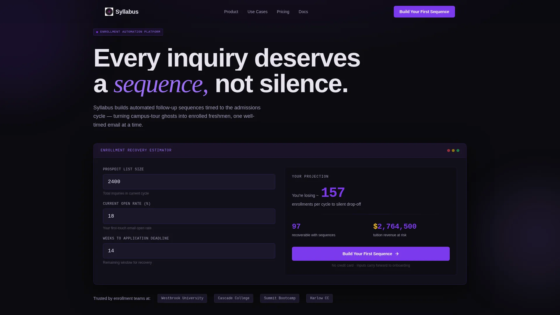
- An interactive enrollment recovery estimator in the header with real-time animated projections
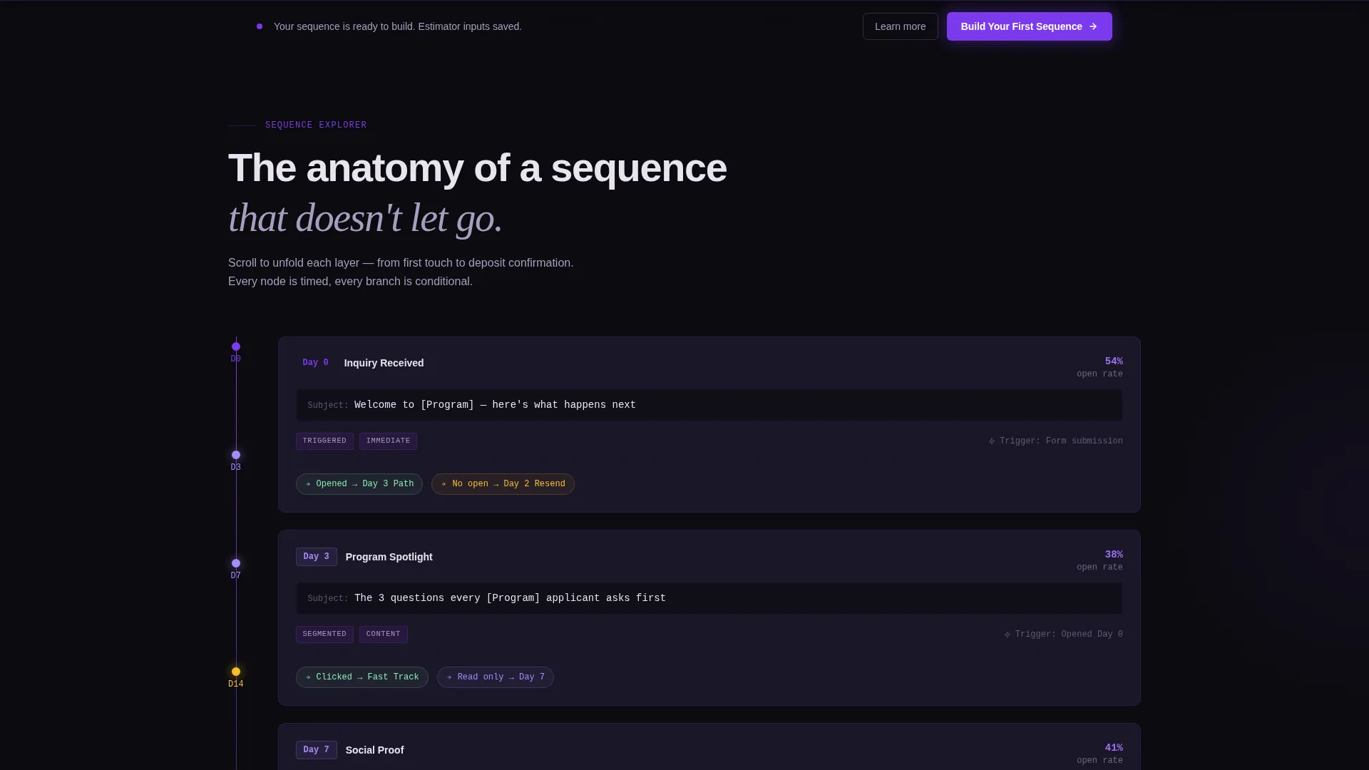
- A scroll-driven sequence explorer that reveals email cards, branching logic, and segmentation layer by layer
- A persistent bottom call-to-action bar that appears after the third scroll reveal and carries estimator inputs into the onboarding flow
Feature list
This template is built around a small set of high-impact interactive components. Each one serves a specific persuasion role in the page flow.
Interactive Enrollment Recovery Estimator
Visitors enter their current list size, average open rate, and application deadline. The estimator then animates a real-time projection of enrollment loss, rendering numbers in electric violet against void black as each digit ticks upward like a departures board.
Scroll-Reveal Sequence Explorer
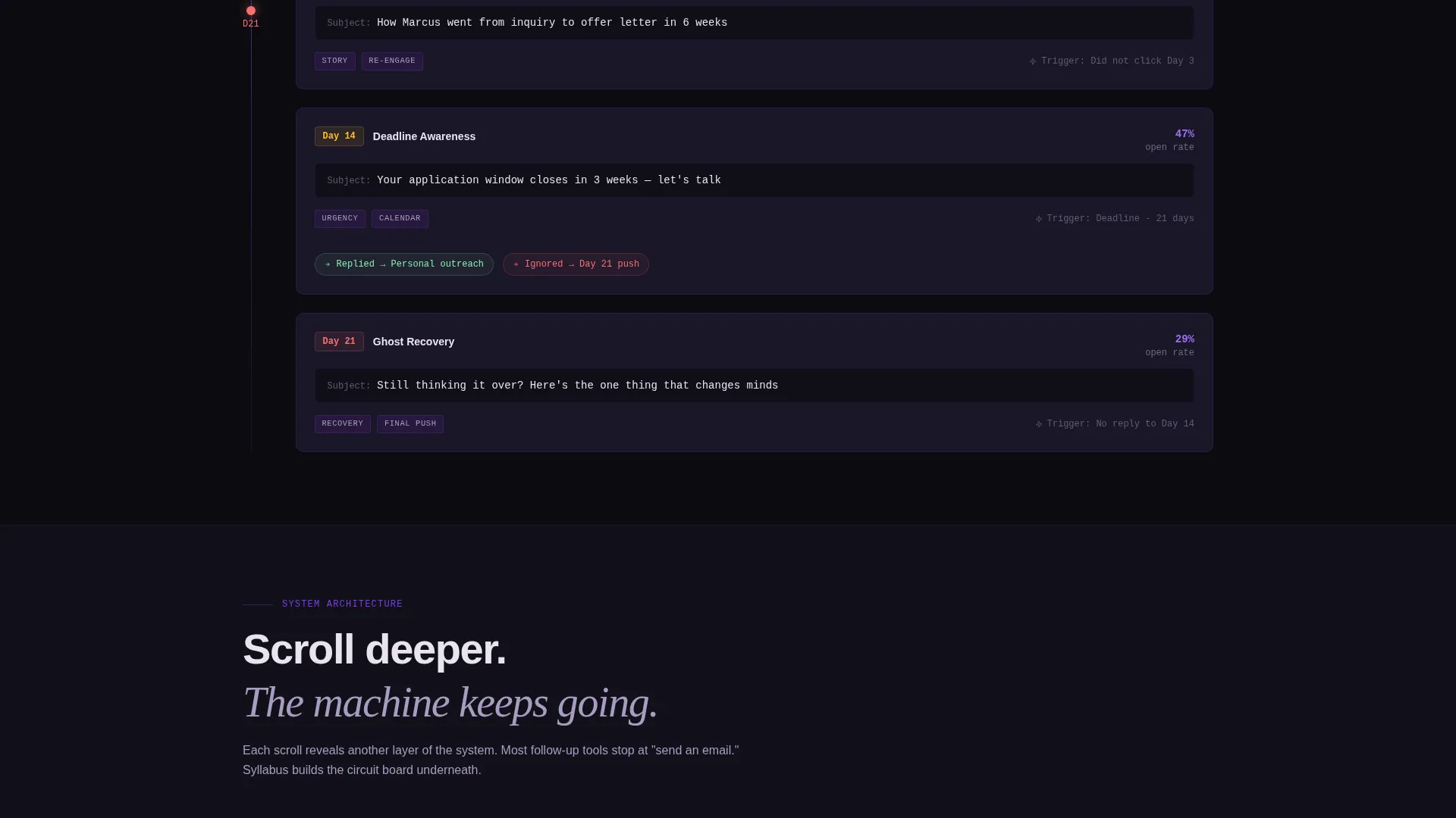
As visitors scroll, the anatomy of a follow-up email sequence unfolds one layer at a time. A timeline rail appears first, then email cards materialize at each node with subject lines, open-rate benchmarks, and branching logic paths that fork based on student behavior.
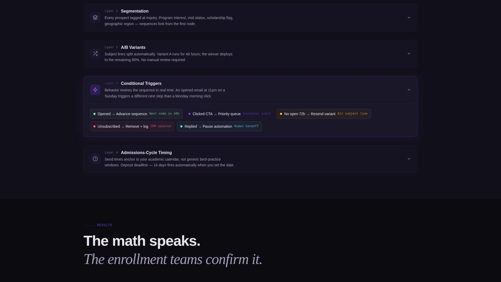
Progressive Segmentation Reveal
Each scroll increment exposes a deeper system layer. Segmentation tags surface, A/B test variants split apart, and conditional triggers illuminate. The experience mirrors zooming into a circuit board, with every scroll proving the system is more sophisticated than it appeared one moment before.
Persistent Call-to-Action Bar
After the third scroll reveal, a bottom bar locks into place with the primary call-to-action: "Build Your First Sequence." Its violet glow intensifies against the void background. No form appears on this page; the click carries the visitor's estimator inputs forward into a pre-personalized onboarding flow.
No-Photography Visual Strategy
The template avoids stock photography entirely. There are no smiling students, no campus shots. The visual language is pure data: stark numerics, sequence diagrams, and color-coded logic paths that communicate the math of missed opportunity directly.
Page sections overview
| Section | Purpose |
|---|---|
| Estimator Header | Quantifies enrollment loss with live animated projections |
| Sequence Timeline Rail | Reveals the day-by-day structure of a follow-up sequence |
| Email Card Nodes | Shows subject lines, benchmarks, and behavior-based branches |
| Segmentation Layer | Surfaces tags, A/B variants, and conditional triggers |
| Persistent call to action Bar | Locks in the signup prompt after the third scroll reveal |
Design & branding system
The visual identity follows a Directory and Discovery theme through a Void and Violet color system. The palette is described in the brief as feeling like a planetarium lecture hall: darkness that focuses attention, then sudden purple light tracing meaning across the space.
- Absolute void black (#0B0B0F) as the primary background, deep plum (#2E1A47) for section dividers and card surfaces
- Electric violet (#7C3AED) for interactive highlights, progress indicators, and the persistent call-to-action glow
- Soft chalk (#E8E4F0) for body text, keeping legibility high against the dark background
Mobile & speed optimization
The scroll-reveal structure and progressive animation approach are designed to work across screen sizes without cluttering the layout. The page remains skimmable on smaller viewports because each section is self-contained and reveals content incrementally.
- Each scroll-triggered layer is isolated, so content loads in visible increments rather than all at once
- The persistent call-to-action bar is designed for thumb-reach placement on mobile screens
- No photography assets means the page relies on vector-style data visuals and typography, keeping visual weight manageable
How this template helps you convert
Trust is built by showing the machinery before asking for the commitment. The page is structured so that by the time the call-to-action solidifies, the visitor has already mentally built half a sequence themselves.
- The estimator makes the cost of inaction personal and specific, turning an abstract yield problem into a number the visitor owns
- The scroll-reveal explorer demonstrates product sophistication without a single written feature claim, letting the interactive layers speak for themselves
- The pre-personalized trial flow removes friction at the moment of conversion: no form, no cold start, just a continuation of what the visitor already started in the estimator
Other information about this template
This template is categorized under Technology, with a subcategory of Education Email Templates and a niche focus on education follow-up email. It is built as a single scroll-reveal landing page with an Interactive Explorer creative direction and a Calculator and Estimator header concept. The page direction is click-through, meaning the primary goal is to move visitors to a free-trial signup without collecting form data on the page itself.
- The template style is Scroll Reveal (Progressive), meaning sections animate into view as the visitor scrolls rather than loading all at once
- The theme is Directory and Discovery, which informs the step-by-step sequence reveal and the sense that the visitor is uncovering a system layer by layer
- This template is well suited for founders or product teams building a landing page for an education follow-up email tool and needing a design that communicates both emotional urgency and technical credibility
Theme
Directory & Discovery
Creative direction
Interactive Explorer
Color system
Void & Violet
Style
Scroll Reveal (Progressive)
Direction
Click-Through
Page Sections
Interactive Enrollment Recovery Estimator
Scroll-reveal Sequence Explorer
Progressive Segmentation Display
Persistent Bottom Call-to-action Bar
Photography-free Visual Language
Related questions
Who is this landing page template designed for?
Does the estimator in the header require a backend connection?
Can I use this template without stock photography?
How does the persistent call-to-action bar work?
Is this template suitable for a single product or multiple offerings?



