AI for Higher Education Advanced Education Website Template
Syllabus is a higher education AI image generator landing page template built on a dark Data Command aesthetic. It features a logo bar header, a live comparison grid, before/after sliders, and use-case card flips. Designed for instructional designers, adjunct faculty, and provost-office teams, it makes the cost of the old workflow impossible to ignore.
by Rocket studio
Quick summary
Syllabus is a single-page dashboard landing page template for a higher education AI image generator. It opens with a scrolling institution logo bar, moves into a live side-by-side comparison grid, and escalates through sliders and use-case cards. The design follows a dark Data Command theme in Electric Indigo, built to convert educators who need publication-ready visuals fast.
Who this template is for
This template is purpose-built for teams operating inside higher education institutions. It speaks directly to people who produce course content at scale, under budget pressure, and on tight compliance deadlines.
- Instructional designers building online learning modules across multiple course sections
- Adjunct professors managing zero-dollar media budgets for four or more course sections
- Provost-office teams who need every visual asset brand-consistent and accessibility-compliant on a fixed deadline
What problem this template solves
Sourcing visual content for academic courses is slow, expensive, and legally fraught. Stock photo libraries charge per image, require copyright clearance, and rarely deliver discipline-specific accuracy. This template makes that pain visible row by row, so the visitor understands the problem before they even reach the call to action.
- Copyright clearance steps and watermark anxiety eat hours that educators do not have
- Generic stock imagery fails to meet accessibility overlay or brand-palette requirements
- No single workflow currently covers STEM diagrams, historical reconstructions, and multilingual captions together
What you get with this template
The template delivers a complete, single-page conversion flow designed around a comparison-first strategy. Every section is structured to stack evidence and reduce friction before the call to action appears.
- A scrolling logo bar with forty-plus university crests and learning management system platform marks rendered in monochrome indigo
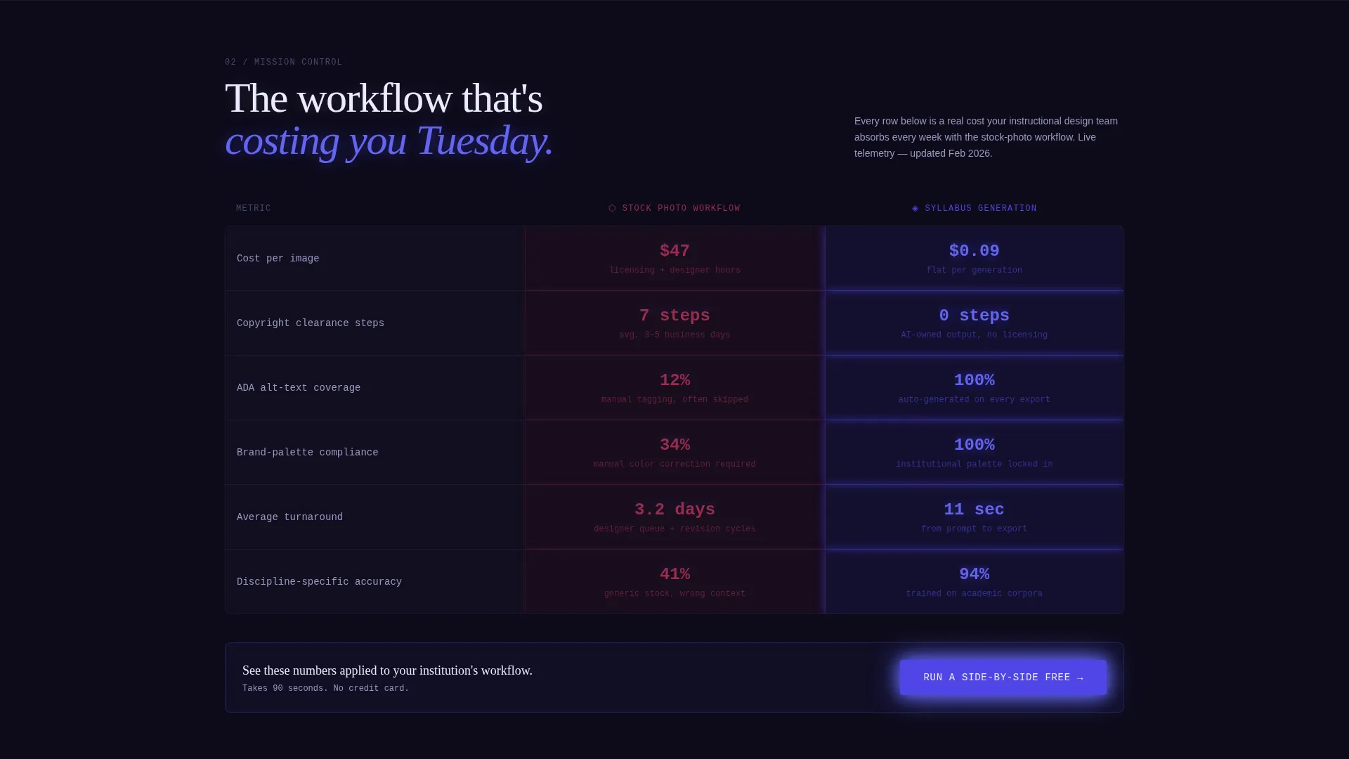
- A live comparison grid pitting the old stock-photo workflow against AI generation across five timed metrics, with animated telemetry-style number reveals
- A before/after image slider, six flipping use-case cards, and a sticky bottom call-to-action bar that persists after the second scroll
Feature list
A single paragraph introduces the feature set before the individual items are detailed below. This template is structured around six distinct capabilities, each tied directly to the conversion flow described in the source brief.
Scrolling Institution Logo Bar
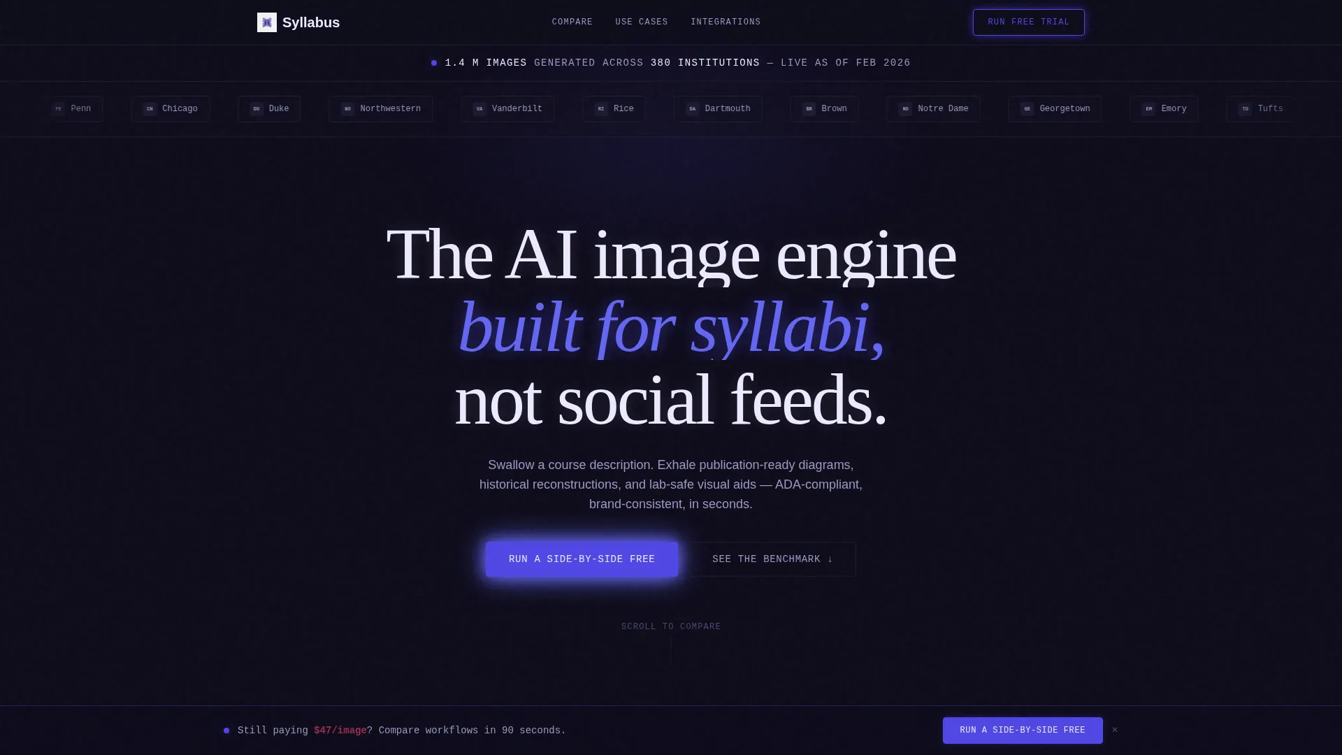
A slow-scrolling horizontal bar displays forty-plus university crests and learning management system marks in monochrome indigo on a terminal-black ground. A single stat sits above the bar and the primary headline sits below it, replacing a traditional hero image with institutional proof.
Live Comparison Grid
Two animated columns contrast the stock-photo workflow against AI generation across cost per image, copyright clearance steps, accessibility alt-text coverage, brand-palette compliance, and average turnaround time. Numbers animate in like mission-control telemetry. The primary call-to-action button is embedded directly inside the grid.
Before/After Visual Slider
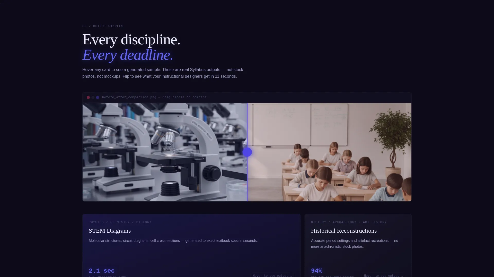
A horizontal drag slider lets visitors compare a generic stock classroom image against a generated discipline-specific visual. The interaction makes the quality difference tangible without requiring any explanation from the copy.
Six Flipping Use-Case Cards
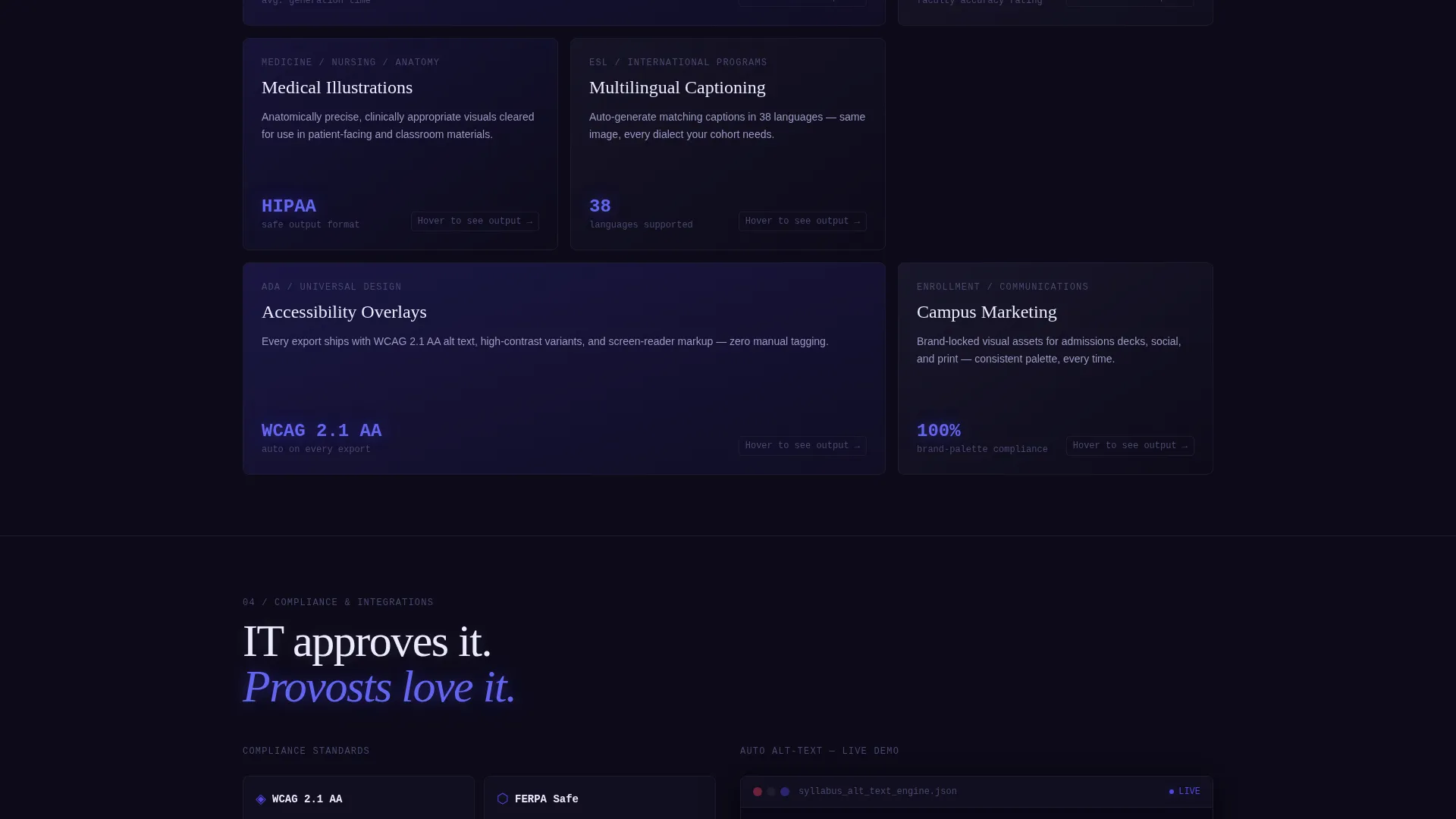
A card grid covers STEM diagrams, historical recreations, medical illustrations, multilingual captioning, campus marketing, and accessibility overlays. Each card flips on hover to reveal an output sample, giving visitors a practical preview of the tool's range.
Dual Conversion Path Design
The primary call to action, "Run a Side-by-Side Free," appears inside the comparison grid and repeats as a sticky bottom bar. A secondary path, "See the Full Benchmark Report," gates a downloadable PDF behind the same email capture, targeting visitors who need committee-ready evidence.
Two-Field Capture Form
Clicking either call-to-action path opens a focused form with just two fields: institutional email address and a dropdown for learning management system platform. The low-friction form is calibrated for institutional buyers who are already pre-qualified by the page content.
Page sections overview
| Section | Purpose |
|---|---|
| Stat + Headline | Opens with a single credibility stat and primary headline above the logo bar |
| Institution Logo Bar | Scrolling monochrome crests and platform marks replace a traditional hero image |
| Comparison Grid | Side-by-side animated metrics make the old workflow's cost immediately visible |
| Before/After Slider | Drag-interactive visual contrast between stock and AI-generated imagery |
| Use-Case Card Grid | Six flipping cards cover the tool's full discipline range with output samples |
| Sticky call to action Bar | Persistent bottom bar repeats the primary call to action after the second scroll |
| Email Capture Form | Two-field form collects institutional email and learning management system choice |
Design & branding system
The visual identity follows a Data Command theme inspired by a university IT lab running late at night. Every color decision reinforces clinical precision over decorative warmth, which directly supports the institutional audience's trust expectations.
- Deep terminal black (#0D0B1A) as the page background, cool-gray panel borders (#1E1B2E) framing grid cells like integrated development environment window chrome
- Electric indigo (#4F46E5) pulsing across active states, data highlights, and the right column of the comparison grid, while the left column glows in dull red (#6B2138)
- Phosphor white (#ECEAFF) for all body text, reading as a faint glow against the dark ground and reinforcing the monitor-screen aesthetic throughout
Mobile & speed optimization
The template's layout is designed to translate the data-grid aesthetic cleanly across screen sizes. Compact section flow and a sticky call-to-action bar ensure the conversion path works on smaller displays without losing the comparison-first logic.
- The sticky bottom bar persists across scroll depth on mobile, keeping the primary call to action reachable at any point
- The comparison grid and card flip interactions are structured to remain readable and functional at reduced viewport widths
How this template helps you convert
This template is built around a single idea: make the cost of not switching visible before asking for the click. Every section is designed to add a new reason to act, not simply repeat the same appeal.
- The comparison grid quantifies the old workflow's friction row by row, so the call to action arrives when the visitor is already convinced rather than still skeptical.
- The dual conversion path captures both trial-ready visitors and committee-driven buyers in the same page flow, increasing total lead volume without requiring a second page.
Other information about this template
This template is a strong fit for teams evaluating AI image generation tools for learning management system environments. It is designed to work across institutional procurement contexts where evidence and compliance matter as much as the product itself.
- The template's logo bar is sized to accommodate platform marks from widely used learning management systems including Canvas, Blackboard, Moodle, and D2L
- The downloadable benchmark report path is specifically designed for procurement and committee review cycles common in higher education buying processes
- The Electric Indigo color system and Data Command theme make this template visually distinct from generic software as a service landing pages, helping it stand out in an institutional context
Theme
Data Command
Creative direction
Launch Energy
Color system
Electric Indigo
Style
Dashboard/Data Grid
Direction
Comparison/Versus
Page Sections
Scrolling Institution Logo Bar
Live Animated Comparison Grid
Before/after Image Slider
Six Flipping Use-case Cards
Dual Conversion Path
Two-field Institutional Capture Form
Related questions
Who is this landing page template designed for?
What sections are included in this template?
Can I customize the color system and branding?
What are the two conversion paths in this template?
Does this template require a hero image?



