Syllabus - Powerful LMS Landing Page Template
Syllabus is a bento grid landing page template for education learning management platforms. It pairs an interactive dashboard hero with a Problem→Solution scroll arc, moving visitors from felt frustration to clear resolution. Built on a dark Electric Indigo palette, it targets university departments, corporate training teams, and K-12 coaches who need a single command center for every course interaction.
by Rocket studio
Quick summary
Syllabus is a single-page, bento grid landing page template designed for learning management system (LMS) platforms. It opens with a fully interactive dashboard preview, walks visitors through a Problem→Solution Arc, and closes with a sticky call-to-action bar. The dark Dashboard Pro theme and Electric Indigo color system make it feel purposeful, focused, and distinctly modern.
Who this template is for
This template is built for teams and founders who need to sell an LMS platform to an audience that already lives inside too many disconnected tools. It speaks directly to the people who feel that pain every morning.
- Department heads at mid-size universities managing five separate tools for grading, content, and communication
- Corporate Learning and Development (L&D) managers onboarding large cohorts of new hires each quarter
- K-12 instructional coaches tracking whether teachers have completed assigned training modules on time
What problem this template solves
Most LMS marketing pages describe features. This template recreates the feeling of the problem first, then resolves it visually. That emotional sequence is what makes a visitor stop scrolling and start clicking.
- Scattered course materials, disconnected gradebooks, and high-volume student email threads make instructors feel overwhelmed before the school day starts
- Generic software landing pages fail to show the product in action, leaving buyers uncertain about what they are actually getting
- Decision-makers at institutional scale need to see both individual instructor relief and district-wide reach before they commit to a pilot
What you get with this template
You get a complete, ready-to-customize bento grid landing page with a structured narrative arc baked into the scroll sequence. Every section serves a specific role in moving the visitor toward the primary call to action.
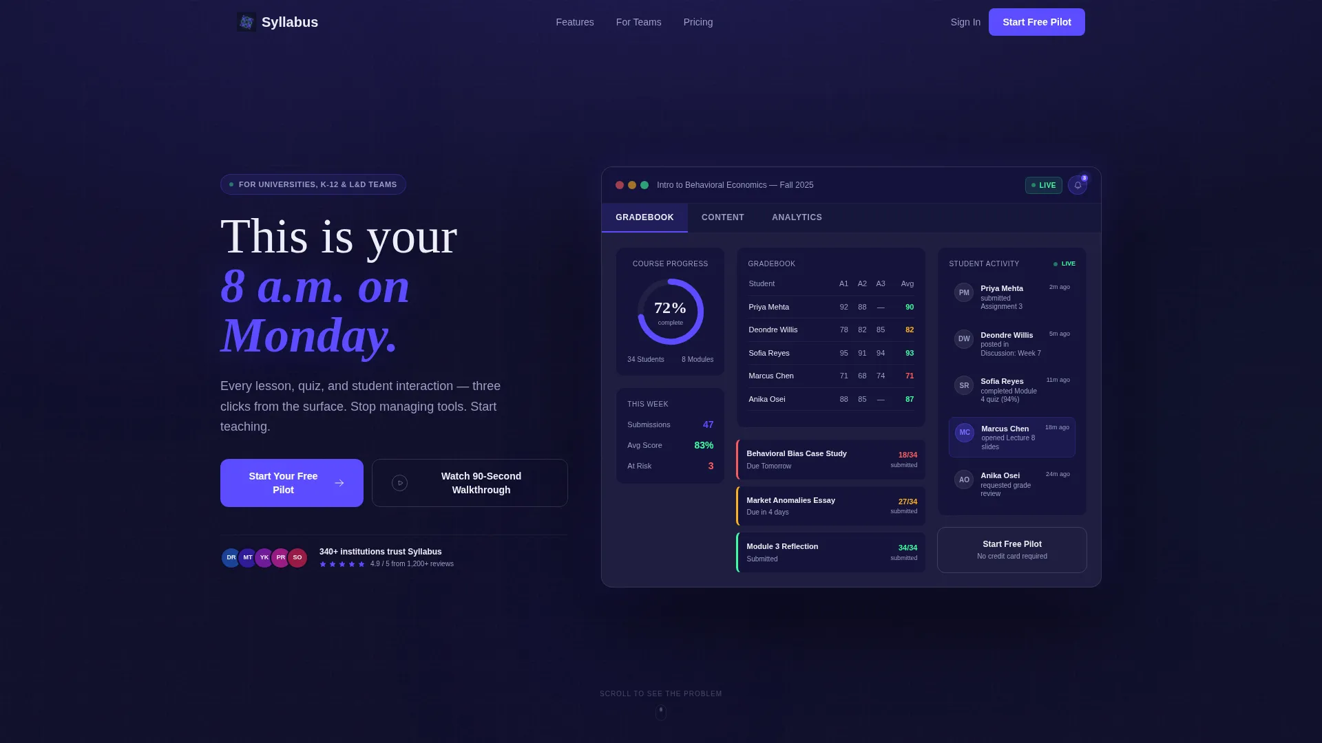
- An interactive hero dashboard mockup showing a live course, completion data, and clickable tab views for Gradebook, Content, and Analytics
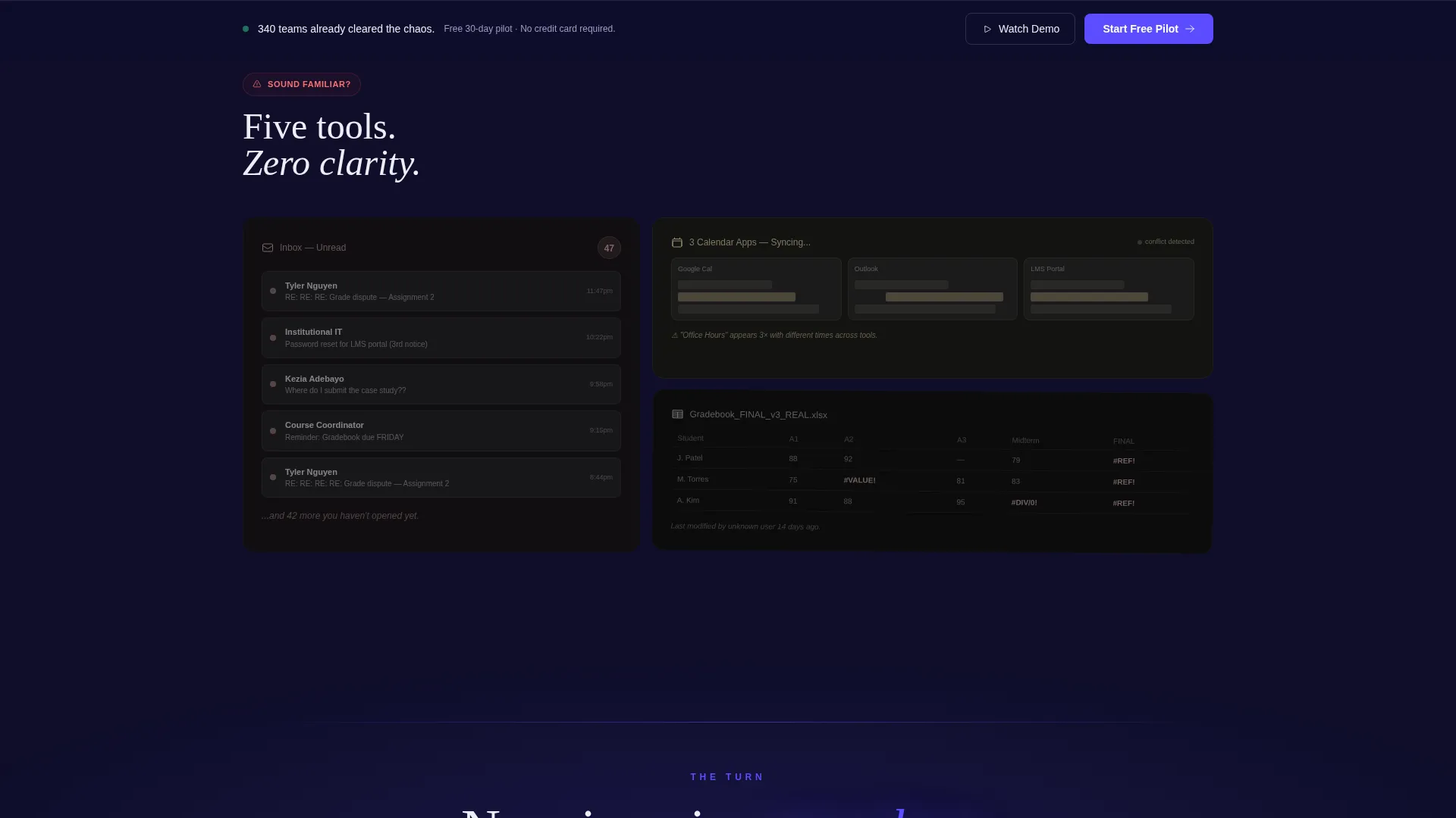
- A Problem→Solution transition sequence where desaturated broken-workflow cards snap into a fully saturated, aligned Electric Indigo grid as the visitor scrolls
- A sticky bottom call-to-action bar, secondary floating text-link calls to action beside every solution card, and a zero-form click-through flow to a dedicated signup page
Feature list
This template is built around six tightly scoped features. Each one supports the landing page's core goal: letting visitors experience the product before they ever sign up.
Interactive Hero Dashboard Preview
The hero section embeds a fully rendered, clickable dashboard mockup at full scale. It shows a real course in progress, "Intro to Behavioral Economics, Fall 2025," with a donut chart at 72% completion, a live student activity feed with names and timestamps, three assignment cards with color-coded due-date urgency, and a pulsing notification badge on a discussion thread. Visitors hover cards to see lift animations and click tabs to switch between views.
Problem→Solution Scroll Arc
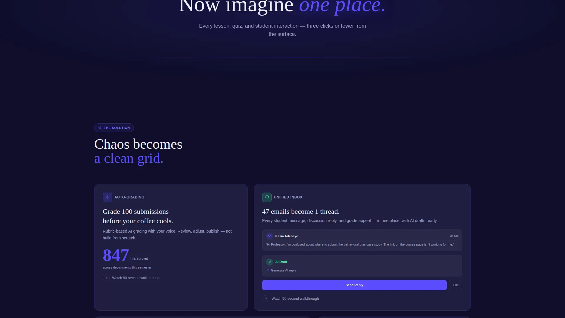
The scroll experience opens with a bento grid of broken workflows rendered in desaturated slate tones. Cards show "47 unread student emails," conflicting calendar tools, and a spreadsheet gradebook with a visible formula error. A single transition line, "Now imagine one place," triggers the grid to snap into alignment and saturate into the full Electric Indigo palette, turning the page's emotional tone in one visible moment.
Bento Grid Solution Cards
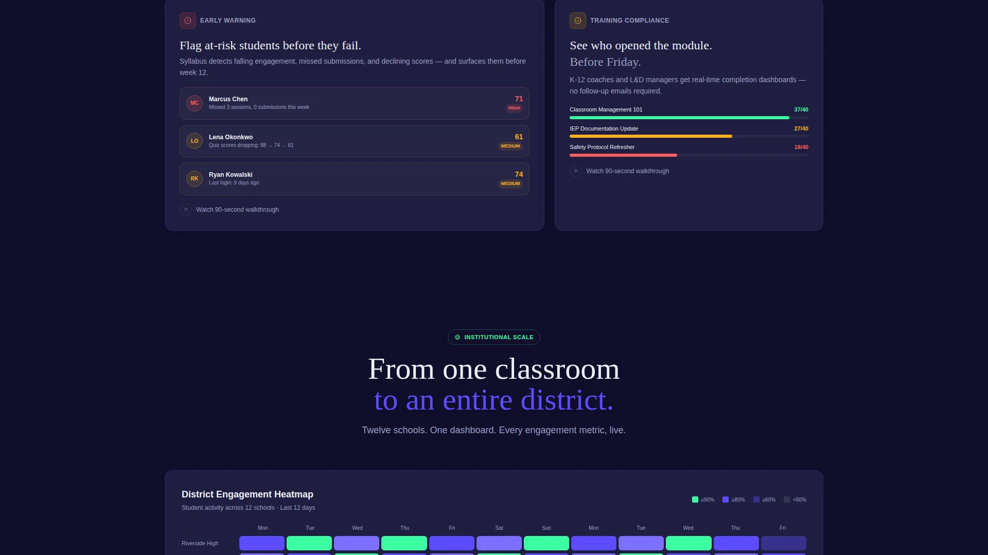
Every section below the transition is a solution card in the reorganized bento grid. Cards include an automated grading panel with a live time-saved counter, a unified inbox with AI-suggested reply indicators, and an analytics panel that flags at-risk students. The final card shows a district-wide engagement heatmap across twelve schools, giving institutional buyers a sense of the platform's full ceiling.
Sticky Bottom Call-to-Action Bar
The primary call to action, "Start Your Free Pilot," first appears as a ghost-outlined button inside the interactive hero. It then solidifies into a full indigo button after the problem-to-solution turn. A sticky bottom bar carrying the same call to action activates once the visitor scrolls past the page midpoint, keeping the action always one click away without interrupting the reading flow.
Secondary Floating call to action Links
A secondary call to action, "Watch the 90-Second Walkthrough," floats as a text link with a play icon beside every major solution card. This gives visitors who are not yet ready to start a pilot a low-commitment path to learn more. The two-call to action structure covers both high-intent and research-stage visitors on the same page.
Dashboard Pro Visual Theme
The template uses a cockpit-style dark workspace with every color serving a defined purpose. Deep workspace navy forms the background, electric indigo marks active states and primary buttons, cool slate surfaces cards and secondary panels, soft chalk handles body text and labels, and signal green appears only for completion states and success indicators.
Page sections overview
| Section | Purpose |
|---|---|
| Interactive Hero Preview | Opens with a clickable dashboard mockup grounding the visitor in a real use case |
| Broken Workflow Grid | Visualizes the pain state with desaturated, skewed problem cards before the transition |
| "Now Imagine" Transition | Single-line scroll trigger that reorients the grid and saturates the palette |
| Automated Grading Card | Shows time saved with a live counter, making the benefit concrete and measurable |
| Unified Inbox Card | Presents AI-suggested replies inside a single consolidated message view |
| At-Risk Analytics Card | Flags struggling students early with a dedicated analytics panel |
| District Heatmap Card | Scales the narrative to institutional reach across twelve schools |
| Sticky call to action Bar | Keeps the primary call to action visible after the visitor passes the page midpoint |
Design & branding system
The visual identity follows a Dashboard Pro theme built entirely around the Electric Indigo color system. The palette is intentionally tight, so every illuminated element carries weight and draws the eye for a reason.
- Background uses deep workspace navy (#0F0E2A), card surfaces use cool slate (#1E1E3F), and body text uses soft chalk (#EDEEF7) for clear contrast in a dark environment
- Electric indigo (#5B4CFF) drives active states, progress bars, and primary buttons, while signal green (#3DFFA2) is reserved exclusively for completion states and success indicators
- The overall aesthetic feels like a cockpit at altitude, dark and focused, with card lift animations and a pulsing notification badge adding subtle motion that keeps the interface feeling alive
Mobile & speed optimization
The bento grid layout is structured to adapt clearly across screen sizes, keeping the card-based narrative readable whether the visitor is on a large monitor or a smaller device.
- Card components are built to reflow naturally into single-column stacks on smaller screens, preserving the Problem→Solution Arc without breaking the visual sequence
- The interactive hero preview and sticky call to action bar are designed to remain functional and visible across device sizes, so the primary conversion path is never hidden on mobile
How this template helps you convert
This template is engineered around the principle that letting a visitor use the product is the strongest conversion argument available. Every design decision reinforces that idea.
- The interactive hero dashboard gives visitors a direct, hands-on preview of the platform experience before they read a single feature claim, building trust through action rather than description.
- The Problem→Solution Arc mirrors the visitor's own emotional state, moving from felt frustration to visible relief, so the call to action arrives at the exact moment the visitor is most ready to act.
- The zero-form click-through flow removes friction from the primary conversion path. The visitor clicks once, then chooses their institution type and class size on a dedicated signup page, keeping this landing page focused entirely on earning that first click.
Other information about this template
This template is a strong fit for LMS platform teams preparing for semester-start or onboarding-cycle launches, when decision-makers are most actively evaluating new tools. It is also well suited for product marketing teams running paid campaigns, since the single-page structure keeps all traffic focused on one clear action.
- The template is built as a single landing page, not a multi-page site, which keeps the conversion path direct and the message undiluted
- The bento grid layout makes it straightforward to swap in real platform data, replace mockup course names, or update card statistics to reflect current product capabilities
- The institution-type selector in the downstream signup flow (university, K-12, or corporate) is referenced in the template's call to action copy, so the page already primes visitors for that segmentation step
Theme
Dashboard Pro
Creative direction
Problem→Solution Arc
Color system
Electric Indigo
Style
Bento Grid
Direction
Click-Through
Page Sections
Interactive Hero Dashboard Preview
Problem to Solution Scroll Arc
Bento Grid Solution Cards
Sticky Bottom Call to Action Bar
Secondary Floating Walkthrough Links
Dashboard Pro Dark Theme
Related questions
Who is this landing page template designed for?
Does this template include the interactive dashboard as a built-in component?
Is there a form on this landing page?
Can I update the mockup data shown in the hero dashboard?
What makes the Problem→Solution Arc effective for LMS buyers?



