Syllabus - Powerful School Management Landing Page Template
Syllabus is a school and academy management landing page template built around a dark Tech Glass aesthetic and a scroll-driven comparison table layout. It targets private school administrators, academy founders, and charter network IT directors ready to move beyond spreadsheets and legacy tools. The template guides visitors from skepticism to sign-up through honest feature contrasts and a frictionless three-field trial form.
by Rocket studio
Quick summary
Syllabus is a single-page landing page template designed for school and academy management platforms. It uses a comparison table structure to show the gap between outdated manual processes and a modern all-in-one platform. The carbon-black Tech Glass visual style makes every detail feel intentional, and the progressive sign-up form removes every barrier between interest and action.
Who this template is for
This template is built for teams launching or marketing a school management platform. It speaks directly to the people inside educational institutions who feel the daily friction of disconnected tools.
- Private school administrators managing enrollment, attendance, and scheduling across multiple legacy systems
- Academy founders who still rely on spreadsheets and printed report cards to run daily operations
- IT directors at charter school networks tasked with consolidating fragmented platforms into one solution
What problem this template solves
Most school management platforms have a credibility problem before a visitor even reaches the pricing page. Administrators have been burned by over-promised "one platform" solutions before. This template addresses that skepticism head-on.
- Replaces vague feature lists with side-by-side comparison tables that show exactly what changes
- Removes conversion friction by using a three-field progressive form with no credit card required
- Guides three distinct audiences, administrators, parents, and students, through relevant feature sets as they scroll
What you get with this template
The template delivers a fully structured, single-page layout built for freemium and free-trial conversion. Every section is designed to earn the next click before asking for a commitment.
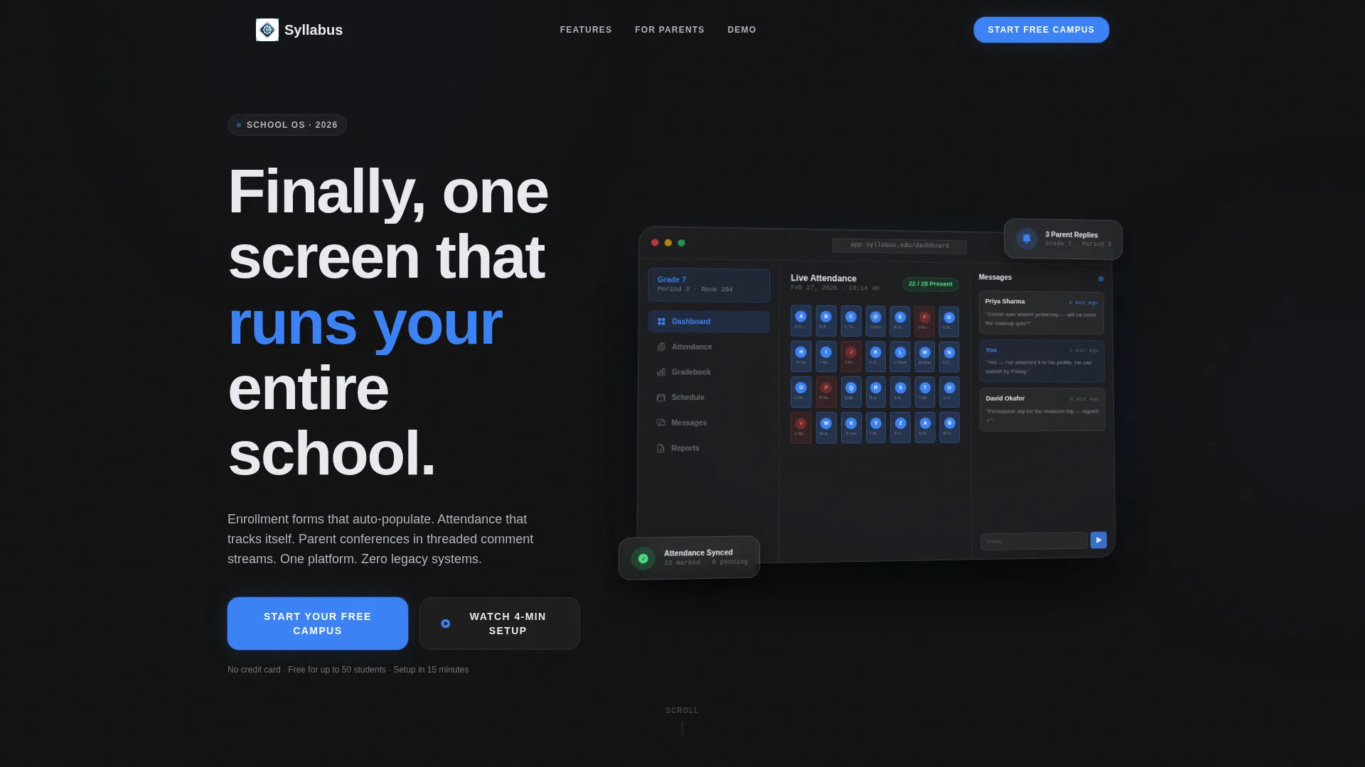
- A hero section with a tilted product screenshot and a headline that fades in above the dashboard image
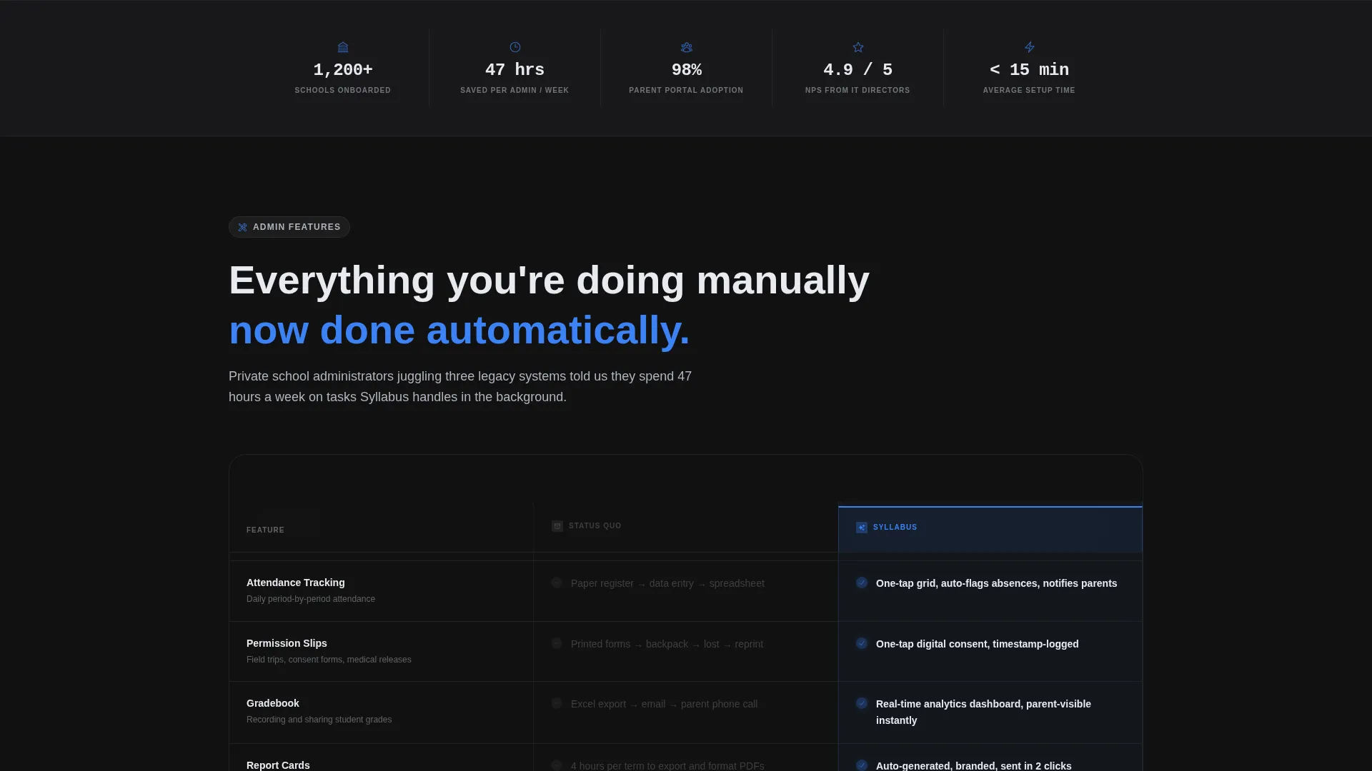
- Layered comparison tables organized by administrative, parent-facing, and student-facing feature categories
- Two conversion entry points: a "Start Your Free Campus" sign-up form and an inline demo video path
Feature list
This template is built around the specific needs of school platform marketing. Each section serves a defined purpose in moving a skeptical visitor toward action.
Tilted Hero Dashboard Screenshot
The header places a pixel-perfect admin dashboard screenshot on a frosted-glass card, tilted five degrees on a single axis. A soft ambient shadow lifts the image off the carbon background. The headline "Finally, one screen that runs your entire school." fades in above it.
Scroll-Driven Comparison Tables
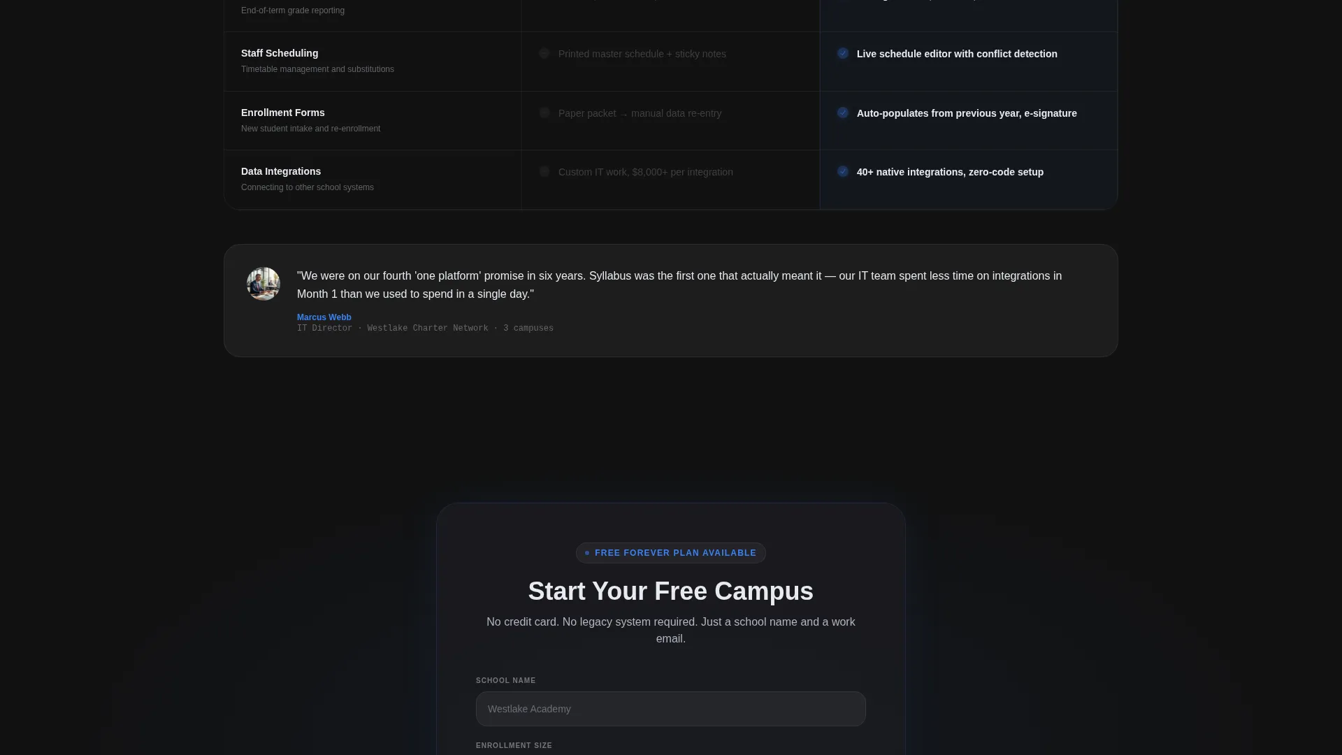
The core of the page is a series of frosted-glass comparison tables. Each table pits the platform against the status quo, covering manual rostering versus drag-and-drop scheduling, paper permission slips versus one-tap digital consent, and spreadsheet gradebooks versus real-time analytics dashboards. The platform column glows with blue check icons while the legacy column dims in muted gray dashes.
Progressive Three-Field Sign-Up Form
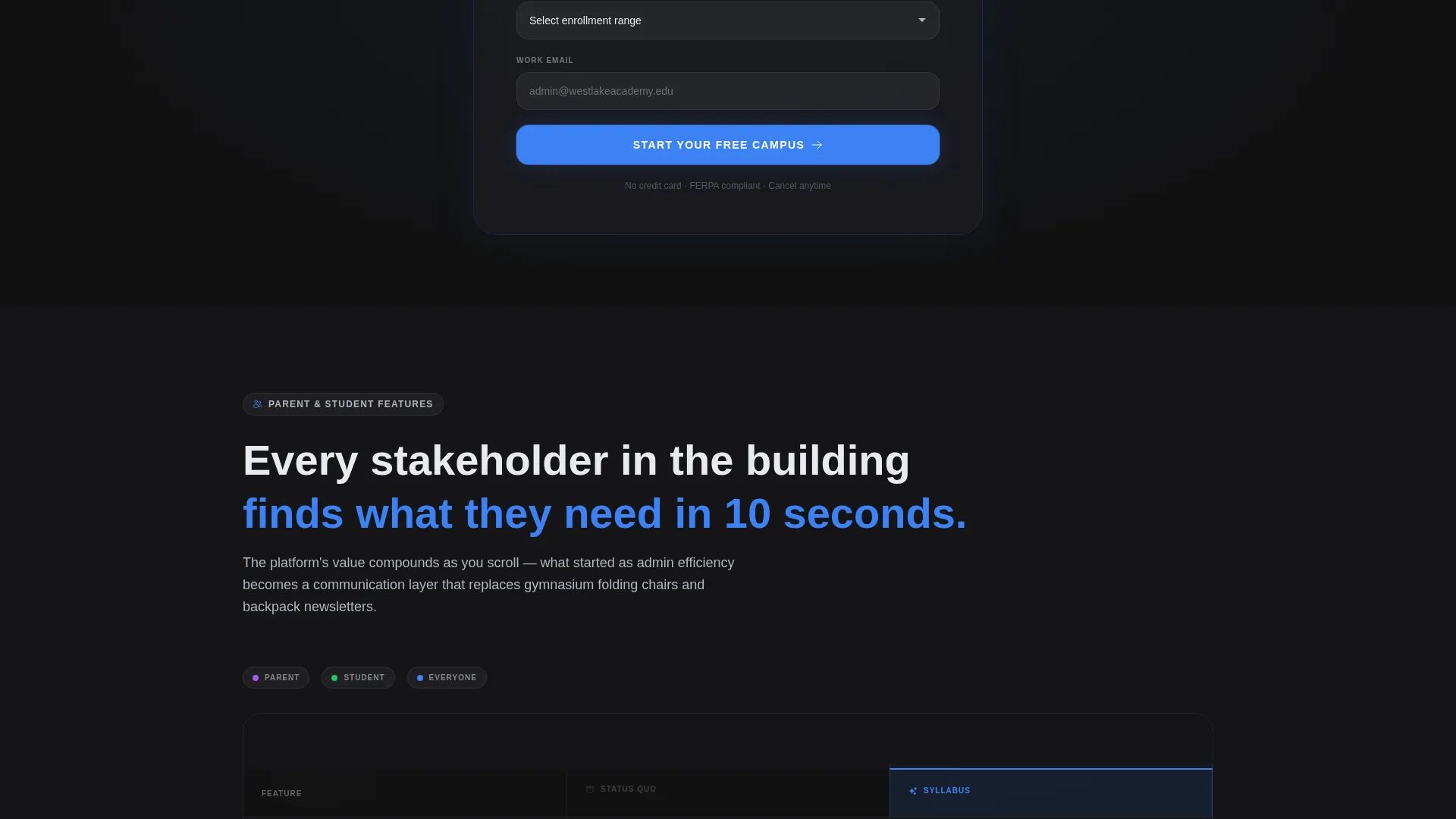
The primary conversion form collects school name, enrollment size via dropdown (under 200, 200 to 800, or 800 and above), and work email. No credit card is required. The form repeats after every second comparison table to catch visitors at the moment they are most convinced.
Inline Demo Video Path
A secondary call to action reads "Watch the 4-Minute Setup." The demo video plays inline without redirecting the visitor. If the visitor already typed their school name into the form, the final screen pre-fills that value, reducing repeated data entry.
Audience-Segmented Table Structure
As the visitor scrolls, the comparison tables shift from administrative features to parent-facing features to student-facing features. This deliberate widening of the audience means the page speaks to every stakeholder in the institution before reaching the final call to action.
Repeating call to action Rhythm
The primary call to action, "Start Your Free Campus," repeats on a consistent cadence after every second comparison table. This rhythm prevents visitor drop-off by placing a conversion opportunity at every natural pause in the scroll.
Page sections overview
| Section | Purpose |
|---|---|
| Hero Dashboard Header | Establishes platform credibility with a live admin screenshot and a bold headline |
| Admin Comparison Table | Contrasts manual rostering with drag-and-drop scheduling and attendance tracking |
| Primary call to action Block | First placement of the "Start Your Free Campus" three-field sign-up form |
| Parent Feature Table | Highlights parent-facing improvements like digital consent and message threads |
| Inline Demo Video | Offers a four-minute setup walkthrough that plays without leaving the page |
| Student Feature Table | Shows student-facing benefits to widen the audience before the final call to action |
| Final call to action Form | Repeats the progressive sign-up form to capture late-scroll conversions |
Design & branding system
The template uses a Tech Glass visual identity built on the Carbon Fiber color system. Every design decision reinforces a feeling of precision and modernity without visual clutter.
- Four-color palette: deep chassis black (#121212) for backgrounds, woven carbon gray (#2A2A2E) for surfaces, frosted panel white (#E8EAF0) for text and cards, and electric indicator blue (#3B82F6) reserved for active states, toggles, and call-to-action pulses
- Frosted-glass card styling for comparison table columns, with blue glowing check icons in the platform column and muted gray dashes in the legacy column
- Ambient shadow and five-degree tilt on the hero dashboard card to create a sense of physical depth on a flat screen
Mobile & speed optimization
The template is structured to remain clear and navigable on smaller screens. The scroll-driven layout is well-suited to vertical mobile browsing.
- Comparison tables are designed to stack clearly, keeping the platform column readable without horizontal scrolling
- The progressive sign-up form uses a minimal three-field structure that is easy to complete on a mobile keyboard
- The inline demo video plays within the page rather than opening an external app or tab, preserving session continuity on mobile
How this template helps you convert
Every layout decision in this template exists to reduce hesitation and make the next step obvious. The structure is built around a visitor who is skeptical, informed, and short on patience.
- The comparison table format converts passive browsing into active evaluation by showing the exact cost of the status quo before presenting the alternative, making the decision feel logical rather than sales-driven.
- The repeating "Start Your Free Campus" form, combined with the no-credit-card policy and three-field simplicity, removes the two most common reasons visitors delay signing up: commitment anxiety and form fatigue.
Other information about this template
This template is part of the School and Academy Website Templates subcategory under the Technology category. It is a strong fit for teams building marketing pages for school management software, student information systems, or similar education technology platforms.
- The template style is Comparison Table, making it especially effective for products that need to justify a switch from an established workflow
- The freemium and free-trial landing page direction aligns with the no-credit-card sign-up form and the inline demo video path
- The header concept is a Product Screenshot, grounding the page in real platform user interface rather than abstract illustrations
- The Carbon Fiber color system and Tech Glass theme are consistent choices for education technology platforms targeting institutional decision-makers
Theme
Tech Glass
Creative direction
Feature Matrix
Color system
Carbon Fiber
Style
Comparison Table
Direction
Freemium/Trial
Page Sections
Tilted Hero Dashboard Screenshot
Scroll-driven Comparison Tables
Progressive Three-field Sign-up Form
Inline Demo Video Path
Audience-segmented Table Flow
Repeating Call to Action Rhythm
Related questions
Who is this landing page template designed for?
Can I adjust the comparison table content for my platform's specific features?
Does the sign-up form require a credit card?
How does the inline demo video path work?
Can this template address more than one audience segment?



