Psychology Tutoring Comparison Landing Page Template
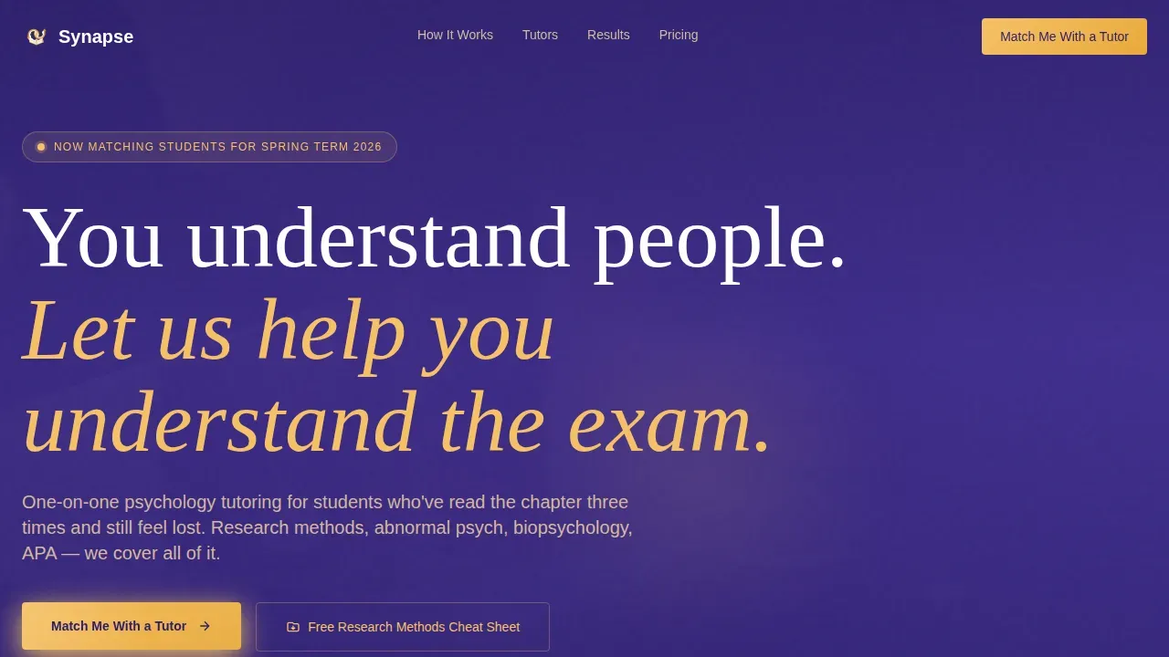
Synapse is a lead generation landing page template built for one-on-one psychology tutoring services. It guides visitors through a Problem-to-Solution scroll arc, uses an animated comparison table to prove guided tutoring beats self-study, and captures leads through a low-friction "Match Me With a Tutor" form. The warm indigo-and-amber design feels like a library desk lamp on a late study night.
by Rocket studio
Quick summary
Synapse is a single-page lead generation landing page designed for specialist psychology tutoring services. It opens with an institutional logo bar, moves visitors through named student pain points, then resolves the tension with a comparison table, tutor profiles, real student results, and a dual-path lead capture form. The page is built mobile-first, with scroll-reveal animations and a sticky call-to-action bar.
Who this template is for
This landing page template is built for psychology tutors and tutoring businesses operating in the UK higher education market. It suits anyone offering one-on-one academic support to students who are struggling with research methods, biopsychology, APA formatting, or abnormal psychology case studies. Whether you run a solo practice or a small tutoring service with multiple specialists, this page gives you a confident and credible starting point.
- Solo psychology tutors wanting a professional landing page without starting from scratch
- Small tutoring businesses serving second-year undergrads, mature returners, and postgraduate candidates
- Psychology educators who want to convert site visitors into booked sessions through a structured, persuasive page layout
What problem this template solves
Psychology tutoring services often struggle to communicate their value clearly to a student audience that is already overwhelmed. A generic page with a contact form does not answer the student's core question: "Will this actually help me pass?" The Synapse template is built to answer that question before the visitor has to ask it.
- Students arrive on a landing page feeling anxious about their course and need to see their specific pain points named immediately
- Tutors lose potential clients because their page does not make a clear, side-by-side case for why guided study beats solo revision
- The lead capture form is often too long or too generic, increasing drop-off before the visitor submits their details
What you get with this template
You get a fully structured landing page layout that moves visitors from problem recognition to conversion in a single scroll. Every section has a defined role. The page is opinionated in the right ways: warm in tone, specific in content, and direct in its calls to action. The layout is designed to focus user attention and reduce the risk of visitors leaving before they reach the lead form.
- A complete five-section landing page with hero, problem space, comparison table, tutor profiles, and lead capture
- An Electric Indigo color system with amber accents, parchment content surfaces, and chalk-white card panels
- Dual conversion paths: a primary "Match Me With a Tutor" form and a secondary email-gated downloadable cheat sheet
Feature list
This landing page template includes several purpose-built features. Each one serves the core goal: turn a struggling psychology student into a booked tutoring session. Below, each feature is described in practical terms so you can evaluate whether it fits your tutoring business needs.
Animated Comparison Table
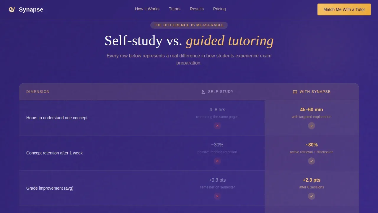
The centrepiece of this landing page is a side-by-side comparison table that sets self-study against guided tutoring across dimensions including revision time, concept retention, grade improvement, and confidence before deadlines. As the user scrolls to each row, a micro-animation fills the "with tutor" column in amber. This amber fill draws the eye and reinforces the point that guided tutoring delivers measurable differences. Research consistently shows that students who participate in structured, expert-led tutoring often achieve higher grades compared to those who study alone, and this table makes that argument visually and immediately.
Problem Space Section with Student Language
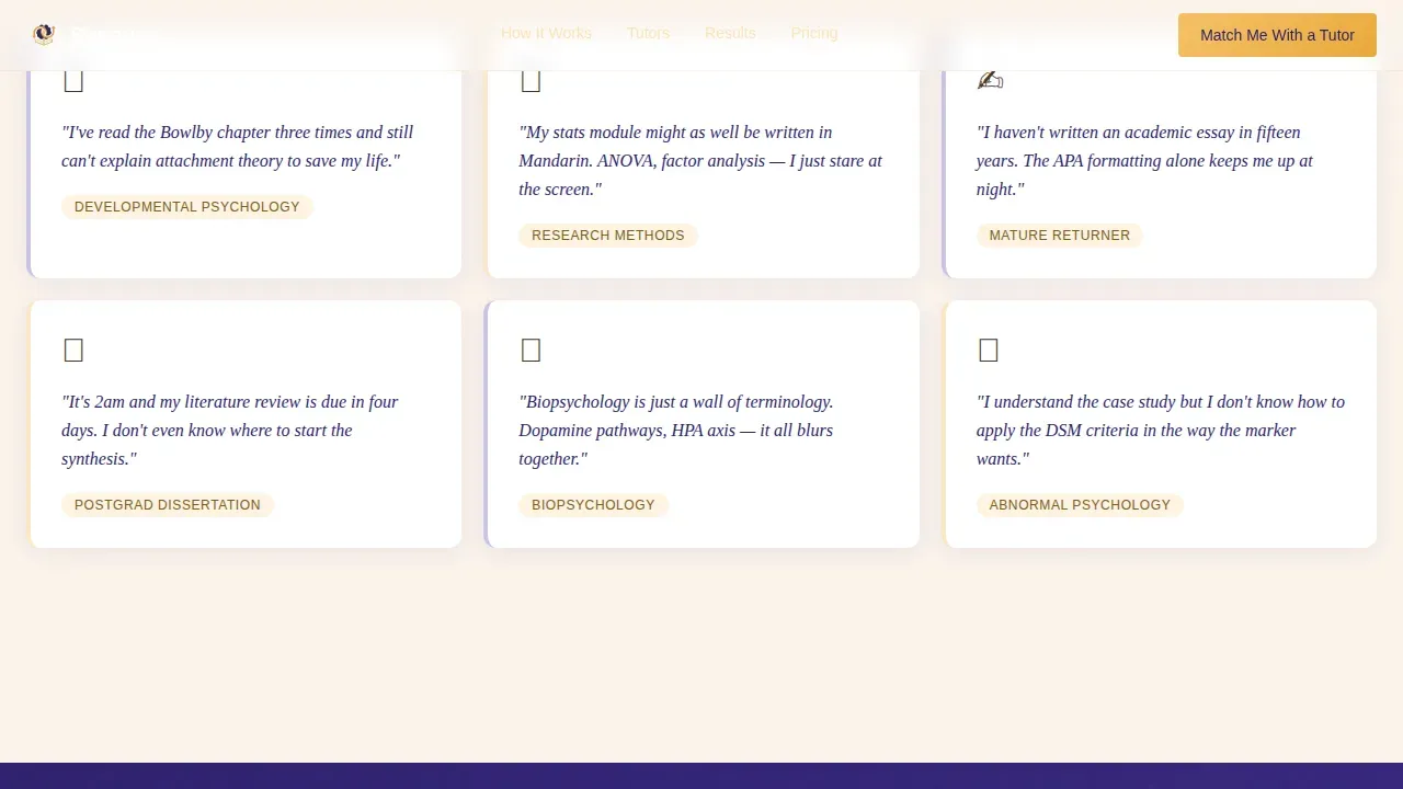
The page opens its scroll in the problem space, naming specific pain points in the words real psychology students use. For example, a card might read: "You've read the chapter three times and still can't explain Bowlby to save your life." This approach respects the student's experience without being condescending. Defining the struggle in honest language before offering a solution is a proven technique for building trust. Trust is crucial for user engagement, and genuine empathy in copy is one of the fastest ways to establish it on a landing page.
Dual Lead Capture System
The primary conversion path is a short, low-friction form that asks for module name first, then university, year of study, and a free-text field for the student's biggest challenge. Asking for module name as the first thing a user types is an identity-affirming move that encourages completion. A secondary path offers a free downloadable "Research Methods Cheat Sheet" gated behind an email address, catching visitors who are not yet ready to book but are willing to exchange an email for immediate value. Keeping the form short and relevant reduces drop-off and improves overall conversion.
Tutor Profile Bento Grid
Tutor profiles are displayed in an asymmetric bento grid layout with specialist subject tags and credibility signals. Each profile card can mention academic credentials, relevant teaching experience, and areas of focus such as biopsychology, abnormal psychology, or research methods. Displaying credentials prominently helps visitors evaluate the quality of the service quickly. Students who are searching for support in a specific psychology module want to see evidence of specialism, not generalist claims.
Sticky Mobile Call-to-Action Bar
On mobile devices, a sticky bar at the bottom of the screen keeps the primary call to action visible at all times as the user scrolls. This is critical for a student audience that is likely to access the page on a phone, often late at night. The sticky bar carries action-oriented language and an amber button that contrasts against the indigo background. This visual cue ensures the conversion point is never more than a thumb-tap away, regardless of where the user is on the page.
Institutional Logo Bar with Social Proof
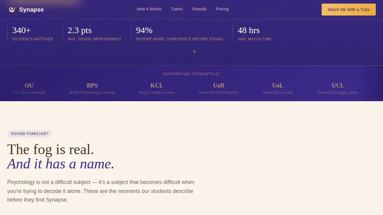
The header section opens with a horizontal logo bar displaying university crests and psychology department logos from institutions whose students the service has supported. Social proof is a powerful psychological motivation that influences user behaviour on landing pages. Seeing a familiar university logo in the first half-second of a page visit signals credibility before the user has read a single word of copy. The logo bar works alongside named student testimonials and grade improvement figures to build a layered case for the service.
Page sections overview
| Section | Purpose |
|---|---|
| University Logo Bar | Establishes institutional credibility immediately on arrival |
| Hero Headline Block | Reframes student struggle as a solvable problem |
| Problem Space Cards | Names specific pain points in honest student language |
| Comparison Table | Shows self-study versus. guided tutoring across key dimensions |
| Tutor Profile Grid | Displays specialist credentials and subject focus areas |
| Student Results Strip | Presents testimonials, grade stats, and social proof |
| Lead Capture Form | Collects module, university, year, and challenge details |
| Cheat Sheet Offer | Secondary email-gated download for not-yet-ready visitors |
| Footer Row | Single-row linear footer with navigation and contact links |
Design & branding system
The design follows a Community Hearth visual theme. The aesthetic is best described as a campus library after dark: overhead fluorescents off, one desk lamp on, a laptop screen casting violet and gold across the room. The layout uses warm scholarly typography paired with a deep indigo-and-amber color system that feels both serious and inviting.
- Deep evening indigo (#3D2C8D) dominates headers, section dividers, and the background to give the page a focused, after-hours study atmosphere
- Soft hearthlight amber (#F5C167) is used for call-to-action buttons, hover states, animated table fills, and testimonial pull-quotes to draw the eye to conversion points
- Warm parchment (#FAF3EB) surfaces the reading areas and problem space cards, while chalk white (#FFFFFF) defines card panels for maximum contrast and legibility
Mobile & speed optimization
This landing page is built mobile-first. The student audience is most likely to encounter the page on a phone, often late at night when motivation to seek help is highest. Every layout decision accounts for small-screen readability and thumb-friendly interaction.
- The sticky bottom bar keeps the primary call to action accessible at all times on mobile, removing the risk of a student scrolling past the conversion point without acting
- Scroll-reveal animations and staggered card entrances are handled by client-side components, while static content uses server-side rendering to keep the page fast to load on a mobile connection
- The comparison table is designed to remain readable on narrow screens, with amber fill animations that work on touch devices without requiring hover interaction
How this template helps you convert
This landing page is built as a transactional landing page with a single conversion goal. Every design and content decision on the page works toward getting the visitor to fill in the lead form or download the cheat sheet. There are different types of landing pages, but this one is firmly in the lead generation category. The layout, copy structure, and interaction design all serve that purpose.
- The Problem-to-Solution scroll arc moves the user from emotional recognition of their struggle to confident action, raising the emotional temperature from anxious to relieved as they progress down the page. Loss aversion motivates the visitor: the idea of another failed exam sitting ahead of them is a stronger spur to act than any generic sales message, and the page uses that psychology without exploiting it.
- The comparison table provides a clear, visual, side-by-side case for booking a tutor. Research shows that structured, expert-led tutoring can improve student exam performance significantly over the course of a semester. Presenting that difference in a scannable table format lets visitors evaluate the value of the service quickly without having to process dense paragraph text.
- The dual conversion path means the page captures value from visitors at different stages of readiness. Visitors ready to book can fill in the primary form immediately. Visitors who are still searching for a reason to commit can access the free cheat sheet, entering the service's lead funnel at a lower point of friction.
Other information about this template
The Synapse expert psychology tutoring comparison landing page template is built to serve the full range of psychology student audiences, from second-year undergrads struggling with introductory science modules to postgraduate candidates facing their dissertation literature review. It is designed with the specific challenges of UK higher education in mind, including APA formatting expectations, research methods coursework, and the pressure of timed exams.
- The page supports coverage of different models of abnormality in psychology as a content area, including the medical/biological, behavioral, psychodynamic, and cognitive models, all of which are common exam topics that tutors describe in their profile content
- There are different models for how tutoring services structure their offer, and this template accounts for a range of session formats by including a session format breakdown section within the student results area
- Psychology as a science sits at the intersection of biological, social, and cognitive research traditions; the template is flexible enough to describe tutor expertise across all of these areas, from cognitive-behavioral therapy (CBT) as a practical application to biopsychology and neuroscience
- Not all landing page designs include a secondary conversion path alongside the primary form; this template provides both, which is particularly valuable for a business that serves women returning to college after a career gap as well as traditional school-to-university students
- The comparison table structure is one of the most practical landing page design choices for a tutoring service, because comparing self-study against expert-led sessions across specific dimensions gives the user a clear framework for their decision
- The page layout is deliberately consistent across breakpoints: the same content hierarchy that a desktop user sees is preserved on mobile, so the visitor experience does not degrade when the user switches devices
- Future iterations of the page can incorporate short video clips (under two minutes) explaining a key psychology concept to demonstrate teaching style and build additional trust with visitors who are still evaluating the service
- The page is localized for UK English with implied GBP pricing, making it relevant to university students at institutions across England, Scotland, and Wales
- Peer tutoring research suggests that targeted, structured sessions can help students in introductory science and social science courses persist in their course at higher rates than those who study without support; this evidence base can be referenced directly in the page's problem-space copy to strengthen the case for booking
- The importance of a short, focused form cannot be overstated for a student audience; the Synapse form asks only for the most relevant details, reducing the cognitive load on a user who may already be stressed about their course
Theme
Community Hearth
Creative direction
Problem→Solution Arc
Color system
Electric Indigo
Style
Comparison Table
Direction
Lead Generation
Page Sections
Animated Self-study Versus. Tutor Comparison Table
Problem Space Cards in Student Language
Low-friction Dual Lead Capture
Credentialled Tutor Profile Bento Grid
Institutional Logo Bar for Instant Credibility
Sticky Mobile Call-to-action Bar
Related questions
Can I use this template without a psychology tutoring background?
Does the comparison table content come pre-written?
How does the dual lead capture system work on this landing page?
Is this landing page suitable for mature students returning to education?
Can I describe different subject specialisms in the tutor profile section?



