No-Code Platform Documentation Reviews Website Template
The Extend Data Command Airtable Plugin Directory landing page template is a dark-themed, dashboard-style single page built to showcase curated Airtable extensions. It combines an interactive grid preview, spec-sheet category sections, and frictionless click-through cards, giving ops managers, no-code builders, and startup CTOs a fast, data-dense way to discover and compare the right extension for their airtable base.
by Rocket studio
Quick summary
This template delivers a full-viewport, dark-IDE landing page designed to showcase a curated index of Airtable plugins and extensions. Visitors land on a live, filterable grid of extension cards, scroll through data-dense spec sheets, and click through to individual extension detail pages, all without hitting a form or a signup gate. The page earns the action by letting real data do the selling.
Who this template is for
This template is built for anyone running a directory, marketplace, or curated index of Airtable tools. The design and interaction model match the workflow of people who live inside data-heavy interfaces every day.
- Ops managers dealing with base sprawl who need to evaluate automation tools quickly
- No-code builders assembling client portals and hunting for the right extension to fill each gap
- Startup CTOs who chose Airtable over a traditional database and now need it to behave like one
What problem this template solves
Finding the right Airtable extension today means bouncing between blog posts, marketplaces, and community threads. There is no single page that lets you filter, compare, and decide in one session. Visitors leave before they find what they need, and directory owners lose the click.
- No structured way to browse extensions by category in a grid view
- Spec details like version, install count, and ratings are scattered across multiple sources
- Directory pages often force a signup before visitors can access any real data
What you get with this template
You get a complete, single-page directory landing page built around a Data Command visual theme. Every section is designed to reduce friction and move visitors toward the extension detail page.
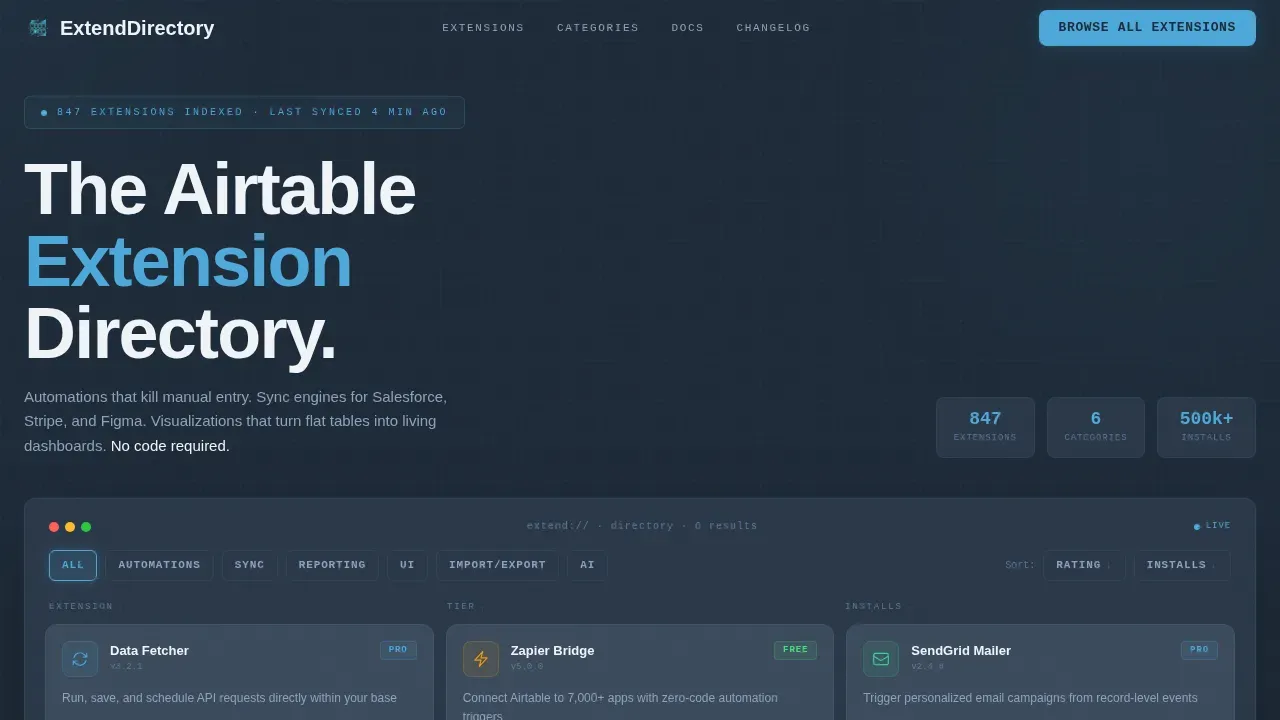
- An interactive hero grid with live category filters across six extension categories
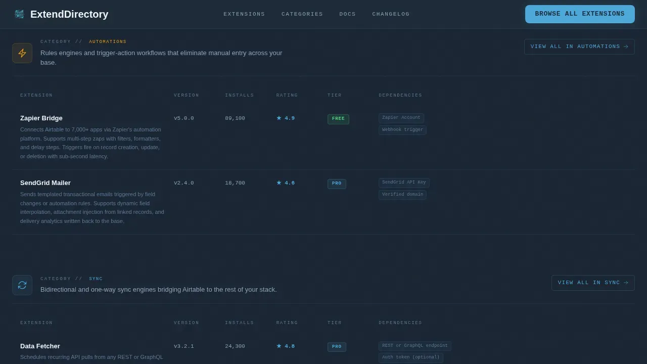
- Scrollable spec-sheet sections that present each category in a tight two-column data format
- A persistent top-bar call-to-action and per-card "View Extension" buttons for zero-friction click-through
Feature list
This template includes six core design and interaction features, each grounded in the source brief.
Interactive Hero Grid with Live Filters
The header is a functioning mock of the directory grid itself. It renders at full viewport width, showing six extension cards in a two-by-three layout. Category filters sit across the top, Automations, Sync, Reporting, user interface, Import/Export, AI, and clicking one re-sorts the grid instantly. Each card shows an extension icon, a one-line description, a compatibility tag, and a star rating. Row-hover highlights in sky-blue and sort arrows on column headers make the grid feel operational rather than decorative.
Spec-Sheet Category Sections
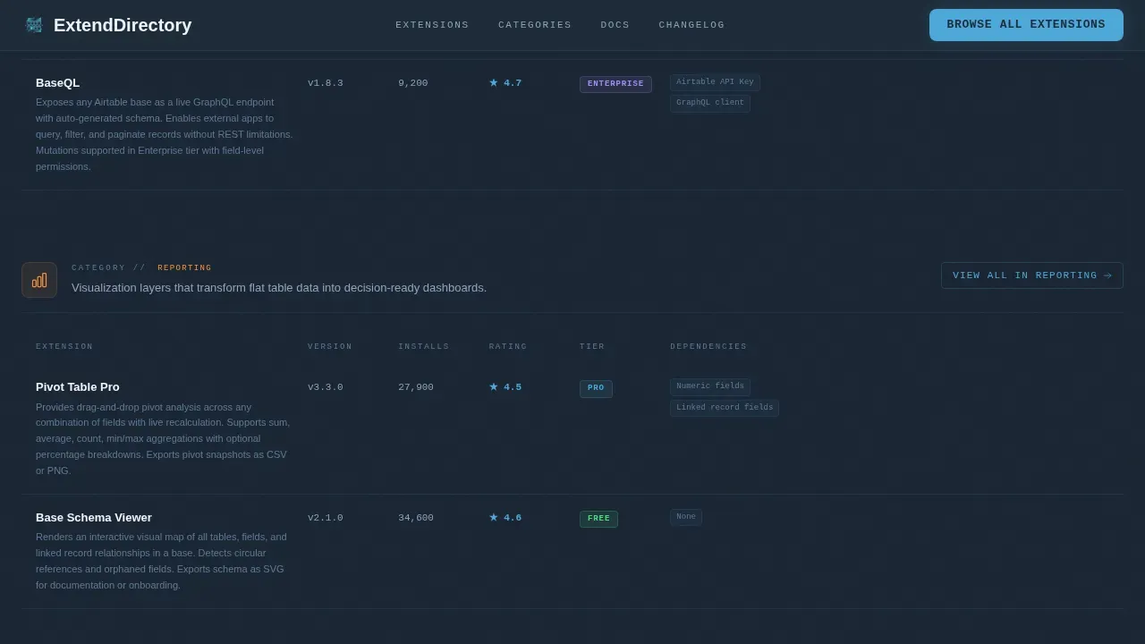
Below the hero, each scroll section isolates one category of extension and presents it as a product teardown. The format is a tight two-column data layout: name, version, install count, average rating, integration dependencies, and a three-sentence capability summary. The rhythm is scan-compare-decide, and each section closes with a "View All in [Category]" link that signals the depth behind the directory. There is no marketing prose, just structured data that lets visitors move fast.
Authority Stat Bar
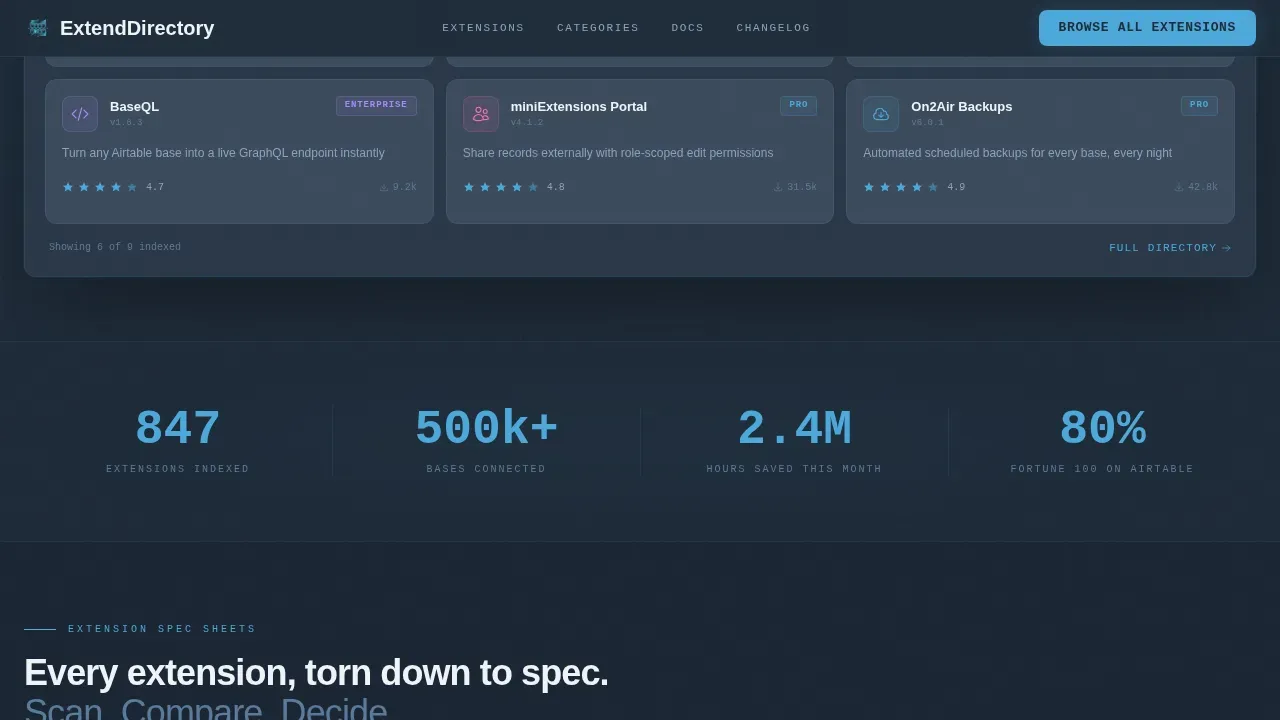
A horizontal stat bar breaks the vertical scroll midway through the page. It surfaces three high-impact numbers: total extensions indexed, bases connected, and hours saved this month. The numbers are large enough to establish authority without interrupting the scan cadence. This section creates a natural pause point before visitors continue into the lower spec sheets.
Click-Through Card System
Every extension card and spec-sheet row funnels toward a single action: clicking through to the individual extension detail page. The primary call-to-action on each card reads "View Extension" in sky-blue against slate. No form, no account wall, the page earns the click by letting visitors interact with real records before asking them to go deeper.
Testimonial Strip
A compact horizontal scroll of user quotes sits between the spec sheets and the final call-to-action. Each quote is short and tied to a specific use case, reinforcing trust without slowing the page's scan rhythm. Install counts and usage metrics alongside each quote add a layer of social proof grounded in real data.
Persistent Top-Bar Call-to-Action
A fixed top bar carries a "Browse All Extensions" button throughout the full scroll. Visitors who want to skip curation and access the full directory index can act at any point on the page. The bar stays visible without blocking content, keeping the primary conversion path accessible on every device.
Page sections overview
| Section | Purpose |
|---|---|
| Hero Interactive Grid | Filter and preview extensions live |
| Category Stat Bar | Display authority metrics prominently |
| Spec Sheet: Automations | Compare automation extension details |
| Spec Sheet: Sync | Compare sync extension details |
| Spec Sheet: Reporting | Compare reporting extension details |
| Testimonial Strip | Reinforce trust with user quotes |
| Final call to action Strip | Drive full-directory browse action |
| Footer | Developer-minimal navigation links |
Design & branding system
The visual identity follows a Data Command theme built on a Slate and Sky color system. The palette is intentionally dark and workspace-coded, designed to feel like a well-organized integrated development environment (IDE) at 2 a.m.
- Deep workspace slate (#1E2A38) on primary backgrounds; mid-tone graphite (#3B4A5C) for card surfaces and grid rows
- Sky-blue (#4DA8DA) as the primary interactive accent on links, toggles, active filter states, and call-to-action buttons
- Typography uses Plus Jakarta Sans for body and heading text paired with JetBrains Mono for all data values, version strings, and code-adjacent labels
Mobile & speed optimization
The template is desktop-first by design. The data-dense grid layout and two-column spec sheets are built for the screen real estate that ops and developer users typically have. Responsive behavior is included, but the primary experience is optimized for larger viewports.
- Server components handle all static sections; client components handle only the interactive grid and filter transitions
- GSAP ScrollTrigger drives scroll-based animations; grid filter transitions and spotlight card effects run on the client only
- Magnetic button interactions and hover states are scoped to pointer devices to avoid unintended behavior on touch screens
How this template helps you convert
This template is built around a single conversion goal: get the visitor to click through to an extension detail page. Every design decision reduces the distance between landing and clicking.
- The interactive grid lets visitors filter and engage with real records before they have consciously decided to explore, lowering the psychological cost of the first click
- Spec-sheet rows replace vague marketing copy with concrete data points, install count, version, rating, so visitors can compare and decide without leaving the page
- The persistent top-bar call to action and per-card "View Extension" buttons create multiple access points, so the path to conversion is never more than one click away regardless of scroll position
Other information about this template
This section covers additional context about how this template relates to Airtable's broader extension ecosystem, including relevant tools and technical background for buyers evaluating fit.
- The Page Designer extension is one of Airtable's primary tools for creating custom, data-driven page layouts; users can add the Page Designer extension by selecting "Tools" and then "Add an extension" inside their airtable account
- The designer extension allows mapping airtable base data into custom layouts; the Page Designer's Table Mode displays linked records in an organized grid format similar to the directory layout in this template
- Custom Record Size settings in Page Designer can be used to match a web viewport for landing page prototyping; users can configure the record size to fit Letter or custom dimensions
- The Page Designer extension requires linking to a specific airtable table containing the content; using a clear, descriptive table name and field names helps the template pull the correct data for each version
- To build a new airtable extension from scratch, users must first set up a new airtable base and access the Extensions dashboard; the Airtable Blocks command line tool helps manage the local development environment and code
- Airtable extensions can be developed using JavaScript and the Airtable API; once released, an extension becomes visible to all collaborators inside the airtable base and can be built to run across multiple bases
- Documint and Plumsail are specialized extensions that allow for more advanced web-ready templates in Airtable; both tools extend what the default page designer can produce
- An Airtable API integration connects your airtable base to an external system so records can be imported and updated automatically; APIs (Application Programming Interfaces) return structured data in formats like JSON, which Airtable can map to new fields
- Many external API connections require an api key for authentication; when you configure a new integration, you typically paste the api key into a credentials field to authorize access and avoid an authentication error
- To import airtable data from an external api, you can point a data-fetching extension at an https endpoint, save the configuration, and schedule automatic syncs; this keeps your existing table records current without manual re-import
- Airtable automations can trigger on record changes, schedule recurring syncs, or post data to external services; airtable automations work well alongside directory templates to keep install counts and ratings fresh
- The const base pattern in Airtable scripting specifies the base object for a given script; developers use it to access and edit records, create a new field, or delete stale entries programmatically
- Data Fetcher includes pre-built integrations for tools like Google Sheets and Stripe; these services let you import airtable-compatible data files without writing custom code
- Airtable today supports a wide range of project types beyond spreadsheet use; it can serve as the backend data store for directory sites, client portals, and project management systems
- The url field type in Airtable is useful for storing extension detail page links; each record can hold the direct url so the "View Extension" button always points to the correct destination
- Telling airtable which fields to display in a view, and in what format, is done through the field configuration panel; this controls the default layout of grid view and designer outputs
- For a new table or default page setup, records in an airtable table can be treated as unique landing page instances; each record holds one extension's data, icon image, description, rating, and compatibility value
Theme
Data Command
Creative direction
Spec Sheet
Color system
Slate & Sky
Direction
Click-Through
Page Sections
Interactive Hero Grid with Live Category Filters
Spec-sheet Category Sections
Authority Stat Bar
Click-through Card and Call to Action System
Testimonial Strip
Data Command Visual Theme
Related questions
What is the Extend Data Command Airtable Plugin Directory landing page template?
Do I need to write code to use this template?
How does the interactive hero grid work?
Can I connect this template to a live Airtable base?
What does the spec-sheet section display?



