Software & SaaS Portfolio Website Template
Sync is a bento grid landing page template built for collaboration and productivity tools. It uses a Tech Glass visual theme with a Teal Catalyst color system to showcase a live-feeling dashboard, animated proof cards, and a frictionless freemium signup flow. The design turns scattered workflow pain into a single, compelling conversion moment.
by Rocket studio
Quick summary
Sync is a single-page bento grid landing page template designed for collaboration and productivity software. It opens with a bold typographic stat, expands into a grid of animated proof cards, and closes with a low-friction two-step signup. The Tech Glass aesthetic makes the product dashboard feel alive from the first scroll.
Who this template is for
This template is built for teams and founders who need to communicate real workflow value fast. It speaks directly to the people who feel the cost of fragmented tools every day.
- Startup operations leads managing communication overflow across multiple channels
- Product managers coordinating standups and sprints across distributed time zones
- Agency project coordinators who manually stitch status updates from several tools
What problem this template solves
Most collaboration tools suffer from the same marketing problem: the product is powerful, but the landing page feels flat. Generic screenshots and vague benefit copy fail to convey what it actually feels like to use the tool.
- Visitors leave before trusting the product because there is no tangible proof on the page
- Signup forms with too many fields create friction that kills conversion before it starts
- Static hero images cannot show a live, dynamic workspace in a believable way
What you get with this template
You get a fully structured, single-page layout with every section purpose-built to move a visitor from skepticism to signup. Nothing is decorative without reason.
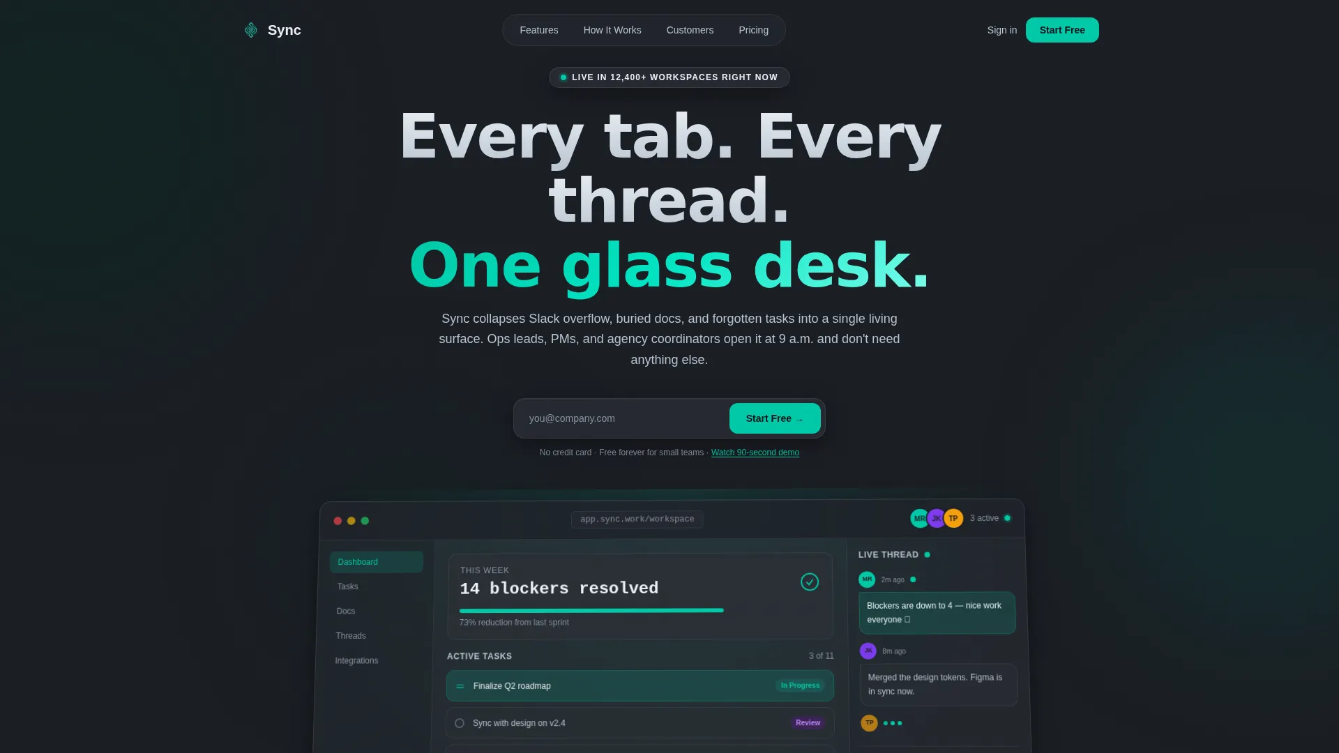
- A full-width dashboard preview header rendered on a frosted-glass plane with a live workspace scene
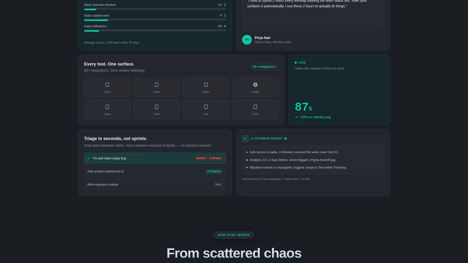
- A bento grid body section with animated stat cards, a drag-and-drop loop card, a customer quote card, and an integration mosaic card
- A two-step freemium signup flow asking only for work email, then team size, with no credit card required
Feature list
This template is built around a specific set of visual and structural components drawn directly from the design brief.
Stats-First Hero Typography
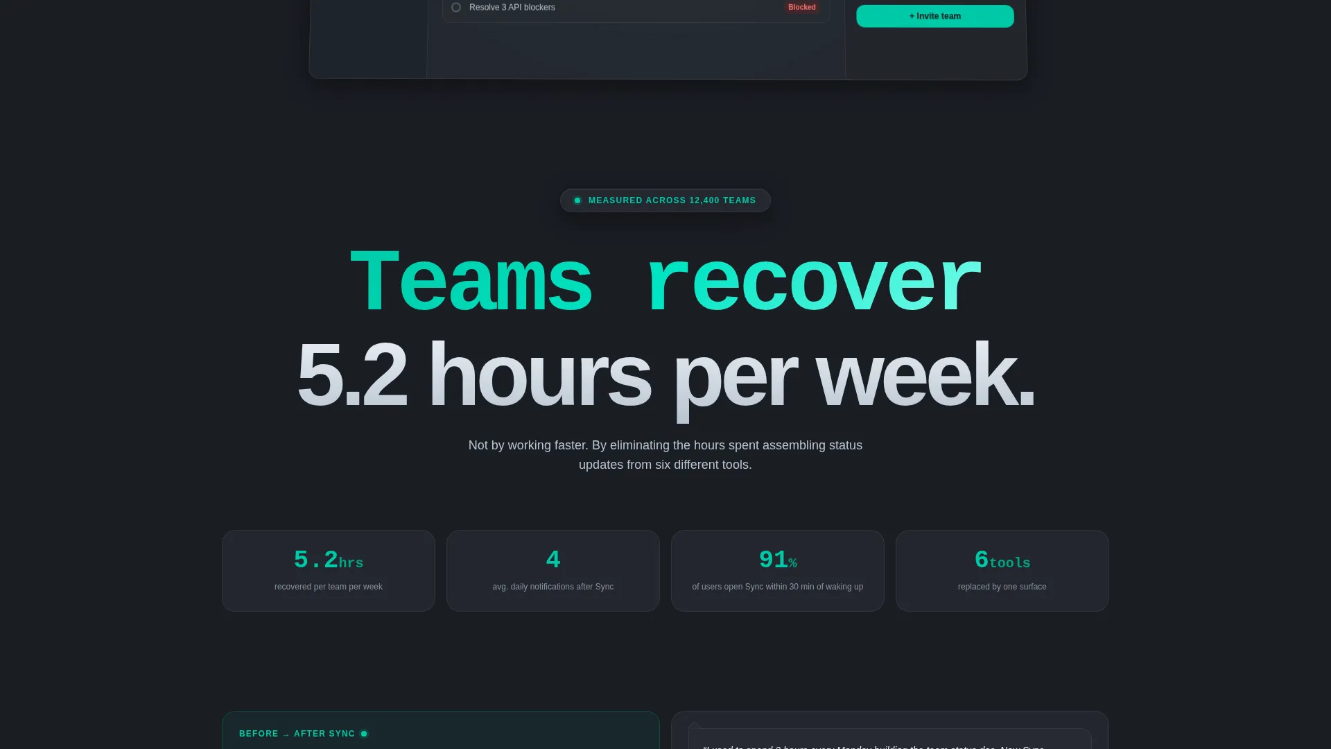
The page opens with a massive typographic stat that reads "Teams recover 5.2 hours per week." This single line lands before any other element, setting an immediate proof-based tone that earns attention before asking for it.
Live Dashboard Preview Header
The header features a pixel-perfect product screenshot on a frosted-glass plane with a subtle depth-of-field tilt. The scene shows three active team avatars, a task column mid-sort, a pinned metric card, and a live comment thread with a green presence dot.
Animated Bento Grid Cards
The bento grid below the hero contains self-contained proof cards. One card animates a notification count from 38 down to 4. Another loops a three-second drag-and-drop task triage clip. Each card earns its space with motion or data.
Customer Quote Chat Bubble
A dedicated bento card surfaces a real customer quote inside a chat-bubble component. This social proof sits inside the grid alongside data cards, giving the testimonial the same visual weight as a product metric.
Integration Mosaic Card
One bento card displays a grid of integration icons on individual glass tiles. This communicates compatibility at a glance without requiring a separate integrations section to take up page real estate.
Two-Step Freemium Signup Flow
The primary call to action is "Start Free With Your Team" in catalyst teal. It appears first as a native-looking button inside the dashboard screenshot, then as a sticky bottom bar on mobile and a floating glass pill on desktop. The two-step form asks only for work email, then team size.
Page sections overview
| Section | Purpose |
|---|---|
| Dashboard Preview Header | Anchors the page with a live-feeling product screenshot on a frosted-glass hero plane |
| Stats-First Opener | Delivers the headline impact stat before the grid loads to earn immediate attention |
| Bento Grid Body | Displays animated proof cards, each covering one specific benefit or data point |
| Notification Count Card | Animates the before/after reduction from 38 notifications to 4 for instant clarity |
| Task Triage Loop Card | Loops a three-second drag-and-drop clip to make the product feel tangible and real |
| Customer Quote Card | Presents a real customer quote inside a chat-bubble component within the grid |
| Integration Mosaic Card | Shows tool compatibility icons on glass tiles without a separate integrations section |
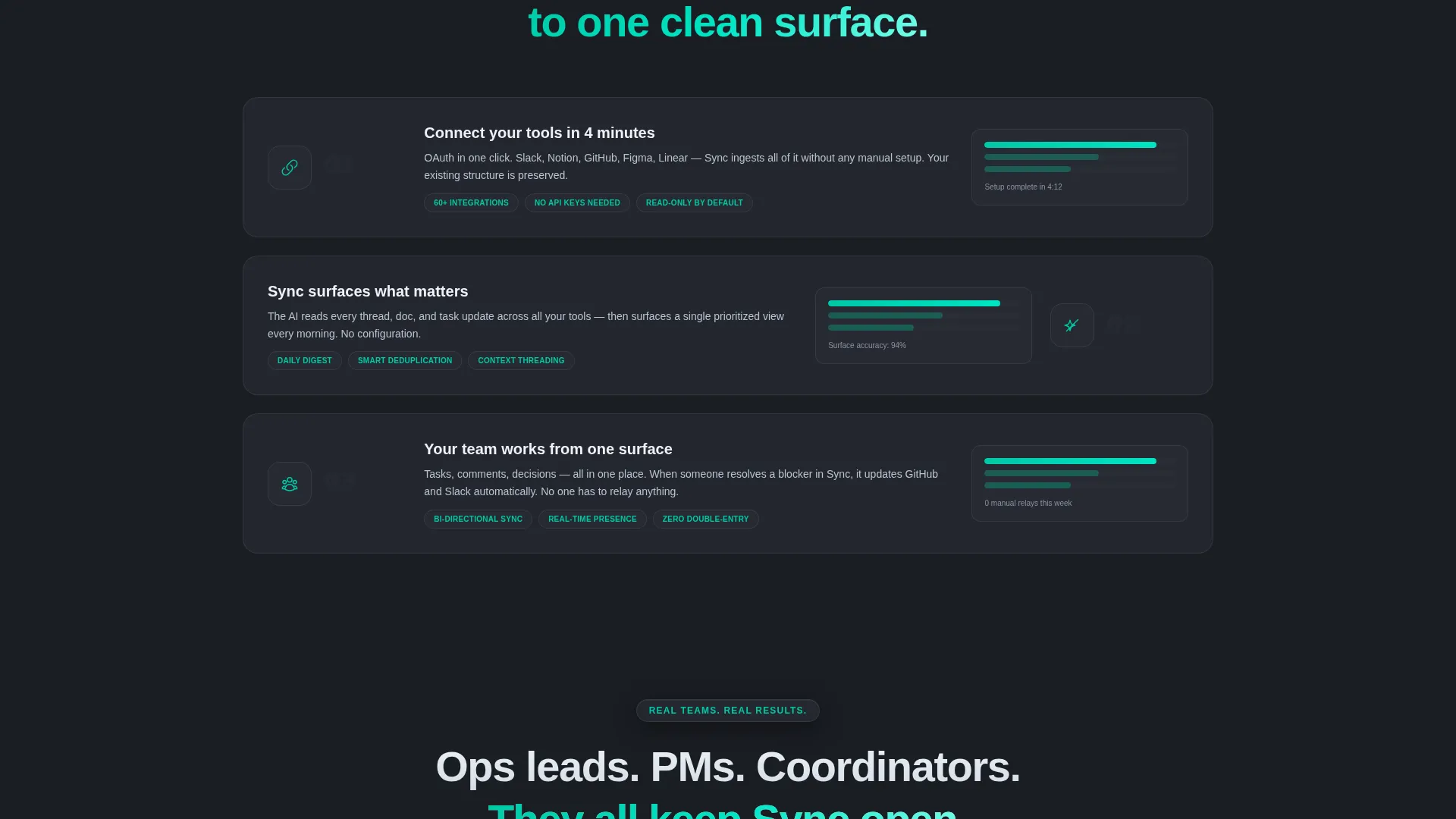
| Grid Consolidation Zone | Transitions scattered bento cards into a unified dashboard view as the user scrolls |
| Primary call to action Button | Triggers the two-step freemium signup with work email and team size only |
| Secondary Demo Link | Offers an inline 90-second autoplay demo video for visitors who need more proof |
| Mobile Sticky call to action Bar | Keeps the signup action persistent at the bottom of the screen on mobile |
| Desktop Floating Pill | Maintains a floating glass-style call-to-action pill visible throughout desktop scroll |
Design & branding system
The visual identity follows a Tech Glass theme built on four intentional values from the Teal Catalyst color system. Every color choice has a functional role in the interface.
- Deep workspace charcoal (#1A1D23) as the base background, translucent panel gray (#2A2D35) for frosted-glass card surfaces, and catalyst teal (#00C9A7) reserved exclusively for interactive elements and live-data pulses
- Crisp interface white (#EDF2F7) used for all typography and iconography to maintain legibility on dark surfaces
- Frosted-glass blur effects on card panels and the header plane to create perceived depth without visual noise
Mobile & speed optimization
The layout adapts its bento grid structure for smaller screens without losing the core proof-card experience. The mobile version keeps conversion accessible at all times.
- The bento grid reflows into a single-column stack on mobile while preserving card animations and motion elements
- A sticky bottom bar replaces the floating desktop pill, keeping the primary call to action visible without interrupting scroll
- The two-step signup form is thumb-friendly and requires minimal input at each step
How this template helps you convert
Every layout decision in this template is connected to a specific conversion behavior. The page is built to reduce doubt and reduce friction at the same time.
- The stats-first opening and animated bento cards build trust through evidence before the visitor reaches any signup prompt, so the call to action feels earned rather than premature.
- The two-step signup form removes every non-essential field. Work email on step one, team size on step two, no credit card, no organization name. Lower friction means more completions.
- The secondary "Watch a 90-second demo" path keeps hesitant visitors engaged with an inline autoplay video that ends directly on the same signup field, closing the loop for proof-seekers.
Other information about this template
This section covers additional practical details about working with the Sync template and its design context.
- The template is categorized under Technology, specifically the Software and Software as a Service subcategory, with a niche focus on collaboration and productivity tools
- The bento grid layout style is well-suited for product-led growth pages where showing the tool in action is more persuasive than describing it in paragraphs
- The Teal Catalyst color system is designed to feel like a flagship phone's dark-mode interface: luminous edges, intentional glow, and nothing decorative without purpose
- The template style and creative direction follow a Stats-First Impact approach, meaning every section leads with proof before asking for anything in return
- The header concept is classified as a Dashboard Preview, which positions the product screenshot as the hero rather than relying on stock photography or illustration
Theme
Tech Glass
Creative direction
Stats-First Impact
Color system
Teal Catalyst
Style
Bento Grid
Direction
Freemium/Trial
Page Sections
Stats-first Hero Typography
Live Dashboard Preview Header
Animated Bento Grid Cards
Customer Quote Chat Bubble
Integration Mosaic Card
Two-step Freemium Signup Flow
Related questions
Who is this landing page template designed for?
Does the signup flow require a credit card?
Can I replace the dashboard screenshot with my own product visuals?
What makes the bento grid layout effective for a productivity tool?
Is there a secondary path for visitors who are not ready to sign up?



