Expert Data & Analytics Professional Website Template
Unify is a bold brutalist customer data platform landing page built on a modular card grid. It guides visitors through a Problem→Solution Arc, from fragmented tool chaos to a single, unified customer record. With a Logo Bar header, live data visuals, and a frictionless click-through call to action, it converts growth teams and data operators in one decisive scroll.
by Rocket studio
Quick summary
Unify is a single-page landing page template built for customer data platforms. It uses a card grid layout and a Problem→Solution Arc to take visitors from recognizing their data mess to trusting your unified solution. The Bold Brutalist visual identity commands attention, and every call to action routes to a demo, no form required.
Who this template is for
This template is built for teams selling or positioning a customer data platform to a technically aware but time-starved audience. It speaks directly to the people who feel the pain of disconnected data every day.
- Growth-team leads tired of switching between multiple analytics dashboards to find a single customer view
- Marketing operations managers who spend hours reconciling exported spreadsheets every week
- Data engineers who maintain fragile pipelines that break whenever a vendor updates an API
What problem this template solves
Most customer data platform pages describe features in abstract terms. Visitors skim, feel nothing, and leave. Unify flips that by making the visitor's own chaos visible before presenting the solution.
- Visitors see their existing tool stack reflected back at them in the Logo Bar, creating instant recognition
- The "Mess" card row names real pain points with specific numbers, making the problem feel urgent and familiar
- The visual transition from problem cards to solution cards mirrors the emotional shift your product delivers
What you get with this template
You get a complete, ready-to-customize single-page layout that carries a visitor from problem awareness to demo click without a single friction point. Every section is purposeful and ordered.
- A scrolling Logo Bar header with fifty-plus integration logos that shift from monochrome to full color on hover
- A modular card grid split into a "The Mess" problem row and a clean, confident solution row below a sky-blue horizon rule
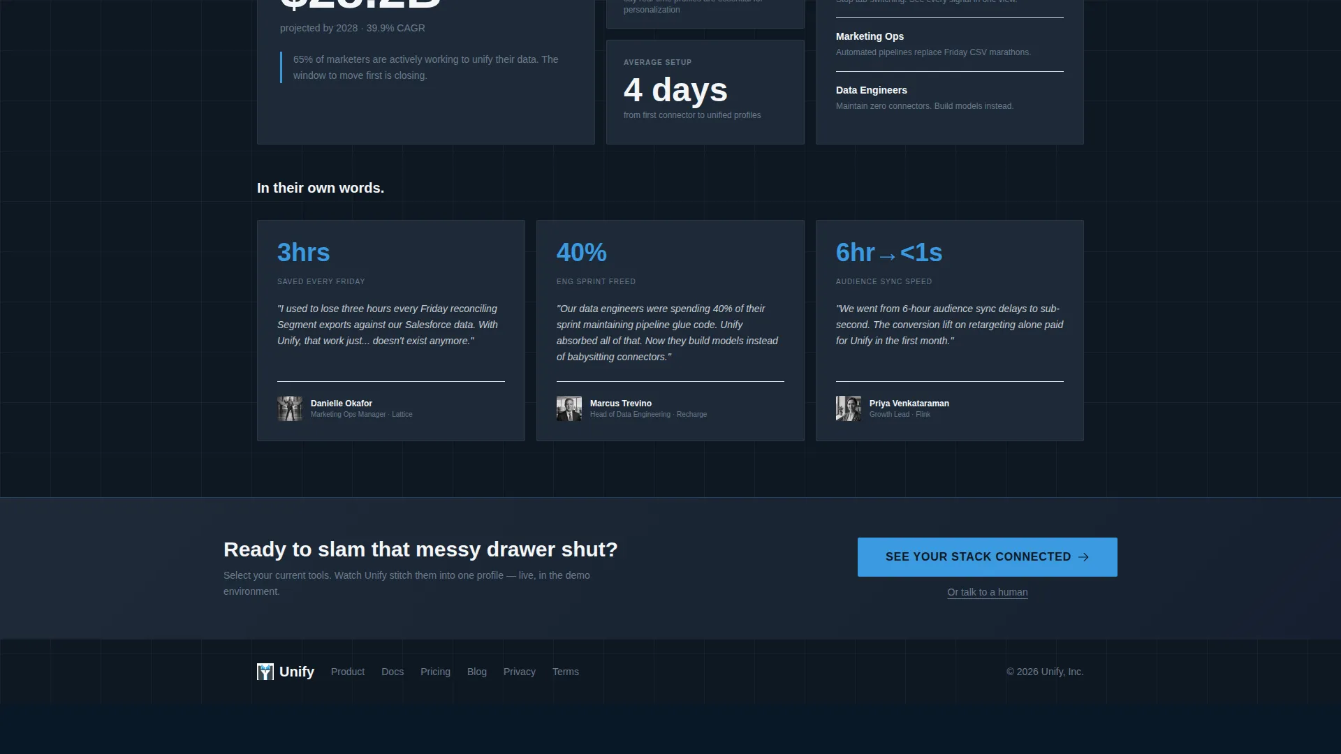
- A persistent bottom bar and in-grid calls to action all pointing to one guided demo destination, with a secondary "talk to a human" escape link
Feature list
This section describes the built-in components and interaction patterns included in the template.
Dual-Row Scrolling Logo Bar
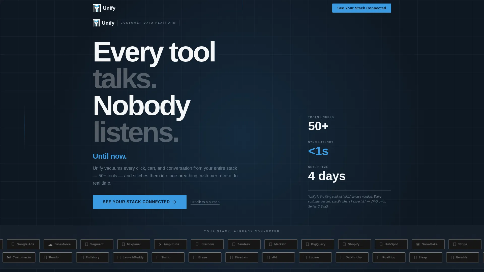
Two rows of integration logos scroll in opposite directions above the main headline. Each logo displays in monochrome against the slate background and snaps to full color when the cursor passes over it. This creates immediate stack recognition for any visitor who uses those tools.
Problem Card Row ("The Mess")
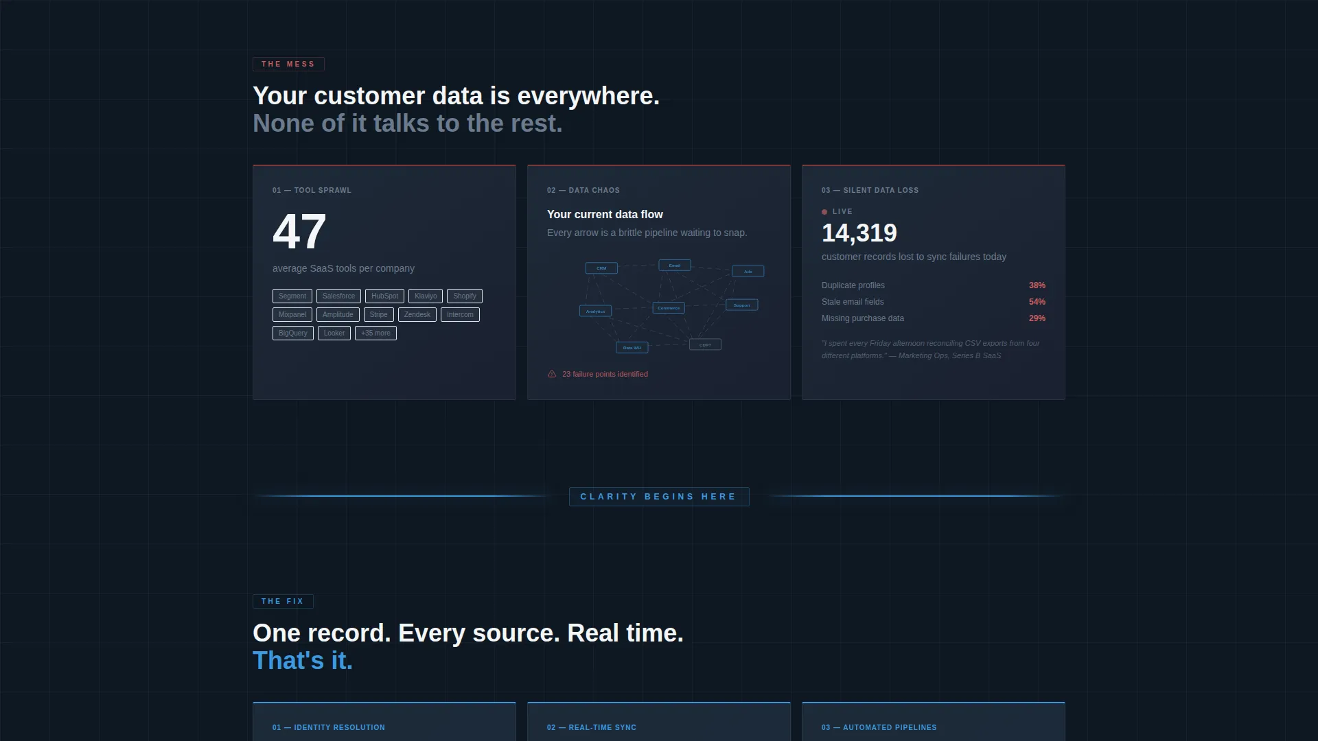
Three brutalist cards open the content grid with hard, specific pain data. One card shows a stacked-logo collage with a "47 average SaaS tools per company" stat. Another displays a tangled dependency diagram labeled "Your current data flow." The third shows a live-style counter of records lost to sync failures. Together, they make the problem visceral before the solution appears.
Sky-Blue Horizon Rule Divider
A single full-width horizontal rule in electric sky blue cuts across the page between the problem and solution sections. It acts as a visual and emotional reset point, signaling to the visitor that something has changed.
Solution Card Grid
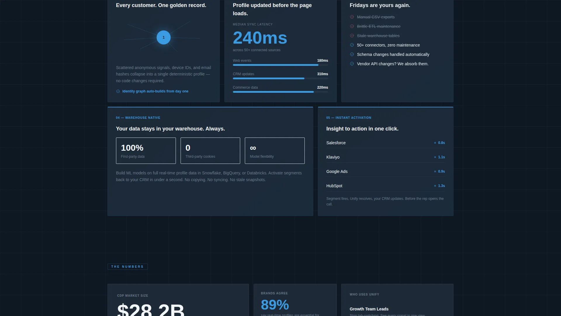
Below the divider, the same modular card structure mirrors and resolves each problem card. Cards show unified customer profiles, a real-time sync latency number, and an identity resolution animation of scattered data points collapsing into one. The grid feels calm, organized, and authoritative.
Frictionless call to action System
Every solution card and the persistent bottom bar carry the same call to action: "See Your Stack Connected." Clicking routes to a guided demo environment where the visitor picks their tools from a visual picker before seeing a personalized unification simulation. No form appears on the landing page itself.
Bold Brutalist Typography System
Oversized chalk-white slab type anchors the hero headline. Sky-blue accent type handles subheadings and active states. The type scale is unapologetically large, punching through dark slate surfaces with high contrast and no decorative softening.
Page sections overview
| Section | Purpose |
|---|---|
| Logo Bar Header | Displays integration logos scrolling in two rows; hero headline and sky-blue subhead sit centered above |
| Hero Headline Block | Delivers the core "Every tool talks. Nobody listens." message in oversized slab type |
| Problem Card Row | Three cards visualize real data fragmentation pain with specific stats and diagrams |
| Horizon Rule Divider | Full-width sky-blue line marks the transition from problem to solution |
| Solution Card Grid | Mirrors each problem card with a resolved, unified counterpart and live data visuals |
| Persistent Bottom Bar | Carries the primary call to action at all times as the visitor scrolls through the page |
Design & branding system
The template uses a Slate & Sky color system built on four intentional values. The palette communicates weight, clarity, and precision without relying on softness or decoration.
- Deep gunmetal slate (#1E2A38) backgrounds cards and primary surfaces; exposed-concrete gray (#6B7B8D) handles secondary surfaces and supporting elements
- Electric sky blue (#3B9AE1) drives all primary action colors, hover states, active toggles, the horizon divider, and the subheadline accent
- Chalk white (#F4F6F8) is used for all primary typography and breathing space, creating strong contrast against dark backgrounds without harshness
Mobile & speed optimization
The card grid layout is modular by design, which makes it straightforward to adapt for smaller viewports. Each card is a self-contained unit that can restack vertically without losing its visual logic.
- The modular grid structure allows cards to reflow naturally from multi-column desktop rows into single-column mobile stacks
- The persistent bottom bar call to action stays accessible on all screen sizes, keeping the primary action visible without requiring the visitor to scroll back up
- Logo Bar rows adapt to narrower widths while preserving the scrolling direction contrast that drives the recognition effect
How this template helps you convert
The entire page is engineered as a single, linear path from pain recognition to demo click. No dead ends, no distractions, and no form gate on the page itself.
- The Logo Bar immediately validates the visitor's tool stack, making them feel seen and lowering their guard before the headline lands
- The Problem→Solution Arc creates emotional momentum, so by the time the visitor reaches a call to action card, they are already picturing the relief your platform delivers
- The frictionless call to action routes directly to a personalized demo simulation, and the secondary "Or talk to a human" link captures high-intent visitors who are ready to skip self-serve entirely
Other information about this template
This template is designed specifically for the customer data platform category and fits naturally within a broader data and analytics technology positioning. It is built to support teams that compete in a space where buyers already know the problem but struggle to trust a new solution quickly.
- The template style is Card Grid (Modular), making individual sections easy to reorder, duplicate, or swap without breaking the overall layout
- The theme is Bold Brutalist, a deliberate choice for a data product audience that values directness and substance over decorative polish
- The creative direction follows a Problem→Solution Arc, a proven structure for technical SaaS landing pages where buyer skepticism is high
- The header concept is a Logo Bar, which is particularly effective for platforms that connect to many third-party tools and want to signal integration breadth immediately
- The landing page direction is Click-Through, meaning conversion is measured by demo clicks rather than form fills, reducing friction for a high-consideration purchase
Theme
Bold Brutalist
Creative direction
Problem→Solution Arc
Color system
Slate & Sky
Style
Card Grid (Modular)
Direction
Click-Through
Page Sections
Dual-row Scrolling Logo Bar
Problem Card Row with Live Data Visuals
Sky-blue Horizon Rule Divider
Solution Card Grid with Unified Profiles
Frictionless Click-through Call to Action System
Bold Brutalist Type and Card Layout
Related questions
Does this template include a contact form or lead capture form?
Can I swap out the integration logos in the Logo Bar?
Who is this landing page template best suited for?
Can I change the color palette to match my brand?
Is the Problem to Solution card grid easy to edit?



