Sync - Unified ERP Landing Page Template
Sync is a split-screen landing page template built for enterprise resource planning (ERP) platforms serving online sellers. It pairs a live-coded API header with a scrolling feature comparison matrix to show exactly why unified operations beat fragmented tools. The Void and Violet visual system makes complex capability claims feel sharp, credible, and impossible to ignore.
by Rocket studio
Quick summary
Sync is a single-page ERP landing page template designed for multi-channel commerce platforms. It opens with a split-screen code snippet header, rolls into a feature comparison matrix, and closes every scroll section with a pinned audit call-to-action (call to action). The design speaks directly to operations teams tired of juggling disconnected dashboards.
Who this template is for
This template is built for SaaS founders and product marketers who sell enterprise tools to operations-focused buyers. It speaks the language of people managing real inventory, real orders, and real pressure.
- Operations managers and fulfillment directors who oversee stock across multiple sales channels
- Founders or product leads positioning an ERP platform against legacy software or spreadsheet workflows
- Marketing teams who need a conversion-ready page that leads with technical credibility
What problem this template solves
Multi-channel sellers constantly lose time reconciling data that lives in separate systems. Inventory counts sit in one place, purchase orders in another, and accounting ledgers somewhere else entirely. This template gives an ERP platform a page that visually proves consolidation is possible.
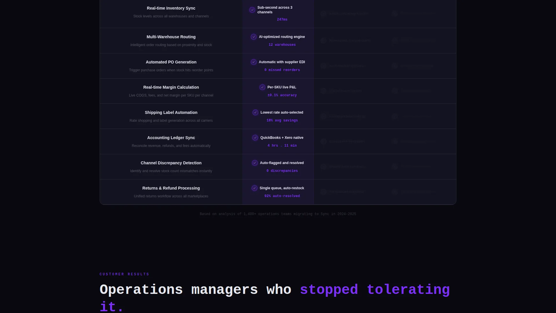
- Visitors arrive skeptical; the comparison matrix makes the gap between Sync and legacy tools undeniable row by row
- The two-step audit form replaces a generic contact form with a qualification flow that feels useful to the buyer
- The pinned call to action keeps the conversion path visible without interrupting the evidence-building scroll
What you get with this template
You get a fully structured, single-page layout with every section pre-built and purposeful. Nothing is decorative filler. Every block earns its place by advancing the visitor toward a decision.
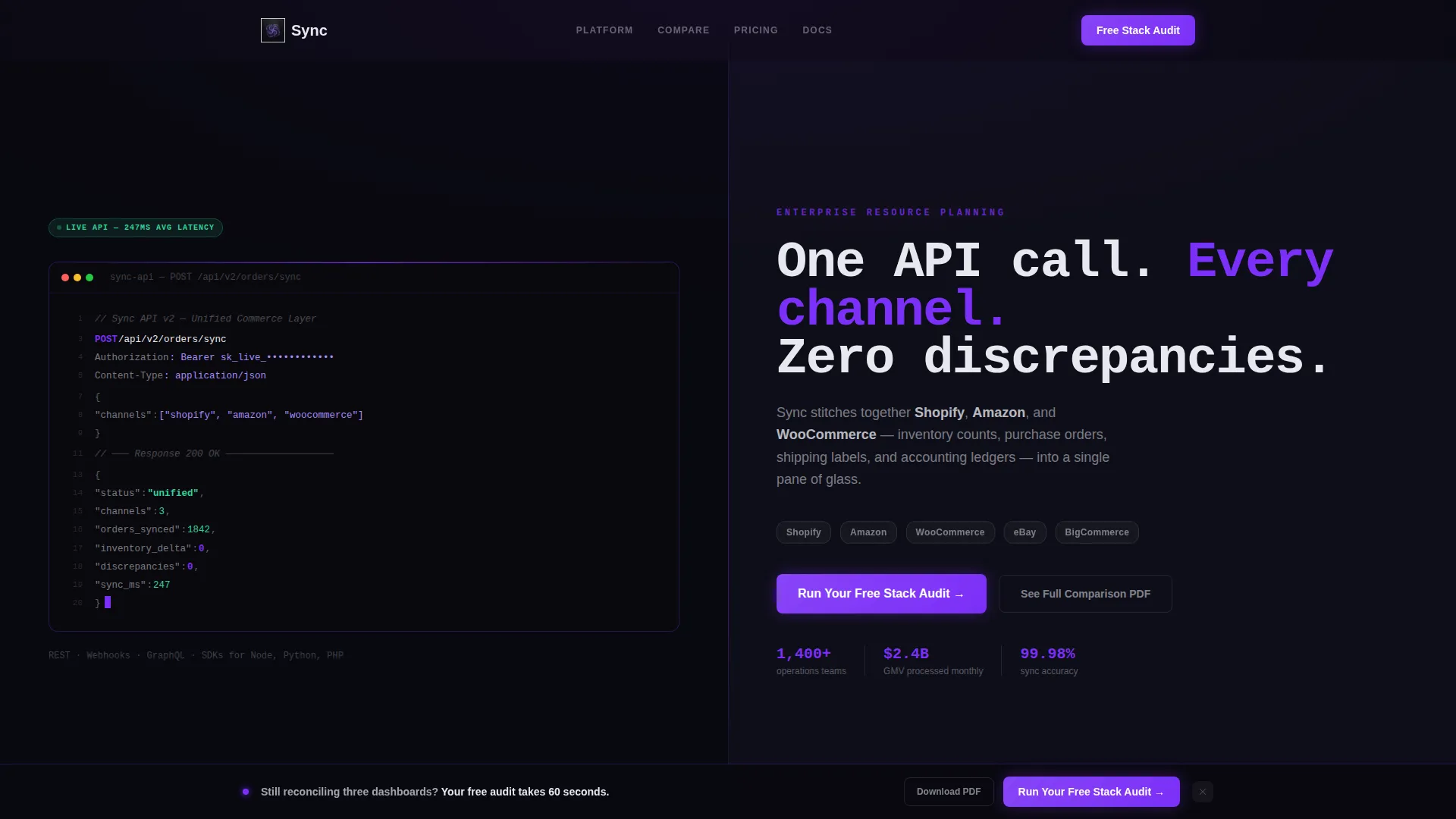
- A split-screen viewport header with a syntax-highlighted API terminal block on the left and a bold headline on the right
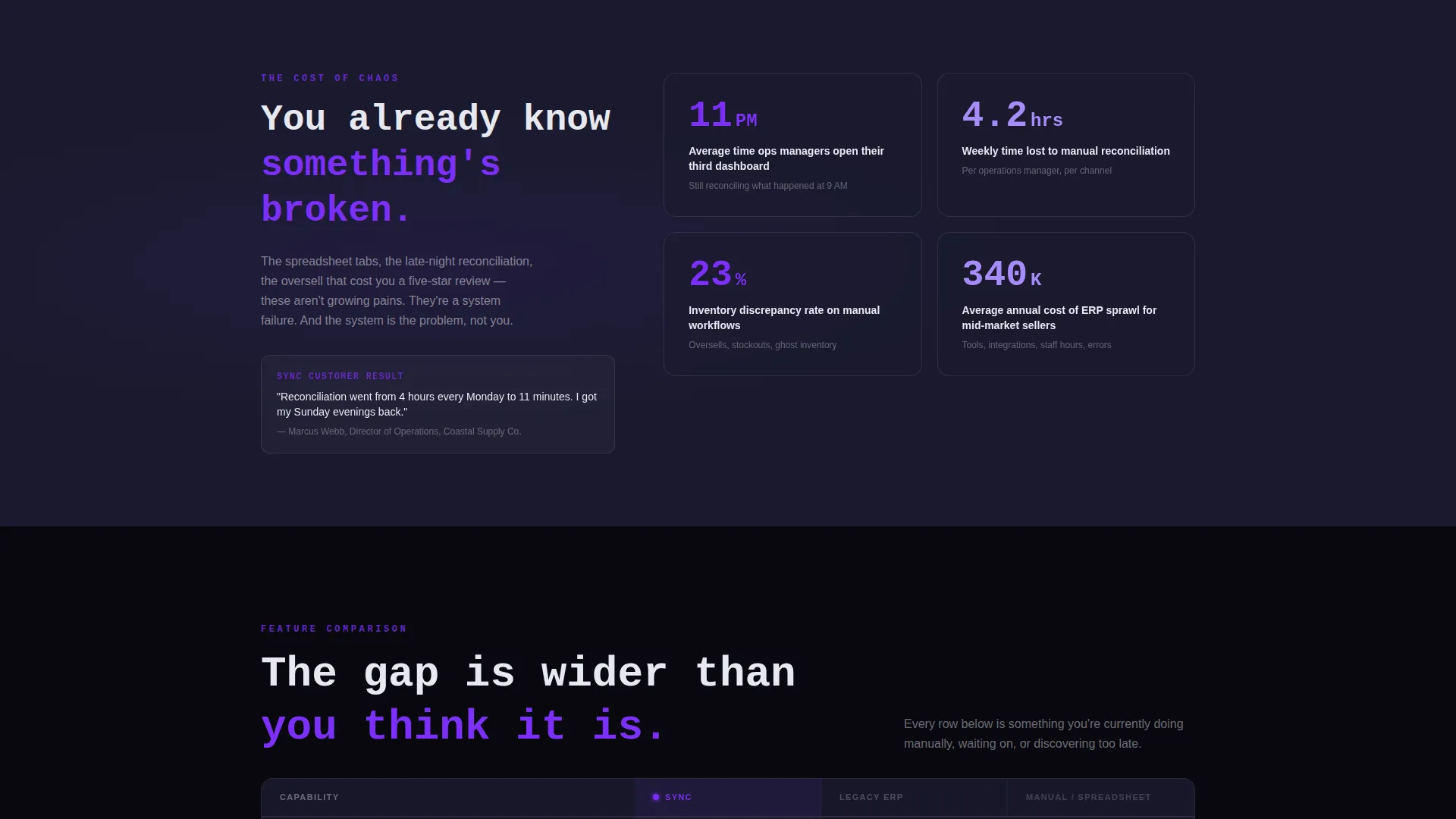
- A scrolling feature matrix grid comparing platform capabilities against legacy ERPs and manual workflows
- A two-step embedded form for stack audit capture and a secondary gated PDF download path
Feature list
This template ships with six core layout and interaction components, each designed around the buying psychology of an operations or finance buyer.
Split-Screen API Header
The header divides the viewport into two equal halves. The left panel displays a styled terminal block showing a realistic POST /api/v2/orders/sync call with a JSON response body. The right panel holds a monospaced display headline and a subline naming the three competing platforms the ERP connects. The code looks functional because it is written to be plausible to a developer.
Scrolling Feature Comparison Matrix
The main content section is a structured comparison grid. Each row represents a capability such as inventory sync, multi-warehouse routing, automated purchase order (PO) generation, or real-time margin calculation. The left column glows with violet check icons and live metric counters. Competing columns are muted and struck through, deliberately dimmed to let the contrast speak for itself.
Pinned Conversion call to action Bar
After the third comparison row, a sticky bar locks to the bottom of the viewport. It carries the primary call to action button labeled "Run Your Free Stack Audit." It stays visible throughout the scroll without blocking the comparison content, keeping the action step one click away at all times.
Two-Step Audit Capture Form
Clicking the primary call to action opens a two-step inline form. Step one presents a checkbox grid of sales channels and a monthly order volume dropdown. Step two captures a work email address and current ERP selection. This qualification sequence makes the form feel like a useful diagnostic rather than a data grab.
Gated PDF Download Path
A secondary call to action offers "See the Full Comparison PDF" for visitors still in research mode. This path captures leads who are not yet ready to commit to the audit but want a deeper breakdown. It runs parallel to the primary call to action without competing for visual attention.
Tech Glass Card System
All content cards float on the dark background using a 1-pixel frosted border and backdrop blur. Violet appears only on interactive elements and hover states. The card surfaces use frosted glass white typography against void black, creating clear hierarchy without harsh contrast.
Page sections overview
| Section | Purpose |
|---|---|
| Split-Screen Header | Establish technical credibility with a live API code block and bold channel headline |
| Feature Matrix Grid | Build a scrolling, row-by-row comparison between Sync and legacy tools |
| Pinned call to action Bar | Keep the stack audit action step visible after the third comparison row |
| Two-Step Audit Form | Qualify leads with channel and volume questions before capturing email |
| Gated PDF Download | Offer a research-mode exit path for visitors not yet ready to convert |
Design & branding system
The visual identity follows a Tech Glass theme built on a Void and Violet color system. The palette is intentionally restrained. Dark backgrounds anchor every section, and violet appears only where the eye should travel next.
- Core colors: absolute void black (#09090F) and deep crystalline charcoal (#1A1A2E) for backgrounds; electric violet (#7B2FF7) for interactive highlights; frosted glass white (#E8E8F0) for typography and card surfaces
- Cards use 1-pixel frosted borders with backdrop blur to create a floating, layered depth without gradients or noise
- Typography uses a monospaced display font in the header to reinforce the developer-tool aesthetic throughout
Mobile & speed optimization
The split-screen layout is structured to reflow gracefully on smaller viewports. The two-column header collapses to a stacked single-column view on mobile, preserving the code block and headline hierarchy without truncation.
- The comparison matrix rows remain scannable at mobile widths, with column labels anchored for context during horizontal scroll
- The pinned call to action bar adjusts to the mobile bottom bar position so the audit button stays accessible throughout the page scroll
How this template helps you convert
The page is built around Comparison and Versus conversion logic. Every design and copy decision is stacked to make the visitor feel the cost of their current setup before presenting an alternative.
- The feature matrix accumulates evidence row by row, widening the perceived gap between the platform and legacy tools until the visitor stops comparing and starts deciding
- The pinned call to action bar surfaces the audit action at the exact moment comparison fatigue sets in, removing friction from the next step
- The two-step form opens with channel and volume questions that feel diagnostic, making the visitor more willing to share their work email in step two
Other information about this template
This template is purpose-built for the e-commerce ERP niche and sits inside the broader Technology and E-Commerce Software and SaaS category. It is designed to work for any platform positioning itself as a unified operations layer for multi-channel sellers.
- The template is well-suited for platforms competing against point solutions, manual spreadsheet workflows, or legacy enterprise tools that require heavy implementation budgets
- The gated PDF download component doubles as a content marketing asset, supporting mid-funnel lead nurture alongside the primary audit call to action
- The code snippet in the header is styled to feel plausible and functional, which helps build trust with technically literate buyers who would dismiss purely cosmetic user interface mockups
- Page type is a single-page landing structure with a section-led scroll flow; it is not a multi-page site build
Theme
Tech Glass
Creative direction
Feature Matrix
Color system
Void & Violet
Style
Split Screen (50/50)
Direction
Comparison/Versus
Page Sections
Split-screen API Terminal Header
Scrolling Feature Comparison Matrix
Pinned Stack Audit Call to Action
Two-step Lead Qualification Form
Gated PDF Comparison Download
Tech Glass Card System
Related questions
What type of businesses is this landing page template built for?
Can I customize the feature comparison rows in the matrix?
How does the pinned call to action bar behave during scroll?
Do I need a developer to set up the two-step audit form?
What makes the Tech Glass visual style a good fit for an ERP platform?



