Media & Publishing Digital Presence Professional Website Template
Syndicate is a scroll-reveal landing page template built for a members-only media industry forum. It uses a Problem→Solution Arc, a terminal code-snippet hero, and an animated comparison table to convert media operators from noisy generic communities into a signal-dense private intelligence network. The Acid Digital color system runs on void black, phosphor green, and electric violet.
by Rocket studio
Quick summary
Syndicate is a single-page, scroll-reveal landing page template for a private media and publishing intelligence forum. It guides visitors through a visceral problem, a specific solution, and a direct head-to-head comparison, all before asking for an email. The design runs on a Data Command aesthetic: void black backgrounds, terminal phosphor green calls to action, and electric violet premium accents.
Who this template is for
This template is built for media operators who are done with generic online communities and want a credible, conversion-ready home for a signal-dense private forum. It suits founders and platform builders who serve a professional publishing audience.
- Managing editors, indie newsletter operators, and publishing CTOs who need peer-level intelligence
- Media community builders launching a members-only forum for the publishing and editorial industry
- Editorial product teams promoting a gated intelligence platform to a B2B media audience
What problem this template solves
Media professionals are drowning in platform noise. Generic subreddits, open Slack groups, and social feeds mix signal with performance. There is no fast, credible way to show a jaded media operator why a private forum is worth their attention.
- Visitors from a media background have high skepticism and low patience for vague value claims
- Existing community landing pages fail to demonstrate information quality before asking for commitment
- The template closes the gap between "this looks interesting" and "I need to be in this room"
What you get with this template
You get a fully structured, single-page scroll-reveal layout designed to move a skeptical media professional from curiosity to conversion. Every section is sequenced to build evidence before it asks for anything.
- A terminal code-snippet hero with typewriter animation that materializes the headline after the code resolves
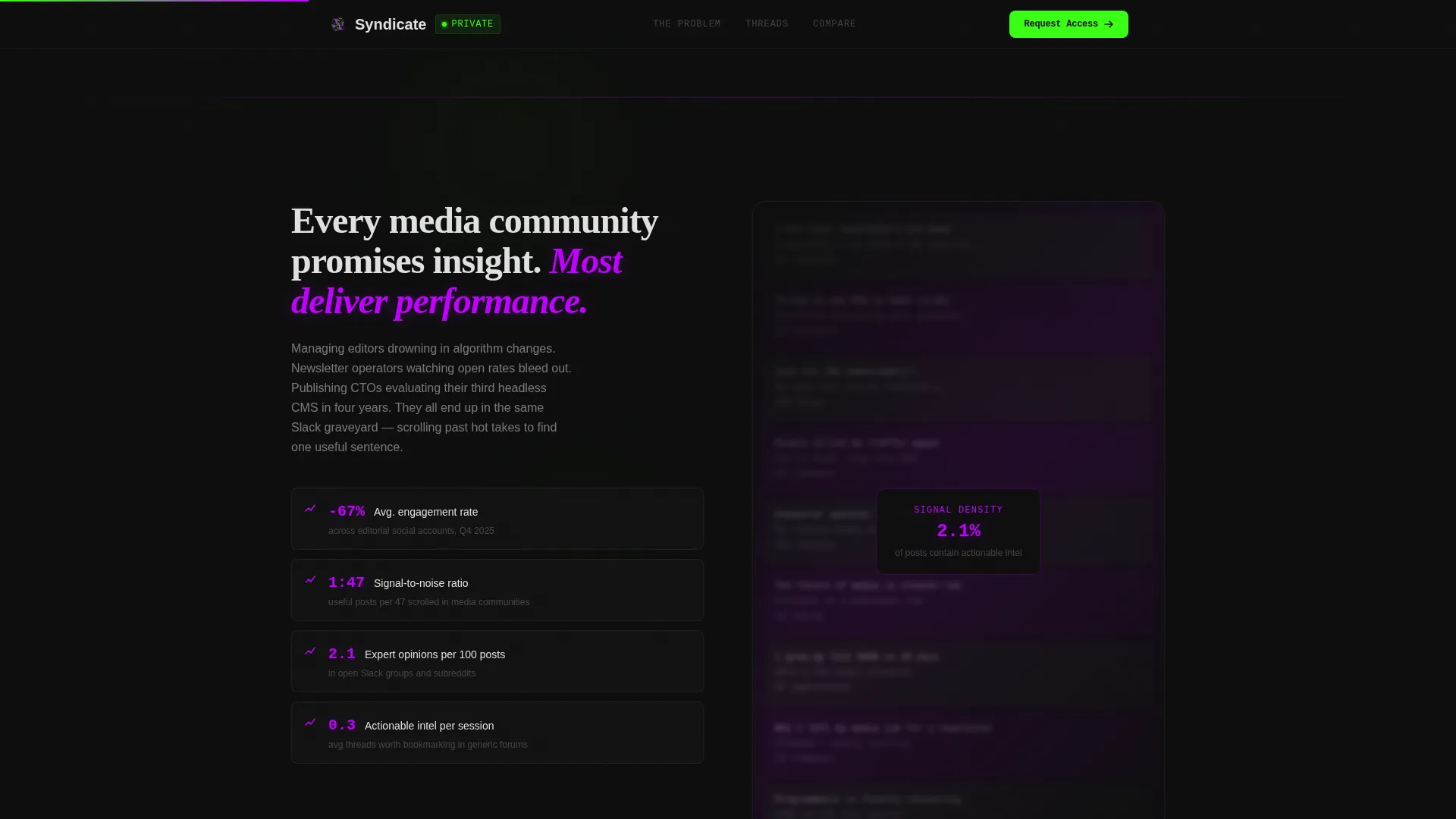
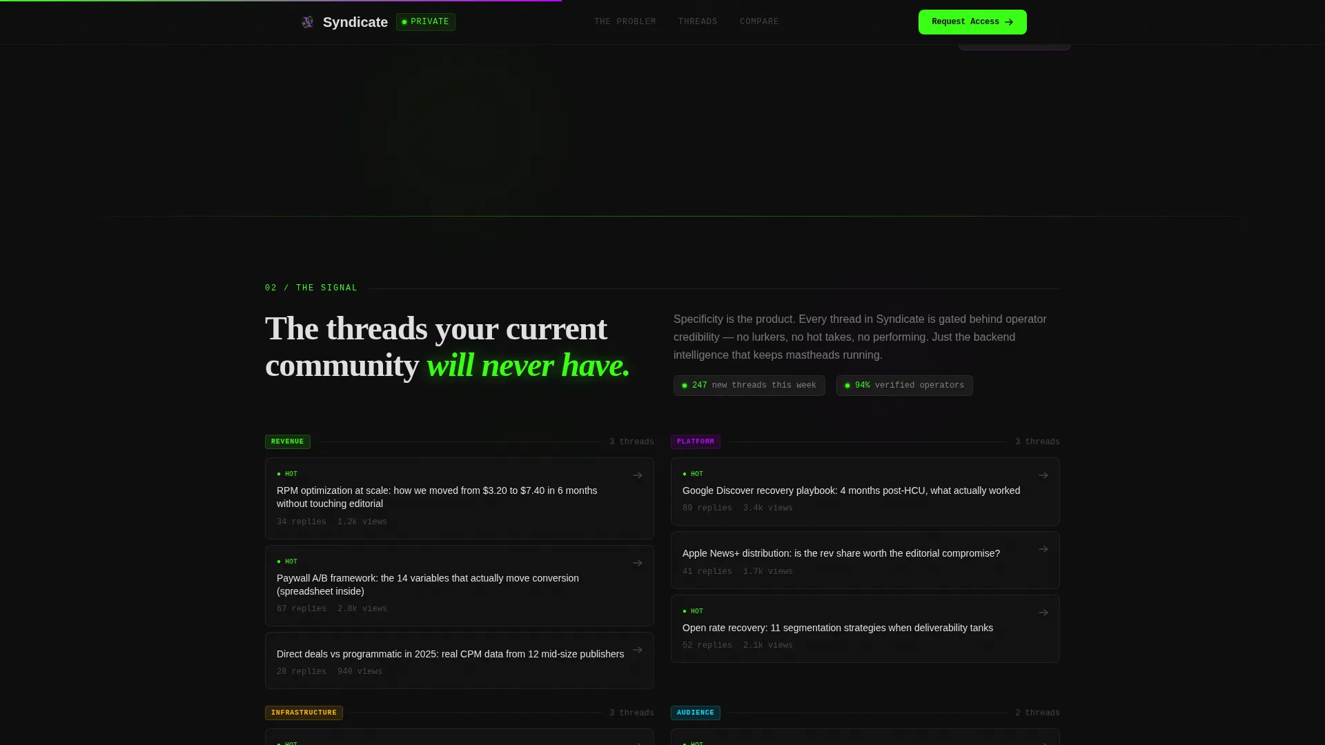
- A Problem Wall section with blurred social noise and declining metrics overlay, followed by a shattering reveal of real categorized forum threads
- An animated comparison table, a gated preview call to action, and a minimal horizontal footer
Feature list
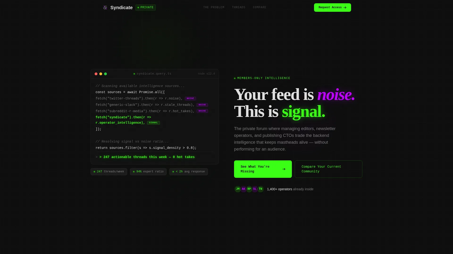
Terminal Code-Snippet Hero
The hero opens with a pseudo-code block styled like a real integrated development environment. Lines resolve one by one using a typewriter effect, comparing a generic forum fetch to a Syndicate fetch. When the snippet completes, a return value appears and the headline materializes beneath it in scanner white.
Problem-to-Solution Scroll Arc
The page is structured as a three-act scroll experience. A wall of blurred social media posts overlaid with declining engagement metrics establishes the problem. The wall then shatters into categorized forum threads with real, specific topic titles. The arc makes the solution feel earned rather than asserted.
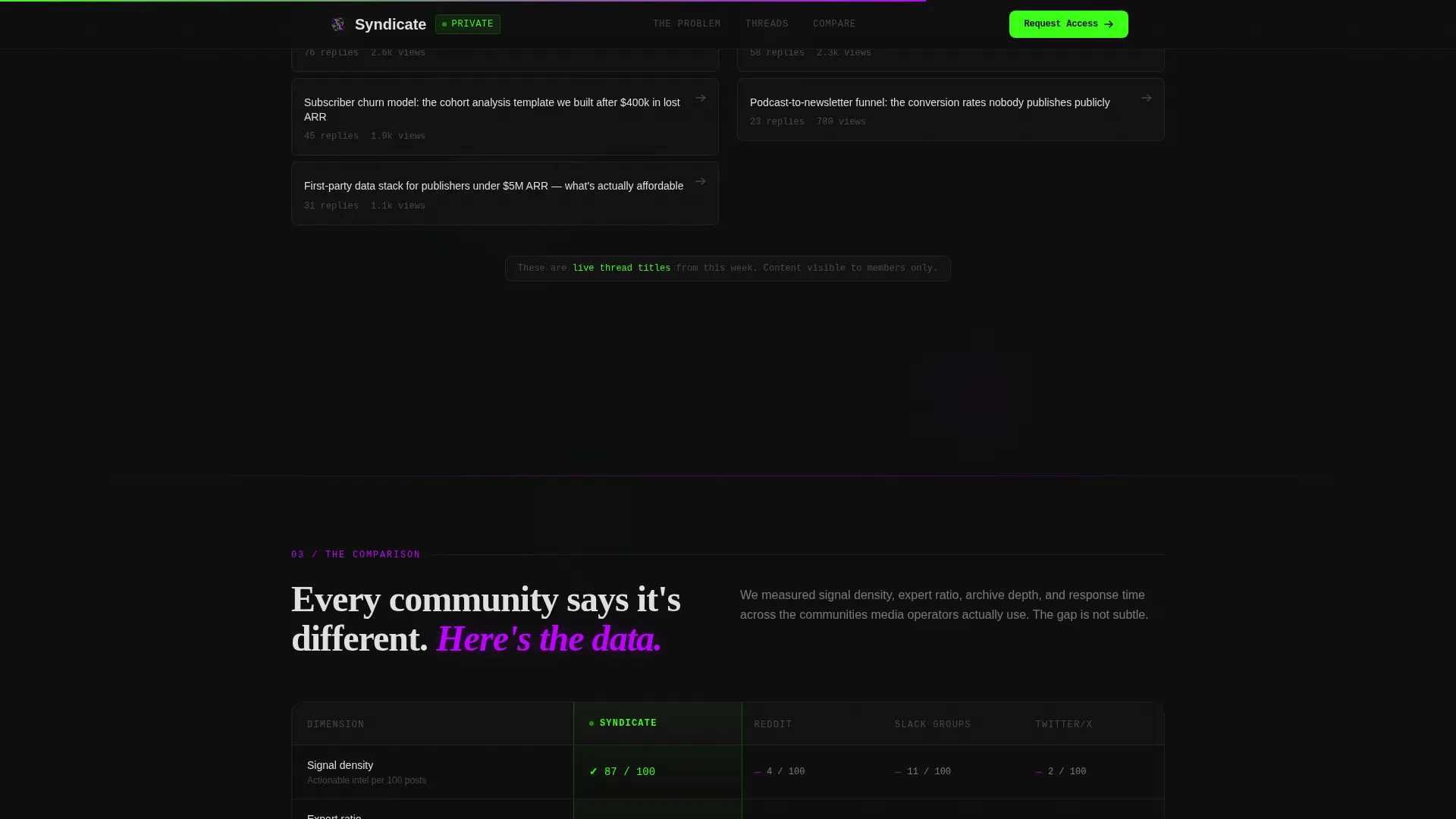
Animated Comparison Table
A live side-by-side table contrasts the forum against generic communities, subreddits, and paid Slack groups. Rows animate in on scroll using staggered timing. Green checkmarks stack in the Syndicate column while competitors accumulate violet dashes across dimensions like signal density, expert ratio, searchable archive depth, and response time.
Email-Gated Preview Call to Action
The primary call to action reads "See What You're Missing" and gates a live preview of three trending threads behind a single email field. The gate activates after the comparison table has already made the case, so the ask feels natural rather than premature.
Interactive Gap Analysis Tool
A secondary conversion path labeled "Compare Your Current Community" lets visitors select their existing forum or information source. The tool returns a personalized gap analysis. This interactive element deepens engagement for visitors who are not yet ready to submit their email.
GSAP ScrollTrigger Animation System
The template uses high-fidelity scroll-triggered animations throughout. Scroll reveals are powered by Intersection Observer for performance. GPU-accelerated transforms handle the wall shatter, table row stagger, and counter animations without layout-blocking repaints.
Page sections overview
| Section | Purpose |
|---|---|
| Terminal Hero | Runs pseudo-code animation, materializes headline |
| Problem Wall | Shows blurred social noise with metrics overlay |
| Solution Reveal | Shatters wall into specific forum thread categories |
| Comparison Table | Animates rows comparing forum against alternatives |
| Email Gate | Gates thread preview behind single email field |
| Minimal Footer | Closes page with Vercel-style horizontal flow |
Design & branding system
The visual identity follows a Data Command theme executed through an Acid Digital color system. Every background is void black. Active states, live data indicators, and primary calls to action glow in terminal phosphor green. Electric violet tags premium content and marks competitor dashes in the comparison table. Scanner white body text sits clean against the dark field. Monospaced type appears wherever the terminal aesthetic demands it.
- Color palette: void black (#0D0D0D), terminal phosphor green (#39FF14), electric violet (#BF00FF), scanner white (#E0E0E0)
- Typography: JetBrains Mono for code and terminal elements, DM Sans for body copy, Fraunces for editorial headlines
- Visual tone feels like a newsroom analytics dashboard left running at 2 a.m., everything pulsing with signal
Mobile & speed optimization
The template is built desktop-first, reflecting the reality that media operators work at desks during late-night production cycles. Performance is treated as a design constraint, not an afterthought. All animations run on GPU-accelerated transforms to avoid layout-blocking repaints.
- Intersection Observer controls all scroll-reveal triggers, keeping animation costs low as content enters the viewport
- GPU-accelerated CSS transforms handle the wall shatter, counter animations, and table row stagger sequences
- GSAP ScrollTrigger manages the typewriter code reveal and headline materialization without affecting scroll performance
How this template helps you convert
The entire page is sequenced as a Comparison/Versus conversion flow. Evidence accumulates across each scroll section before the call to action appears. By the time a visitor reaches the email gate, the comparison table has already closed the argument.
- The code-snippet hero establishes credibility immediately by speaking the technical language of the target audience before a single marketing claim is made.
- The Problem Wall followed by the Solution Reveal creates an emotional arc that makes specificity feel like relief, not a sales pitch.
- The animated comparison table stacks visible, row-by-row proof, so the "See What You're Missing" call to action opens a door the visitor already wants to walk through.
Other information about this template
This template is built specifically for the media and publishing community forum niche inside a broader technology category. It suits a B2B publishing intelligence product and is not a general-purpose forum template. Several design and structural decisions are worth noting for teams evaluating it.
- Template style is Scroll Reveal (Progressive), meaning each section enters the viewport with purposeful animation rather than loading all at once
- The header concept is Code Snippet, a practical signal to a technical audience that this platform speaks their language before any prose appears
- The creative direction is Problem→Solution Arc, which structures persuasion around a felt problem rather than feature enumeration
- The landing page direction is Comparison/Versus, making the animated table the central persuasion engine rather than testimonials or feature grids
- Footer follows a minimal horizontal flow pattern inspired by clean developer-product aesthetics
Theme
Data Command
Creative direction
Problem→Solution Arc
Color system
Acid Digital
Style
Scroll Reveal (Progressive)
Direction
Comparison/Versus
Page Sections
Terminal Code-snippet Hero Animation
Problem-to-solution Scroll Arc
Animated Comparison Table
Email-gated Thread Preview
Interactive Gap Analysis Tool
Gpu-accelerated Scroll Reveals
Related questions
What type of product is this template designed for?
Can I adapt the comparison table to reflect my own community's strengths?
What animation tools does this template use?
Is this template suitable for a general community or forum product?
What does the email gate section show visitors after they sign up?


