Online Skill Courses Careers Website Template
Codecraft is a single-column HTML and CSS online course landing page built for career-switchers, freelancers, and junior designers ready to learn from scratch. It follows a Problem→Solution Arc with a custom split-screen browser illustration, live code animations, module breakdowns, woven testimonials, and a freemium signup form, all styled in a bold Institutional Authority palette of navy, chalk white, highlighter yellow, and electric coral.
by Rocket studio
Quick summary
This landing page is designed for one HTML and CSS online course that teaches students by building real websites from empty files. No frameworks, no shortcuts. The page moves visitors from gut-punch problem awareness to confident module-by-module discovery, then converts them with a free Module 1 signup. Every section earns the next scroll.
Who this template is for
This product landing page speaks directly to people who have been circling web development without ever jumping in. It is built for a specific kind of motivated learner who is done waiting.
- Career-switchers writing their first HTML tags late at night after the kids are asleep
- Junior designers tired of handing mockups to developers and sitting idle
- Freelancers who have been faking it with WordPress and finally want to understand the code underneath
What problem this template solves
Most course landing pages look the same. They stack a video, a bullet list, and a price. They do not earn trust. This product landing page solves the deeper problem: visitors arrive skeptical and leave unconvinced.
- Visitors cannot picture the transformation until they see it happen, so the page plays a live code animation before the call to action
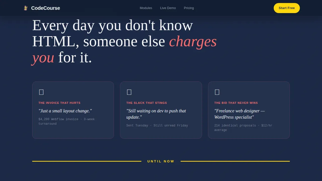
- The real cost of not knowing HTML and CSS is invisible, so a Problem Arc section makes it visible and urgent
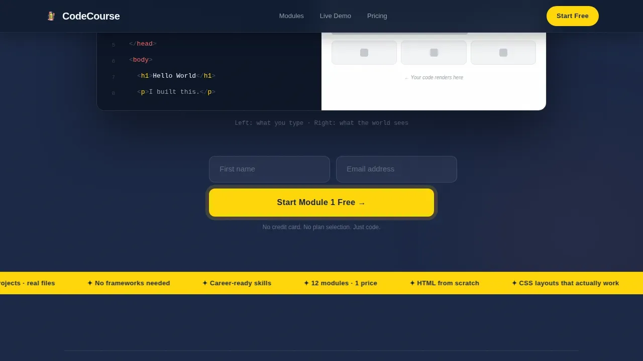
- Conversion is weak when signup forms ask too much, so the inline form asks only for a first name and email
What you get with this template
You get a complete, single-column landing page structure that guides every visitor from problem recognition to confident enrollment. The layout is built with strong visual hierarchy and clear page sections that each serve one purpose.
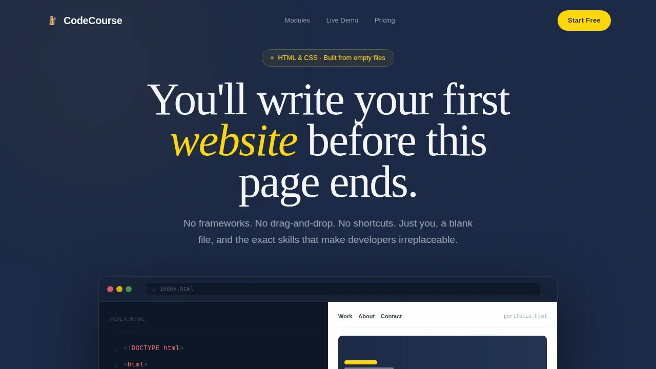
- A custom split-screen browser illustration in the hero section with a blinking cursor animation and fade-in code lines
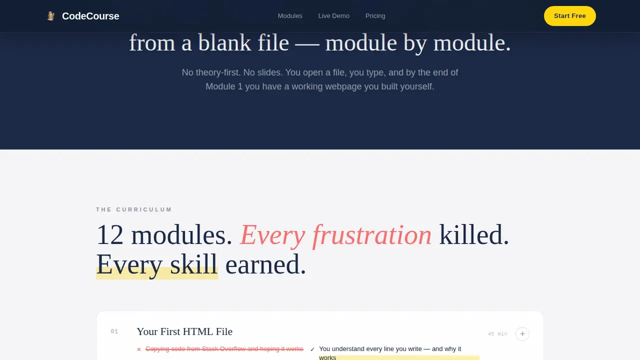
- A full module breakdown with coral strikethrough problem labels and yellow highlight power statements, plus testimonials woven between modules
- Two conversion paths: a free Module 1 inline signup form and a full course pricing toggle at the page bottom with a 14-day money-back line
Feature list
This landing page packs a focused set of features that serve both the course buyer and the developer building the page. Each feature has a clear job to do.
Problem-to-Solution Arc Layout
The page opens in the problem and pivots through a single yellow divider line. Above the divider, screenshots of real frustrations, invoices, waiting messages, crowded freelancer listings, create tension. Below it, each module card shows the specific frustration it kills on the left in coral strikethrough, and the specific power it gives on the right in a yellow highlight. This structure is what makes the product landing page feel like a story, not a brochure.
Live Code Animation Demo
Before the primary call to action appears, visitors watch a first-lesson code animation play out in real time. HTML tags cascade into a browser preview, elements fade into existence, and a cursor blinks on the code side. By the time users reach the signup form, they have already seen the transformation and want to type it themselves. JavaScript drives the interactivity of this sequence, handling real-time content changes and simple animations.
Freemium Inline Signup Form
The primary call to action is "Start Module 1 Free." Clicking it opens an inline form that asks only for a first name and email. No credit card, no plan selection. Forms on landing pages should only ask for essential information to reduce user friction, and this one does exactly that. The form appears first beneath the hero section and again after the third module reveal.
Pricing Toggle Section
Committed buyers reach a dedicated section at the bottom of the page. It displays "Unlock All 12 Modules" with a single annual price and a toggle for monthly billing. A short description of the 14-day money-back guarantee sits in small type beneath the price. The toggle uses JavaScript to switch between billing periods without a page reload, keeping users on the page.
Woven Testimonial System
Testimonials are not stacked at the bottom. They are placed between module cards as real student screenshot blocks, each one showing code the student wrote alongside the site it produced. Incorporating social proof through specific outcomes builds immediate credibility and keeps the scroll momentum moving downward.
Custom Vector Header Illustration
The hero section uses a custom split-screen browser illustration drawn in a clean, slightly playful vector style. The left pane shows hand-written HTML tags in monospaced type, color-coded in coral and yellow. The right pane renders those tags into a miniature portfolio page in real time. A blinking cursor on the code side and fading elements on the preview side add life to the illustration without heavy video files.
Page sections overview
| Section | Purpose |
|---|---|
| Hero with Illustration | Opens the page with the split-screen browser animation and primary call to action |
| Problem Arc | Shows the real cost of not knowing code through screenshots and tension |
| Yellow Divider Pivot | Marks the emotional turn from problem to solution |
| Module Breakdown Cards | Walks through each course module with coral and yellow contrast labels |
| Woven Testimonials | Builds credibility between modules with real student outcomes |
| Live Code Demo | Plays the first lesson animation before the second call to action appears |
| Freemium Signup Form | Collects first name and email to unlock Module 1 for free |
| Pricing Toggle | Displays full course pricing with monthly and annual billing options |
| Footer Row | Closes the page with minimal links and legal text |
Design & branding system
The visual identity follows an Institutional Authority theme layered over a Dopamine Pop color system. The result feels like a university textbook that someone attacked with neon highlighters: serious bones and thrilling annotations. Every color has a specific role, and every font choice reinforces the contrast between academic rigor and human warmth.
- Deep lecture-hall navy (#1B2845) dominates the top and bottom thirds as the primary background; chalk white (#F5F5F7) opens up the teaching sections in the middle, giving the layout breathing room and helping users scan content quickly
- Highlighter yellow (#FFD60A) appears only on buttons, progress indicators, and module power labels, using high-contrast color to guide the hand toward the next action; electric coral (#FF6B6B) marks problem states, strikethroughs, and "before" examples
- Typography pairs Fraunces serif headlines with DM Sans for body text and user interface elements; the font family contrast reinforces the institutional-meets-human tone, and the sans serif body text keeps long teaching sections easy to read on any device
Mobile & speed optimization
The landing page is built mobile-first. Students learning at midnight on their phones are the primary audience. Mobile-first optimization requires layouts to stack into a single column and ensure tappable elements are large and well-spaced, and this page delivers exactly that.
- Responsive web design techniques including media queries and Flexbox ensure the layout adapts cleanly to any screen size; Flexbox is used to align items and justify content across module cards, testimonial blocks, and the pricing row, with flex properties adjusting automatically for smaller devices
- The page is fully responsive, using relative units and CSS Grid to handle image and content alignment at any viewport; responsive images support different resolutions by device, and a hamburger menu pattern is available for mobile navigation
- The lightweight single-column structure and compressed hero images help the page load quickly; JavaScript is scoped to interactive components like the code animation, pricing toggle, and scroll-to-top behavior, keeping the rest of the page static and fast
How this template helps you convert
A well-structured landing page improves user engagement and conversion rates. This one is built around a single-minded conversion goal: get the visitor to start Module 1 for free, then upgrade when they are ready. Every design choice serves that path.
- The hero section places the logo, headline, and primary call-to-action button above the fold within the first visible screen area, using a benefit-oriented headline that speaks directly to visitor pain points and a high-contrast yellow button that is impossible to miss
- The Problem Arc builds urgency before the solution appears, so by the time users reach the module breakdown and live code demo, they are already emotionally invested; the inline signup form then asks only for a first name and email, removing every possible barrier to entry
- The pricing section at the bottom converts committed buyers with a clear annual and monthly toggle, a transparent price, and a short money-back reassurance, giving confident buyers a second path to convert without revisiting the top of the page
Other information about this template
This landing page is a strong learning reference as well as a ready-to-use product. Developers exploring the codebase will find clean, well-commented HTML and CSS files organized inside a logical project folder structure. The code follows semantic HTML5 conventions, using proper elements like header, nav, main, and footer tags to improve accessibility and document clarity.
- CSS variables define the color palette and font sizes across the project, making it straightforward to update spacing, border radius values, padding, margin, and text align properties from a single location; this approach keeps the CSS files maintainable as the project grows
- The layout uses Flexbox to align items and justify content within module cards and testimonial rows; CSS Grid handles image and content alignment in larger sections; centering elements, managing auto margin behavior, and controlling flex wrap are all handled consistently across the codebase
- Font family choices are declared at the top of the CSS file; the Fraunces serif and DM Sans sans serif pairing is defined using standard font style declarations, and the font family can be swapped by updating a single CSS variable
- The page can support video embeds for lesson previews or course introduction clips; video sections can link to external tutorial platforms or course content without relying on a content management system; links and icon elements are styled with consistent border radius and spacing throughout
- The Codecraft master HTML and CSS landing page template is categorized under Education and Training on the marketplace; it is the product landing page choice for course creators who want to learn HTML and CSS alongside their students while shipping a professional page from scratch
- JavaScript handles interactivity including the live code animation, pricing toggle, scroll reveals, and form behavior; understanding the basics of HTML, CSS, and JavaScript gives developers full control over the page's design and functionality; the JS file is separate from the HTML document for easy editing
- The page is built without a content management system dependency, making it easy to host anywhere; the project folder contains all HTML, CSS, and JavaScript files needed to deploy the page independently
Theme
Institutional Authority
Creative direction
Problem→Solution Arc
Color system
Dopamine Pop
Style
Single Column Flow
Direction
Freemium/Trial
Page Sections
Problem-to-solution Arc with Module Cards
Live Code Animation Before the Call to Action
Freemium Inline Signup Form
Pricing Toggle with Annual and Monthly Options
Woven Testimonials Between Modules
Custom Split-screen Browser Hero Illustration
Related questions
Do I need to know how to code to customize this landing page?
Can I use this page to actually learn HTML and CSS while I customize it?
Is the page design mobile-friendly?
How does the freemium conversion model work in this landing page?
Can I add video content or tutorial previews to this landing page?



