Complete Advanced Tech & AI Platforms Privacy Policy & Terms Website Template
Synth is a single-page landing page template built for a synthetic data generation platform. It pairs a dark terminal-inspired visual identity with a Problem to Solution Arc layout, a live comparison table, and a frictionless app download flow. The design targets ML engineers, QA leads, and startup CTOs who need production-realistic datasets fast, without compliance friction.
by Rocket studio
Quick summary
Synth is a comparison table landing page template designed for a synthetic data generator. It opens with a dashboard screenshot mid-generation, walks visitors through a sharp pain-versus-solution arc, and closes with a single-tap download call to action. The template uses a Midnight Blue color system and Startup Velocity theme to project speed and technical credibility.
Who this template is for
This template is built for technical founders and platform teams who need to communicate complex developer value quickly. It speaks directly to the people who feel the daily friction of data access delays.
- ML engineers blocked on model training while waiting for legal clearance on production records
- QA leads running load tests against hollow fixtures that do not reflect real-world data distributions
- Startup CTOs who need realistic demo environments before a single real user has signed up
What problem this template solves
Getting access to realistic data is slow, risky, and politically complicated inside most organizations. This template gives a synthetic data platform a structured narrative to show visitors exactly why that pain exists and why the product eliminates it.
- Compliance review cycles delay model training by days or weeks, breaking engineering momentum
- Traditional mock data lacks statistical coherence, making test results unreliable
- Requesting sanitized database dumps from database administrators creates bottlenecks and friction
What you get with this template
You get a fully structured single-page layout that moves visitors from recognized pain to confident action without detours. Every section is purpose-built for a developer-first audience.
- A header section with a product screenshot, monospace stat line, and a primary call-to-action button
- A three-act Problem to Solution Arc including a live comparison table, an animated schema-to-data diagram section, and a proof section with benchmarks and integration logos
- A sticky mobile call-to-action bar and a secondary browser-based trial path that captures intent after the visitor has already felt the product speed
Feature list
This template packages several purpose-built components that work together to reduce friction between landing and conversion.
Dashboard Screenshot Header
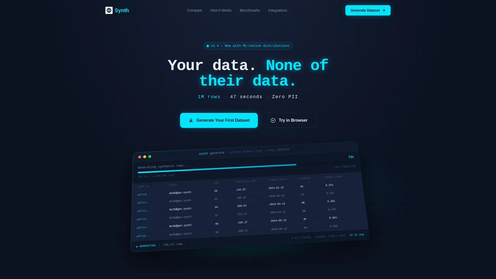
The header features a pixel-perfect product screenshot mid-generation. A progress bar sits at 73 percent, schema columns populate in real time, and a row counter spins past 400,000. The screenshot rests on a subtle isometric plane with a faint cyan glow beneath it, giving the impression of live energy. Above it: "Your data. None of their data." Below it: "1M rows. 47 seconds. Zero PII." typeset in monospace.
Three-Column Comparison Table
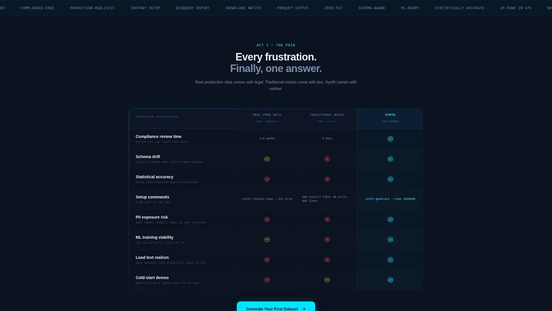
The core of the page is a structured comparison table pitting Real Production Data, Traditional Mocks, and Synth against each other row by row. Each row maps to a specific developer frustration: compliance review time, schema drift, statistical accuracy, and setup commands. Red cross marks accumulate in the first two columns while cyan check marks cascade down the Synth column.
Animated Schema-to-Data Diagram
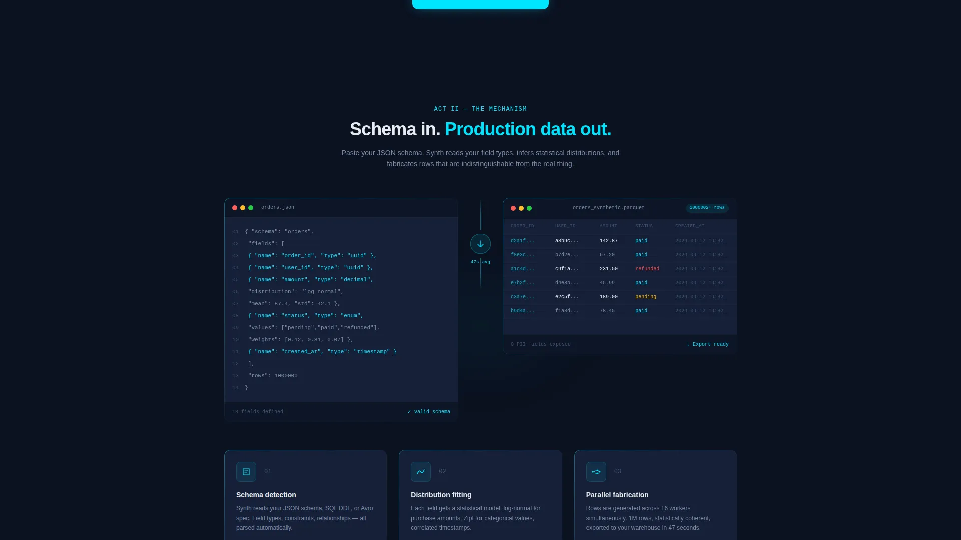
The mechanism section shows a user pasting a JSON schema and watching synthetic rows waterfall into a table. Each generated value is statistically coherent, making the output indistinguishable from production data. This visual reinforces the platform promise without requiring the visitor to read a paragraph of technical explanation.
Proof Section with Benchmarks and Logos
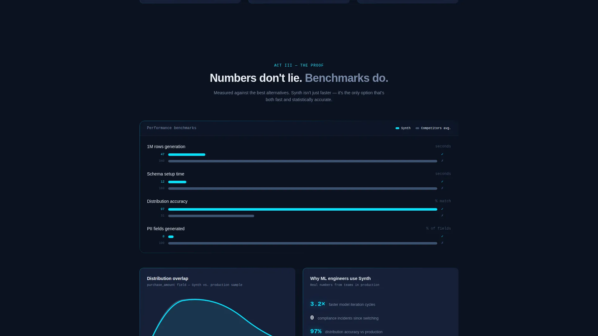
The third act presents latency benchmarks and distribution overlap charts as small inline visualizations. Integration logos signal that the output connects to real production tooling. This section builds credibility for visitors who need technical reassurance before committing to a download.
Frictionless App Download Flow
The primary call to action, "Generate Your First Dataset," appears three times: after the header, after the comparison table, and as a sticky bottom bar on mobile. Each instance uses platform detection to deep-link to the correct app store or open a desktop download modal. No form fields are required at this stage.
Secondary Browser Trial Path
Visitors who are not ready to install can choose "Try in Browser." This path requires no upfront commitment. An email is captured only after the visitor has generated a sample dataset and experienced the platform speed firsthand.
Page sections overview
| Section | Purpose |
|---|---|
| Dashboard Screenshot Header | Opens with product proof and a bold stat line to establish speed and credibility immediately |
| Problem Statement Row | Frames the compliance and mock-data pain points that the target audience recognizes |
| Comparison Table | Contrasts Real Production Data, Traditional Mocks, and Synth across developer-relevant criteria |
| Schema-to-Data Diagram | Visualizes the generation mechanism with an animated JSON-in, data-out flow |
| Benchmarks and Proof | Delivers latency stats, distribution charts, and integration logos as technical validation |
| Primary call to action Block | Repeats the download call to action with platform detection and a single-tap flow |
| Mobile Sticky Bar | Keeps the primary call to action persistent for mobile visitors throughout scroll |
| Browser Trial Path | Offers a no-install entry point that defers email capture until after value is demonstrated |
Design & branding system
The visual identity follows a Startup Velocity theme built around a Midnight Blue color system. Every color decision reinforces the feeling of a terminal environment at maximum focus.
- Void-dark navy (#0B1120) forms the primary background, reading like a terminal screen in a dark room; deep satellite blue (#162038) surfaces card areas and table rows
- Electric cyan (#00E5FF) serves as the accent color, used for check marks, glows, and interactive elements to draw attention without noise
- Chalk white (#E8ECF1) handles all body text, floating clean and legible against the dark layers; monospace typography appears in stat lines and code-adjacent elements to reinforce technical authenticity
Mobile & speed optimization
The template is designed to maintain its conversion flow on smaller screens without losing the visual drama of the desktop layout.
- The sticky bottom call-to-action bar keeps "Generate Your First Dataset" accessible throughout the entire mobile scroll experience
- The comparison table is structured to reflow cleanly on narrow viewports, keeping the Synth column readable and the check mark cascade visible
How this template helps you convert
The page is engineered to move a skeptical technical visitor from curiosity to download with as little resistance as possible.
- The header screenshot and monospace stat line answer the product's core promise in under three seconds, before the visitor reads a single word of body copy
- The comparison table externalizes the visitor's existing frustration, making the Synth column feel like an obvious resolution rather than a sales pitch
- The three-placement call-to-action strategy and the browser trial fallback together ensure that no visitor leaves the page without a clear, low-friction next step
Other information about this template
This template is a strong fit for any synthetic data generator platform that needs to communicate technical depth without overwhelming a developer audience. The layout strategy borrows from the best patterns in developer tool marketing.
- The template style is a Comparison Table layout, which is particularly effective for products competing against established workflows or legacy approaches
- The creative direction follows a Problem to Solution Arc, a three-act structure that mirrors how technical buyers naturally evaluate new tooling
- The header concept is a Product Screenshot, which is a proven anchor for developer-focused landing pages because it shows the product in action before any claims are made
- The primary landing page direction is App Download, supported by platform detection logic that eliminates guesswork for the visitor
- The Midnight Blue color system and Startup Velocity theme are designed to resonate with the late-night, high-focus energy of an engineering team pushing toward a deadline
Theme
Startup Velocity
Creative direction
Problem→Solution Arc
Color system
Midnight Blue
Style
Comparison Table
Direction
App Download
Page Sections
Dashboard Screenshot Header with Stat Line
Three-column Developer Comparison Table
Animated Schema-to-data Diagram
Proof Section with Benchmarks and Logos
Three-placement Download Call to Action
Post-experience Email Capture Path
Related questions
Who is this template built for?
Does downloading require filling out a form?
How does the comparison table communicate value?
What visual style does this template use?
Can this template work before a native app is available?



