Talent — Recruitment Solutions Landing Page Template
Recruit is a single-page staffing community landing page built for agency recruiters, talent acquisition leads, and independent headhunters. It combines a live Markup and Margin Benchmarking Tool, a membership comparison table, and industry-report-style data cards into a lead generation flow that turns curiosity into sign-ups, without feeling like a typical membership gate.
by Rocket studio
Quick summary
Recruit is a comparison table landing page designed for a staffing and recruiting community forum. It opens with a live benchmarking calculator, escalates through an industry-report content flow, and closes with progressive lead capture forms. The template is built to convert working recruiters and talent acquisition professionals into verified community members.
Who this template is for
This template was built for operators inside the staffing and recruiting industry who want a credible, data-driven home for their community. It speaks directly to practitioners, not generalists.
- Agency recruiters billing under five million dollars annually who want peer benchmarks they cannot find elsewhere
- Talent acquisition leads inside mid-market companies looking for candid, practitioner-level discussion
- Solo headhunters who left corporate to run their own desk and need vetted vendor data and deal breakdowns
What problem this template solves
Most staffing professionals have no reliable way to benchmark their own pricing against real-world peers. Industry surveys are outdated, LinkedIn posts are promotional, and firm-specific data stays locked inside individual desks. This template solves that visibility gap by making community-sourced benchmark data the headline offer, then converting curiosity into membership sign-ups.
- Recruiters cannot easily compare their gross margin to community-reported medians by staffing vertical
- No single public resource consolidates fill rates, markup ranges, and compliance changes in one place
- Community forums without a clear value ladder struggle to convert free visitors into verified, engaged members
What you get with this template
This landing page delivers a full section-by-section lead generation experience grounded in staffing industry context. Every component serves the conversion flow while maintaining the feel of a credible industry publication.
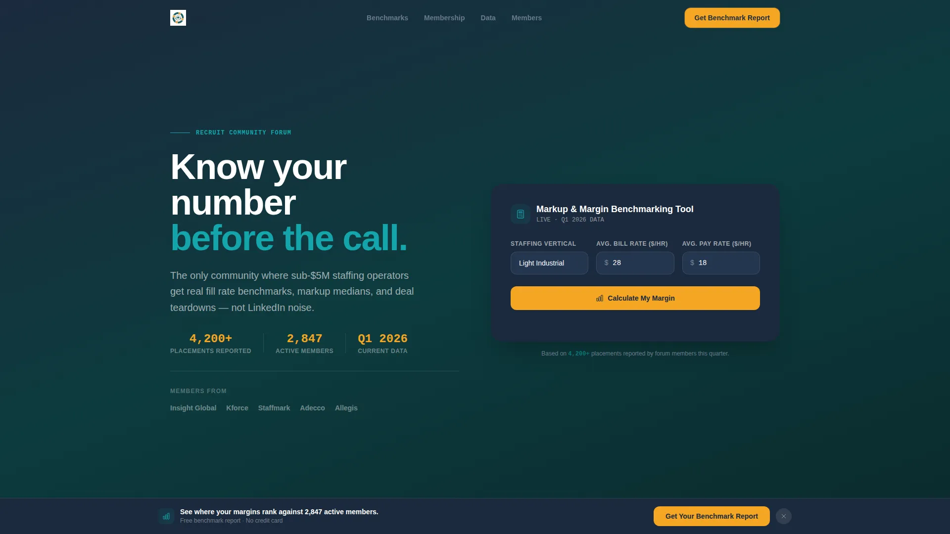
- A live Markup and Margin Benchmarking Tool with vertical selection, animated results, and a color-coded gauge bar
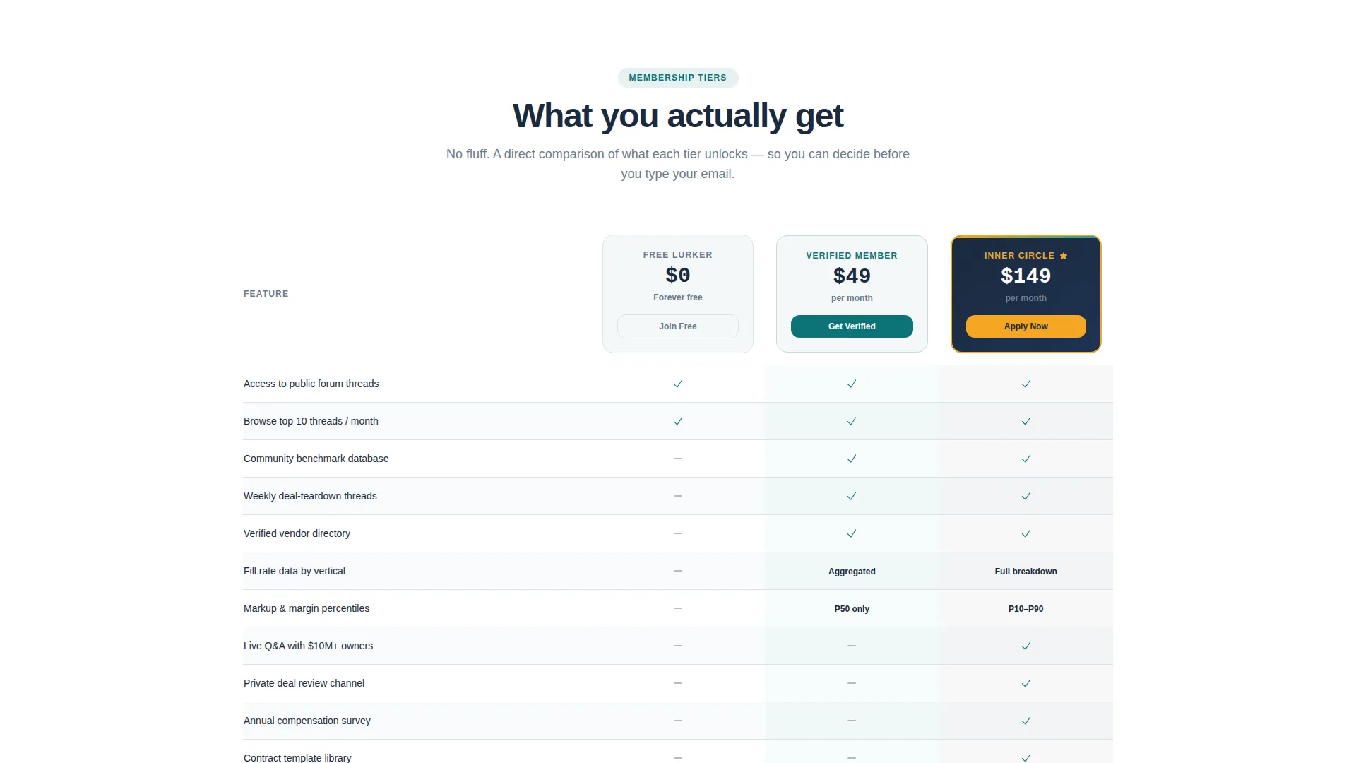
- A three-tier membership comparison table (Free Lurker, Verified Member, Inner Circle) with feature-by-feature access rows
- Data cards presenting community stats, a sticky bottom call-to-action bar, and a progressive disclosure sign-up form
Feature list
This template brings together purpose-built components that work together as one persuasive flow. Each feature is grounded in the source brief and designed to move a staffing professional from visitor to member.
Live Markup and Margin Benchmarking Tool
Visitors select their staffing vertical (light industrial, information technology, healthcare, or clerical), enter their average bill rate and pay rate, and instantly see an animated gross margin result. A horizontal gauge bar shifts from red to amber to green, showing where their numbers land relative to community-reported medians from over 4,200 placements. The partial result intentionally creates the motivation to sign up for the full percentile breakdown.
Membership Tier Comparison Table
A side-by-side comparison table presents three membership tiers clearly. Each column maps Free Lurker, Verified Member, and Inner Circle access across rows covering benchmark databases, weekly deal-teardown threads, verified vendor lists, and live question-and-answer sessions with agency owners who have scaled past ten million dollars in revenue.
Industry Report Data Cards
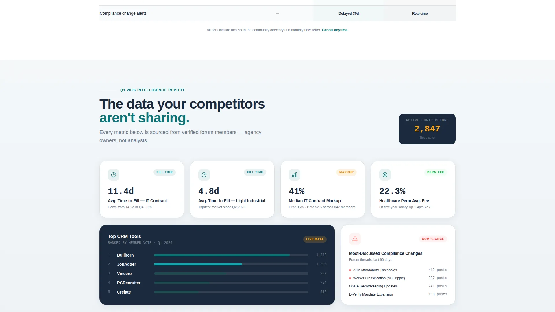
Below the comparison table, community statistics are presented as styled report cards. Each card surfaces a specific metric: average time-to-fill by vertical, most-discussed compliance changes, and top customer relationship management tools ranked by member vote. The card layout reinforces the proprietary-report creative direction throughout the scroll.
Progressive Disclosure Lead Capture
The primary sign-up form uses a staged reveal: work email first, then staffing vertical, then company size. This approach feels like a profile setup rather than a content gate. A secondary path captures free-tier emails behind a "Browse This Month's Top Threads" prompt, creating two conversion routes from a single page.
Sticky Call-to-Action Bar
After the first scroll, a sticky bottom bar appears with the primary call-to-action: "Get Your Benchmark Report." It persists as visitors move through the data narrative, ensuring the conversion anchor is always visible without interrupting the reading experience.
Page sections overview
| Section | Purpose |
|---|---|
| Benchmarking Calculator Header | Capture attention with an interactive gross margin tool and animated peer comparison gauge |
| Data Source Credibility Line | Anchor trust with the "4,200+ placements" community-reported stat directly below the calculator |
| Membership Comparison Table | Present tier-by-tier feature access so visitors can self-select into the right sign-up path |
| Community Stats Cards | Deliver report-style data on fill rates, compliance topics, and CRM tool rankings |
| Primary Lead Capture Form | Convert intent via progressive email disclosure tied to vertical and company size |
| Secondary Thread Browse Path | Offer a lower-friction free-tier entry point for visitors not ready for the full sign-up |
| Sticky call to action Bar | Maintain conversion visibility throughout the scroll without disrupting content flow |
Design & branding system
The visual identity follows a Directory and Discovery theme using the Teal Catalyst color system. The palette is deliberately functional, designed to feel like a well-organized recruiting dashboard at the start of a workday rather than a marketing site.
- Deep operational teal (#0D7377) anchors headers and section dividers; midnight charcoal (#1B2A3D) grounds the comparison tables and data-heavy backgrounds
- Clean whiteboard (#F4F7F9) opens up testimonial and benefit blocks to create visual breathing room throughout the scroll
- Signal amber (#F5A623) fires only on calls-to-action and key metrics, keeping every amber element meaningful and clickable
Mobile & speed optimization
The layout is designed to remain readable and functional across screen sizes. Every interactive element in the calculator and comparison table is built for comfortable use on smaller displays.
- The benchmarking calculator inputs and gauge bar adapt to single-column layouts on mobile screens without losing the animated result behavior
- The sticky call-to-action bar is sized and positioned for thumb-friendly interaction on phone displays
- The comparison table collapses gracefully on narrow screens so tier differences remain scannable without horizontal scrolling
How this template helps you convert
The conversion architecture is layered deliberately. Each section adds information density while nudging visitors closer to the sign-up action.
- The calculator delivers a partial but genuinely useful result immediately, establishing credibility before asking for anything, and then makes the full breakdown the natural reward for signing up
- The membership comparison table makes the value gap between tiers visible at a glance, so visitors understand exactly what they unlock by moving from Free Lurker to Verified Member or Inner Circle
- The sticky call-to-action bar and dual sign-up paths ensure every visitor, whether highly motivated or still browsing, encounters a relevant and low-friction next step
Other information about this template
This template is built within the Technology category under the Staffing and Recruiting Digital Presence subcategory. It is purpose-built for the Staffing and Recruiting Community Forum niche and carries a strong intersection match with its theme, color system, and creative direction.
- The Industry Report creative direction makes the page feel like proprietary content, which is a known trust signal for practitioners who are skeptical of generic marketing pages
- The Directory and Discovery theme suits community platforms where visitors need to quickly understand what they get access to and at what level
- The Teal Catalyst color system was selected to align with the visual language of applicant tracking system dashboards and recruiting operations tools, making the design feel native to the audience's daily workflow
- The template style is a comparison table, which is the most efficient format for communicating tiered membership value to an audience that is trained to evaluate options side by side
- The lead generation direction prioritizes email capture with vertical and company-size segmentation, giving community operators useful data about who is joining, not just that someone joined
Theme
Directory & Discovery
Creative direction
Industry Report
Color system
Teal Catalyst
Style
Comparison Table
Direction
Lead Generation
Page Sections
Live Markup and Margin Benchmarking Tool
Three-tier Membership Comparison Table
Industry Report Data Cards
Progressive Disclosure Lead Capture Form
Sticky Call-to-action Bar
Related questions
Can I change the staffing verticals listed in the calculator?
Does the comparison table support more than three membership tiers?
Is the partial calculator result intentional in the template design?
What does the progressive disclosure sign-up form collect?
Who is this landing page template best suited for?



