Accounting Firm Software Careers Website Template
Ledger is a hub-and-spoke accounting firm case management landing page built for firms drowning in active engagements, scattered documents, and looming deadlines. It uses a dark charcoal-and-teal visual identity, a live API code snippet header, and a five-spoke feature matrix to show managing partners and staff accountants exactly why one platform beats thirty open browser tabs.
by Rocket studio
Quick summary
Ledger is a single-page, anchor-nav landing page template for an accounting firm case management platform. It consolidates engagement tracking, document management, and deadline visibility into one focused interface. The design uses deep charcoal, electric teal, and white card surfaces to project focus and precision. The primary call to action pushes visitors into a free trial without a form on the page.
Who this template is for
This template speaks directly to professionals inside accounting firms who are managing high volumes of active work and need a faster, more reliable system than email chains and spreadsheets.
- Managing partners overseeing hundreds of active returns during peak filing season
- Staff accountants tracking missing documents across multiple client threads
- Operations managers monitoring which engagements are running over budget before write-downs occur
What problem this template solves
Accounting firms lose time and money when engagement data lives in disconnected tools. Email threads, shared spreadsheets, and generic project management software were not built for the specific rhythm of tax and audit work. This template presents a platform that replaces that fragmented workflow with one unified nerve center.
- No central place to see all open engagements, deadlines, and client documents at once
- Time wasted hunting for K-1s and status updates across multiple email chains
- No early warning system for engagements that are bleeding hours before the write-down hits
What you get with this template
You get a complete, single-page landing page structured around a hub-and-spoke anchor navigation. The page is built to educate, persuade, and convert technical and operational buyers at accounting firms. Every section is designed to answer a specific objection and pull the visitor deeper into the platform's value.
- A sticky anchor nav with five spoke sections: Intake, Tracking, Documents, Deadlines, and Reporting
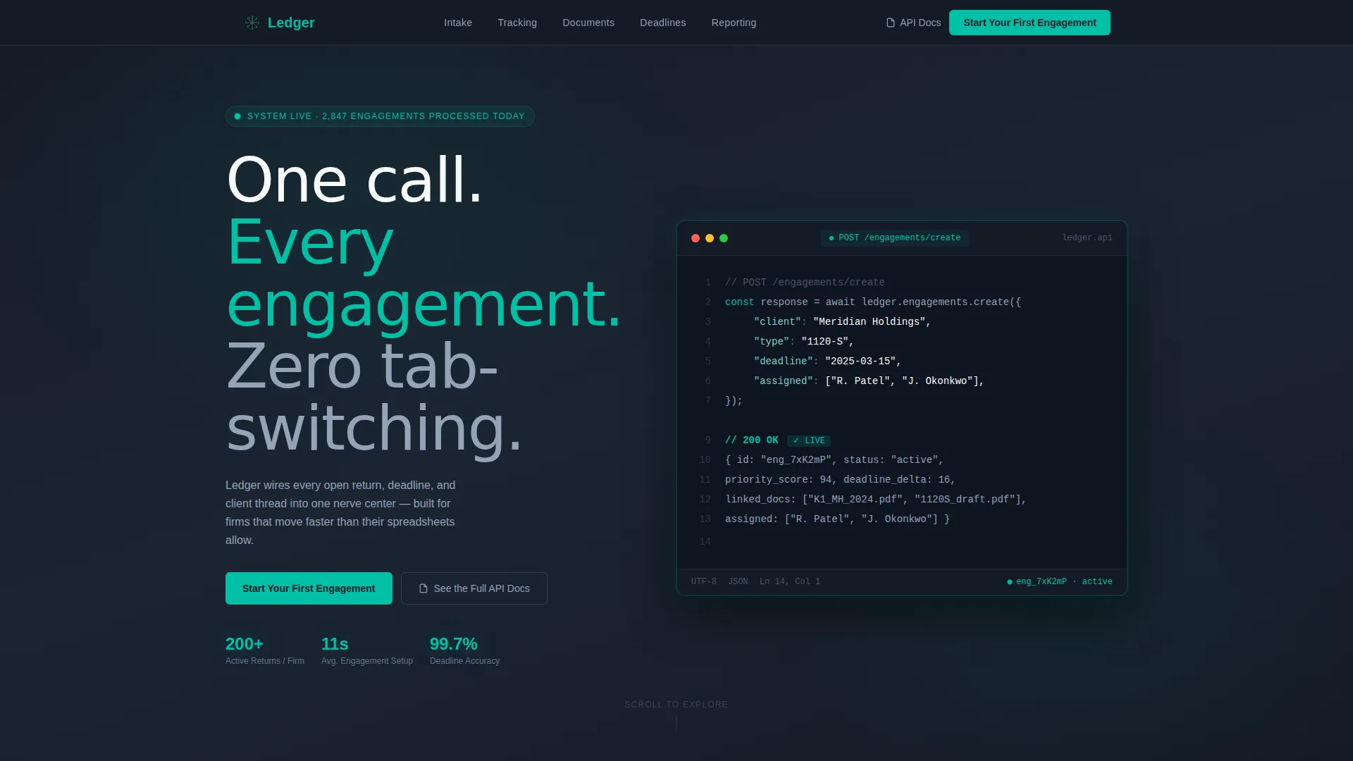
- A syntax-highlighted API code snippet header showing a live engagement creation call
- Three strategically placed calls to action routing visitors to a free trial signup flow
Feature list
This template is built around a deliberate content and design system. Each component serves a specific conversion or communication purpose.
Anchor Navigation Hub
A sticky top navigation pins five spoke labels to the viewport as the user scrolls. Each label links directly to its corresponding feature section, so visitors can jump to the section most relevant to their role without losing their place on the page.
Live API Code Snippet Header
The header centers a styled, syntax-highlighted code block showing a real POST /engagements/create API call. The payload includes a client name, return type, deadline, and assigned team members. A 200 OK response displays a live engagement object with status, priority score, and linked documents. This instantly signals to technical evaluators that the platform has a real, documented API.
Feature Matrix with Comparison Grid
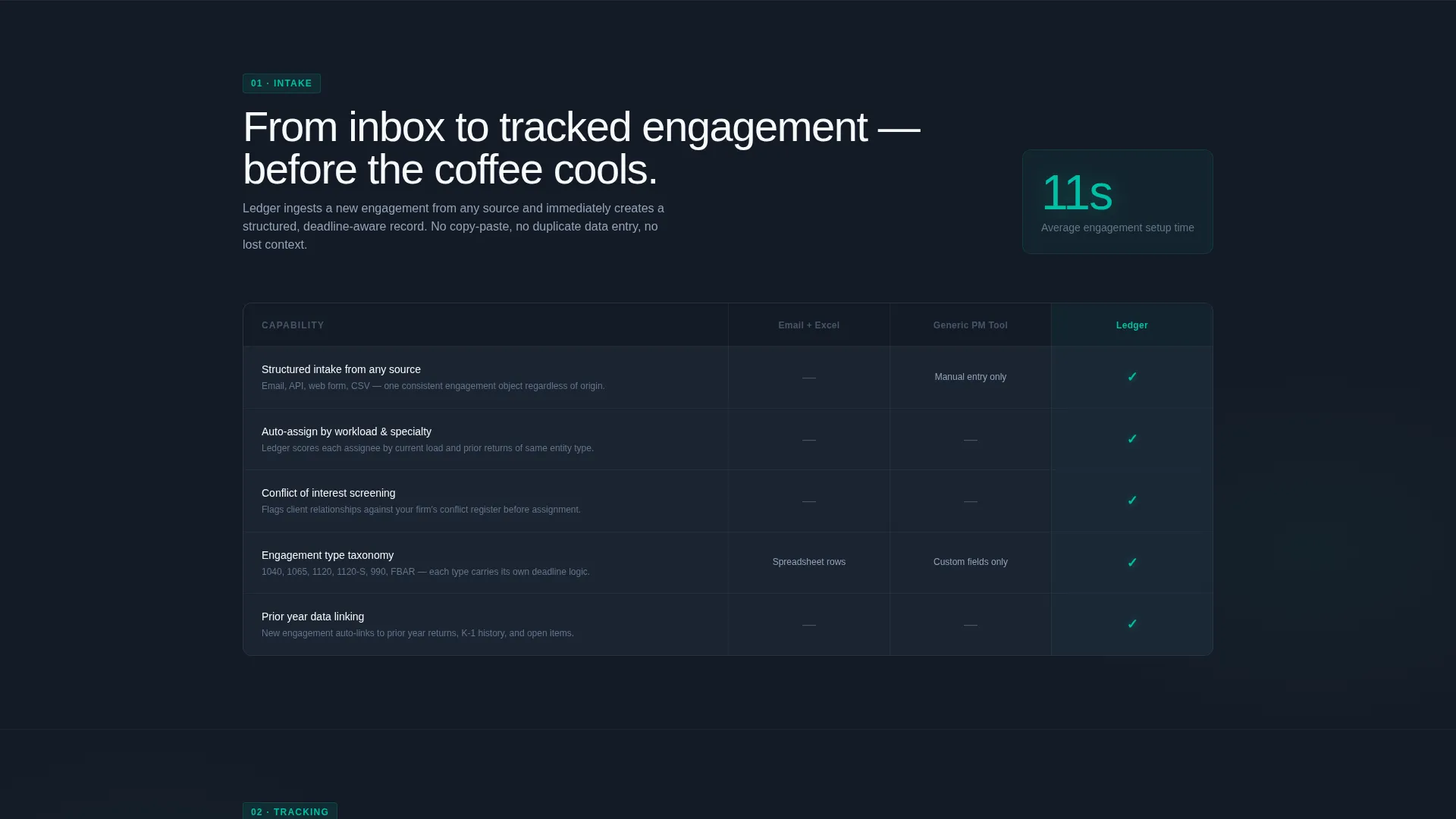
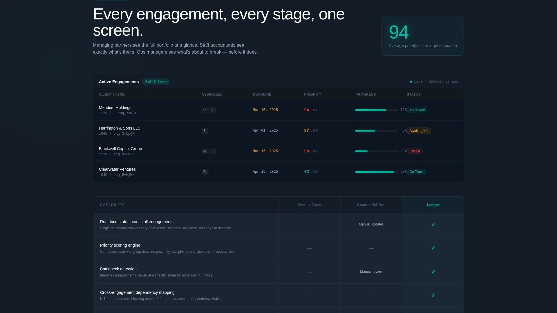
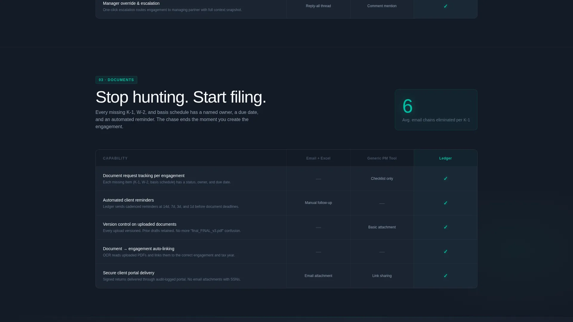
Each spoke section opens with a single concrete metric, then expands into a three-column comparison grid. The columns pit "Email + Excel" and "Generic PM Tool" against the platform being promoted. Teal checkmarks and specific capability descriptions replace vague feature names, making each row a clear, evidence-based argument.
Spoke-to-Spoke Scroll Momentum
The five spoke sections are sequenced so each one answers the objection raised by the previous section. This creates a logical pull that keeps visitors scrolling through the full argument before they reach a call to action.
Strategic Call-to-Action Placement
The primary call to action, "Start Your First Engagement," appears three times: in the header, after the third spoke section, and pinned inside the anchor nav. A secondary path, "See the Full API Docs," serves technical evaluators who need proof of depth before committing.
Page sections overview
| Section | Purpose |
|---|---|
| Sticky Anchor Nav | Links to all five spoke sections and pins the primary call to action |
| Code Snippet Header | Introduces the platform with a live API call and engagement object response |
| Intake Spoke | Demonstrates fast engagement creation with a concrete setup time metric |
| Tracking Spoke | Compares engagement tracking against legacy tools using a feature matrix |
| Documents Spoke | Shows document management capabilities versus email and generic software |
| Deadlines Spoke | Highlights deadline visibility features with a side-by-side comparison grid |
| Reporting Spoke | Presents reporting capabilities and surfaces the mid-page call to action |
| Footer Call to Action | Reinforces the free trial path and links to API documentation |
Design & branding system
The visual identity is built around a Teal Catalyst color system layered over a Startup Velocity theme. The palette is deliberately dark and focused, evoking the concentrated energy of a late-night filing season sprint rather than a generic software product page.
- Deep workspace charcoal (#1B2432) sets the primary background, keeping the interface feeling like a focused terminal environment
- Electric teal (#00BFA6) owns every interactive element, progress indicator, teal checkmark, and call-to-action button throughout the page
- Cool slate (#64748B) handles secondary text, dividers, and supporting labels, while white flash (#F8FAFB) lifts content cards off the dark surface
Mobile & speed optimization
The template is structured with a single-page, section-led layout that keeps the content hierarchy clean and easy to reflow across screen sizes. The anchor nav and comparison grids are the two layout elements most relevant to consider for smaller viewports.
- The hub-and-spoke anchor nav is designed to remain accessible as a pinned element regardless of scroll position
- Comparison grid columns are laid out to support horizontal scroll or stacked reflow on narrow screens without losing the visual argument
How this template helps you convert
The page earns the click before it asks for one. Every design and content decision is built to reduce skepticism and demonstrate platform depth to a high-trust, high-stakes buyer audience.
- The API code snippet header immediately proves the platform is real and technical, setting credibility before a single marketing claim is made
- The feature matrix format turns abstract capabilities into specific, side-by-side evidence that the platform outperforms legacy tools on every row
- Three carefully placed calls to action appear at the moments of highest trust: after the header, after three spokes of argument, and persistently in the anchor nav
Other information about this template
This template is purpose-built for the accounting firm software category within a broader technology template set. It is well suited for promoting case management tools, engagement workflow platforms, and practice management software targeting professional services firms.
- The template style is Hub and Spoke with Anchor Navigation, a structure well suited to platforms with multiple distinct feature areas
- The header concept is a Code Snippet, a pattern that resonates strongly with technical buyers evaluating API-first platforms
- The landing page direction is Click-Through, meaning no form appears on the page and all conversion paths route to an external signup or documentation flow
Theme
Startup Velocity
Creative direction
Feature Matrix
Color system
Teal Catalyst
Style
Hub & Spoke (Anchor Nav)
Direction
Click-Through
Page Sections
Sticky Hub-and-spoke Anchor Nav
Syntax-highlighted API Code Header
Three-column Feature Matrix Grid
Spoke-sequenced Scroll Logic
Three-point Call-to-action Placement
Related questions
Who is this landing page template designed for?
Does this template include a contact form or lead capture form?
Can the feature matrix comparison grid be customized?
What makes the anchor navigation a hub-and-spoke structure?
Is the API code snippet in the header functional code?



