Consumer App & Platform Reviews Website Template
The Tandem landing page template gives language schools, universities, and edtech startups a polished, conversion-ready web presence for their white-label language exchange app. Built on a dark Startup Velocity aesthetic with teal pulse accents, it pairs a live-metrics hero with an interactive brand-preview widget, letting visitors see their own logo on a working app before they ever fill out a form.
by Rocket studio
Quick summary
This landing page template is purpose-built for organizations ready to launch a branded language exchange app without the cost of building from scratch. It combines a stats-driven hero, a scroll-powered feature matrix, and a live brand-preview widget to move visitors from curiosity to a demo request. The design feels production-ready the moment the page loads.
Who this template is for
This template serves decision-makers who need to bring a language learning app to market fast. It speaks directly to people who understand the value of language exchange but cannot justify eighteen months of development time or a full engineering team.
- Language school directors looking to compete with large-scale language learning app platforms without draining their budgets
- University internationalization officers who need to justify exchange program investment with a tangible, branded digital product
- Edtech founders who want to add a social language practice feature to their platform quickly and affordably
What problem this template solves
Building a language exchange app from the ground up takes serious money, time, and technical talent. Most language schools and edtech companies do not have all three. This landing page template solves the presentation layer of that problem by giving your white-label app a credible, high-converting web presence before a single line of custom code is written.
- Eliminates the gap between having a product and being able to sell it, by providing a ready-to-deploy landing page that communicates value immediately
- Removes the guesswork from messaging by structuring the page around proven pain points: build cost, time to market, and team size
- Replaces generic app-store description pages with a strategic, demo-first sales flow that turns visitors into qualified leads
What you get with this template
You get a fully structured, single-page landing layout with five major sections, each designed to push visitors further down the sales funnel toward a demo form submission. Every component is grounded in the brief and ready to customize.
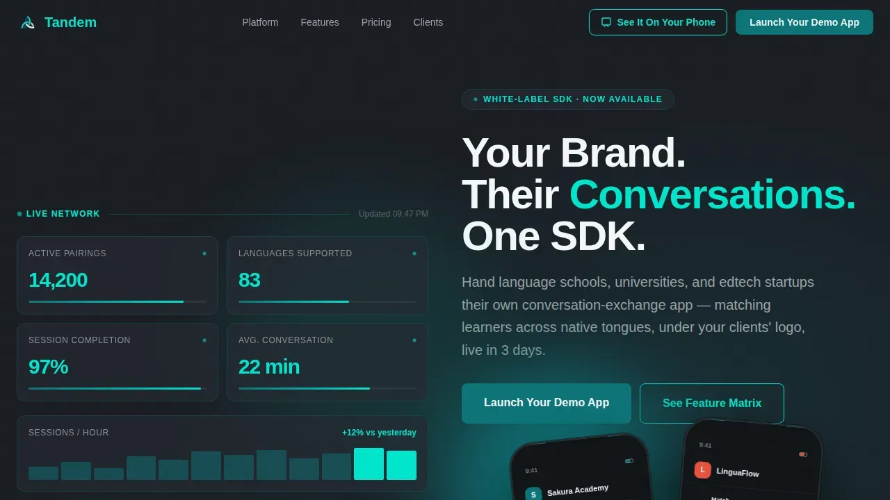
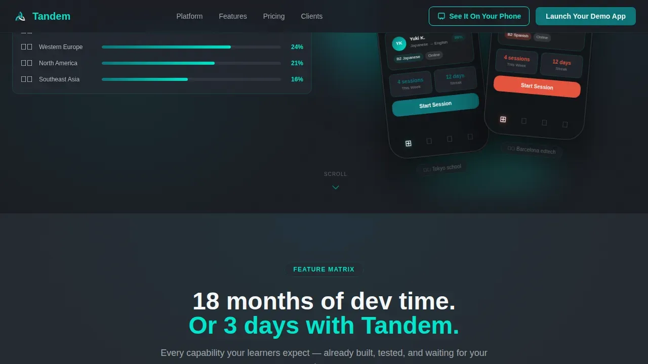
- A split-screen hero with a live-metrics dashboard on the left and dual phone mockups on the right, showing the same app wearing two different brand identities
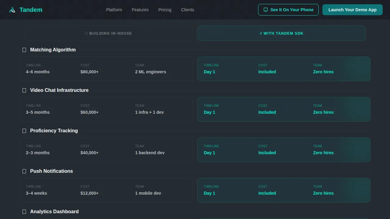
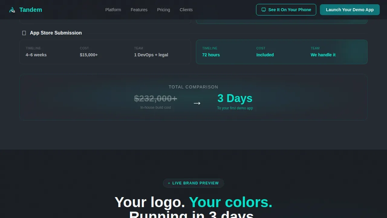
- A feature matrix with alternating split-screen rows that contrast in-house build costs against white-label speed and savings, covering six discrete app functionalities
- A brand-preview widget where visitors upload a logo and pick an accent color to instantly reskin a phone mockup in real time, letting potential customers experience ownership before committing
Feature list
This template includes the following built-in design and content components. Each one is drawn directly from the project brief.
Stats and Metrics Hero Wall
The left half of the hero displays a live-updating dashboard mock with ticking counters: active pairings, languages supported, session-completion rate, and average conversation length. These metrics build immediate credibility and create urgency, communicating the scale of the language exchange platform before visitors read a single word of body copy.
Split-Screen Feature Matrix
Alternating scroll rows place in-house development reality on the left and the white-label equivalent on the right. Each row covers a distinct app capability: matching algorithm, video calls, proficiency tracking, push notifications, analytics dashboard, and App Store submission support. The contrast sharpens with every scroll, so visitors stop comparing and start configuring.
Live Brand Preview Widget
Visitors upload their logo and select an accent color. The phone mockup reskins in real time, showing their own brand on a working language learning app screen. This interactive moment is the page's highest-value conversion tool. It answers the "will this really look like mine?" question before the demo form appears.
Demo-First Conversion Form
The primary call-to-action reads "Launch Your Demo App" and collects only three fields: company name, platform preference (iOS, Android, or both), and work email. Short forms that ask for essentials reduce friction and improve submission rates. This form appears directly after the brand-preview widget, when visitor intent is at its peak.
Sticky SMS Demo Button
A secondary sticky button in the navigation reads "See It On Your Phone" and sends an SMS link to a pre-skinned demo build. This gives mobile visitors and on-the-go decision-makers an immediate, tactile way to access a working version of the app without waiting for a formal sales call.
Social Proof and Credibility Section
Client institution logos, session metrics, and testimonial quotes appear as a dedicated trust layer. Social proof presented alongside real performance numbers helps visitors review the platform's track record. Testimonials from real users with names and context add authenticity that generic copy cannot replicate.
Page sections overview
| Section | Purpose |
|---|---|
| Hero Stats Wall | Establish scale and credibility with live-ticking metrics and dual branded phone mockups |
| Feature Matrix Rows | Contrast in-house build cost against white-label speed across six app capabilities |
| Brand Preview Widget | Let visitors reskin a phone mockup live with their own logo and accent color |
| Social Proof Strip | Reinforce trust with client logos, session statistics, and testimonial quotes |
| Demo Request Form | Capture company name, platform preference, and work email to generate qualified leads |
| Single-Row Footer | Provide minimal navigation and legal links without distracting from the conversion goal |
Design & branding system
The visual identity follows a Startup Velocity theme. The overall feel is a countdown clock in a control room: dark, focused, and purposeful, with teal light pulsing at every interactive point. Typography uses Manrope for bold headlines and DM Sans for body copy, creating a clean hierarchy that guides visitors from headline to call-to-action without confusion.
- Color palette: deep launch-pad teal (#0D7377) for headlines and navigation, reactor-core cyan (#00E5CC) on hover states and progress bars, mission-control charcoal (#1A1D23) for backgrounds, and clean-room white (#F4F7F8) for card surfaces and body text
- Animation layer: ticking number counters in the hero, floating phone mockups at slight angles, scroll-reveal feature rows, and real-time reskinning inside the brand-preview widget
Mobile & speed optimization
The template is built desktop-first for business decision-makers, with a mobile-responsive fallback that keeps all interactive components functional on smaller screens. App landing pages should load quickly to protect engagement; this template keeps interactive widgets as client-only components while keeping the rest of the page static.
- Desktop-first layout preserves the full split-screen experience for B2B visitors reviewing the page at a desk or in a meeting
- Mobile-responsive fallback ensures the hero stats, brand-preview widget, and demo form remain accessible and usable on any screen size
How this template helps you convert
This landing page is structured as a demo-first sales funnel, not a passive brochure. Every section is ordered to build trust, demonstrate value, and reduce the perceived risk of booking a demo. The page earns the tap before asking for it.
- The hero metrics wall delivers immediate social proof, showing visitors real numbers around active language exchange sessions and completion rates before any feature description appears
- The feature matrix uses direct cost and time comparisons to address the core pain points of language school directors and edtech founders, making the value of the white-label approach self-evident
- The brand-preview widget converts passive visitors into active participants; by the time visitors reach the "Launch Your Demo App" form, they have already seen their brand on a working screen, which dramatically lowers the barrier to submission
Other information about this template
This template is part of a broader category of marketing collateral for app-driven businesses. Marketing collateral refers to branded content used to promote products, services, or values, and a well-built landing page is one of the most strategic assets in that toolkit. Maintaining brand consistency across all marketing collateral is crucial for building trust with new customers and reinforcing brand recognition at every touchpoint.
Language exchange is a form of collaborative learning where two people with different native languages work together to practice and develop fluency in each other's language. Exchanges can be conducted in person or through digital means. Online platforms connect users with a language exchange partner from different countries and regions, eliminating geographic barriers and giving learners exposure to varied accents and cultures. The key to fluency is consistency in practice, and a well-designed app makes that practice easy to access and maintain.
Successful language learning apps offer text, audio, and video communication features so users can speak, listen, and write within the same platform. Many also support language parties: group conversation sessions that help learners meet people with shared interests while building confidence in a new language. A tandem member of such a platform benefits from matching with a language exchange partner who is a native speaker of the language they want to learn, while also serving as a native resource for their partner's target language.
Effective landing pages for language learning apps use simple visual steps to describe how the exchange process works, rely on icons and short bullets to communicate key functionalities, and use video content to increase conversions. Including a video on the landing page helps users understand the app's features more quickly than text alone. A/B testing helps teams determine which page variations convert best over time, protecting their investment in the page and improving effectiveness with every iteration.
This template is also relevant for teams exploring no-code and AI-powered development workflows. AI-powered tools can help non-technical users create production-ready apps without traditional programming skills. No-code platforms allow users to create applications using natural language prompts, which means a language school or edtech startup can rely on modern tools to build, deploy, and iterate without needing a large engineering team. The Tandem launch your branded language exchange app landing page template pairs well with such workflows, giving teams a professional web presence to publish alongside a rapidly built product.
- The tandem member experience is central to the platform's value: every user is both a learner and a native speaker resource for someone else
- Language parties are group-format practice sessions that the platform can support, helping users meet new people and connect across cultures in a structured social setting
- Digital marketing collateral, including this landing page, should align with different stages of the sales funnel to engage prospects from first visit through to conversion
Theme
Startup Velocity
Creative direction
Feature Matrix
Color system
Teal Catalyst
Style
Split Screen (50/50)
Direction
App Download
Page Sections
Live-ticking Metrics Hero
Alternating Feature Matrix
Real-time Brand Preview Widget
Demo-first Conversion Form
Sticky SMS Demo Button
Social Proof and Credibility Strip
Related questions
Who is this landing page template designed for?
What sections does the template include?
Can I show my own brand inside the template?
What does the primary conversion flow look like?
Is this template suitable for mobile visitors?



