Dog Expert Directory Website Template
Tanker is a split-screen aviation fuel landing page template built for fuel supply operators, FBO managers, and ground handling directors. It pairs hard operational metrics with striking visuals using a Data Command theme and Fire & Earth color system. The click-through layout drives qualified prospects toward a fuel supply quote request, with a secondary path for lighter-intent visitors.
by Rocket studio
Quick summary
Tanker is a precision-built landing page template for aviation fuel and logistics operations. It uses a 50/50 split-screen layout to pair live operational data with contextual imagery. The Data Command theme and Fire & Earth palette give the page an apron-at-night authority. Every section is designed to move qualified buyers toward a fuel supply quote request.
Who this template is for
This template is built for professionals who operate in high-stakes, time-sensitive fuel supply environments. It speaks their language: uptime, margins, uplift, and compliance. If your business keeps aircraft moving, this page was made for you.
- FBO managers handling fuel margins on thin-volume regional days
- Charter operators who need guaranteed fuel uplift at short-notice outstations
- Ground handling directors negotiating into-plane contracts at competitive volume
What problem this template solves
Aviation fuel buyers need more than a glossy brochure. They need to see proof of capability before they commit to a supply agreement. Generic website templates cannot deliver the technical credibility this market demands.
- There is no clear way to communicate storage capacity, delivery radius, and response-time commitments on a standard page layout
- Prospective clients abandon pages that lead with brand story instead of operational facts
- Lightweight designs fail to signal the compliance depth that procurement and safety teams require
What you get with this template
You get a fully structured, single-page layout that progresses from capability through reliability to compliance. Each section is denser than the last, rewarding buyers who keep reading with more detailed proof. The page is click-through optimized, with no form on the page itself.
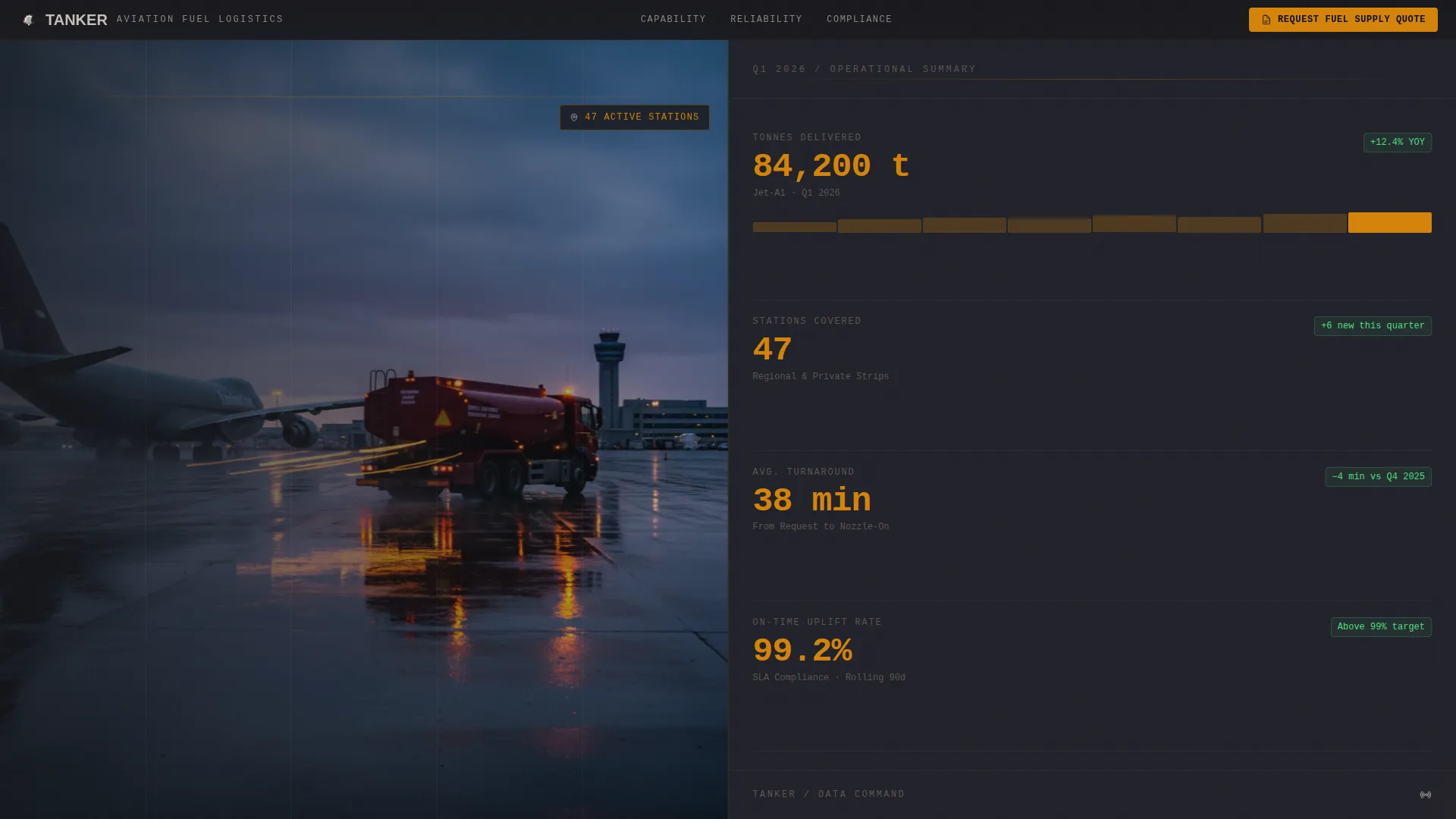
- A full-screen video background header with headline space for tonnage delivered, stations covered, and average turnaround time
- A primary call-to-action for requesting a fuel supply quote, placed in a persistent top bar and again after the compliance section
- A secondary lead-capture path offering a station network map download with a single email field
Feature list
This section covers the core built-in capabilities that define what the Tanker template delivers.
Full-Screen Video Header
The header uses an unbroken video background shot from a fuel bowser approaching a parked aircraft at dusk. Amber hazard lights reflect off wet tarmac. The camera closes the distance until the underwing nozzle connects and the fuel flow counter begins spinning. Monospaced headline type overlays the footage with operational numbers first, brand identity second.
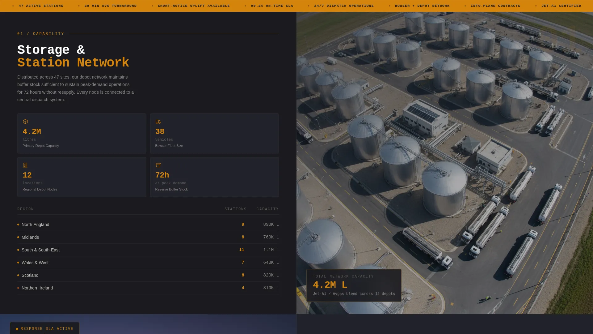
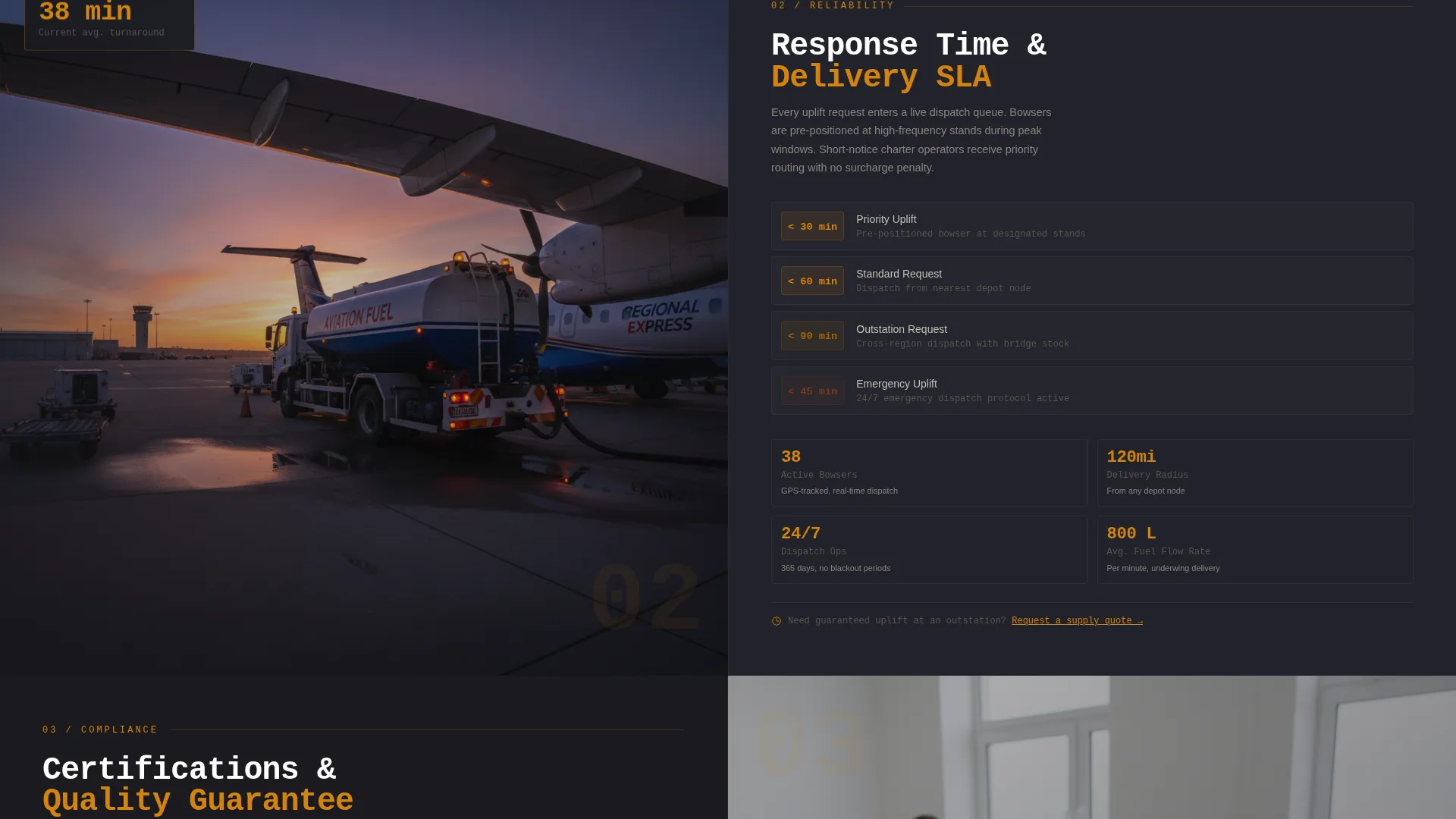
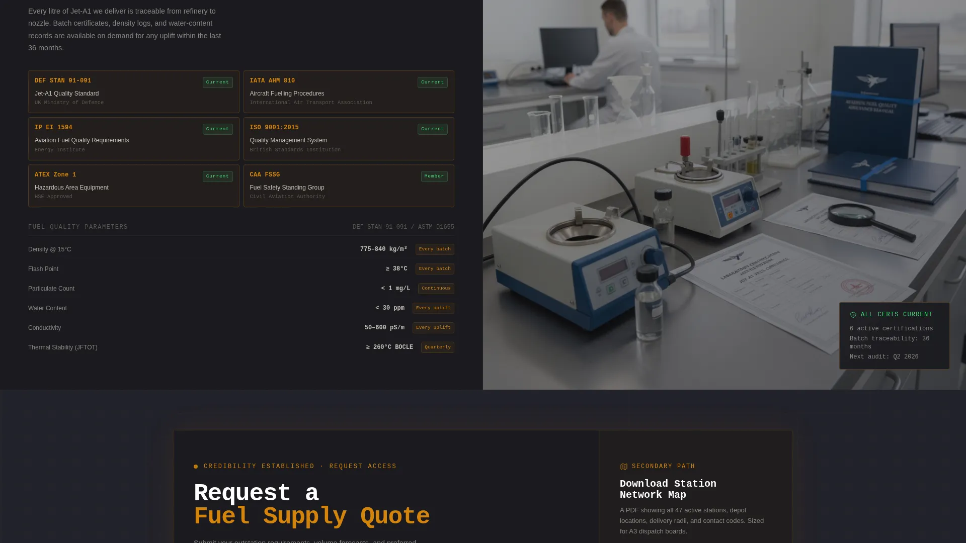
Split-Screen Spec Sheet Layout
Every scroll section divides the screen 50/50. Hard operational metrics sit on the left: storage capacity, delivery radius, response-time service level agreements, and fuel quality certifications. Contextual photography or schematics occupy the right. The progression moves from capability to reliability to compliance, mimicking the structure of a technical data sheet.
Persistent Primary Call-to-Action Bar
The "Request a Fuel Supply Quote" call-to-action appears as a fixed top-bar element visible throughout the entire scroll. It reappears as a full-width block after the compliance section, when buyer credibility is at its highest point. No form is embedded on the page; the click routes to a dedicated request-for-quote portal.
Station Network Map Download
A secondary conversion path targets lighter-intent visitors. A single email field triggers the download of a station network map PDF. This gives operations managers a reference document they can pin to the dispatch board, extending the template's reach beyond the initial page visit.
Fire & Earth Color System
The template uses a four-tone palette: deep tarmac black (#1A1A1E) for backgrounds, kerosene amber (#D4840B) for interactive elements and data callouts, scorched earth red-brown (#7A3B1E) for hover states and alert-level data points, and runway concrete (#C4BFB6) for body text and dividers. The system feels like a refueling apron under sodium lighting at night.
Monospaced Data Typography
Headline type is rendered in monospaced style to reinforce the Spec Sheet creative direction. Numbers and metrics are treated as primary content, not supporting decoration. This typographic choice signals technical precision and suits the data-forward tone of the aviation fuel and logistics sector.
Page sections overview
| Section | Purpose |
|---|---|
| Video Header | Establish operational credibility with live metric headlines over apron footage |
| Persistent Quote Bar | Keep the primary call-to-action visible at all scroll depths |
| Capability Block | Display storage capacity and depot network data in split-screen format |
| Reliability Block | Present delivery radius and response-time service level data |
| Compliance Block | Show fuel quality certifications and contractual guarantees |
| Quote call to action Block | Full-width call-to-action placed at peak credibility after compliance |
| Network Map Download | Secondary conversion path with single email field for PDF download |
Design & branding system
The visual identity follows a Data Command theme grounded in the Fire & Earth color system. Every design choice reinforces the feeling of standing on a fuel apron at night: surfaces either heat-stained or load-bearing, light cutting through darkness.
- Backgrounds use deep tarmac black (#1A1A1E); amber (#D4840B) dominates interactive elements, metric highlights, and data callouts
- Runway concrete (#C4BFB6) carries body text and section dividers; scorched earth red-brown (#7A3B1E) activates only on hover states and alert-level data points
- Monospaced type reinforces the Spec Sheet direction and ensures numbers read as primary content across all sections
Mobile & speed optimization
The split-screen layout is structured to restack cleanly on smaller viewports without sacrificing the data-forward hierarchy. Each metric block retains its visual weight when the two-column format collapses to a single column.
- Video header is designed to degrade to a static image on mobile, keeping the apron atmosphere without requiring full video playback
- Data callouts and metric highlights are sized for legibility at thumb-scroll speed, so key numbers remain readable without zooming
- The persistent top-bar call-to-action adapts to mobile navigation height conventions, staying visible without obscuring content
How this template helps you convert
The Tanker template is built as a click-through landing page, not a brochure. Every structural decision points toward one outcome: moving a qualified prospect to request a fuel supply quote.
- The persistent top-bar call-to-action creates continuous access to the quote request path, so buyers do not need to scroll to the bottom before acting
- The progressive disclosure structure builds trust section by section, with the full-width quote block arriving after the compliance section when buyer confidence is highest
- The station network map download gives undecided visitors a reason to share their contact details, capturing lighter-intent leads without interrupting the primary conversion path
Other information about this template
This template belongs to the Aerospace & Defense category, sitting within the Aircraft & Aviation subcategory and the Aviation Fuel & Logistics niche. It carries an intersection match score of 13 against its niche context, reflecting a tight alignment between creative direction, theme, template style, and target audience.
- The template style is Split Screen (50/50), the theme is Data Command, the creative direction is Spec Sheet, and the header concept is Full-Screen Video Background
- The landing page direction is Click-Through, designed to route visitors to an external request-for-quote portal rather than capture form data on the page itself
- This template is well suited to operators who need to present technical depth and operational scale to procurement-level buyers in regional aviation markets
Theme
Data Command
Creative direction
Spec Sheet
Color system
Fire & Earth
Style
Split Screen (50/50)
Direction
Click-Through
Page Sections
Full-screen Video Header with Metric Headlines
Split-screen Spec Sheet Scroll Layout
Persistent Quote Request Call-to-action
Station Network Map Lead Capture
Fire & Earth Data Command Color System
Monospaced Spec Sheet Typography
Related questions
Who is the primary audience for this landing page template?
Does this template include a contact form?
Can I edit the operational metrics shown in the header and spec sheet sections?
What makes the split-screen layout effective for aviation fuel buyers?
Is the video background required, or can I use a static image instead?


