Specialist Directory & Marketplace Platforms Comparison Website Template
Taproom is a modular card grid landing page built for brewery and winery directories. It combines a dark, cellar-inspired visual identity with data-rich discovery tools, letting visitors browse regional venues, compare tasting room details side by side, and build a mapped trail from a persistent shortlist bar. Everything is designed to move curious browsers toward a concrete plan.
by Rocket studio
Quick summary
Taproom is a single-page directory landing page for craft breweries and boutique wineries. The card grid layout surfaces ratings, style counts, price tiers, and distance at a glance. A persistent comparison bar lets visitors shortlist up to four venues and bundle them into a planned tasting trail, guiding every scroll from broad discovery to a confident next-pour decision.
Who this template is for
This template is built for anyone who needs a polished, content-dense directory front end for the craft beverage space. It works equally well as a launch surface for a curated regional guide or a venue-scouting tool.
- Weekend explorers planning brewery crawls and regional tasting trails
- Event coordinators scouting venues with on-site production and private hire potential
- Serious collectors comparing cellar-door exclusives against taproom-only releases
What problem this template solves
Finding the right brewery or winery usually means bouncing between half a dozen review tabs, losing track of options, and never quite committing to a route. Taproom collapses that research loop into one focused page.
- Scattered venue information forces visitors to leave the page before they decide
- No visual comparison tool means explorers forget what they liked after scrolling past it
- Generic directory layouts fail to communicate the atmosphere and craft identity that drives beverage tourism decisions
What you get with this template
You get a fully structured, single-page directory landing page built around modular cards and a comparison-first conversion flow. Every section is ready to populate with real venue data.
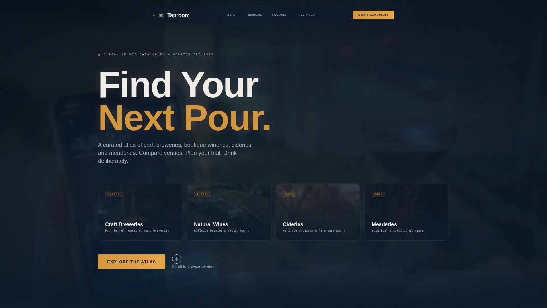
- A frosted dark-glass header with parallax depth and category panels for breweries, natural wines, cideries, and meaderies
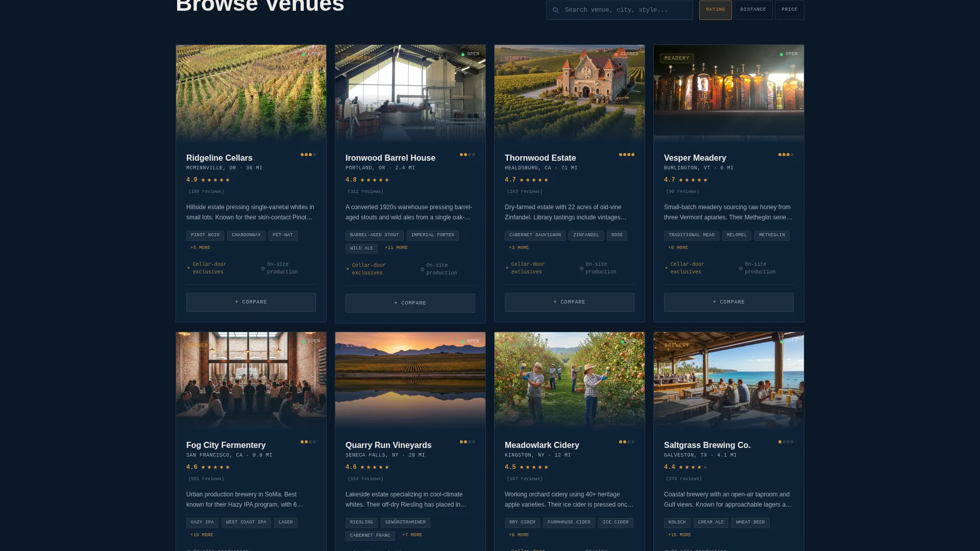
- A modular card grid displaying ratings, distance, style counts, and price tier per venue
- A persistent bottom bar shortlist holding up to four venues, with a "Plan My Trail" call to action that bundles selections into a mapped route with driving times, open hours, and reservation links
Feature list
This template ships with a cohesive set of purpose-built components that take a visitor from casual curiosity to a confirmed itinerary.
Frosted Dark Glass Header
The header floats translucent, frosted-glass category panels against a deep cellar navy background. Each panel covers a distinct category such as craft breweries, natural wines, cideries, and meaderies. A parallax cursor effect shifts blurred imagery of copper kettles, stacked barrels, and vineyard rows behind the glass as the visitor moves across the screen.
Modular Venue Card Grid
Every venue card shows the details a visitor needs to shortlist quickly: ratings, distance, style count, and price tier. Cards use chalk white surfaces against the dark background, with warm amber hover states that highlight the active card like a pint held up to lamplight. The grid is fully modular, so adding or reordering cards requires no structural changes.
Regional Heatmap Section
A data-rich section visualises brewery and winery density across regions. It follows the Industry Report creative direction, presenting the landscape as a state-of-the-market briefing before narrowing the visitor toward specific venue choices.
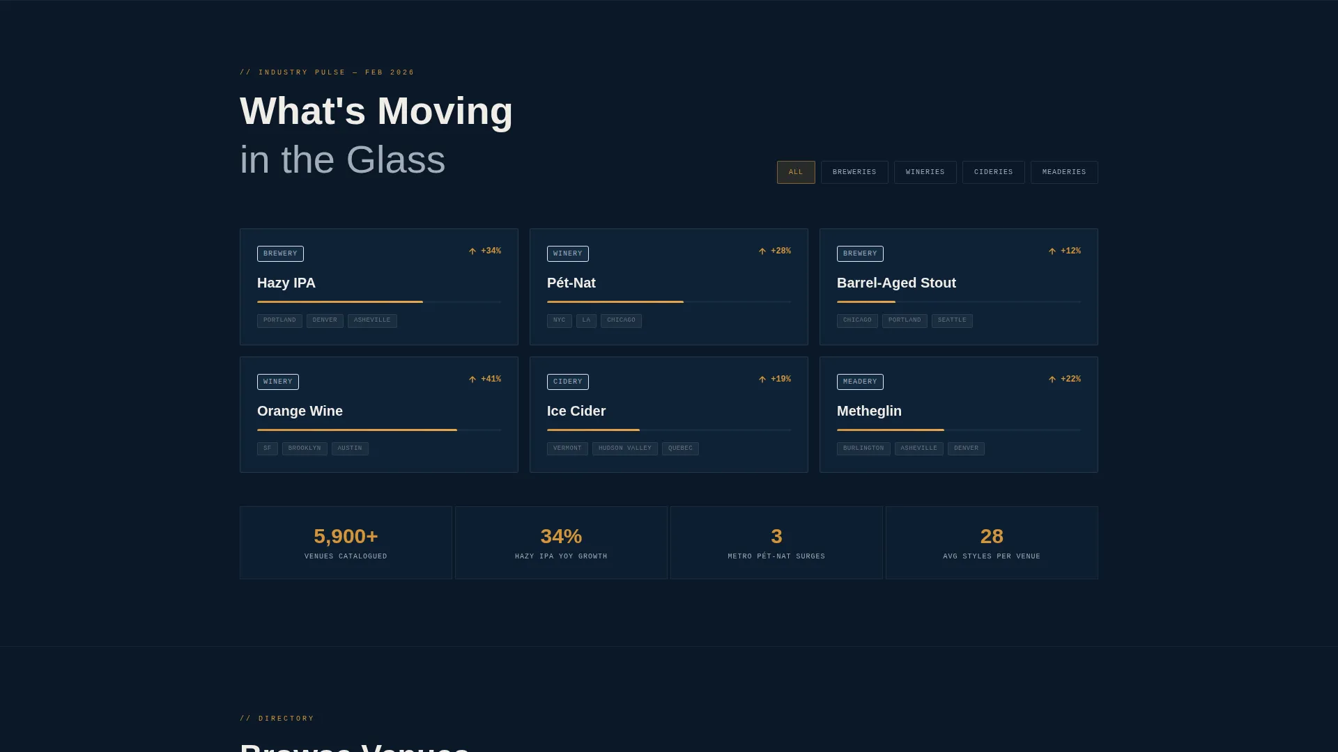
Trending Style Cards
Trending style cards surface movement in the market, such as hazy IPAs or pét-nat surging across metro areas. Each card communicates a single trend with a figure and a short label, reinforcing the sense that this directory is alive and current.
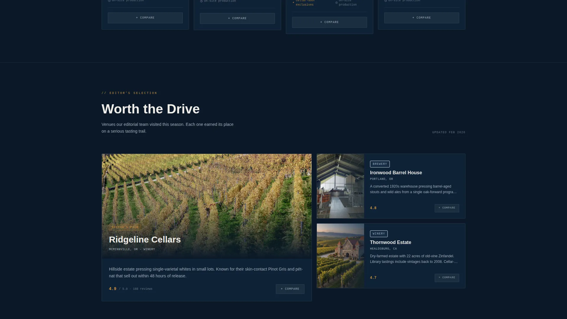
Side-by-Side Comparison Panel
The "Compare These Two" call to action appears on every card pair. Selecting it launches an in-page side-by-side detail panel covering production volume, tasting fees, rating scores, and available styles. The panel opens without navigating away, keeping the visitor inside the discovery flow.
Persistent Comparison Shortlist Bar
A fixed bottom bar holds the visitor's active shortlist of up to four venues. The "Plan My Trail" secondary call to action bundles those selections into a mapped route complete with driving times, open hours, and reservation links, turning a browsing session into an actionable itinerary.
Page sections overview
| Section | Purpose |
|---|---|
| Dark Glass Header | Introduces four venue categories with parallax depth and the "Find Your Next Pour" headline |
| Regional Heatmap | Shows brewery and winery density by region to orient the visitor geographically |
| Trending Style Cards | Highlights rising beverage styles with figures to build relevance and urgency |
| Venue Card Grid | Displays all directory listings in a modular, filterable card layout |
| Comparison Detail Panel | Opens side by side on card pair selection to compare two venues in depth |
| Persistent Bottom Bar | Holds the visitor's shortlist and surfaces the "Plan My Trail" trail-building call to action |
Design & branding system
The visual identity draws from a Midnight Blue color system that feels like a tasting flight arranged on a dark slate board. Every color choice has a functional role in the interface.
- Deep cellar navy (#0B1929) as the primary background, chalk white (#F0EDE8) for card surfaces and primary type, and brushed pewter (#A3ADB8) for secondary text and divider lines
- Warm amber (#D4953A) activates on hover states and active filters, giving the interface an immediate tactile warmth
- The overall palette and frosted-glass panel treatment reinforce the Directory and Discovery theme without relying on literal photography in the interface frame
Mobile & speed optimization
The modular card grid and fixed bottom bar are structured to adapt cleanly across screen sizes. The layout prioritises the comparison and shortlist flow at every breakpoint.
- The card grid reflows naturally from a multi-column desktop layout to a single-column mobile view
- The persistent bottom bar compresses without losing the shortlist or the primary calls to action on smaller screens
- Section-by-section scroll structure keeps content scannable on mobile without requiring horizontal interaction
How this template helps you convert
Every structural decision in Taproom is built to reduce friction between "I'm browsing" and "I'm going." The page earns the click by showing enough data before asking for a commitment.
- Venue cards surface ratings, distance, style counts, and price tier upfront, so adding a venue to a comparison feels like a natural next step rather than a leap of faith.
- The side-by-side comparison panel keeps the visitor on the page during the decision moment, preventing the tab-switching that kills conversion in standard directory layouts.
- The "Plan My Trail" call to action on the persistent bottom bar converts a shortlist into a concrete itinerary, giving visitors a clear, low-effort path to act on their choices.
Other information about this template
Taproom is categorised under the Technology category and the Directory and Marketplace Platforms subcategory, with a specific focus on the Brewery and Winery Directory niche. It is a strong starting point for anyone building a discovery-first platform in the craft beverage space.
- The template style is Card Grid (Modular), suited to directories with large or growing venue inventories
- The creative direction follows an Industry Report structure, escalating from broad regional landscape to narrow venue-level decision data
- The header concept is Dark Glass Panels, a visual treatment that communicates quality and atmosphere before a single venue card loads
- The conversion direction is Comparison and Versus, a format proven to hold visitor attention in high-consideration browse categories
Theme
Directory & Discovery
Creative direction
Industry Report
Color system
Midnight Blue
Style
Card Grid (Modular)
Direction
Comparison/Versus
Page Sections
Frosted Dark Glass Header with Parallax
Modular Venue Card Grid
Side-by-side Comparison Panel
Persistent Shortlist and Trail Builder
Regional Heatmap and Trending Style Cards
Related questions
Who is this landing page template built for?
Can I add more venue cards to the grid?
Does the comparison panel navigate away from the page?
How does the Plan My Trail feature work?
Is this template suitable for a winery-only directory?



