Tariff - Dynamic Telecom Landing Page Template
Tariff is a Bold Brutalist landing page template built for an AI-powered telecom price optimization platform. It features a live-data aesthetic, an interactive comparison table, a margin-recovery calculator with a draggable slider, and viewport-locked calls to action. The design drives revenue assurance professionals and MVNO leaders toward a free price simulation demo.
by Rocket studio
Quick summary
Tariff is a single-page, click-through landing page template designed for a machine-learning telecom pricing platform. It opens with a full-viewport product screenshot, moves visitors through an interactive comparison table and a margin-recovery calculator, and closes every section with a direct call to action. The visual language is raw, dark, and data-driven.
Who this template is for
This template is built for teams that sell or market AI-driven dynamic pricing tools to the telecom industry. It speaks directly to buyers who live inside spreadsheets and rate-plan data every day.
- Revenue assurance directors at mid-tier carriers watching average revenue per user (ARPU) erode quarter over quarter
- Pricing analysts who manage competitor plan comparisons manually and need a faster, smarter solution
- Chief Technology Officers at mobile virtual network operators (MVNOs) who need dynamic pricing without building a dedicated data science team
What problem this template solves
Manual telecom pricing is slow, error-prone, and always one competitor bundle behind. This template positions an AI repricing engine as the answer to that gap, giving prospects a visceral feel for the platform before they ever fill out a form.
- Pricing teams struggle to reprice plans before the next billing cycle closes, losing margin with every delay
- Static landing pages fail to show dynamic tools in action, creating a trust gap between the claim and the product
- Buyers need to experience the platform's speed and logic before committing to a demo request
What you get with this template
You get a fully structured, interaction-rich landing page template that mirrors the energy of a live pricing control room. Every section is purposeful, and every interactive element is a preview of the real product.
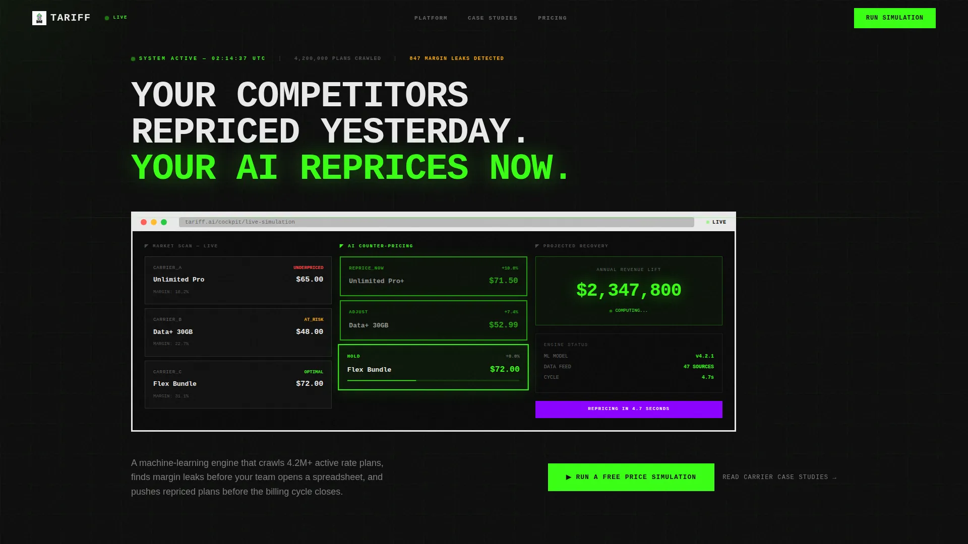
- A full-viewport hero with a product screenshot inside a brutalist browser-chrome frame and an oversized headline
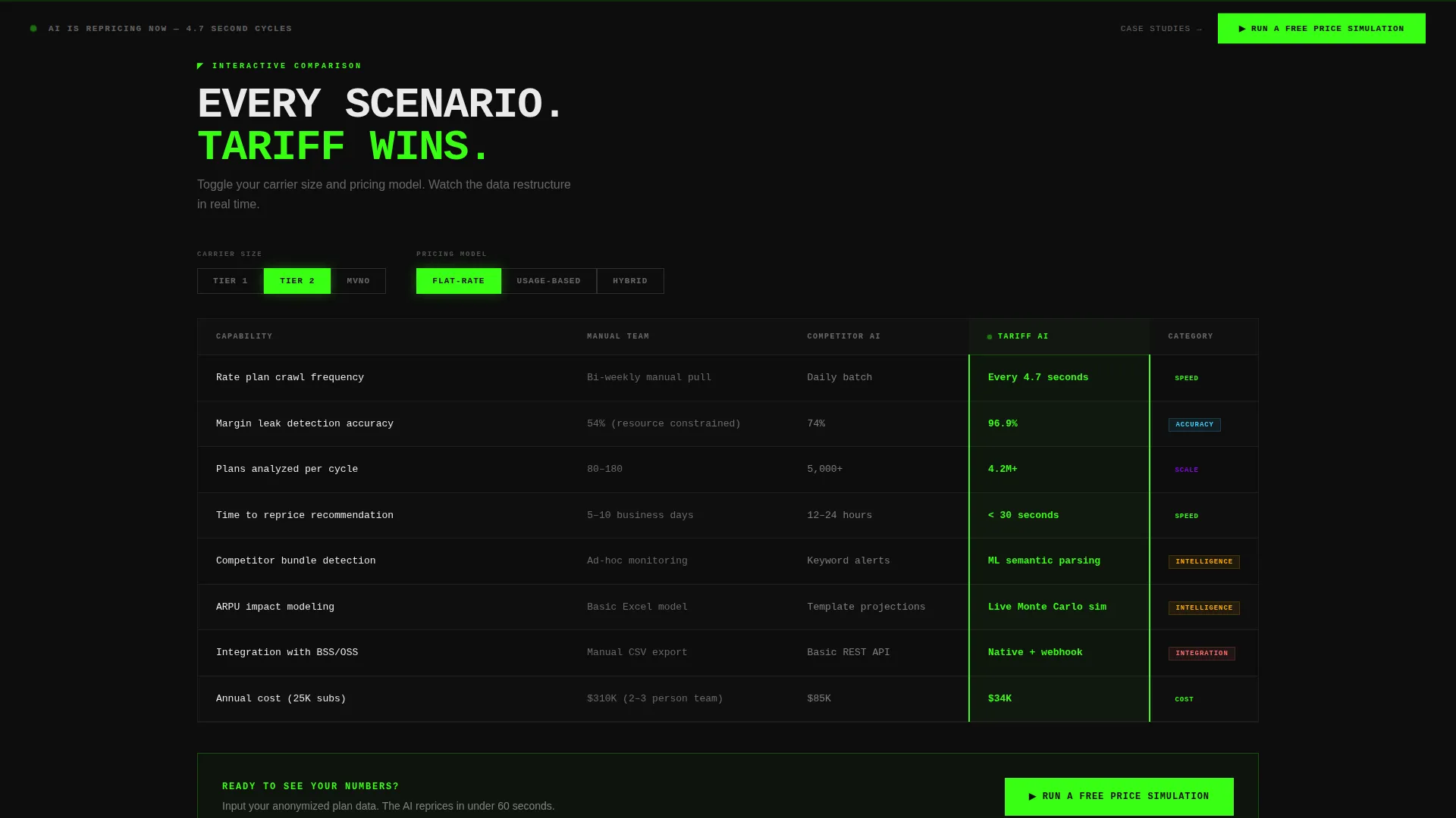
- An interactive comparison table that restructures in real time as visitors toggle carrier size and pricing model type
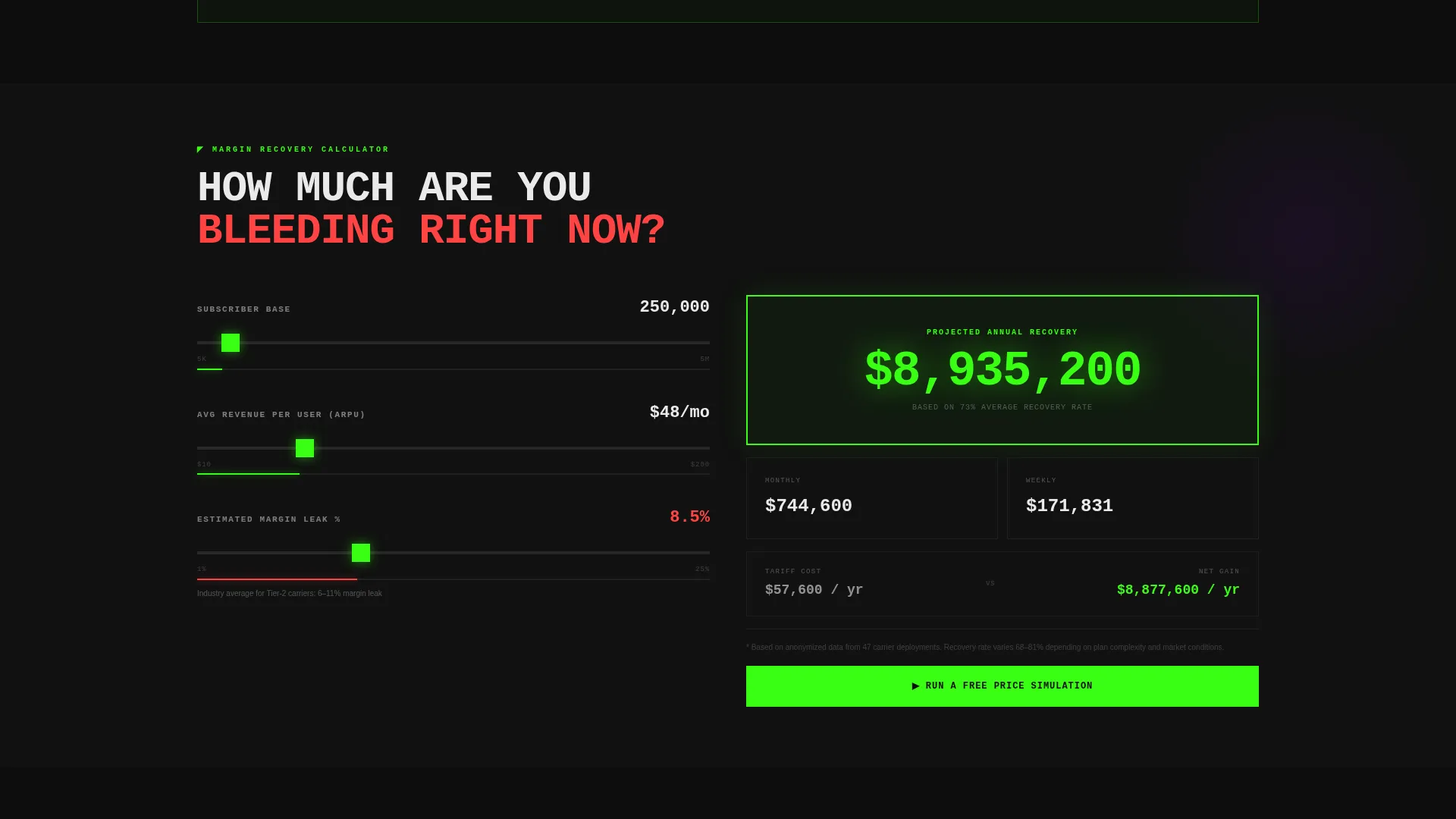
- A margin-recovery calculator with a draggable subscriber-base slider and animated projected revenue figures
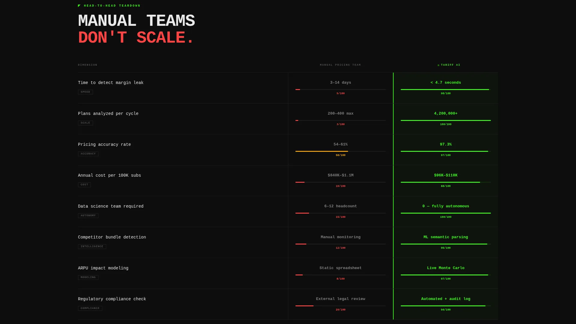
- A head-to-head teardown section comparing manual pricing teams against the AI across speed, accuracy, and cost
- Viewport-locked and inline calls to action that route directly to a gated sandbox demo, with no on-page form
Feature list
This template is built around five core interactive and visual capabilities drawn directly from the platform brief.
Full-Viewport Product Screenshot Hero
The header fills the entire screen with a pixel-perfect platform screenshot. It shows three competitor plan cards, a center column with AI-recommended counter-pricing glowing in toxic green, and a revenue lift percentage animating upward. A thick white browser-chrome frame surrounds the image, and an oversized monospaced headline is stamped above it.
Real-Time Interactive Comparison Table
The comparison table is not static. Visitors toggle between carrier size tiers (Tier 1, Tier 2, MVNO) and pricing model types (flat-rate, usage-based, hybrid). The table columns restructure in real time to reflect how the AI's optimization logic shifts per scenario, giving each visitor a personalized data view.
Animated Margin-Recovery Calculator
A draggable slider lets visitors set their subscriber base size. As the slider moves, projected annual revenue recovery climbs visually on screen. This interactive element makes the platform's value concrete and quantifiable before any sales conversation begins.
Manual-versus-AI Teardown Section
A structured comparison breaks down manual pricing team performance against AI performance across three axes: speed, accuracy, and cost. The section uses the same brutalist visual language as the rest of the page, keeping the argument sharp and readable.
Viewport-Locked and Repeating Call to Action
The primary call to action, "Run a Free Price Simulation," is locked to the bottom of the viewport during the hero section. It repeats after the comparison table and again after the margin calculator. A secondary text link, "Read the Carrier Case Studies," provides an alternative path for analytical buyers who need evidence before committing.
Page sections overview
| Section | Purpose |
|---|---|
| Hero Product Screenshot | Establishes platform credibility with a live repricing simulation visual |
| Interactive Comparison Table | Lets visitors filter by carrier size and pricing model in real time |
| Margin Recovery Calculator | Quantifies annual revenue recovery using a draggable subscriber slider |
| Manual versus. AI Teardown | Compares human pricing teams against AI on speed, accuracy, and cost |
| Secondary call to action Row | Offers a case study path for buyers who need proof before simulating |
Design & branding system
The visual identity follows a Bold Brutalist theme powered by an Acid Digital color system. Every design decision is intentional and stripped of decoration.
- Void black (#0D0D0D) dominates all backgrounds, creating a terminal-window feel throughout the page
- Toxic green (#39FF14) pulses on hover states, active toggles, real-time metric counters, and the primary call-to-action button
- Signal white (#EAEAEA) handles all primary typography, set large, blunt, and often in uppercase against the dark backgrounds
- Electric violet (#8B00FF) marks differentiation columns in the comparison table and highlights premium-tier badges
Mobile & speed optimization
The template is structured with a lean, scroll-driven layout that keeps interactive elements responsive and readable on smaller screens. The brutalist design system naturally avoids heavy decorative assets.
- All toggle-driven table states and slider interactions are built to reflow cleanly on mobile viewport widths
- The viewport-locked call to action adapts to bottom-bar positioning on mobile, keeping the primary action always visible
- The dark background and monospaced typography system reduces render weight compared to image-heavy or gradient-rich alternatives
How this template helps you convert
Every design and interaction decision in this template is engineered to reduce hesitation and push qualified visitors toward the demo sandbox.
- The product screenshot hero shows the platform working before the visitor reads a single word of copy, building immediate trust through proof rather than promise.
- The interactive table and margin calculator give visitors a personalized, hands-on experience that mirrors the real product, making the "Run a Free Price Simulation" click feel like a natural next step rather than a cold commitment.
- The dual call-to-action strategy catches both action-ready buyers and research-mode buyers, routing each to the right next step without forcing a form fill.
Other information about this template
This template is categorized under Technology, specifically within the AI for Telecommunications subcategory. It is optimized for the telecommunications AI price optimization niche, targeting mid-market carriers and MVNOs.
- The template style is a Comparison Table layout, chosen to map the AI's multi-scenario output against traditional approaches in a format pricing professionals already trust
- The header concept is a Product Screenshot, grounding the page in real platform proof rather than abstract marketing visuals
- The creative direction is Interactive Explorer, meaning the scroll journey is designed to deepen engagement with each section rather than deliver a flat reading experience
- The click-through landing page direction means there is no lead form on the page; the conversion happens inside the linked demo sandbox
Theme
Bold Brutalist
Creative direction
Interactive Explorer
Color system
Acid Digital
Style
Comparison Table
Direction
Click-Through
Page Sections
Full-viewport Product Screenshot Hero
Real-time Interactive Comparison Table
Animated Margin-recovery Calculator
Manual-versus-ai Teardown Section
Viewport-locked Repeating Call to Action
Related questions
Who is this landing page template designed for?
Does this template include a lead capture form?
Can the comparison table display different carrier scenarios?
What makes the visual design distinctive?
Is there an alternative path for buyers who are not ready to demo?



