Hotel Room Types & Seasonal Rates Comparison Website Template
Tariff is a card grid landing page template built for hotel and resort pricing pages. It presents every room type, seasonal rate, and package deal in a clean, modular layout that guests can browse, compare, and act on instantly. Independent hoteliers, boutique resort operators, and revenue managers will find it far more practical than emailing a spreadsheet every Monday.
by Rocket studio
Quick summary
Tariff is a single-page hotel pricing template designed around a modular card grid. It organizes room types, seasonal rates, and package deals into a layout that feels like a well-stocked concierge desk. Guests can compare options, explore add-ons, and move toward booking without confusion or hesitation.
Who this template is for
This template is built for hospitality professionals who need a better way to present rates to prospective guests. If you currently manage pricing in a spreadsheet and forward it to your front desk, this page was designed for your exact situation.
- Independent hoteliers managing roughly fifteen to eighty rooms who need a clear, guest-facing rate display
- Boutique resort operators juggling peak-season surcharges, shoulder-season promotions, and package bundles
- Revenue managers who want guests to understand pricing without a phone call or back-and-forth email
What problem this template solves
Most hotel pricing pages are either buried inside a booking engine or scattered across multiple pages with no clear hierarchy. Guests give up before they find the room that fits their budget. This template puts every option on one structured, scannable page.
- Guests compare room types, rates, and inclusions side by side without navigating away
- Seasonal pricing and promotional packages are displayed together rather than hidden in fine print
- The layout removes the friction between "interested guest" and "committed booker"
What you get with this template
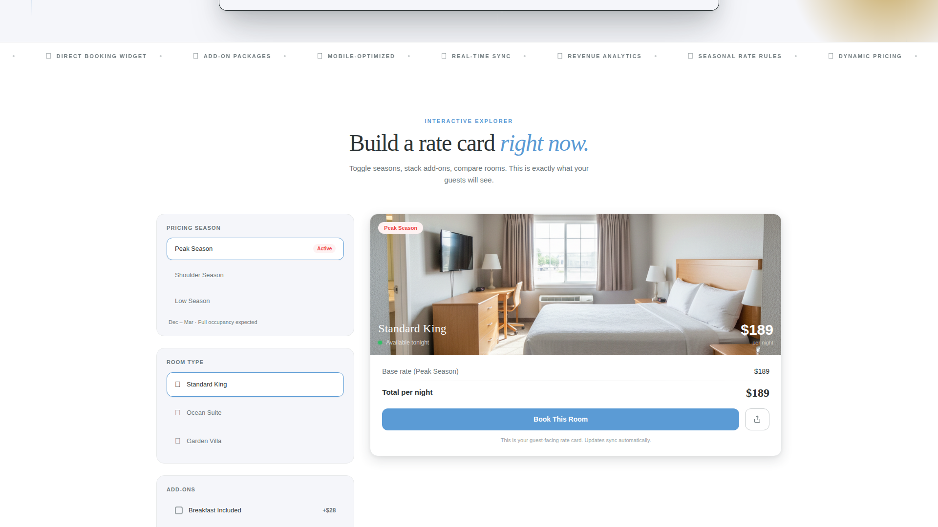
You get a fully structured, single-page layout built around a modular card grid. Every section is designed to carry guests from curiosity to commitment through interaction rather than paragraphs of copy.
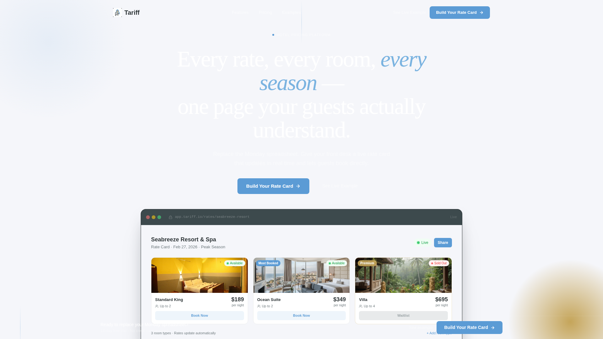
- A product screenshot header with a headline, three visible room-type cards, and real pricing user interface
- An interactive demo section with seasonal view toggles, draggable card reordering, and expandable add-on stacks
- A lead generation form with three sequential fields and a secondary "See Live Example" path for skeptical visitors
Feature list
This template delivers a set of well-defined, purpose-built components. Each one reflects a specific decision about how hotel guests actually browse and decide.
Modular Room Card Grid
Each room type gets its own card showing a nightly rate, a room thumbnail, an occupancy icon, and a live availability indicator. Cards are designed to sit side by side so guests can compare at a glance without scrolling back and forth.
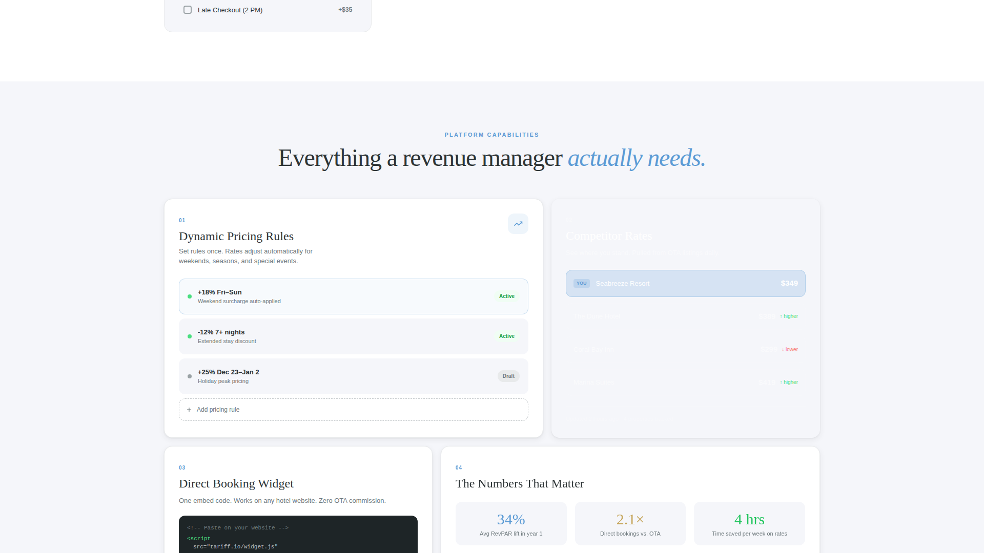
Interactive Seasonal Pricing Toggle
Visitors can switch between seasonal pricing views directly on the page. This lets them see how rates shift between peak and shoulder periods without leaving the layout or asking staff.
Draggable Card Reordering
The demo section lets visitors drag cards to reorder room hierarchy. This interaction demonstrates how the template can reflect a property's actual upsell strategy, with premium rooms surfaced intentionally.
Expandable Add-On Stacking
Clicking into any room card reveals how add-ons such as breakfast, late checkout, and spa credit stack visually on top of the base rate. Guests see the full cost picture before they commit.
Sticky Lead Generation Bar
After a visitor's first interaction, a sticky bottom bar appears with the primary call to action "Build Your Rate Card." The bar stays visible during scroll, keeping the conversion path accessible without interrupting browsing.
Three-Field Sequential Form
The lead capture form collects property name, total room count via a dropdown, and email in three clean steps. The focused sequence reduces hesitation and keeps the submission path short.
Page sections overview
| Section | Purpose |
|---|---|
| Header with screenshot | Anchors attention with real pricing user interface and a single clear headline |
| Interactive demo area | Lets visitors toggle seasonal views and drag room cards hands-on |
| Add-on explorer | Shows how breakfast, spa credit, and late checkout stack per card |
| Dynamic pricing rules | Reveals pricing logic through interaction rather than text |
| Competitor rate comparison | Demonstrates comparative rate context within the live demo |
| Direct-booking widget | Shows the booking entry point embedded inside the card layout |
| Lead generation form | Captures property name, room count, and email in three steps |
| Sticky call to action bar | Persists the "Build Your Rate Card" action after first interaction |
| Secondary example link | Offers a live anonymized hotel page for skeptical visitors |
Design & branding system
The visual identity follows a Directory and Discovery theme using a Slate and Sky color system. The palette is calm and quietly luxurious, like looking out a hotel window just before an overcast morning breaks open.
- Deep charcoal slate (#2D3436) anchors primary backgrounds and card borders; cloud-white (#F5F6FA) fills card faces and open space
- Horizon blue (#5B9BD5) marks interactive elements and hover states so guests always know what is clickable
- Muted gold (#C5A55A) is reserved for premium-tier badges and upgrade nudges, adding a subtle signal of elevated value
Mobile & speed optimization
The card grid layout is built to reflow cleanly across screen sizes. Guests browsing on a phone during travel research get the same clear, structured experience as those on desktop.
- Modular cards stack vertically on smaller screens without losing the rate, thumbnail, occupancy, and availability details
- Interactive elements such as toggles and the sticky call to action bar are sized and spaced for comfortable touch use
- The three-field form reduces input friction on mobile by using a dropdown for room count rather than a free-text field
How this template helps you convert
The template earns the form submission by letting visitors experience the product before asking for anything. Every scroll section is a demonstration, not a sales pitch.
- The interactive demo section lets visitors toggle pricing views, drag cards, and explore add-ons so they have already imagined their own rates inside the layout before they reach the form
- The sticky "Build Your Rate Card" bar appears after the first interaction, catching visitors at the moment of highest intent without forcing the ask too early
- The secondary "See Live Example" link gives skeptical visitors proof before commitment, reducing the drop-off that typically comes from unverified claims
Other information about this template
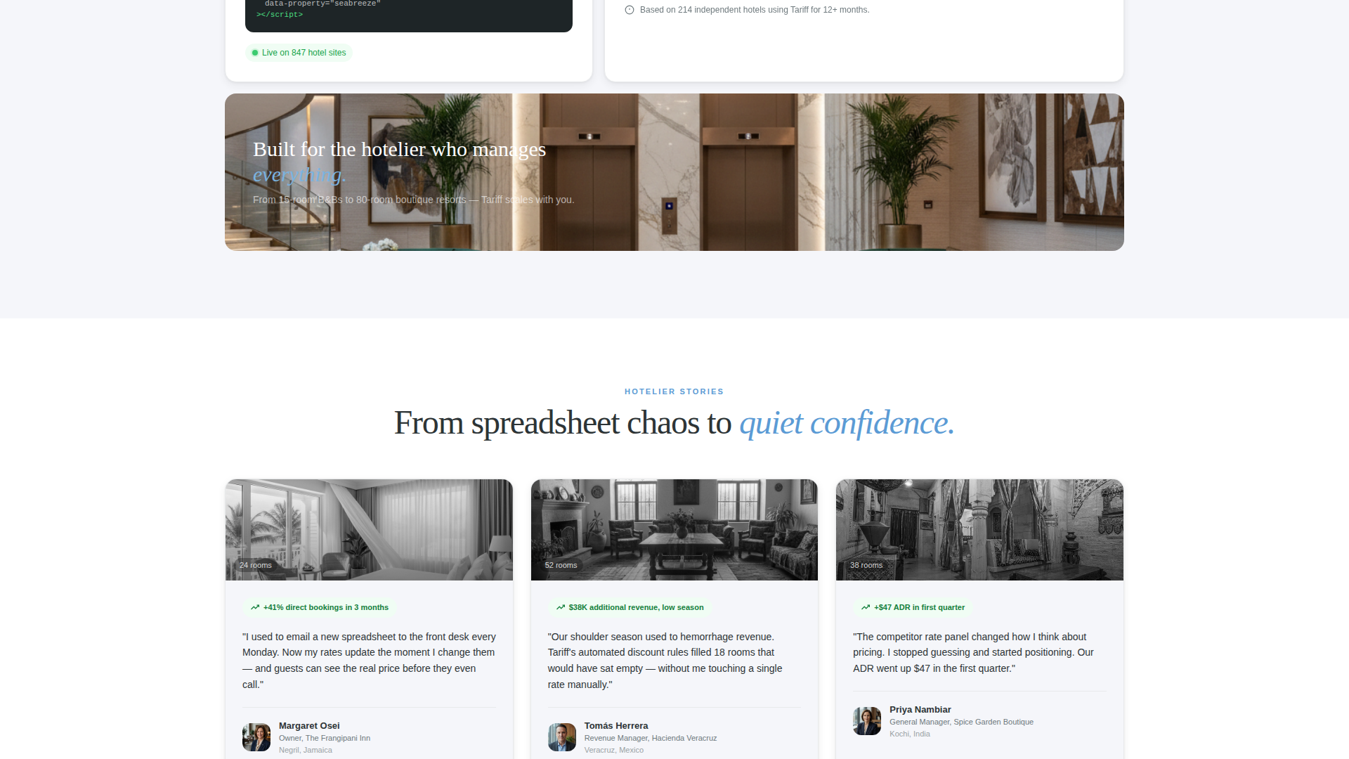
This template is part of the Hotel and Resort Website Templates subcategory under the Technology category on the platform. It was designed specifically for the hotel and resort pricing page niche, where the gap between a guest's interest and their booking decision is often decided by how clearly rates are presented.
- The template style is Card Grid (Modular), making it well-suited for properties with multiple room types that need clear visual separation
- The creative direction is Interactive Explorer, meaning the page teaches through hands-on engagement rather than static feature lists
- The header concept is a Product Screenshot showing the pricing dashboard mid-use, with real data and real typography rather than wireframe placeholders
- The lead generation direction means the page is optimized for capturing qualified property contacts, not just driving direct guest bookings
Theme
Directory & Discovery
Creative direction
Interactive Explorer
Color system
Slate & Sky
Style
Card Grid (Modular)
Direction
Lead Generation
Page Sections
Modular Room Card Grid
Interactive Seasonal Pricing Toggle
Expandable Add-on Stacking
Draggable Card Reordering
Sticky Lead Generation Bar
Three-field Sequential Form
Related questions
Who is this template designed for?
What kind of interactivity does this template include?
How does the lead generation form work?
Can skeptical visitors verify the product before submitting their details?
What makes this layout different from a standard pricing table?