Dark Immersive Grunge Accessories Landing Page
Tarnish is a dark immersive landing page template built for grunge accessories brands. It uses a Gallery Walk structure to showcase rings, chains, and cuffs across full-page product spreads. With a Ruby and Chrome color system, distressed typography, and a persistent cart, every scroll feels deliberate and every piece gets its own stage.
by Rocket studio
Quick summary
Tarnish is a single-page, storybook-style landing page template for handmade grunge accessories. It presents each product in its own full-page spread, using a void black backdrop, arterial ruby accents, and tarnished chrome type. The result is a buying experience that feels more like a gallery walk than a typical product page.
Who this template is for
This template was designed for independent makers and small-batch brands who sell raw, handcrafted metal jewelry. The tone and structure speak directly to buyers who want something with edge, weight, and a story behind it.
- Jewelry workshops selling handmade rings, chains, and cuffs to subculture audiences
- Touring musicians, tattoo artists, and skate communities looking for one standout piece
- Independent brands replacing a generic storefront with something that matches their aesthetic
What problem this template solves
Most product pages treat jewelry like inventory. They stack thumbnails, shrink descriptions, and rush the visitor toward a checkout they haven't earned. For a brand like Tarnish, that approach kills the purchase before it starts.
- Generic templates flatten the drama out of handcrafted pieces that deserve a full frame
- Cluttered layouts compete with the product instead of letting the metal speak for itself
- Visitors leave without connecting to the story or the craft behind the piece
What you get with this template
This template delivers a complete, single-page storefront layout built around the Gallery Walk creative direction. Every element has a purpose and every section earns the scroll.
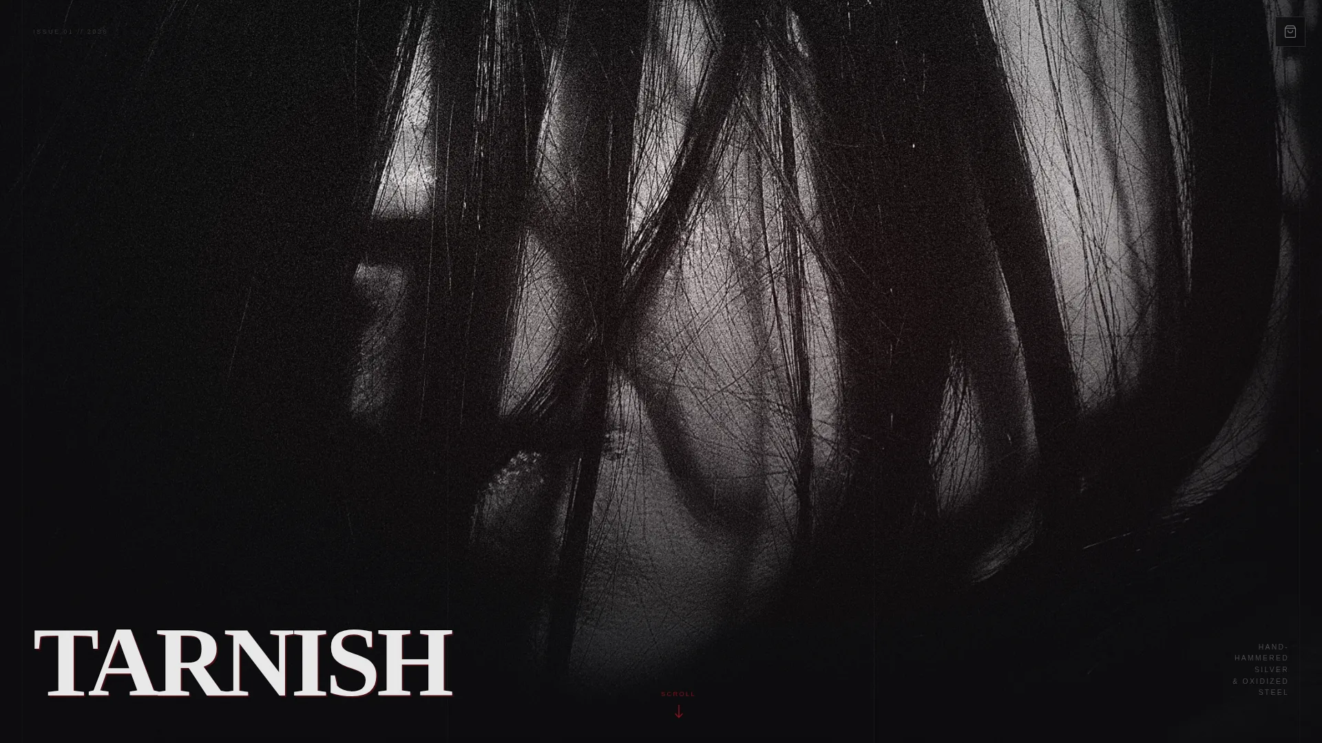
- A full-viewport portrait header with distressed brand lettering and a ruby scroll prompt
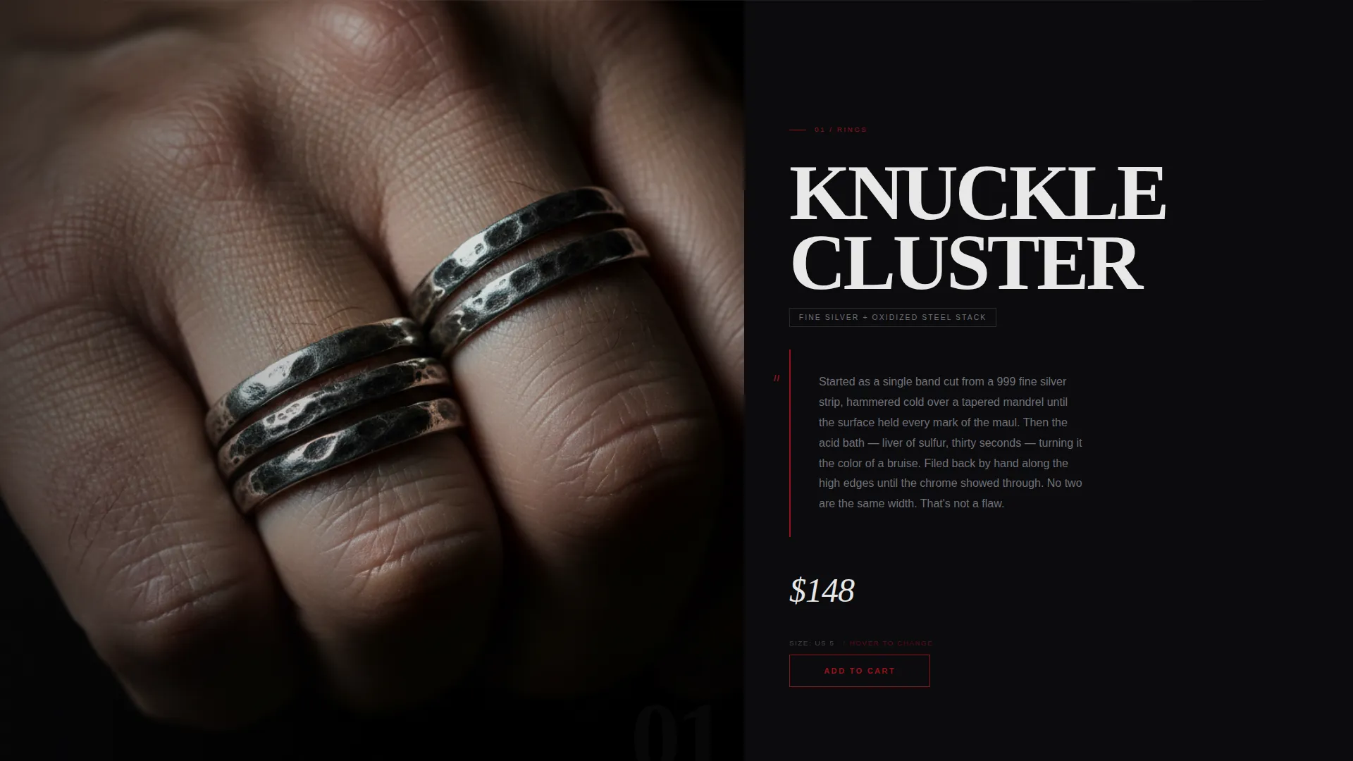
- Three full-page product spreads, each with macro photography framing, a story text block, an "Add to Cart" button, and a hover-triggered size selector
- A persistent cart icon fixed in the top-right corner with a ruby count badge, plus a "Join the Pit" email signup embedded after the third product room
Feature list
This template is built around a tight set of purposeful components. Each one comes directly from the creative brief and serves a specific role in the buying flow.
Full-Viewport Portrait Header
The header fills the entire screen with a single figure shot from collarbone to jaw. The brand name is scratched across the bottom in a distressed serif, and a ruby scroll arrow pulses below it. There is no navigation, no logo lockup, just presence.
Gallery Walk Product Spreads
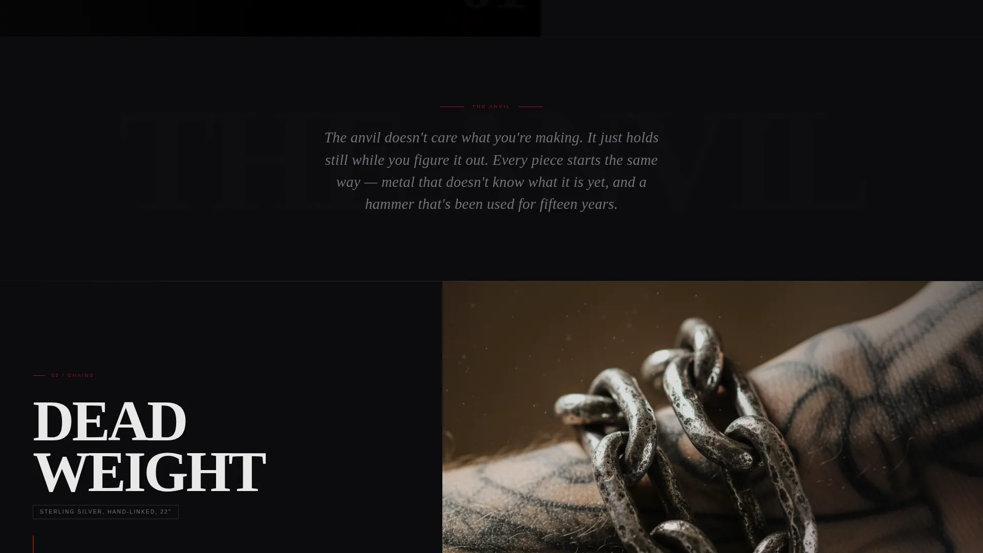
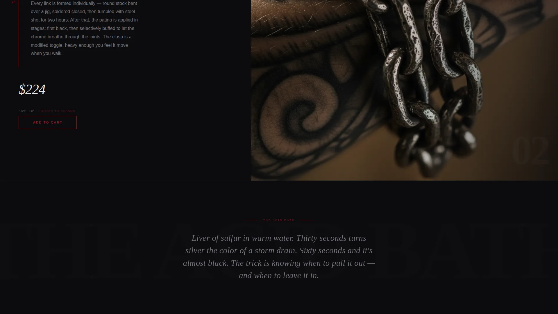
Each of the three product rooms occupies a full page. Rings appear macro on scarred knuckles, chains drape over bare skin, and cuffs rest heavy on a speaker cabinet. Hard cuts separate each spread with no fade or parallax effect between them.
Origin Story Text Blocks
Short chrome-type passages appear between product rooms. They describe the anvil, the acid bath, and the hand-filing process. These blocks add narrative weight without cluttering the product frames.
Persistent Cart with Ruby Badge
A fixed cart icon sits in the top-right corner throughout the entire scroll. The item count badge uses arterial ruby, making it the only persistent interface element on the page.
Hover-Triggered Size Selector
Each product spread includes a minimal dropdown size selector that appears on hover. It stays hidden until the visitor reaches for the button, keeping the product image uninterrupted.
"Join the Pit" Email Signup
After the third product spread, a one-field email signup section invites visitors to join a pre-release list. The single button reads "Get Early Drops" and promises 24-hour advance access to new pieces.
Page sections overview
| Section | Purpose |
|---|---|
| Portrait Header | Sets brand tone and anchors the first impression |
| Rings Product Spread | Showcases ring collection with macro detail |
| Origin Story Block | Shares the craft narrative between products |
| Chains Product Spread | Presents chain pieces with skin-texture context |
| Origin Story Block | Continues the workshop story between spreads |
| Cuffs Product Spread | Closes the product gallery on a heavy note |
| Email Signup Section | Captures pre-release subscribers after the gallery |
Design & branding system
The visual identity is built on a Ruby and Chrome color system anchored by a void black base. Every color choice has a single job and does only that job.
- Void black (#0B0B0D) dominates every full-page spread as the primary background
- Tarnished chrome (#71717A) carries body text, divider lines, and secondary copy
- Arterial ruby (#9B111E) marks every clickable element, the cart badge, and urgent calls to action, while flash white (#E8E8E8) appears only on hover states and price text
Mobile & speed optimization
The template is structured around full-page vertical spreads, which translate naturally to tall portrait screens. The layout was conceived with a mobile-first rhythm in mind.
- Tall portrait framing in the header mirrors how the page feels on a phone held upright
- Single-column product spreads remove the need for responsive grid adjustments on smaller screens
- Minimal interface elements, with only the fixed cart icon as persistent user interface, reduce visual noise on compact displays
How this template helps you convert
The Gallery Walk structure is not decorative. It is a deliberate conversion sequence built to earn each click before asking for it.
- The portrait header stops the scroll immediately and frames the brand as something worth investigating, setting intent before a single product appears.
- Each full-page product spread isolates one piece with its own image, price, story, and button, so the visitor has already made a mental decision before the "Add to Cart" button is in reach.
- The "Join the Pit" signup section captures visitors who are not ready to buy yet, turning a missed sale into a pre-release relationship with a clear value offer.
Other information about this template
This template sits inside the Fashion and Lifestyle category under the Grunge Fashion subcategory. A few additional details worth knowing before you use it.
- The template style is Storybook and Full-Page, meaning it is designed as a single continuous scroll rather than a multi-page site
- The Dark Immersive theme and Gallery Walk creative direction were matched specifically to the grunge accessories niche
- The header concept is Vertical and Portrait, built for dramatic first impressions on both desktop and mobile viewports
- The storefront direction is a Marketplace and Multi layout, meaning each product spread functions as its own self-contained purchase unit
- This template pairs well with brand photography that uses directional lighting, visible grain, and dark negative space
Theme
Dark Immersive
Creative direction
Gallery Walk
Color system
Ruby & Chrome
Style
Storybook/Full-Page
Direction
Marketplace/Multi
Page Sections
Full-viewport Portrait Header
Gallery Walk Product Spreads
Origin Story Text Blocks
Persistent Cart with Ruby Badge
Hover-triggered Size Selector
Join the Pit Email Signup
Related questions
Is this template designed for a single page or multiple pages?
Can I change the number of product spreads?
What kind of photography works best with this template?
Does this template include the email signup component?
Who is the target audience for a template like this?



