Command K-12 Learning Hub Landing Page Template
The Syllabus Data Command K-12 Knowledge Base landing page template is a hub-and-spoke, anchor-nav landing page built for K-12 educators who need every district policy, curriculum map, and compliance deadline in one searchable place. It combines a live search demo, animated spoke reveals, role-specific social proof, and a prominent app-download call to action inside a bold Acid Digital visual system.
by Rocket studio
Quick summary
This landing page template turns a sprawling district knowledge base into a single, navigable command center. Principals, curriculum coordinators, and first-year teachers all land on a page that lets them search first and read second. The Acid Digital visual style, void black backgrounds, electric chartreuse active states, and scanner blue accents, signals precision and authority from the first pixel.
Who this template is for
This template was designed for K-12 education technology teams, EdTech product builders, and school district communications offices that need a professional landing page for a knowledge base or curriculum platform. It serves any institution that wants to replace scattered physical materials and multiple logins with one searchable landing page experience.
- Building principals and curriculum coordinators who manage large volumes of academic policies, course schedules, and compliance documents across every grade level
- First-year teachers and instructional coaches who need fast access to course information, onboarding paths, and training program resources without prior institutional knowledge
- Superintendents and district administrators who need to pull accreditation evidence, standards alignment data, and progress details quickly for prospective students, parents, and community stakeholders
What problem this template solves
K-12 educators currently juggle six or more separate logins to access documents that should live in one place. The course schedule lives in one system. Academic policies live in another. The professional development library is buried in a third-party platform. Meanwhile, potential students, parents, and current students all arrive at different web pages and find different levels of detail. A fragmented experience erodes trust, slows decision-making, and makes it impossible to direct visitors to the right resource fast enough.
- Educators lose time hunting across management systems for a single pacing guide or compliance deadline, when that time should go toward instruction
- The landing page experience varies greatly between staff roles, meaning a principal and a new teacher often face completely different levels of friction when searching for the same course information
- Institutions struggle to build trust with prospective students and parents when important information provided on the page is outdated, incomplete, or scattered across a third-party platform with no unified search
What you get with this template
This template delivers a complete, visually appealing hub-and-spoke landing page built around a functional search experience. Every section is designed to convert visitors from passive browsers into active app installers. The page layout guides users through an accumulation narrative, each spoke adds another layer of capability until the visitor realizes the platform replaces every fragmented tool they currently use. You do not need advanced coding skills to publish this template; the structure is ready to customize and launch.
- A hero section with a holographic device-framed dashboard preview, a typewriter headline, a live search bar demo, and chartreuse status pills showing real-time content freshness signals
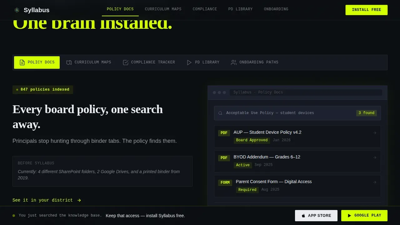
- Five anchor-nav hub spokes, Policy Docs, Curriculum Maps, Compliance Tracker, PD Library, and Onboarding Paths, each with an animated mini-demo that shows the tool solving that category's specific pain at the right grade level
- An app-download call to action section complete with App Store and Google Play badges, a QR code for immediate mobile install, and a one-field email input so desktop visitors can send the link to their inbox and install later
Feature list
This landing page template is built around a set of interconnected features that serve both the visitors exploring the page and the teams who publish and maintain it. Each feature is grounded in the Data Command theme: clarity, speed, and signal over noise.
Holographic Dashboard Preview Hero
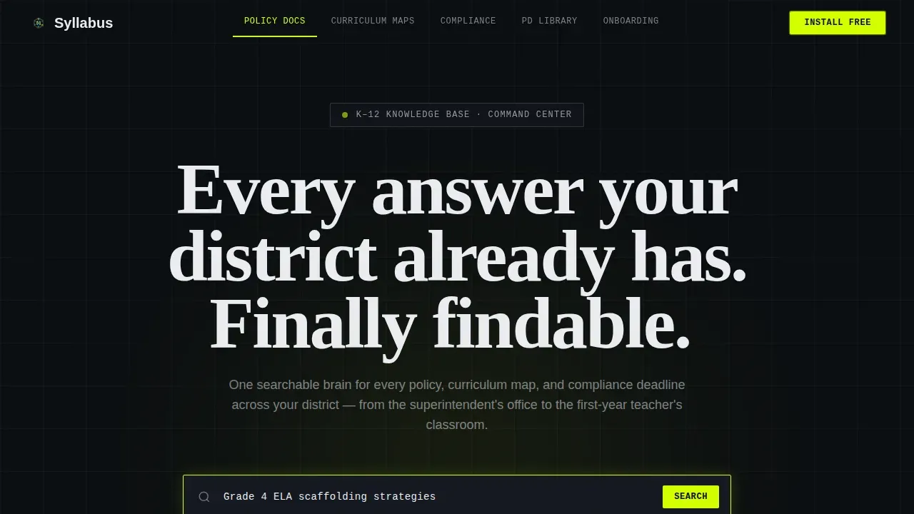
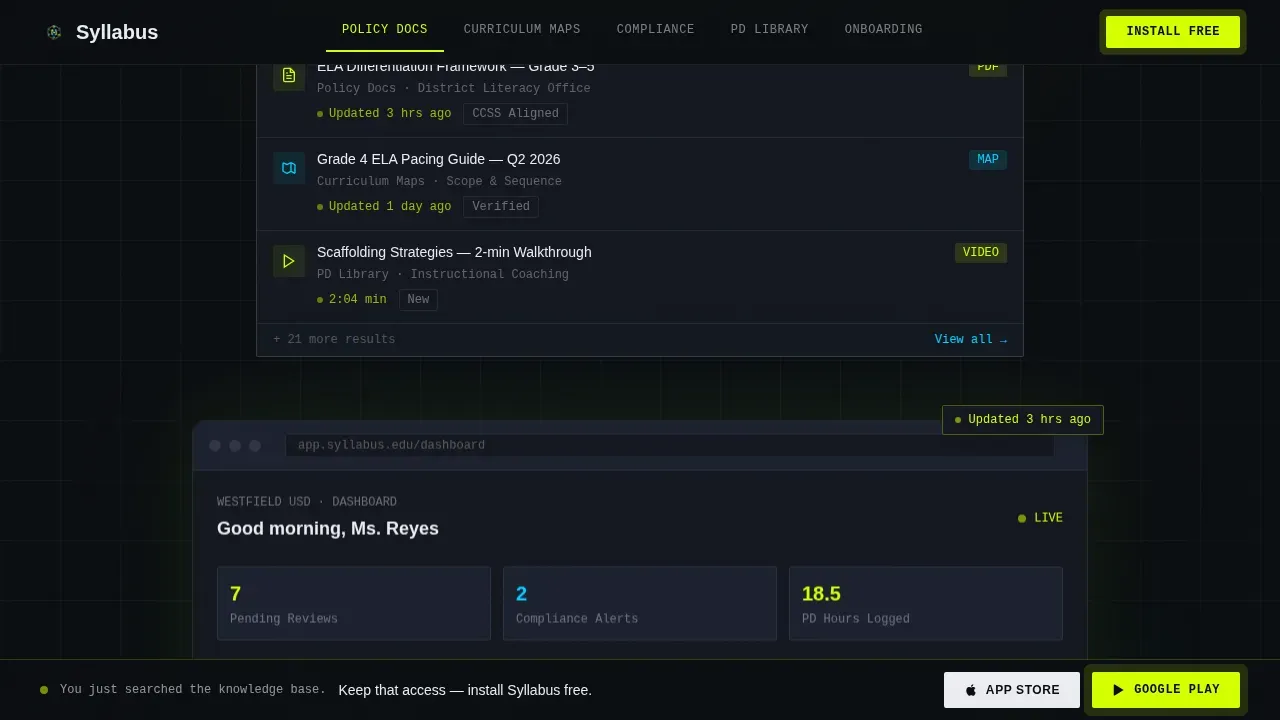
The hero section frames a device-screen app preview showing a real search query mid-autocomplete. Result cards fan below the query, a policy document, a pacing guide, and a short video walkthrough. Chartreuse status pills glow with update timestamps and standards-alignment tags. The surrounding viewport is pure void black, making the dashboard float like a hologram above the fold. A typewriter headline types itself out letter by letter, and a live search bar sits below the frame, inviting visitors to type a plain-English question before reading another word.
Hub-and-Spoke Anchor Navigation
Five clearly labeled anchor-nav spokes organize every piece of course information into a navigable, well organized structure. Each spoke, Policy Docs, Curriculum Maps, Compliance Tracker, Professional Development Library, and Onboarding Paths, opens into a mini-demo section. Animated interactions show the platform solving a specific pain for that category, so visitors understand the scope of the knowledge base by example rather than by description alone. The anchor nav stays persistent, letting users jump between spokes without losing their place on the page.
Live Search Bar Demo with Role-Tailored Results
The page starts with a functioning search bar, not a pitch. Visitors type a real question, for example, "Grade 4 ELA scaffolding strategies", and watch result cards populate in real time. The search experience is tailored to user roles: a teacher sees differentiation frameworks and assignments; an administrator sees accreditation articles and compliance deadlines. This interaction is the most persuasive element on the page because visitors experience the platform's value before any call to action appears.
Accumulation Proof Section with Animated Counters
A speed-stats section follows the hub spokes and uses animated counters to show scale. Each counter represents a dimension of the knowledge base, documents indexed, course schedules mapped, grade level standards covered, and educators onboarded. The accumulation narrative builds the "this too?!" moment: by the time the visitor finishes scrolling the spoke sections, the counter section confirms that the platform is already doing all of this at district scale. Bright spots and areas needing intervention are surfaced clearly, helping educators understand at a glance where the data is strongest.
Role-Specific Social Proof Section
Student testimonials and role-specific educator quotes appear with visible role badges, "Grade 3 Teacher," "Curriculum Coordinator," "Assistant Superintendent." District logos and usage stats reinforce credibility alongside the testimonials. Social proof is positioned after the demo sections so visitors have already experienced the search tool before reading what others say about it. This sequencing makes the social proof land as confirmation rather than as an unsupported claim, helping build trust with prospective students, parents, and administrators who arrive on the page skeptical.
App Download Call to Action with Persistent Pulse
The primary call to action is "Install the Knowledge Base," anchored to the bottom of the viewport with a subtle chartreuse pulse. App Store and Google Play badges appear side by side. A QR code enables an instant mobile scan for visitors on a desktop who want to install on a phone immediately. A one-field email input labeled "Send the link to your inbox" gives desktop visitors a low-friction path to install later. Call to action buttons are prominent, clearly labeled, and tied to the desired action at every stage of the scroll.
Page sections overview
| Section | Purpose |
|---|---|
| Hero Dashboard Preview | Showcases live search demo with holographic device frame and typewriter headline |
| Anchor Nav Bar | Lets visitors jump directly to any of the five hub spoke categories |
| Policy Docs Spoke | Demonstrates how academic policies and compliance documents are found in two clicks |
| Curriculum Maps Spoke | Shows course schedule crosswalks and grade level standard alignments in action |
| Compliance Tracker Spoke | Animates deadline tracking and accreditation evidence retrieval for administrators |
| PD Library Spoke | Displays training program articles and professional development resources by role |
| Onboarding Paths Spoke | Guides new educators through structured course information and first-year resources |
| Speed Stats Section | Animated counters prove platform scale across documents, schedules, and educators |
| Social Proof Section | Role-badged student testimonials and district logos build trust with visitors |
| App Download call to action | App Store, Google Play, QR code, and email input drive the install conversion |
| Footer | Linear single-row footer with essential links and school contact details |
Design & branding system
The Acid Digital color system gives this landing page a look that feels like a terminal screen running at full signal. Void black dominates every background, so chartreuse and scanner blue read as pure signal rather than decoration. The palette is bold enough to stand out in the K-12 education technology space while remaining visually appealing and readable for long-form content. Text formatting uses JetBrains Mono for interface elements and data labels, DM Sans for body copy, and Fraunces for display accents, a combination that balances the Data Command theme with the readability that teachers, principals, and parents expect from an education landing page.
- Void black (#0B0E11) dominates backgrounds; electric chartreuse (#D4FF00) marks active states, progress bars, anchor-nav indicators, and call to action pulse effects; scanner blue (#00D1FF) differentiates secondary actions and data visualization accents; interface white (#EAECF0) keeps long-form body text readable without softening the edge
- Clean lines, sharp grid spacing, and reduced visual clutter keep focus on data and search results rather than decorative page elements, supporting the simplified navigation principle that keeps visitors moving toward the desired action
- The unique design reflects the school's data-forward educational mission rather than a generic template aesthetic, chartreuse status pills, scanner-blue result cards, and the holographic device frame all reinforce the platform's identity as a command-grade tool built for serious educators
Mobile & speed optimization
The template is built desktop-first, which reflects how principals and curriculum coordinators most often access a knowledge base at their desks. However, mobile devices are a primary channel for classroom teachers who move between rooms and need quick answers during the day. The page layout adapts for smaller screens without losing the search demo's interactivity or the anchor nav's usability. Every call to action button remains thumb-reachable, and the QR code section is especially effective for visitors who discover the platform on a desktop and want to install it immediately on their phone.
- Scroll-linked spoke reveals and staggered animations are handled by client components, keeping static content lean and fast to load even on school network connections common on mobile devices
- Call to action buttons scale properly across screen sizes, ensuring visitors on mobile devices can reach the App Store or Google Play badge with a single tap without pinching or zooming
- The one-field email input for desktop visitors and the QR code for mobile visitors give every user a frictionless path to install, regardless of which device they use to land on the page
How this template helps you convert
This landing page is engineered around the principle that visitors who use a tool first are far more likely to install it. Every section is sequenced to deliver a micro-experience before asking for a commitment. The result is a page that can convert visitors who arrived skeptical and leave as confirmed installers.
- The live search bar appears before any sales copy, so the first interaction a visitor has with the page is experiencing a real result, a policy document, a course schedule, or a pacing guide, which makes the value proposition concrete and immediate rather than abstract and descriptive
- The hub-spoke accumulation narrative adds a new layer of capability with each section, so by the time visitors reach the app download call to action, they have already seen the platform solve five distinct pain points across Policy Docs, Curriculum Maps, Compliance Tracking, PD Library access, and Onboarding Paths, making the install feel like keeping access to something they already rely on
- Role-specific social proof with district logos, educator testimonials, and usage stats arrives just before the final call to action, reinforcing credibility and helping increase conversions among the administrators, teachers, and parents who need institutional trust signals before taking the desired action
Other information about this template
This template supports commercial use, meaning teams building EdTech products or district-branded knowledge base platforms can deploy it as a client-facing landing page without restriction. It is fully customizable: every color token, typography setting, and section layout can be adjusted to match an institution's branding without coding skills beyond basic template editing. The page layout is designed so that course information, academic policies, and course schedule data can be updated independently in each spoke section, keeping the page relevant as curricula evolve across the school year.
- The template is well organized around a hub-and-spoke architecture, meaning new spoke categories can be added as the platform grows, for example, a Family Communications spoke for parents or a Student Resources spoke for current students exploring their grade level options
- Text formatting in each spoke section is structured to support scannable articles and short data cards rather than long paragraphs, reflecting best practices for education landing pages where visitors scan before they read and value propositions need to surface within the first two seconds of attention
- The template does not require integration with a third-party platform to publish; it can be deployed as a standalone landing page or connected to existing management systems depending on the team's infrastructure decisions
- Academic policies, important dates, assignments, and course schedules marked as required or optional can each occupy their own labeled card within the relevant spoke, following syllabus template management conventions where items are categorized as required, optional, or institution-recommended
- Because education technology needs vary greatly across districts, the template's modular spoke structure means a small rural school and a large urban institution can both use the same page layout while customizing the data, schedule details, and branding to match their specific educational offerings
- Student testimonials and past students' success stories can be rotated in the social proof section to keep the page fresh for potential students and prospective students who return to the page more than once before installing
- The page is designed to direct visitors toward a single desired action, the app install, while giving teachers, parents, and administrators enough course information and social proof to feel confident taking that step
- Accessibility in education is an ongoing priority, and while this template does not make specific compliance claims, the text formatting choices, color contrast ratios within the Acid Digital palette, and clean page structure support readable experiences for a wide range of users including those with limited technology skills
- The template's school spirit is expressed through the institutional color customization options, allowing each district to inject its own identity into the chartreuse and scanner blue accent system without losing the Data Command visual authority that makes the landing page stand out in the K-12 education technology market

Theme
Data Command
Creative direction
Calculator/Tool First
Color system
Acid Digital
Style
Hub & Spoke (Anchor Nav)
Direction
App Download
Page Sections
Holographic Dashboard Preview Hero
Hub-and-spoke Anchor Navigation
Live Search Bar with Role-tailored Results
Accumulation Proof with Animated Counters
Role-specific Social Proof Section
App Download Call to Action with Persistent Chartreuse Pulse
Related questions
Do I need coding skills to customize and publish this template?
Can this landing page support different user roles like teachers and administrators?
How does the app download call to action work for both desktop and mobile visitors?
Can I add student testimonials and social proof from past students to this template?
Is this template suitable for a single school or a large district institution?



