Teach — Innovative Institution Landing Page Template
Faculty by Electric Academy is a bold, brutalist-themed school and academy team landing page built for admissions directors, principals, and researching parents. It organizes every teacher, coach, and department head into living profile cards grouped by department, with flipping cards, data blocks, and two clear conversion paths, a campus visit form and a faculty directory download.
by Rocket studio
Quick summary
Faculty is a single-page, hub-and-spoke school and academy team landing page that transforms a standard staff directory into a high-impact faculty showcase. Departments are treated as navigable chapters. Each section opens with credential data before revealing individual profiles. Two lead-generation paths capture visitors at different stages of their decision.
Who this template is for
This template is built for school and academy teams that need to present their faculty with authority and warmth. It speaks directly to the people doing the research and the people making the decision.
- Admissions directors running open-house campaigns who need a compelling digital showcase before the visit
- Principals replacing outdated PDF staff directories with something parents and students actually read
- School marketing teams building credibility for prospective families scrolling late at night
What problem this template solves
Most school websites bury their faculty in a static list. Parents get names and headshots but no sense of who these educators actually are. That gap erodes trust at exactly the moment a family is deciding where to enroll.
- Staff pages lack credential context, so readers cannot gauge the depth of a faculty at a glance
- Generic directory layouts give every teacher equal visual weight regardless of role or achievement
- Schools miss lead capture opportunities because the page has no clear next step for interested visitors
What you get with this template
You get a fully structured, single-page school and academy team landing page with a locked anchor navigation rail, department-divided spoke sections, flip-card faculty profiles, and two distinct conversion forms. The layout earns trust through data before asking for anything.
- A hub-and-spoke anchor navigation locking departments like chapters: Leadership, Sciences, Humanities, Athletics, Arts, and Support
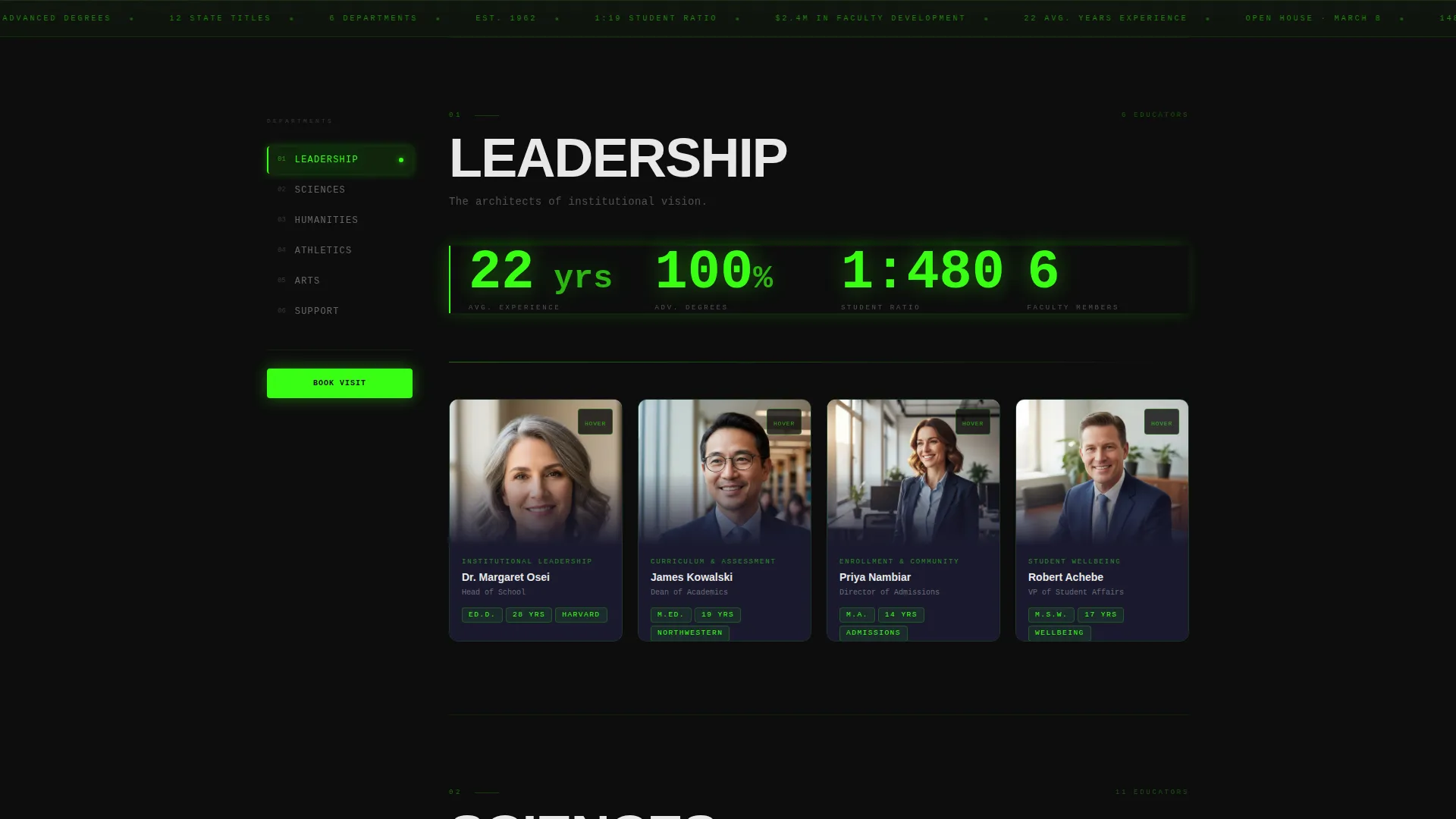
- Department data blocks showing average years of experience, advanced degrees held, and student-to-teacher ratio before each profile set
- Flip-card faculty profiles that reveal a personal teaching-philosophy quote on hover, turning credentials into a human connection
Feature list
This section details the specific functional and visual components included in this landing page.
Hub-and-Spoke Anchor Navigation
A fixed left-rail navigation lists every department as a labeled chapter anchor. Visitors jump directly to the section they care about without scrolling through unrelated content. The structure makes the page feel organized and intentional rather than just long.
Department Data Blocks
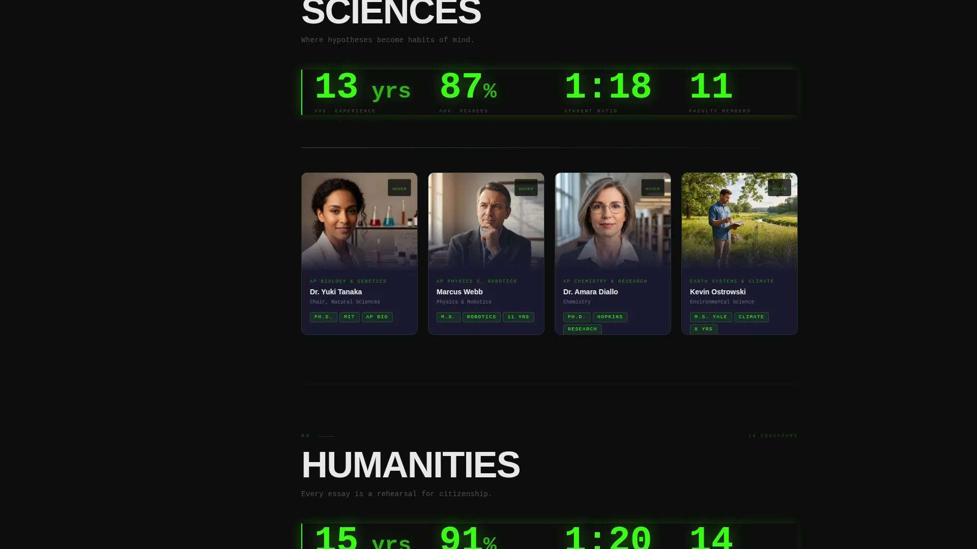
Each department section opens with a compact data block before any profile cards appear. The block surfaces metrics like average years of experience, advanced degrees held, and student-to-teacher ratio. This evidence-first structure builds the case for faculty quality before introducing individual educators.
Flip-Card Faculty Profiles
Every educator gets a profile card. On hover, the card flips to reveal a teaching-philosophy quote in the educator's own voice. The interaction turns a data point into a person, making the page feel alive rather than archival.
Glowing Sticky call to action Bar
After the second department section loads, a reactor-green sticky bar appears with a "Book a Campus Visit" call to action. It remains accessible without blocking content, keeping the primary conversion path in view throughout the scroll.
Campus Visit Booking Form
The primary lead-generation form is deliberately minimal. It asks for parent name, child's current grade level, and a preferred visit date using a date picker. Three fields only, reducing the friction that causes drop-off on longer forms.
Faculty Directory PDF Download
A secondary conversion path invites visitors who are researching but not yet ready to book. Entering an email address unlocks a download of the full faculty directory as a designed PDF, capturing leads at an earlier stage of the decision process.
Page sections overview
| Section | Purpose |
|---|---|
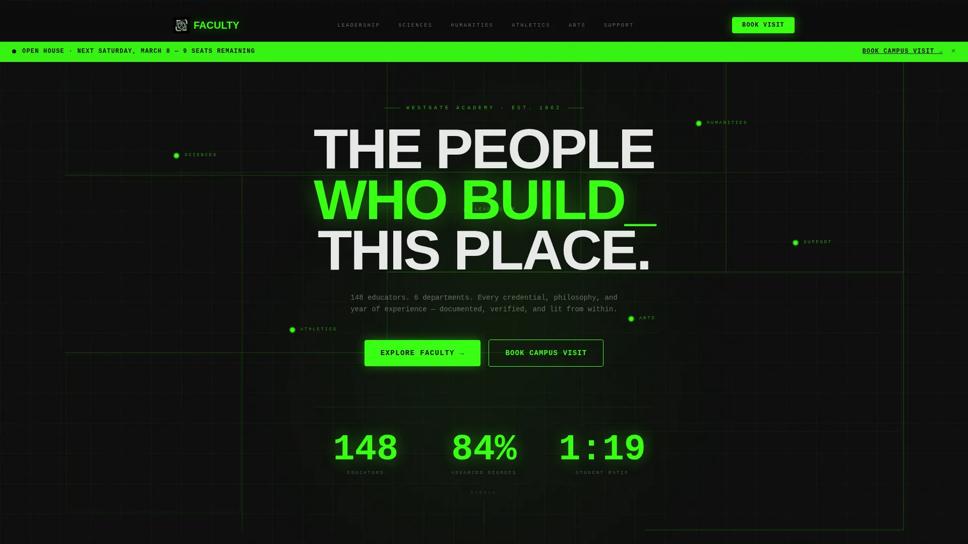
| Full-Bleed Header | Introduces the faculty brand with a dark field, animated wireframe floor-plan grid, and the oversized headline "THE PEOPLE WHO BUILD THIS PLACE" |
| Anchor Nav Rail | Locks to the left rail and lists departments as chapter anchors for quick jump navigation |
| Leadership Department | Opens with a data block, then displays individual profile flip-cards for school leadership |
| Sciences Department | Delivers credential metrics followed by science faculty profiles |
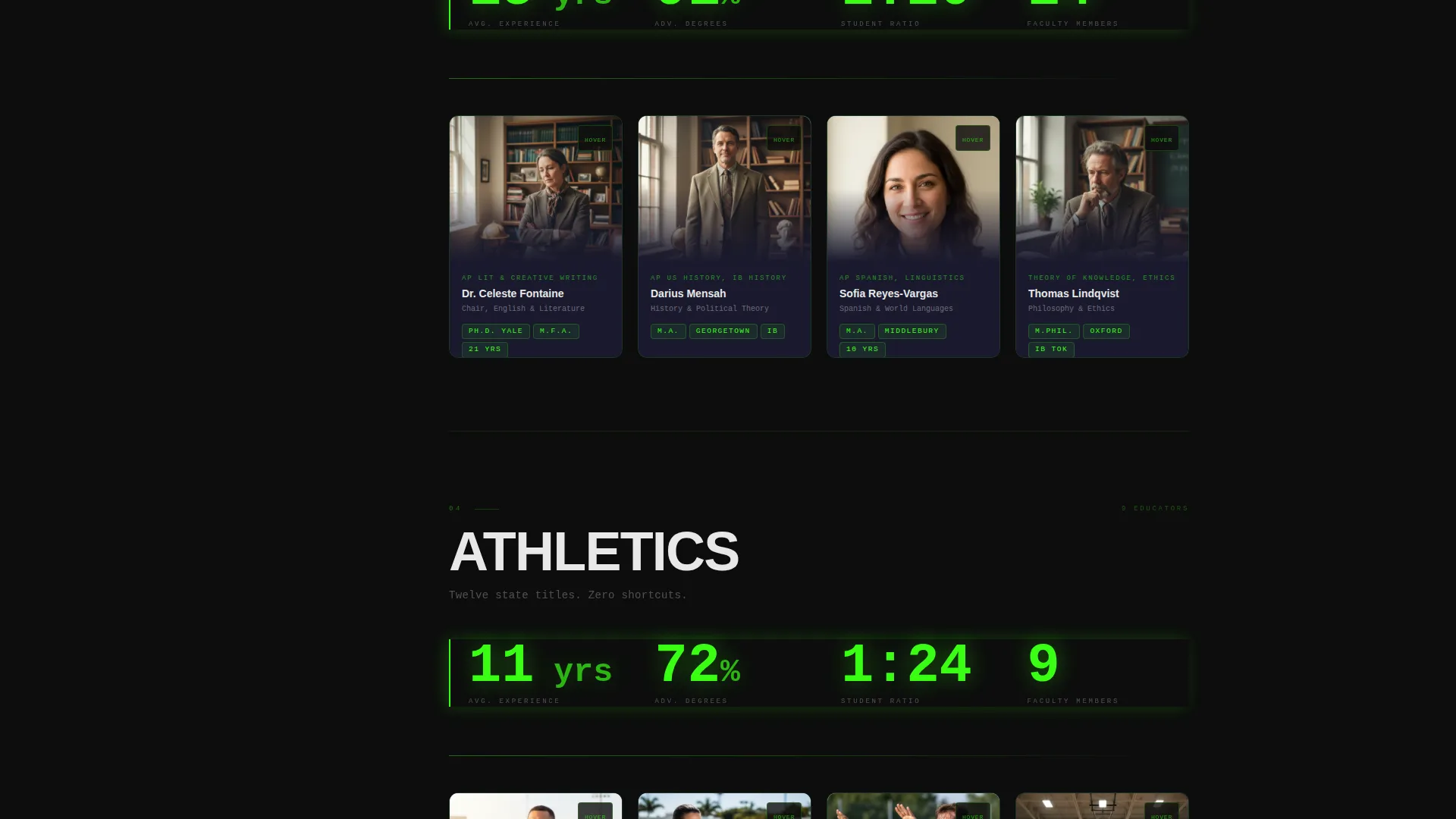
| Humanities Department | Surfaces humanities staff data and individual educator cards |
| Athletics Department | Presents coaching credentials and athletic staff profiles |
| Arts Department | Shows arts faculty data block and creative educator profiles |
| Support Department | Highlights support staff credentials and profiles |
| Sticky call to action Bar | Appears after the second spoke section and remains visible with the "Book a Campus Visit" prompt |
| Faculty PDF Download | Secondary email-capture section offering the full faculty directory as a downloadable PDF |
| Footer call to action | Anchors the "Book a Campus Visit" form permanently at the page bottom |
Design & branding system
The visual identity follows a Bold Brutalist theme paired with an Acid Digital color system. The palette is designed to feel like a school roster displayed on a terminal screen, monospaced and luminous against a void dark background.
- Void black (#0D0D0D) dominates the background; reactor green (#39FF14) powers all glowing accents, hover states, and the sticky call to action bar; static white (#E8E8E8) handles body text and divider rules; deep graphite (#1A1A2E) surfaces card backgrounds and section separators
- Typography uses brutalist, oversized sans-serif type for headlines and display elements, creating high contrast between the dark field and the luminous text
- The header introduces an animated acid-green wireframe grid tracing the school building's floor plan, with room nodes pulsing once to reveal department names before the hero headline appears
Mobile & speed optimization
The layout is structured to remain readable and navigable on smaller screens without losing the visual identity that makes it distinctive.
- The anchor navigation adapts to mobile viewports so department access remains quick without a fixed left rail consuming screen width
- Flip-card interactions are designed for touch environments, keeping profile quote reveals accessible on phones and tablets
- Data blocks and profile card grids reflow into single-column stacks on narrow screens, preserving readability and scan order
How this template helps you convert
The page is structured around a deliberate scroll sequence that builds evidence before presenting any ask. Every layout decision serves the lead-generation goal.
- The data-first scroll earns trust by surfacing department credentials and faculty metrics before any form appears, so visitors arrive at the call to action already convinced rather than skeptical
- The sticky "Book a Campus Visit" bar activates mid-scroll after the reader has engaged with at least two departments, timing the ask to match demonstrated interest
- The PDF directory download creates a second conversion lane for visitors who are researching but not yet ready to commit, capturing contact details from the broadest possible audience
Other information about this template
This template is categorized under School and Academy Website Templates within the Technology category on the platform. It is best suited for independent schools, specialty academies, and programs that rely on faculty reputation as a primary enrollment driver.
- The template style is Hub and Spoke with Anchor Navigation, which makes it well suited for teams with six or more departments that need clear, chapter-style organization
- The Industry Report creative direction means the page reads like an authoritative dossier, which builds institutional credibility without feeling like a promotional brochure
- The Dark Full-Bleed and Glow header concept is a distinctive visual choice that separates this template from standard light-background school websites
- This template is a strong fit for open-house campaigns, accreditation showcases, and enrollment-season pushes where first impressions happen online before any campus visit occurs
Theme
Bold Brutalist
Creative direction
Industry Report
Color system
Acid Digital
Style
Hub & Spoke (Anchor Nav)
Direction
Lead Generation
Page Sections
Hub-and-spoke Anchor Navigation
Department Credential Data Blocks
Flip-card Faculty Profiles
Glowing Sticky Campus Visit Call to Action
Minimal Campus Visit Booking Form
Faculty Directory PDF Download
Related questions
Can I add or remove department sections from this template?
How does the flip-card faculty profile interaction work?
What information does the campus visit booking form collect?
Is the PDF directory download a separate conversion path from the visit form?
Who is this landing page template best suited for?



