Stunning Wix Library | Free Website Template | Rocket
Templ is a bento grid landing page template built for a Wix template library. It leads with a hero-scale product screenshot, organises templates into self-contained category cards, and drives visitors straight into the template browser with zero forms or gates. The Glassmorphic Startup Velocity design feels sharp, dark, and fast, built for founders ready to launch today.
by Rocket studio
Quick summary
Templ is a single-page, click-through landing page template for a Wix template library. It uses a bento grid layout, a glassmorphic dark visual system, and a product screenshot hero to push visitors toward browsing templates immediately. No signup forms, no friction, just sharp previews, category filters, and one clear path to action.
Who this template is for
This template is designed for anyone running or promoting a library of Wix templates. The layout speaks directly to time-pressured, results-focused builders who decide fast.
- Solo founders building their first site at odd hours who need a quick starting point
- Freelance designers managing multiple client projects who want a pre-structured skeleton
- Small marketing teams that need to launch a campaign page without starting from a blank canvas
What problem this template solves
Most template library pages bury their best assets under navigation menus and long text blocks. Visitors leave before they find a preview they want. Templ fixes that by leading with the visuals and removing every unnecessary step between landing and clicking.
- Visitors cannot easily scan what categories are available or how many templates exist in each
- There is no fast path from a landing page to an individual template preview
- Generic layouts fail to communicate the quality and variety of a template collection at a glance
What you get with this template
You get a fully structured, single-page bento grid landing page ready to represent a Wix template library. Every section is pre-designed and purposeful, from the hero down to the sticky mobile call to action.
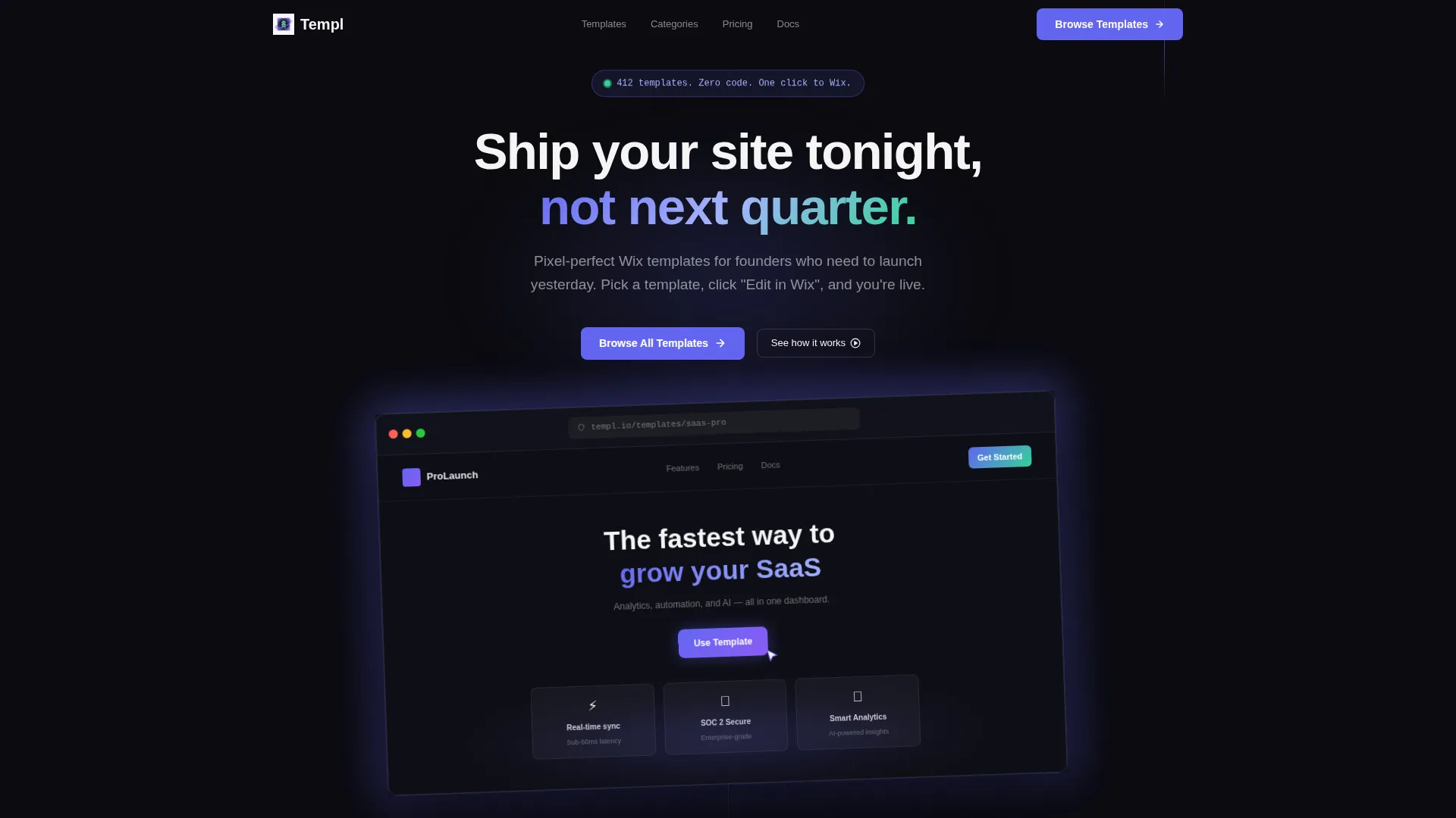
- A hero section with a browser chrome mockup, a floating pill badge, and a looping cursor animation
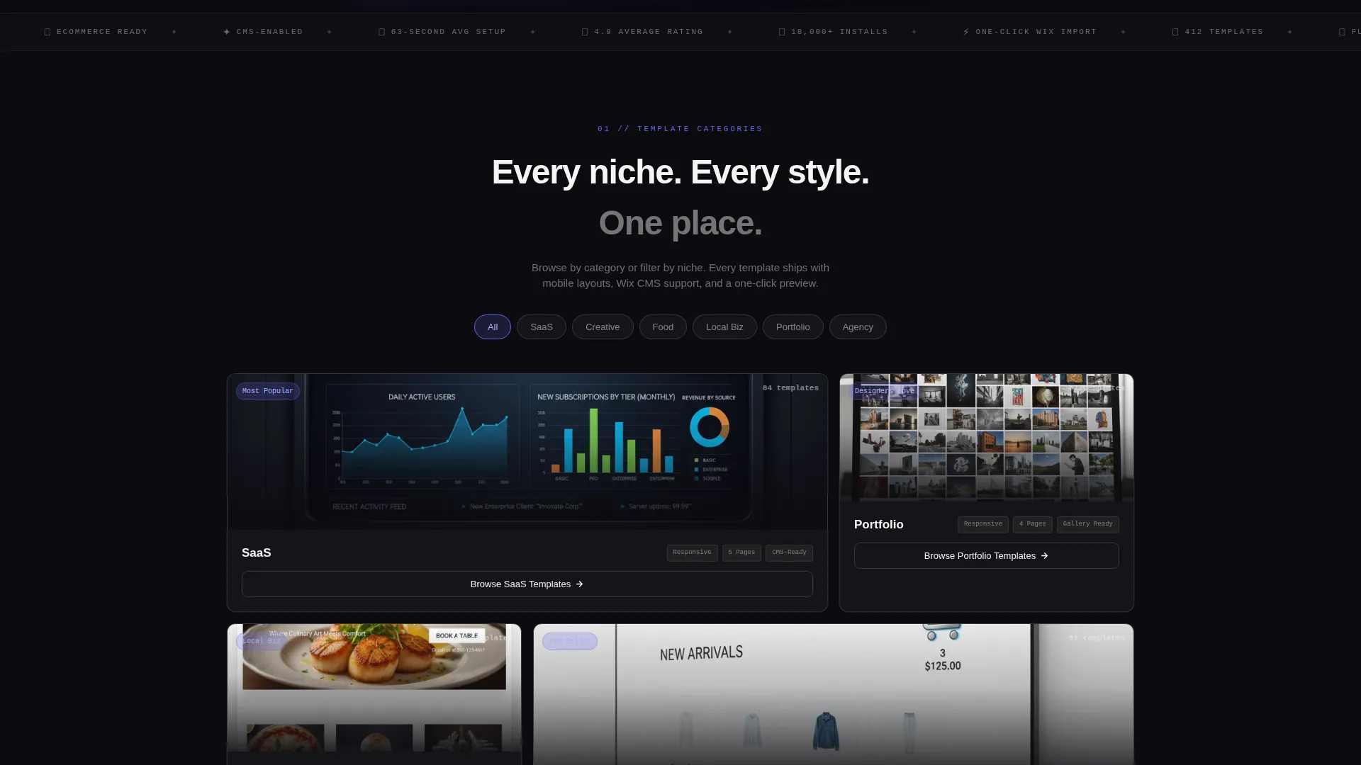
- Six category bento cards each showing a template preview, a template count, spec attributes, and a ghost button
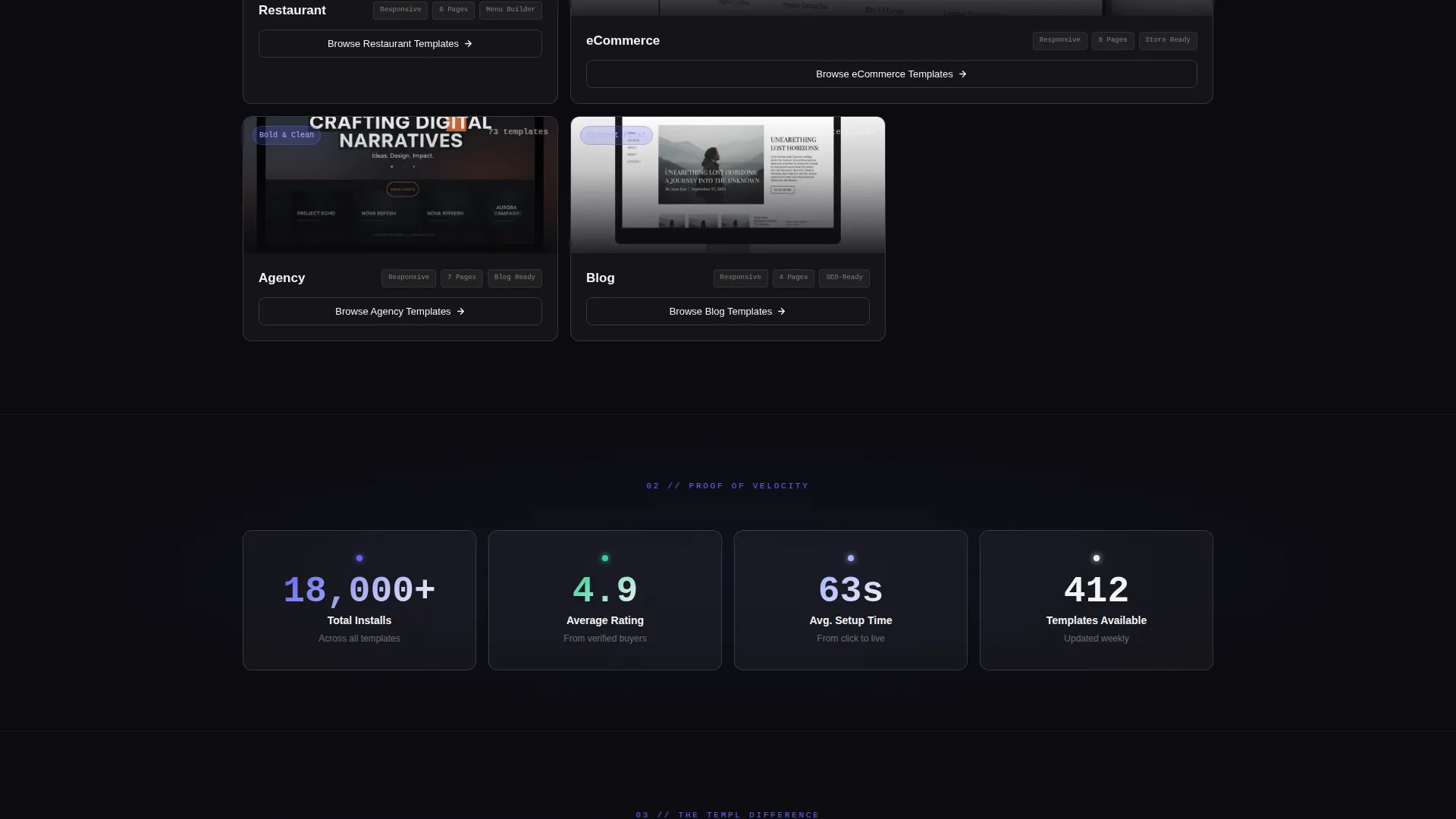
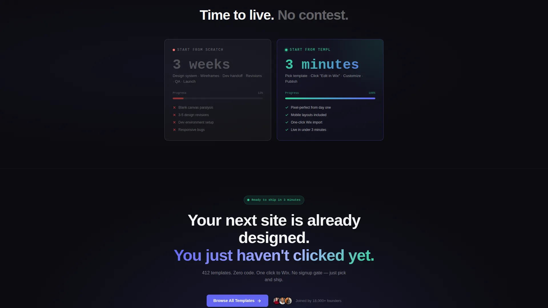
- A social proof stats row, a comparison bento, pill-shaped niche filter toggles, and a sticky mobile call-to-action bar
Feature list
This section covers the core built-in components and interactions that define the Templ landing page.
Hero-Scale Product Screenshot
The header displays a browser chrome mockup of a template at hero scale, angled at a subtle 2-degree tilt. A soft indigo glow bleeds from behind the frame, and a looping cursor animation clicks "Use Template" inside the screenshot to immediately show visitors what the product feels like in action.
Floating Pill Badge
A pill-shaped badge floats above the hero mockup and reads "412 templates. Zero code. One click to Wix." It sets expectations instantly and gives first-time visitors a concrete sense of library scale before they scroll.
Bento Grid Category Cards
Each card in the bento grid is a self-contained data panel for one template category: SaaS, Portfolio, Restaurant, eCommerce, Agency, or Blog. Cards display a cropped template preview, a live category count, three spec-style attributes, and a ghost button that routes directly to the relevant Wix preview.
Social Proof Stats Row
A dedicated row surfaces three high-confidence numbers: 18,000 or more installs, a 4.9 average rating, and a 63-second average setup time. These figures appear as clean stat blocks that reinforce trust without requiring additional copy.
Comparison Bento with Animated Progress Bar
A side-by-side bento panel contrasts "Start from scratch: 3 weeks" against "Start from Templ: 3 minutes." A small animated progress bar fills instantly on the Templ side, making the time-saving argument visual and immediate.
Pill-Shaped Niche Filter Toggles
Visitors can filter the template view directly on the landing page using four pill toggles: SaaS, Creative, Food, and Local Biz. Clicking any pill reshapes the browsable view without leaving the page, reducing decision friction.
Page sections overview
| Section | Purpose |
|---|---|
| Hero mockup header | Anchors the page with a browser chrome product screenshot and a floating pill badge |
| Floating pill badge | Communicates library scale and zero-code promise above the hero frame |
| Primary call to action block | Places the "Browse All Templates" call to action in electric indigo at the top of the page |
| Category bento grid | Organises templates into six self-contained cards with previews, counts, and spec attributes |
| Social proof stats | Displays install count, average rating, and average setup time as trust signals |
| Comparison bento | Shows a timed side-by-side contrast with an animated progress bar |
| Niche filter toggles | Lets visitors filter by niche using pill-shaped toggles on the page itself |
| Sticky mobile bar | Repeats the primary call to action as a fixed bottom bar on mobile devices |
Design & branding system
The visual identity follows a Startup Velocity theme built on a glassmorphic colour system. The result feels like a late-night coding environment with translucent panels floating over a dark desktop.
- Core palette: deep void black (#0B0B0F) as the base, frosted glass panels using white at 8% opacity with a 12-pixel blur, electric indigo (#6366F1) for interactive elements, and soft signal green (#34D399) for confirmation states and hover pulses
- Typography and borders: crisp anti-flash white (#F4F4F5) for text on dark surfaces, with 1-pixel white borders at 15% opacity giving each card a hovering, luminous edge
- Interactive colour use: indigo is reserved exclusively for buttons, links, and the active filter pill, keeping the accent purposeful and visually distinct at every scroll depth
Mobile & speed optimization
The landing page layout is built with a mobile-first context in mind. The sticky bottom bar ensures the primary call to action is always reachable on smaller screens without requiring a scroll back to the top.
- The sticky mobile bar repeats "Browse All Templates" as a persistent bottom element so the conversion path is never more than a thumb-tap away
- Bento grid cells reflow for narrower viewports, keeping category cards readable and the ghost buttons tappable at standard touch sizes
- The glassmorphic panel system uses lightweight visual layering, frosted blur and low-opacity borders, to deliver depth without relying on heavy image assets
How this template helps you convert
Templ is structured as a click-through landing page. Every design decision reduces the distance between a first impression and a meaningful click.
- The hero screenshot and floating pill badge deliver social proof and library scale in the first viewport, giving visitors an immediate reason to keep scrolling rather than bouncing.
- The bento category grid and pill filter toggles let visitors self-segment by niche without leaving the page, so they reach relevant previews faster and with less decision fatigue.
- The comparison bento with its animated progress bar makes the value of using the library tangible, and the sticky mobile call-to-action bar ensures the primary action is always one tap away regardless of scroll position.
Other information about this template
This template sits within the Documentation and Support category, specifically aligned to the Wix template library niche. It is designed to work as a showroom page rather than a documentation hub, using visual proof over written instruction.
- The template style is a bento grid, a layout pattern well suited to showcasing collections where each item benefits from its own contained visual space
- The creative direction follows a Spec Sheet approach, meaning each card communicates structured information: category name, template count, and key attributes in a consistent format
- The header concept is a Product Screenshot at hero scale, a deliberate choice that shows the quality of the templates being sold rather than describing them in abstract terms
- The landing page direction is click-through, meaning there are no forms, no sign-up gates, and no email captures, the sole goal is to route visitors into the template browser
Theme
Startup Velocity
Creative direction
Spec Sheet
Color system
Glassmorphic
Style
Bento Grid
Direction
Click-Through
Page Sections
Hero-scale Browser Chrome Mockup
Floating Pill Badge Above Hero
Bento Grid Category Cards
Social Proof Stats Row
Animated Comparison Bento
Pill-shaped Niche Filter Toggles
Related questions
Does this template require any coding to set up?
Can I update the template categories and counts shown in the bento cards?
Is there a form or sign-up step before visitors can browse templates?
Can the niche filter toggles be customised for different categories?
Who is this landing page template most useful for?


