Advanced Analytics Platform Landing Page Template
Chrono is a split-screen landing page template built for a managed time series database service. It pairs a live PromQL-style code terminal on the left with a rendered query chart on the right, then builds an evidence-driven scroll through benchmark findings, cardinality stress tests, and head-to-head comparisons. The result is a page that earns trust before it asks for anything.
by Rocket studio
Quick summary
Chrono is a single-page, split-screen landing page template designed for a managed time series database service. It opens with a blinking terminal and a live-rendered chart, then walks visitors through a structured Industry Report scroll: benchmark findings, cardinality stress tests, and cost comparisons, all styled in an Acid Digital color system that feels like a CRT monitor in a dark server room.
Who this template is for
This template is purpose-built for infrastructure and data engineering teams who need to convince a technical audience with numbers, not copy. The page speaks to engineers who have already experienced the pain of scaling time series data at high volume.
- Platform engineers hitting Prometheus retention walls and needing reproducible proof of sub-millisecond query performance
- IoT teams whose monitoring system collapsed under the weight of tens of thousands of active sensor readings per device
- Fintech observability leads who need to correlate tick-level financial data with infrastructure telemetry without hiring a dedicated database team
What problem this template solves
Many time series databases struggle as data volumes grow beyond manageable limits. A major challenge with typical time series data at scale is that high cardinality leads to index bloat, degraded query latency, and compaction storms at 3 a.m. Traditional databases are not built for this. Even purpose-built time series databases can buckle when high cardinality columns explode across millions of unique tag values. The Chrono template solves the landing page side of this problem: it gives you a structured, evidence-first format to communicate a complex technical service without relying on vague marketing claims.
- Eliminates the "trust gap" between bold performance claims and skeptical platform engineers who have seen benchmarks lie before
- Replaces generic SaaS landing page patterns with a peer-reviewed, findings-based scroll that treats the visitor as an expert
- Provides a clear conversion path: a free-tier call to action after the benchmark section, plus a gated PDF lead capture for visitors not yet ready to commit
What you get with this template
The template ships as a complete, production-ready single-page layout. Every section is included and pre-structured so you can drop in your real benchmark numbers, syntax-highlighted code, and chart visuals without rebuilding the layout from scratch.
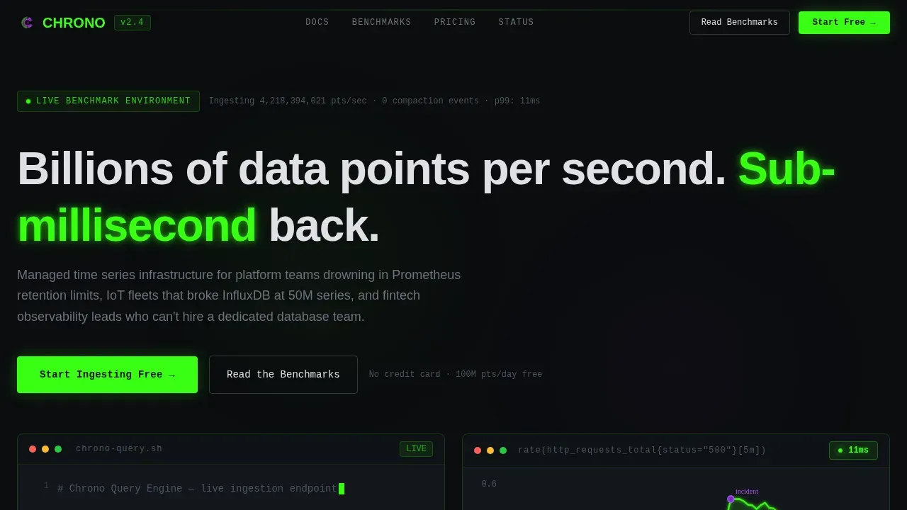
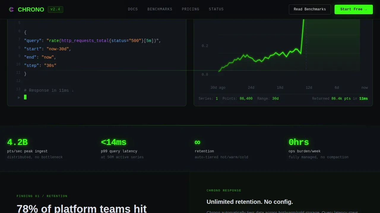
- A 50/50 split-screen hero with a live terminal typing animation on the left and an animated SVG chart path on the right, rendered with a 12ms latency badge
- Five scroll sections covering the hero, three Industry Report findings, and a dual call-to-action section, plus a GitHub-style minimal footer
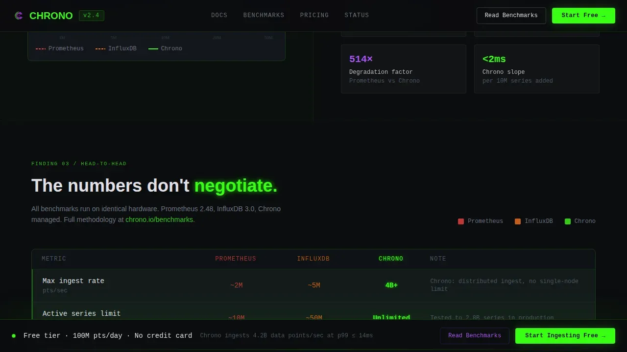
- A persistent bottom call-to-action bar that appears after 60 percent scroll depth, designed to keep the primary conversion action visible without interrupting the reading flow
Feature list
This section describes the built-in components and interaction patterns included in the Chrono landing page template.
Live Terminal Hero with Split-Screen Layout
The hero occupies the full viewport in a 50/50 split. The left panel renders a PromQL-style query with phosphor green and UV purple syntax highlighting against a void black background. A blinking cursor sits after the final semicolon. The right panel shows the query result as a razor-sharp time series chart with a glowing 12ms latency badge. No stock photography, no illustrations: just code and its consequence, side by side.
Scroll-Triggered Industry Report Sections
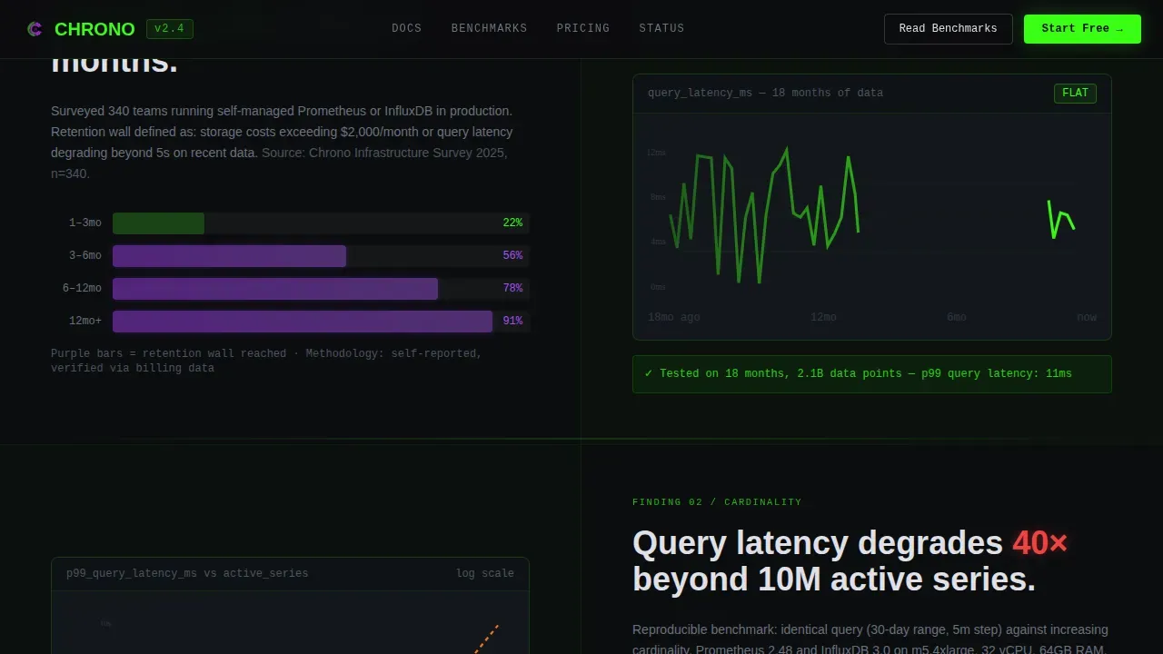
Each scroll section presents a benchmark finding as a standalone evidence block. The first finding covers data volume retention limits. The second maps how query performance degrades as high cardinality grows beyond a threshold. The third delivers a head-to-head comparison table across ingestion rate, query latency, and cardinality headroom. Scroll-triggered stat counters animate each number into view, making the data feel live rather than static.
Persistent Scroll-Depth Call-to-Action Bar
After 60 percent scroll depth, a fixed bottom bar appears with the primary call to action. This keeps the conversion path visible as visitors read through benchmark data without forcing a choice before they have seen the evidence. The bar is a client-side component that tracks scroll position and fades in smoothly.
Dual Conversion Path Design
The call-to-action section offers two paths. The primary path, "Start Ingesting Free," leads to a free-tier signup with no credit card required. The secondary path, "Read the Full Benchmark Report," gates a downloadable PDF behind a work-email field. This two-path structure captures both ready-to-sign-up visitors and leads who need more time with the data.
Acid Digital Color System and Typography
The entire template is built on a void black base with phosphor green as the primary accent and UV purple for interactive hover states. Code blocks sit in slightly lighter charcoal containers with green syntax highlighting. JetBrains Mono handles all code and numerical displays. Manrope handles body text and headings. The combination reads like a CRT terminal in a dark server room.
Animated Chart and Code Components
The SVG chart path animates on load, drawing the time series line from left to right. The terminal panel uses a typing animation to simulate live query ingestion. Section transitions use fade-in with stagger timing. These high-animation components are structured as client-side components, while static sections use server-side rendering to keep initial load fast.
Page sections overview
| Section | Purpose |
|---|---|
| Hero Split Screen | Pairs live terminal code with an animated query result chart and latency badge |
| Finding One Retention | Visualizes retention wall data alongside unlimited retention capability |
| Finding Two Cardinality | Shows query latency degradation curve versus a flat-line performance result |
| Finding Three Benchmarks | Head-to-head comparison table across ingestion, query latency, and cardinality |
| Dual call to action Section | Primary free signup and secondary gated PDF lead capture form |
| Persistent call to action Bar | Fixed bottom bar that appears after 60 percent scroll depth |
| Minimal Footer | Copyright, Docs, Status, Privacy, and Terms links in GitHub developer style |
Design & branding system
The Chrono template uses an Acid Digital color system that communicates urgency and precision. Every color choice is intentional: the background is not empty, it is dense with the suggestion of unqueried data.
- Color palette: void black (#0B0D0F) for backgrounds, phosphor green (#39FF14) for primary accents and section dividers, UV purple (#7B2FBE) for interactive hover states, cold interface white (#E0E0E6) for body text and labels, and charcoal (#14171C) for code block containers
- Typography: JetBrains Mono for all code snippets, latency numbers, and benchmark figures; Manrope for all body paragraphs, headings, and call-to-action labels
- Interactive states: section dividers glow faintly in phosphor green; interactive elements pulse UV purple on hover; code blocks use green syntax highlighting throughout
Mobile & speed optimization
The template is designed desktop-first to match the primary audience of platform engineers working on workstations. A responsive mobile fallback is included. Performance is structured around a split between static and dynamic components.
- Server-side components handle all static sections including the benchmark findings, the comparison table, and the footer, keeping the initial page render lightweight
- Client-side components are scoped to the terminal typing animation, the SVG chart path draw, and the scroll-depth tracker for the persistent call-to-action bar
- The split-screen hero collapses to a stacked single-column layout on smaller viewports, preserving the code-then-result reading order
How this template helps you convert
The page is engineered to earn the click by proving performance claims before asking for anything. The conversion logic follows the same sequence as the scroll.
- The hero establishes immediate credibility by showing a real query and its result side by side, so visitors understand the service's core value proposition within the first few seconds of landing
- The Industry Report scroll builds an evidence case section by section, using benchmark numbers and cardinality stress tests to answer the skeptical questions that platform engineers bring to every new infrastructure tool they evaluate
- The dual call-to-action structure gives every visitor a next step that matches their readiness: sign up for free with no credit card, or download the full benchmark report behind a work-email gate, capturing leads at both ends of the decision timeline
Other information about this template
This template is built specifically around the problems that arise when you need to store time series data at scale. Time series data consists of measurements captured at specific moments, whether at fixed intervals or irregular ones. Time series databases are specifically designed to store, manage, and analyze data points indexed by time, handling high-volume writes and efficient storage compression that relational databases cannot match.
High cardinality refers to the presence of a large number of unique values across one or more dimensions. Cardinality refers to the count of unique values in a dataset, and as that count grows, mainstream time series databases begin to struggle. Index bloat occurs when the database must index every unique combination of tag values, potentially exceeding available memory resources. Ingesting high-cardinality data requires creating new index entries, which can slow write throughput and raise cpu usage significantly.
Compression techniques like delta encoding and columnar storage improve storage efficiency and query performance. Log-Structured Merge Trees, known as LSM trees, transform random writes into sequential writes, which reduces write amplification and improves the storage engine's throughput. An inverted index approach, combined with separation of indexed metadata from raw time-stamped data, helps prevent index bloat at scale. Bloom filters reduce unnecessary disk I/O during point lookups, which keeps dashboard queries fast even as data volume grows.
Data lifecycle management is a key design concern. Time series databases implement retention policies to handle older data, downsampling rollups to aggregate data at lower resolution, and time-based partitioning to organize data into manageable time windows. Data replication and maintenance scheduling are handled at the service layer, removing those responsibilities from the engineering team. This approach also controls storage costs as data volumes grow across months of historical data.
High-cardinality use cases include IoT sensor data telemetry, financial data tick streams, and ad-tech auction tracking. Sensor readings from industrial equipment, continuous queries against infrastructure metrics, and real time analysis of user behavior patterns all generate massive volumes of time stamped data. A scalable solution must handle this incoming data without degrading query performance as new data arrives. Time-based queries against recent data must return fast even when the database holds months of historical data and the total data volume spans billions of rows.
The following well-known tools are frequently referenced in the time series database ecosystem when evaluating build-versus-buy decisions for high cardinality workloads. InfluxDB is one of the most popular open source time series databases due to its performance and scalability. Prometheus is designed specifically for cloud-native environments and excels at monitoring use cases with its powerful query language. TimescaleDB is built as an extension to PostgreSQL, providing time series optimizations while maintaining full SQL compatibility. ClickHouse is a columnar OLAP database widely adopted for time series use cases due to its high compression ratios and fast analytical queries. Gnocchi aggregates data at ingestion time rather than at query time, making queries extremely fast by reading pre-computed results. Abios implemented VictoriaMetrics to handle high cardinality data and improve query performance in the Esports data industry. These tools illustrate the range of approaches the market has taken to solve the same core problems that the Chrono template is designed to communicate.
This template also supports:
- A custom query language display in the hero terminal, editable to match your actual query syntax
- A data model diagram or benchmark table swap in the comparison section, requiring only content replacement rather than layout changes
- English localization with United States dollar pricing and United States date formats built into the placeholder copy
Theme
Directory & Discovery
Creative direction
Industry Report
Color system
Acid Digital
Style
Split Screen (50/50)
Direction
Click-Through
Page Sections
Split-screen Terminal Hero
Scroll-triggered Benchmark Findings
Head-to-head Comparison Table
Dual Conversion Path
Persistent Scroll-depth Call to Action Bar
Acid Digital Visual System
Related questions
What types of teams is this landing page template designed for?
Does the template include benchmark data and charts, or do I supply those?
How does the split-screen hero work on mobile devices?
Can I change the call-to-action labels or the scroll-depth threshold?
What query language syntax does the hero terminal display?



