Property Management App Landing Page Template
Tenancy is a bold, dark-themed property management landing page template built for app downloads. It uses a modular card grid to showcase six operational pillars, rent collection, maintenance dispatch, lease tracking, tenant screening, owner reporting, and vacancy marketing, all presented in a high-contrast Void & Violet visual system designed to feel like a live command center.
by Rocket studio
Quick summary
Tenancy is a single-page, card-grid landing page template for property management apps. It targets mid-market landlords and regional property managers who need one screen to oversee rent rolls, maintenance tickets, and lease renewals. The Bold Brutalist design and dark Void & Violet palette make the platform feel authoritative, focused, and ready to handle hundreds of doors.
Who this template is for
This template speaks directly to people who manage real estate at scale and feel the friction of fragmented tools. It is built for operators who need to project credibility fast and drive app downloads from a focused audience.
- Mid-market property managers handling forty-unit walk-ups or scattered single-family portfolios
- Independent landlords who still field late-night maintenance calls and want a better system
- Regional property management firms scaling past the limits of spreadsheets and manual processes
What problem this template solves
Managing multiple properties across different tools creates gaps. Rent payments land in one place, maintenance requests arrive in another, and lease renewal dates live in a spreadsheet no one updates. The result is missed income, delayed repairs, and unhappy tenants.
- Property managers lose time switching between disconnected systems for rent, maintenance, and leases
- Landlords lack a single, clear view of which units need attention right now
- Growing firms cannot present a professional, app-first brand experience that earns downloads
What you get with this template
You get a complete, single-page landing page layout built around a modular card grid. Every section is pre-designed and ready to customize with your own app content, stats, and copy.
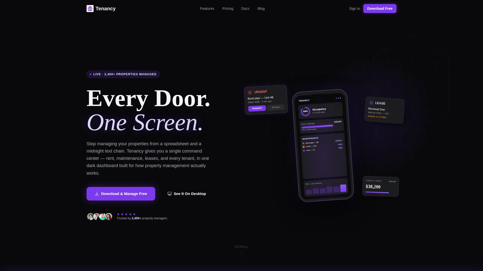
- A dark full-bleed header with an isometric wireframe building illustration and a tilted phone mockup showing a live-style dashboard
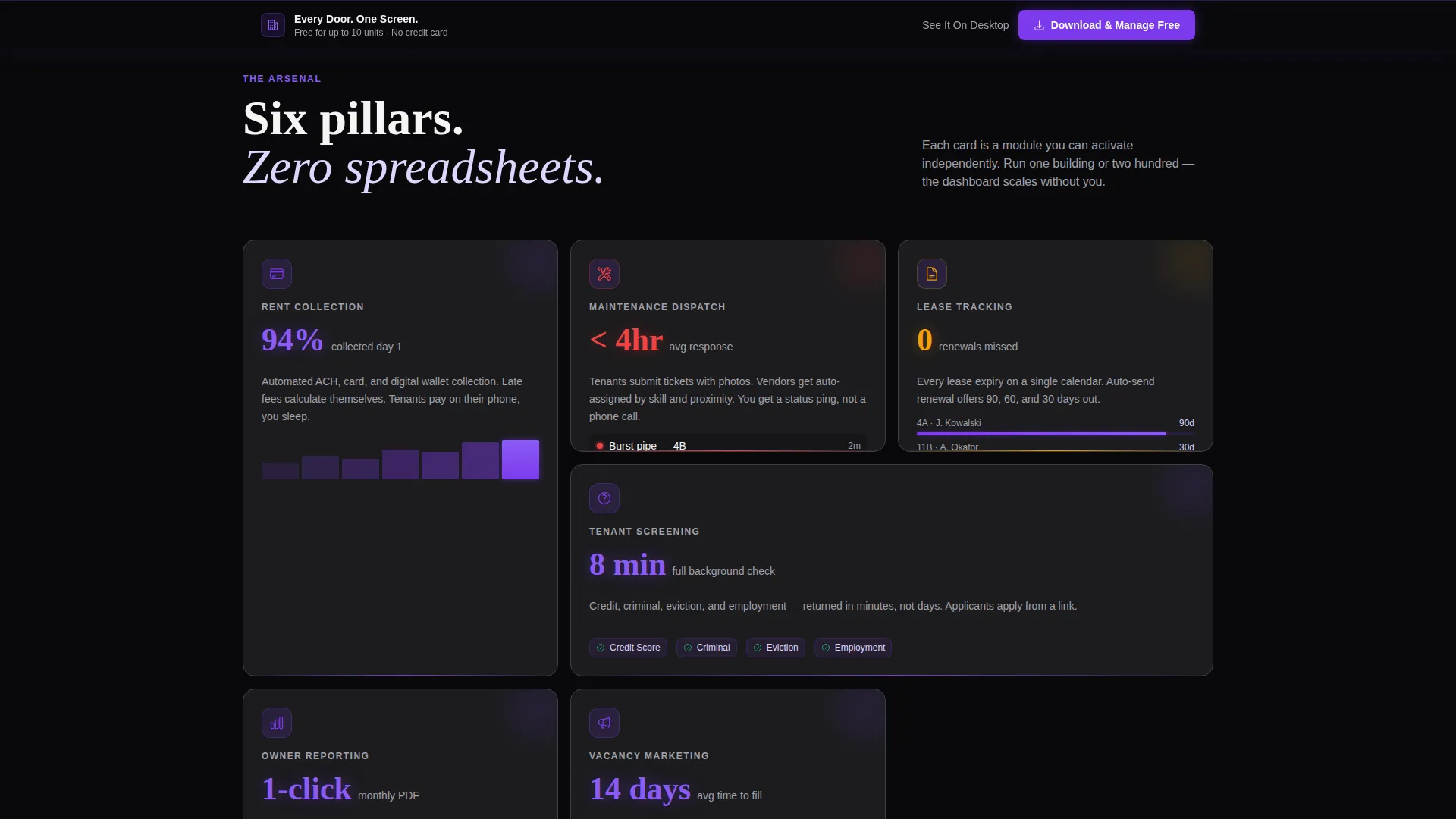
- Six brutalist feature cards, each covering one operational pillar with a violet icon, a three-word label, and a stat or micro-animation
- A sticky app-download bar with paired App Store and Google Play badge slots, a mid-page testimonial break card, and a secondary desktop call to action
Feature list
This template is organized around the core capabilities a property management app needs to communicate on a single landing page.
Modular Card Grid Layout
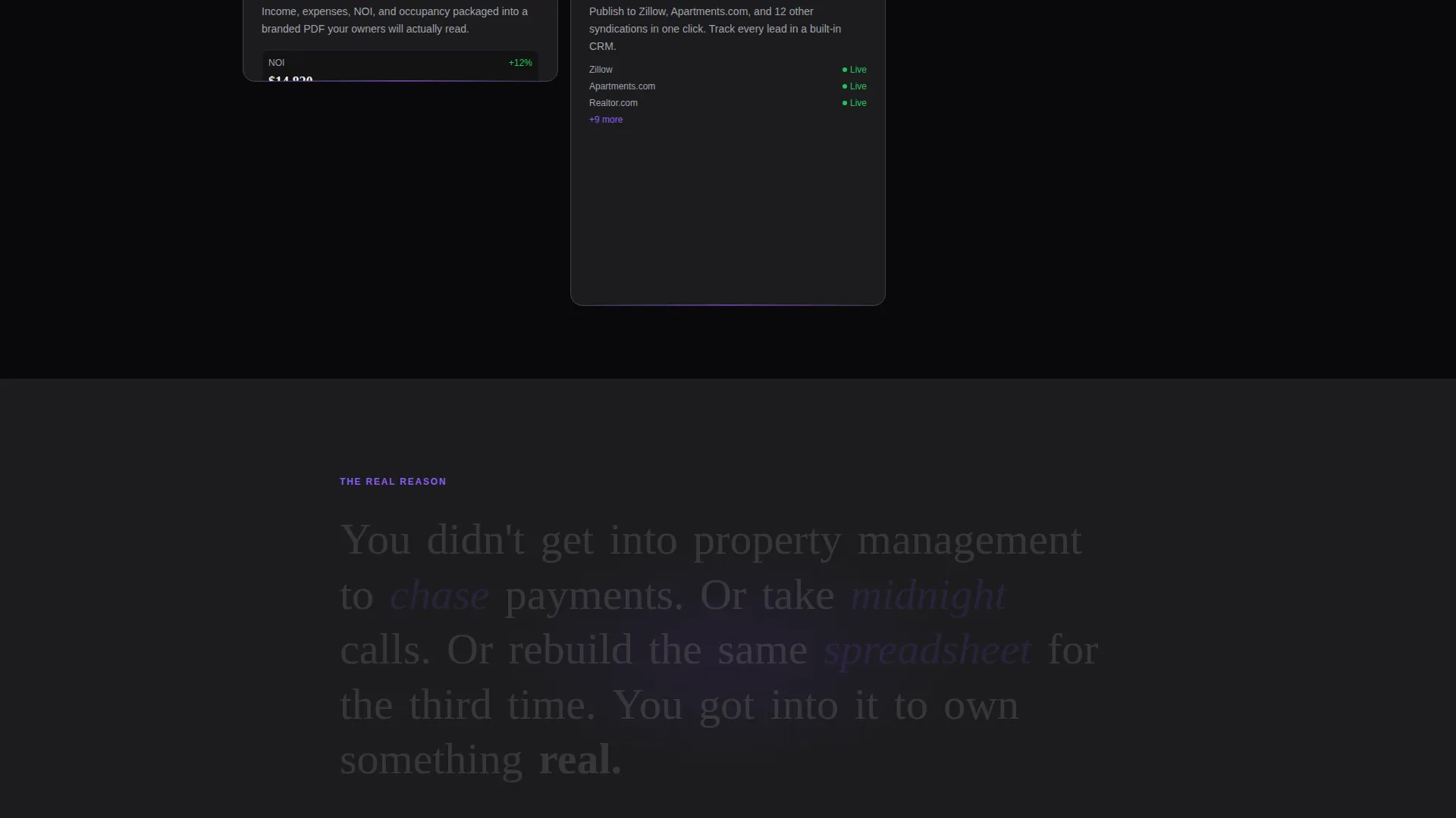
Six self-contained feature cards are arranged in a responsive grid. Each card represents one operational pillar: rent collection, maintenance dispatch, lease tracking, tenant screening, owner reporting, and vacancy marketing. Visitors scan the grid like a portfolio and build their own picture of the platform.
Dark Full-Bleed Header
The header fills the entire viewport in absolute void black. A faint isometric wireframe of an apartment block glows at the edges in soft violet, and a tilted phone mockup displays a miniature dashboard with occupancy figures, a maintenance queue, and a rent collection bar chart.
Sticky App Download Bar
After the first scroll, a slim brutalist bar pins to the screen. It carries the primary call to action alongside App Store and Google Play badge slots rendered in monochrome. On hover, the badges flood with electric violet, reinforcing the download intent throughout the entire page.
Mid-Page Testimonial Break
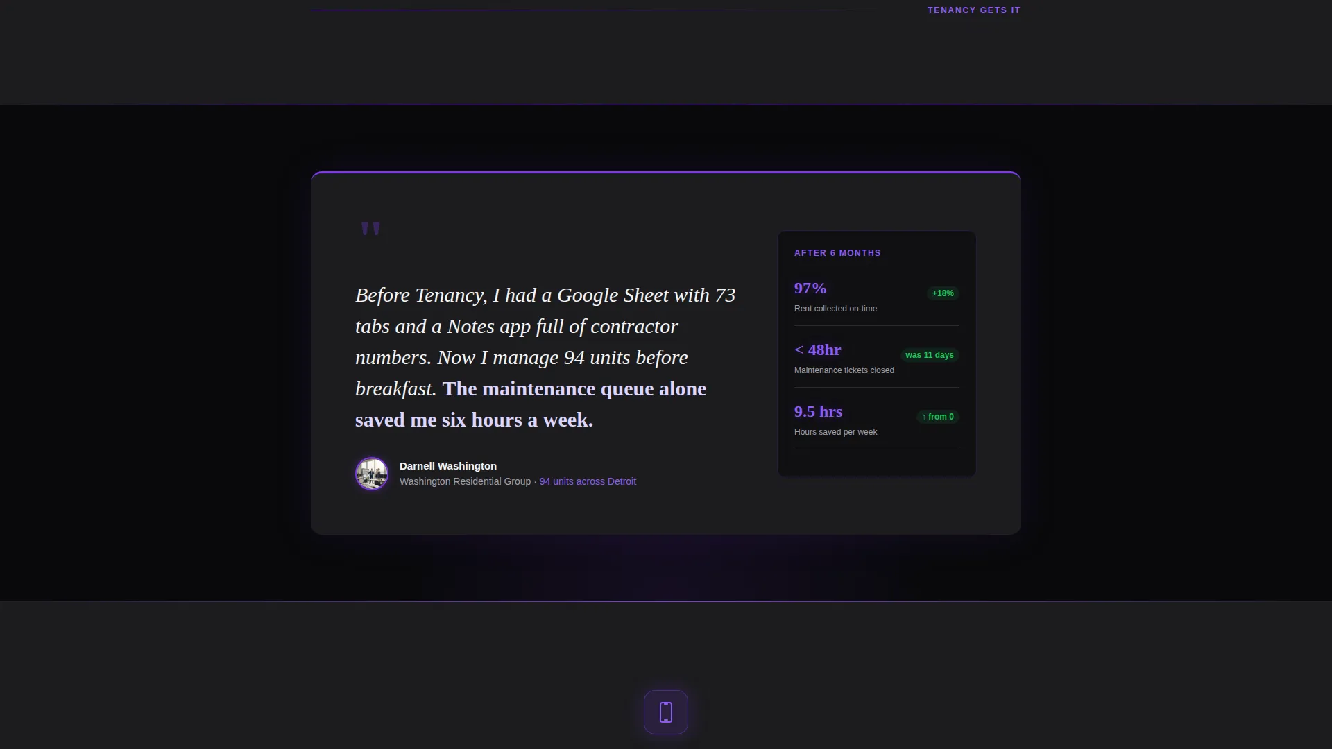
A full-width break card interrupts the grid at the midpoint. It carries a testimonial from a named property manager along with their unit count, providing a credibility anchor exactly when the visitor has absorbed enough features to consider acting.
Bold Brutalist Visual System
Every surface uses the Void & Violet color system. Concrete-charcoal card backgrounds, electric-violet active states, and phosphor-lilac secondary text create a visual hierarchy that feels structural rather than decorative. Icons, hover states, and glows all stay within the same tight palette.
Secondary Desktop call to action Path
Alongside the primary app-download bar, a secondary call to action invites visitors to explore the web dashboard instead. This gives desktop-first property managers a lower-friction entry point without diluting the primary conversion goal.
Page sections overview
| Section | Purpose |
|---|---|
| Dark header frame | Establish tone and present the app dashboard visually |
| Hero phone mockup | Show the live dashboard with occupancy and maintenance data |
| Feature card grid | Lay out six operational pillars in scannable brutalist cards |
| Testimonial break card | Provide a credibility anchor at the midpoint of the page |
| Sticky download bar | Pin the primary app-download call to action after the first scroll |
| Secondary desktop call to action | Offer a web-dashboard entry point for non-mobile visitors |
Design & branding system
The Void & Violet palette is the defining character of this template. It draws from a narrow, high-contrast set of colors that feel purposeful rather than decorative, like a parking garage lit by a single ultraviolet strip.
- Core colors: absolute void black (#09090B), poured-concrete charcoal (#1C1C1E), electric violet (#7C3AED), and pale phosphor lilac (#DDD6FE)
- Violet governs every glow, hover state, and active element; black is structural and exposed, not empty
- Typography is bold and left-aligned sans-serif; the headline "Every Door. One Screen." lands heavy against the dark field
Mobile & speed optimization
The card grid is modular by design. Cards reflow and stack cleanly at smaller screen sizes, so the layout holds its brutalist weight on a phone as well as a widescreen monitor.
- Cards rearrange and stack with satisfying visual weight, maintaining readability across breakpoints
- The phone mockup in the header is sized and tilted to remain legible and impactful on mobile viewports
- The sticky download bar is designed as a slim, low-profile strip that does not obscure content on smaller screens
How this template helps you convert
Every design and layout decision in this template points toward one outcome: getting the visitor to download the app. The page earns the conversion rather than asking for it upfront.
- The header immediately frames the value proposition with a live-style dashboard mockup, so the visitor understands what the app does before reading a single word of body copy.
- The six-card feature grid builds a cumulative case for the platform. By the time a visitor has scanned all six pillars, the sticky download bar feels like a logical next step rather than an interruption.
- The mid-page testimonial from a named property manager with a real unit count adds trust at exactly the moment the visitor is deciding whether to act.
Other information about this template
This template is designed specifically for real estate property management software and app marketing. It fits within the broader technology and real estate software category, making it a strong fit for teams building a property management app landing page from scratch.
- The template style is Card Grid (Modular), which means individual feature sections can be swapped, reordered, or extended without breaking the overall layout
- The Bold Brutalist theme and dark palette distinguish this landing page from the typical light-and-airy real estate aesthetic, signaling a modern, data-first product
- The template supports the App Download conversion path as its primary direction, with a secondary path toward a web dashboard for managers who prefer desktop-first onboarding
Theme
Bold Brutalist
Creative direction
Feature Matrix
Color system
Void & Violet
Style
Card Grid (Modular)
Direction
App Download
Page Sections
Modular Feature Card Grid
Dark Full-bleed Header
Sticky App Download Bar
Mid-page Testimonial Break
Secondary Desktop Call to Action
Void & Violet Branding System
Related questions
Who is this landing page template designed for?
Can I customize the feature cards with my own content?
Does the template include both App Store and Google Play download links?
What makes this template different from a standard real estate landing page?
Is the Void & Violet color system easy to update?



