Industry Mobile Apps Professional Website Template
Tenant is a split-screen landing page template for a property management app built specifically for renters. It uses a Comparison/Versus layout to show exactly why existing tenant portals fall short, pairing damning statistics with live user interface mockups. The design runs on a Monochrome Steel palette, and every section builds a data-driven case that ends with a frictionless sign-up.
by Rocket studio
Quick summary
Tenant is a single-page, split-screen (50/50) landing page template for a renter-facing property management app. It follows an Industry Report creative direction, pairing real frustration statistics with clean app user interface mockups. The Monochrome Steel color system and Dark Glass Panels header create a premium, high-trust feel that speaks directly to renters ready to leave broken portals behind.
Who this template is for
This template is built for founders, product teams, and marketers promoting a tenant-focused property management app. It works best when your audience already knows the pain of disorganized rental admin and just needs proof that a better tool exists.
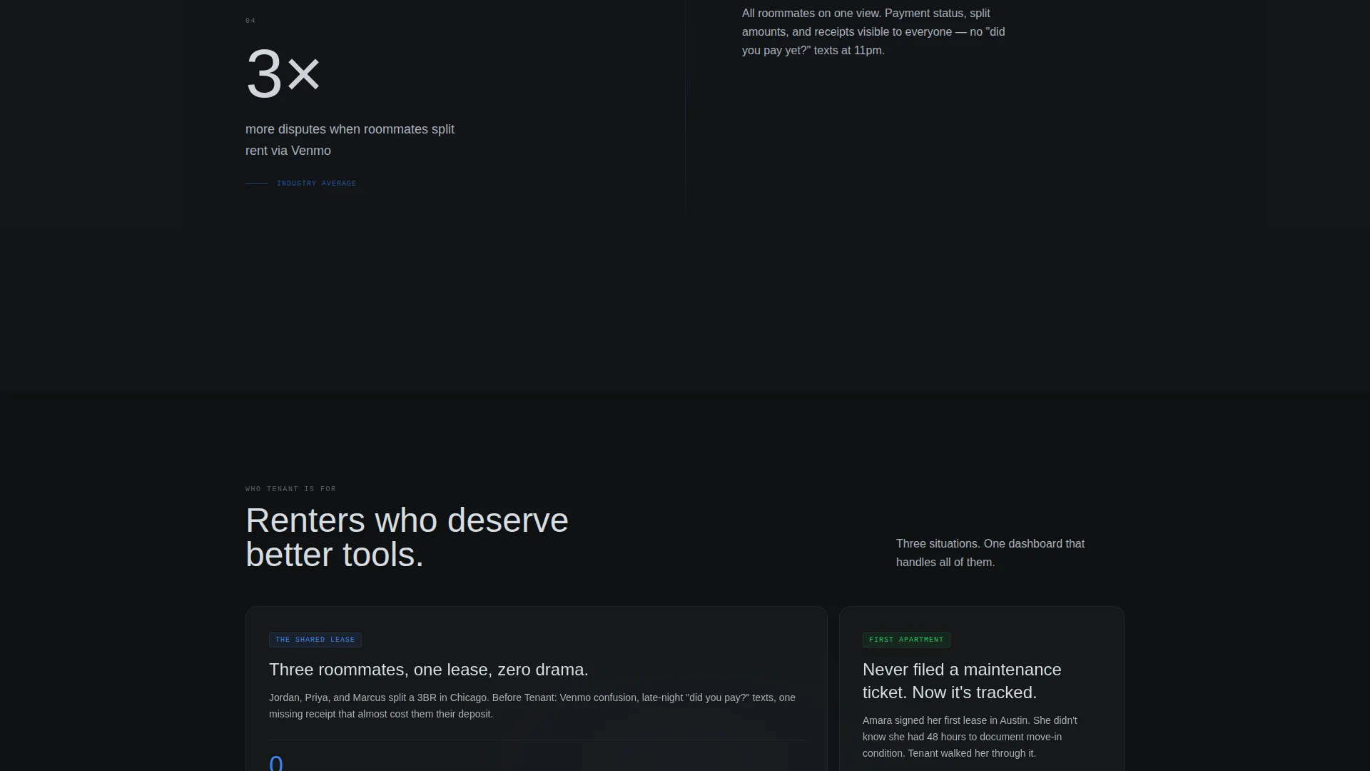
- Renters juggling shared leases with multiple roommates who need one clear source of truth
- First-time apartment renters who have never filed a maintenance ticket and want simple guidance
- Serial movers who need a portable timeline of deposits, inspections, and payment records
What problem this template solves
Most tenant portals are cluttered, confusing, and rarely opened voluntarily. Renters lose deposit receipts, miss maintenance updates, and dig through email threads to find a lease clause. This template frames that frustration as a documented problem, then positions your app as the precise fix.
- Lease documents, maintenance tickets, and rent receipts scattered across email and paper
- No visibility into maintenance request status after submission
- No organized record of rental history when disputing a deposit deduction
What you get with this template
You get a fully structured, conversion-focused landing page that builds its case section by section. The layout is designed so every scroll feels purposeful, and the call to action only appears once enough evidence has accumulated.
- A persistent "versus." strip and sticky toggle letting visitors compare your app against their current portal, email and spreadsheets, or paper files
- A two-question micro-quiz ("See Your Portal Score") that captures a lead by returning a personalized comparison card
- A bottom-bar primary call to action ("Switch to Tenant - Free") that appears after the third section scroll
Feature list
This template is packed with deliberate design decisions, all drawn directly from the source brief. Each feature below serves a specific conversion or usability purpose.
Split-Screen Comparison Layout
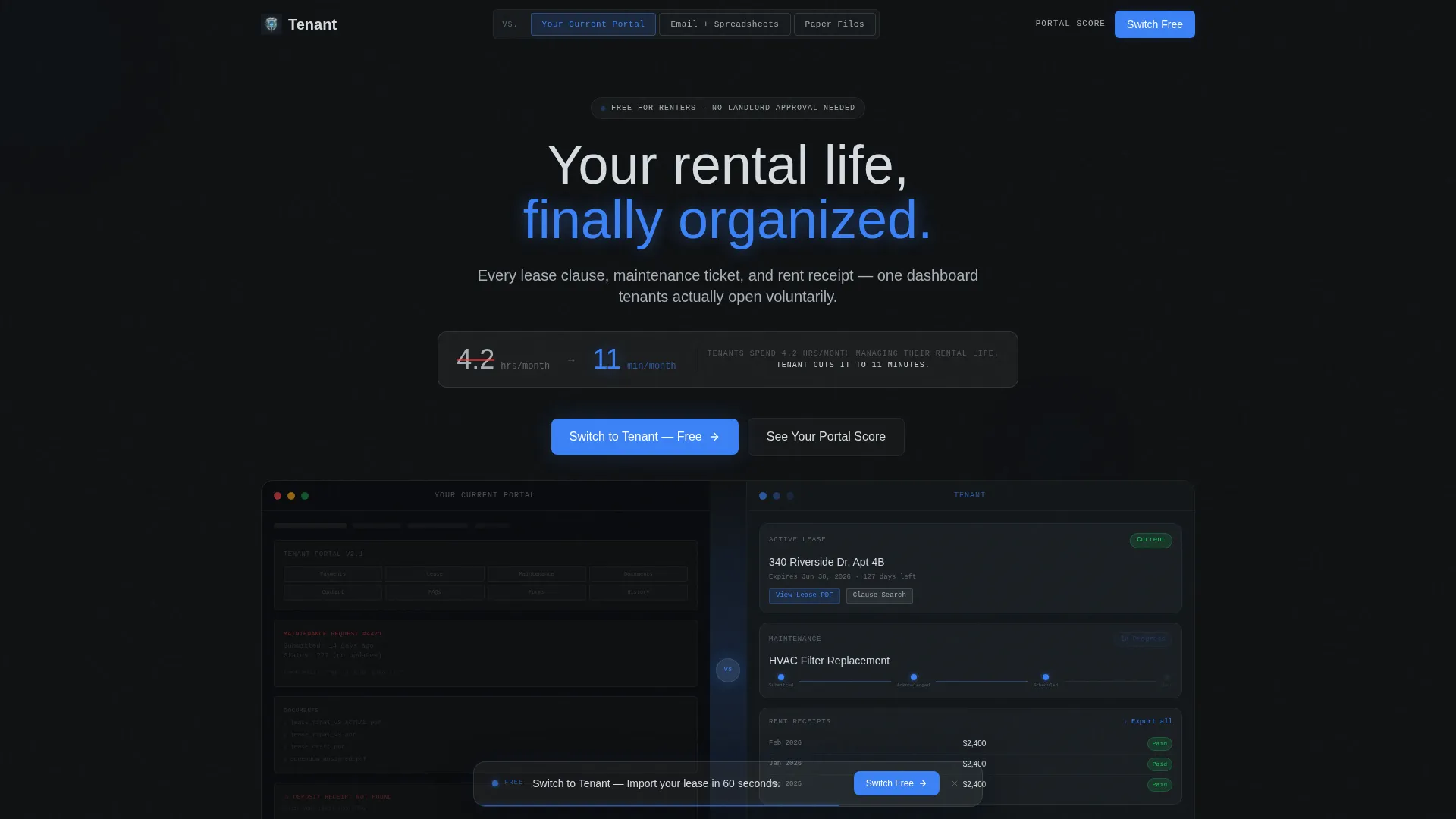
The page divides into two 50/50 columns throughout. The left column presents a damning statistic or legacy portal screenshot. The right column shows the corresponding Tenant app feature as a live user interface mockup. The contrast does the persuading without a single extra word.
Persistent "versus." Strip and Sticky Toggle
A thin "versus." divider runs between the two columns at all times. A sticky toggle at the top lets visitors swap the left-side competitor between three states: their current portal, email plus spreadsheets, or paper files. This keeps the comparison personally relevant to every visitor.
Dark Glass Panels Header
The header splits the viewport into two tall, translucent frosted-glass panels. Ambient light shifts slowly behind the glass. A single stat fades in across both panels to deliver the core value proposition immediately and memorably.
Industry Report Scroll Narrative
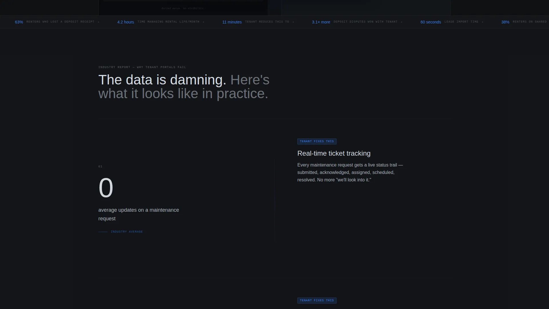
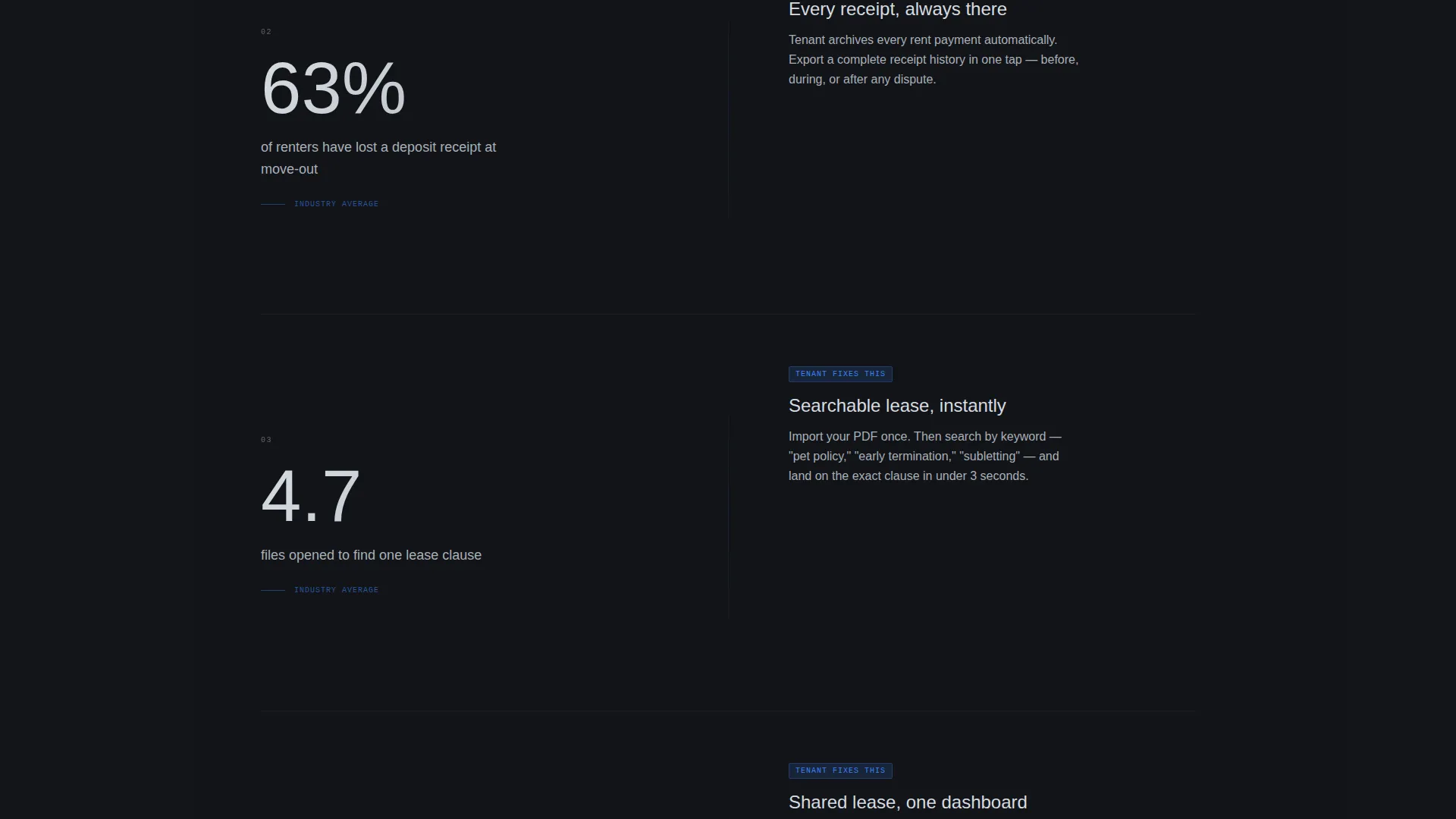
Each section pairs a specific, sourced statistic on the left with a feature demonstration on the right. The narrative escalates from minor friction to high-stakes moments like deposit disputes. Horizontal wipe transitions mimic swiping between app screens, reinforcing the product metaphor.
Portal Score Micro-Quiz Lead Capture
A two-question quiz asks for the visitor's current portal name and biggest frustration. It returns a personalized comparison card. This secondary conversion path captures leads who are not yet ready to sign up but are actively evaluating options.
Bottom-Bar Call to Action
A sticky bottom bar carries the primary call to action and only appears after the visitor has scrolled past the third section. By that point the evidence has built sufficiently, making the prompt feel earned rather than pushy.
Page sections overview
| Section | Purpose |
|---|---|
| Dark Glass Header | Deliver the core stat and contrast the legacy experience with the Tenant app in one cinematic viewport |
| Comparison Toggle Strip | Let visitors personalize the competitor side so the contrast stays relevant to their exact situation |
| Maintenance Visibility Section | Pair the "zero updates" statistic with a real-time ticket-tracking user interface mockup |
| Lease Document Section | Address the "can't find the lease PDF" frustration with the document dashboard feature |
| Deposit Receipt Section | Escalate to the high-stakes deposit dispute scenario and show the full payment timeline |
| Portal Score Quiz | Capture leads through a two-question micro-quiz that returns a personalized comparison card |
| Bottom call to action Bar | Close with the primary sign-up prompt after evidence has accumulated across three or more sections |
Design & branding system
The Monochrome Steel palette is central to the template's identity. Every color choice reinforces a feeling of precision, clarity, and reliability. The single electric-blue accent is reserved strictly for interactive elements and data callouts, making every tap target unmistakable.
- Deep gunmetal (#1B1F23) and near-black backgrounds alternate across sections, creating depth without distraction
- Brushed aluminum (#A8B0B8) and polished chrome highlight (#D6DCE1) handle all body text and labels for consistent legibility
- Electric blue (#3B82F6) fires only on buttons, status pills, and quantified data points, keeping the visual hierarchy sharp
Mobile & speed optimization
The split-screen layout is designed with mobile viewing in mind. On smaller screens, the 50/50 columns stack naturally so the comparison flow reads top to bottom without losing context or impact.
- The horizontal wipe transitions between sections translate to swipe gestures on touch devices, reinforcing the app-like metaphor
- The sticky toggle and bottom-bar call to action remain accessible on mobile viewports throughout the scroll
How this template helps you convert
This template is engineered to move a skeptical renter from curious to convinced before the call to action even appears. The escalating narrative structure and dual conversion paths give every visitor a route to engage.
- The Industry Report scroll builds a specific, evidence-backed case against legacy portals, so visitors arrive at the call to action already persuaded rather than being asked to take a leap of faith
- The Portal Score micro-quiz creates a second, lower-commitment conversion path that captures leads who need more time, returning a personalized card that keeps the app top of mind
Other information about this template
This template sits in the Technology category under the Industry Mobile Apps subcategory, with a niche focus on property management for tenants. It is part of a Directory and Discovery theme family, making it well suited for app comparison pages and product launch campaigns targeting renters.
- The Intersection Match Score for this template is 13, reflecting a precise alignment between the design system, creative direction, and niche audience
- The template style is Split Screen (50/50), the landing page direction is Comparison/Versus, the header concept is Dark Glass Panels, and the creative direction is Industry Report
- The visual metaphor throughout is a perfectly organized filing cabinet made of obsidian and chrome, giving the brand an identity that feels engineered and trustworthy
- This template can support a product launch, a paid acquisition campaign, or an organic referral flow where renters share the page with roommates
Theme
Directory & Discovery
Creative direction
Industry Report
Color system
Monochrome Steel
Style
Split Screen (50/50)
Direction
Comparison/Versus
Page Sections
Split-screen Comparison Layout
Sticky Toggle and Versus Strip
Dark Glass Panels Header
Escalating Industry Report Narrative
Portal Score Micro-quiz Lead Capture
Evidence-timed Bottom Call to Action Bar
Related questions
Who is this landing page template designed for?
Can I change which competitor appears on the left side of the comparison?
What is the Portal Score micro-quiz and how does it work?
Does the call to action appear as soon as the page loads?
Can this template be adapted for a product other than a rental management app?



