Tending - Transparent Seniorcare Landing Page Template
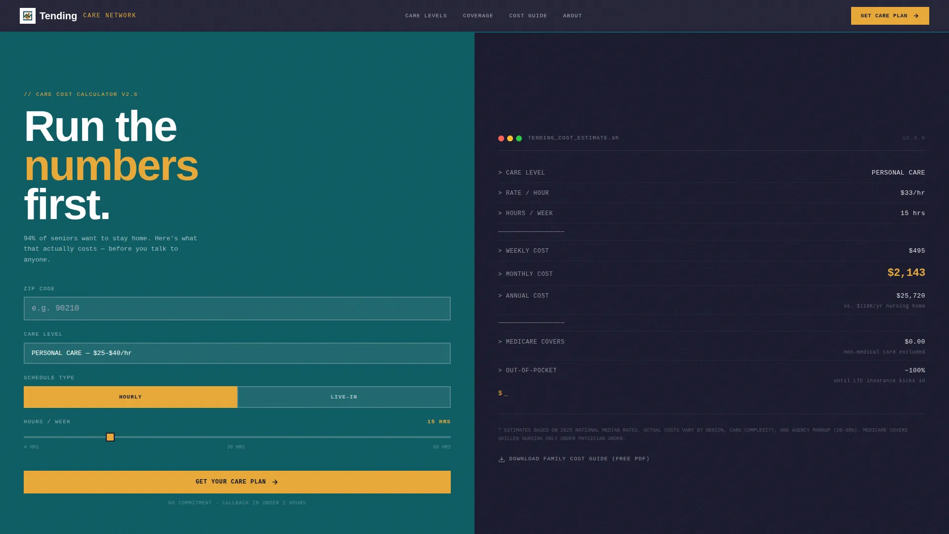
Tending is a bold brutalist senior care landing page template built for transparency and lead generation. A split-screen layout pairs an interactive care cost calculator with emotionally grounded photography. Deep teal, off-white concrete, and warm amber guide overwhelmed families from honest numbers to confident action, making it easier to ask for help before the situation gets worse.
by Rocket studio
Quick summary
Tending is a single-page senior care template designed to turn anxious visitors into qualified leads. The 50/50 split-screen layout puts a live care cost calculator front and center, so families see real numbers before they ever fill out a form. Bold brutalist design and a progressive lead capture form work together to make the first step feel manageable.
Who this template is for
This template is built for home care agencies and senior care services that want to earn trust before asking for anything. It fits teams who know their audience is already overwhelmed and needs honesty, not sales pressure.
- Home care agencies offering companion, personal, or skilled nursing services
- Senior care consultants who work with adult children navigating a parent's decline
- Hospital discharge planners and care coordinators who need a fast, credible intake path
What problem this template solves
Families searching for senior care are scared, exhausted, and short on time. Most landing pages bury costs, hide service tiers, and push a phone call before the visitor is ready. This template removes that friction entirely.
- Visitors can run their own cost estimate before submitting any personal information
- The progressive form breaks a stressful decision into small, digestible steps
- A secondary download path captures leads who are not yet ready to call
What you get with this template
The template delivers a fully structured senior care landing page with every key section already in place. The design is opinionated and purposeful, nothing generic, nothing vague.
- A brutalist split-screen layout with a terminal-style care cost calculator in the header
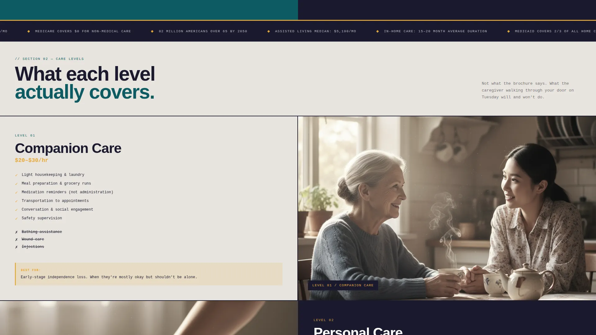
- Scroll sections pairing regional cost data cards with arresting care photography
- A three-screen progressive lead form and a secondary email-capture PDF download path
Feature list
This template ships with a carefully considered set of components built specifically for the senior care context.
Terminal-Style Care Cost Calculator
The header calculator uses a monospaced terminal aesthetic, white text on deep teal, with blocky input fields for zip code, care level, hours per week, and live-in or hourly arrangement. The right panel builds a cost estimate line by line, like a terminal printing output, so the math feels real and immediate.
Progressive Three-Screen Lead Form
The lead capture form is split into three screens. The first screen asks only for zip code and care type. The second captures the loved one's primary need, mobility, memory, medication, or post-surgical recovery. The third requests name, phone, and preferred callback window. This pacing reduces drop-off significantly.
Secondary PDF Download Path
Visitors who are not ready to call can download the Family Cost Guide with an email address only. The PDF is delivered instantly. This secondary path captures early-stage leads without pressuring them into a phone conversation.
Data Card and Photography Scroll Sections
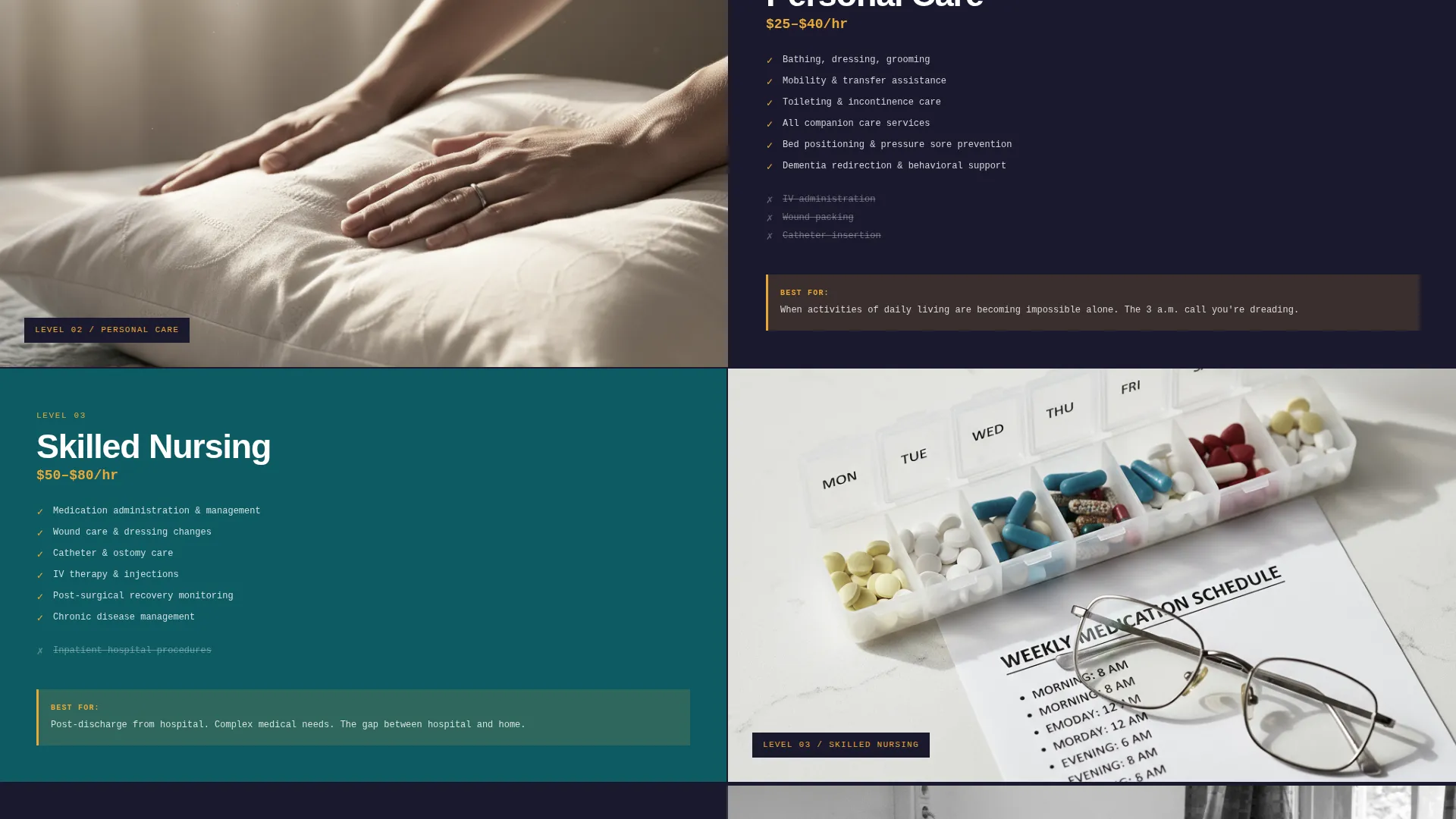
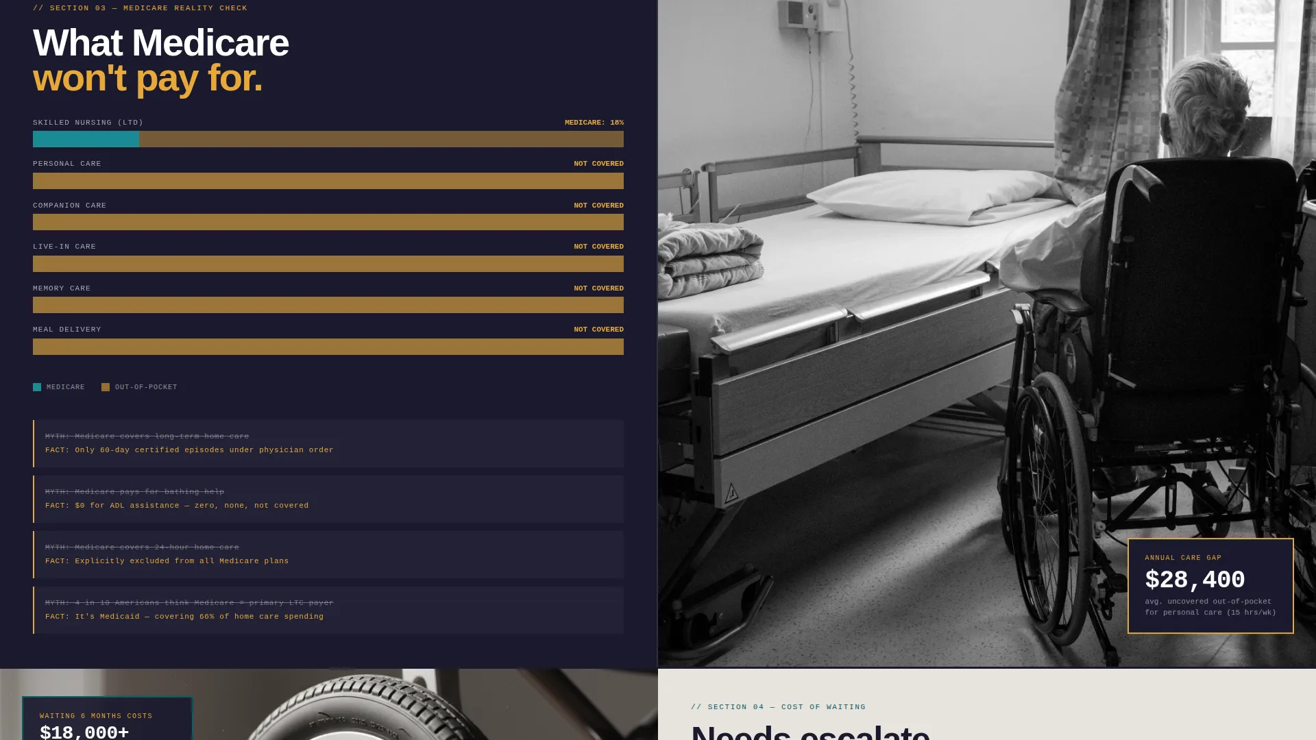
Each scroll section below the header follows a strict 50/50 split. The left side shows a brutalist data card, regional cost comparisons, Medicare coverage gaps as bar charts, or a care-level breakdown in terminal-style type. The right side anchors each data point with a single, arresting photograph.
Amber Accent Call-to-Action System
The warm catalyst amber color is reserved exclusively for buttons, interactive cost outputs, and the primary "Get Your Care Plan" call to action. This controlled use of accent color draws the eye exactly where the template needs it, without visual noise.
Repeating Section call to action Cadence
The primary call to action is pinned at the base of the calculator and repeated after every second scroll section. This cadence keeps the conversion path visible throughout the entire page without feeling aggressive.
Page sections overview
| Section | Purpose |
|---|---|
| Header Calculator Panel | Presents the interactive care cost estimator |
| Real-Time Cost Output | Builds the line-by-line cost estimate display |
| Regional Cost Comparison | Shows average cost data by care level |
| Medicare Coverage Gaps | Renders coverage shortfalls as bar charts |
| Care Level Breakdown | Defines companion, personal, and skilled nursing |
| Escalation Urgency Section | Shows cost of waiting versus acting now |
| Progressive Lead Form | Captures leads across three low-friction screens |
| PDF Download Capture | Collects emails for the Family Cost Guide |
Design & branding system
The visual identity is built around the Teal Catalyst color system. The palette balances clinical authority with human warmth, it feels like a modern hospital wing softened by a single vase of marigolds.
- Deep institutional teal (#0D5C63) anchors the calculator, headers, and data panels
- Exposed concrete off-white (#E8E4DE) and stark charcoal (#1A1A2E) provide the brutalist base
- Warm catalyst amber (#E8A838) is reserved strictly for buttons, sliders, and interactive cost outputs
Mobile & speed optimization
The split-screen layout is structured to reflow cleanly on smaller screens. The stacked mobile view preserves the logical reading order, calculator inputs first, cost output second, so the core experience holds on any device.
- Input fields are chunked and blocky, making them easy to tap on touch screens
- Each scroll section's data card and photograph stack vertically without losing context
- The progressive form's three-screen structure keeps each mobile screen uncluttered
How this template helps you convert
The template is built around a single insight: families need to see their number before they trust a stranger with their loved one. Every design decision supports that sequence.
- The calculator builds credibility first, visitors run their own estimate before any ask is made, which means they arrive at the form already informed and more willing to engage.
- The progressive form reduces commitment anxiety by breaking a high-stakes decision into three small steps, each one easier than the last.
- The PDF download path ensures no lead is lost, visitors who are not ready to call still enter the funnel with a single email address.
Other information about this template
This template is part of a broader set of bold brutalist templates designed for service industries where trust is the primary conversion barrier. A few additional details worth knowing before you build with it.
- The template style is Split Screen (50/50), meaning the layout is intentionally structured around two equal columns at every scroll section
- The Bold Brutalist theme uses raw typography, oversized numbers, and monospaced fonts as design elements, not decorative flourishes
- The header concept is a Code Snippet aesthetic, rendered as a care cost calculator rather than literal code
- The creative direction is Calculator/Tool First, meaning the page earns trust through transparency before requesting any personal information
- The Teal Catalyst color system is consistent across all interactive elements, keeping the visual language coherent from top to bottom
Theme
Bold Brutalist
Creative direction
Calculator/Tool First
Color system
Teal Catalyst
Style
Split Screen (50/50)
Direction
Lead Generation
Page Sections
Terminal-style Care Cost Calculator
Progressive Three-screen Lead Form
Secondary PDF Download Path
Data Card and Photography Scroll Sections
Amber Accent Call-to-action System
Related questions
Who is this landing page template designed for?
Can I adjust the care cost calculator inputs to match my services?
What does the progressive lead form collect?
Is there a way to capture leads who are not ready to call?
Can the color system be customized for a different brand palette?



