Computer Vision Technology Specialist Professional Website Template
Tensor is a bento grid landing page template built for a computer vision newsletter and community. It combines a dark terminal aesthetic with information-dense layout tiles, a freemium conversion flow, and a logo bar header. The design speaks directly to machine learning engineers who value signal over noise and want to see proof before they subscribe.
by Rocket studio
Quick summary
Tensor is a single-page bento grid template designed for a computer vision newsletter and community. It uses a deep navy color system, monospace typography, and a tile-based layout to communicate technical credibility at a glance. The page converts visitors on a freemium model, earning trust with real content previews before presenting a paid upgrade path.
Who this template is for
This template is built for publishers, indie creators, and community builders operating in technical or engineering-adjacent spaces. If you run a newsletter, a knowledge community, or a curated dispatch for a specialized audience, this layout gives your offering a credible, professional home.
- Computer vision newsletter operators targeting engineers and researchers
- Machine learning community builders offering a paid or freemium membership tier
- Solo practitioners or research leads launching a niche technical publication
What problem this template solves
Technical newsletters often live on generic email-platform landing pages that feel disconnected from the audience they serve. A machine learning engineer landing on a soft, pastel sign-up form loses trust immediately. This template solves that credibility gap.
- It presents your newsletter like a product, not a form, using real content previews to prove value upfront
- It structures the freemium offer clearly so visitors understand exactly what is free and what is behind a paywall
- It signals community depth through visible member counts, channel names, and a topic taxonomy before any commitment is required
What you get with this template
You get a complete, section-led single-page layout built around the bento grid structure. Every scroll tile is self-contained and scannable. The page is designed to feel like a well-organized terminal dashboard, dense with information but never cluttered.
- A logo bar header with monochrome subscriber company logos and a bold monospace headline
- Bento grid content tiles covering issue frequency, topic heatmaps, community previews, and sample issue cards
- A dual-call to action freemium conversion section with a free subscribe field and a paid upgrade toggle
Feature list
This section covers the core built-in capabilities of the Tensor landing page template.
Bento Grid Tile Layout
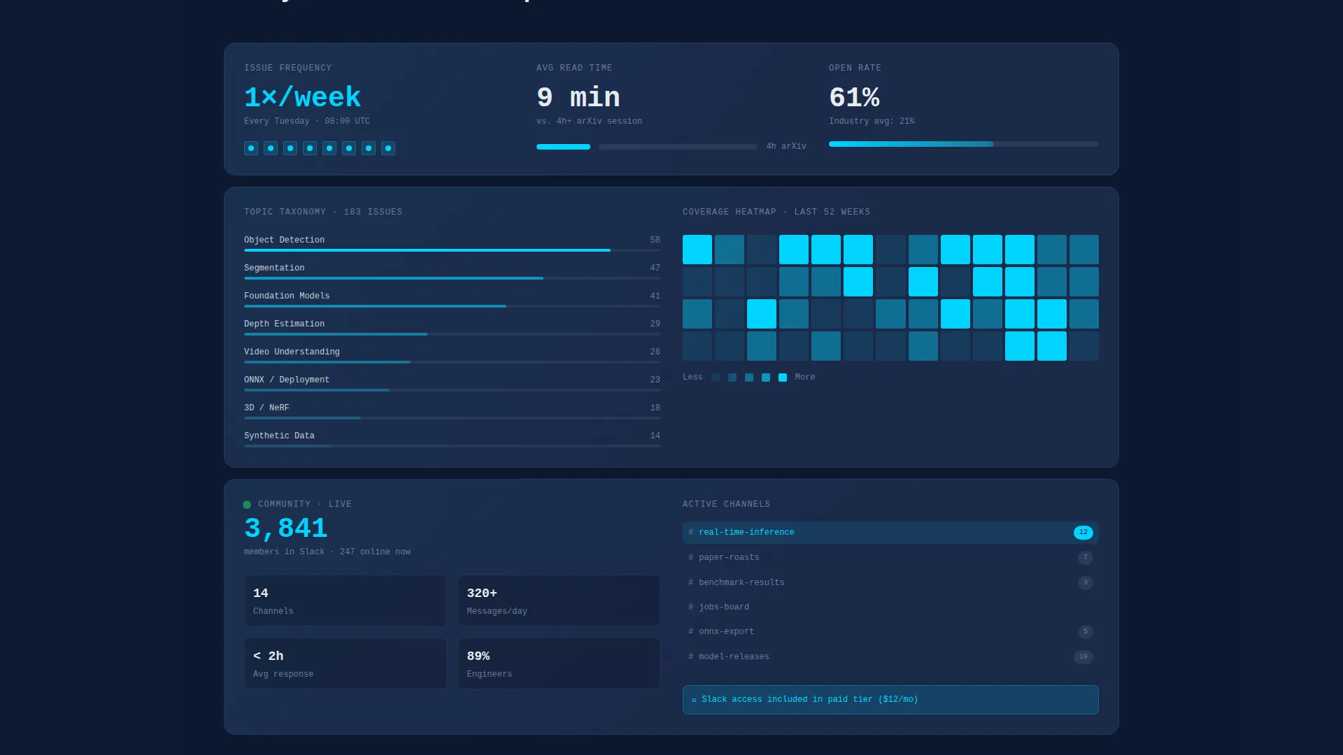
The page is structured as a scrollable bento grid where each tile functions as a self-contained data card. Tiles cover distinct content units such as read-time stats, topic categories, and community previews. The grid rhythm reveals additional tiles as the visitor scrolls, encouraging exploration without requiring navigation.
Logo Bar with Hover States
The header opens with a horizontal logo bar displaying subscriber company logos rendered in monochrome silver against the deep navy background. Each logo subtly brightens on hover, adding an interactive layer that reinforces social proof without distracting from the headline above.
Sample Issue Card Preview
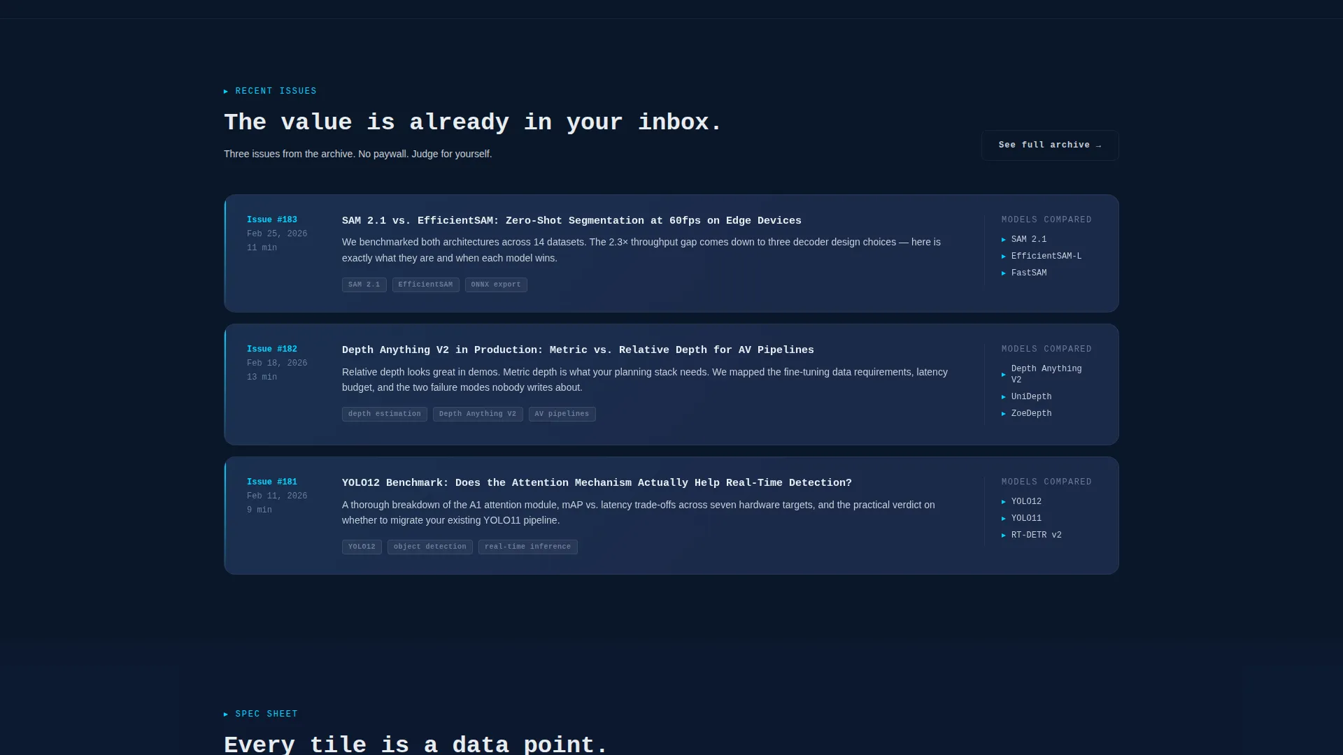
A real issue card sits below the header headline, showing an actual subject line, date, and topic tags. This component proves the product before asking for anything, letting visitors evaluate the newsletter's quality and tone on first contact.
Freemium Conversion Section
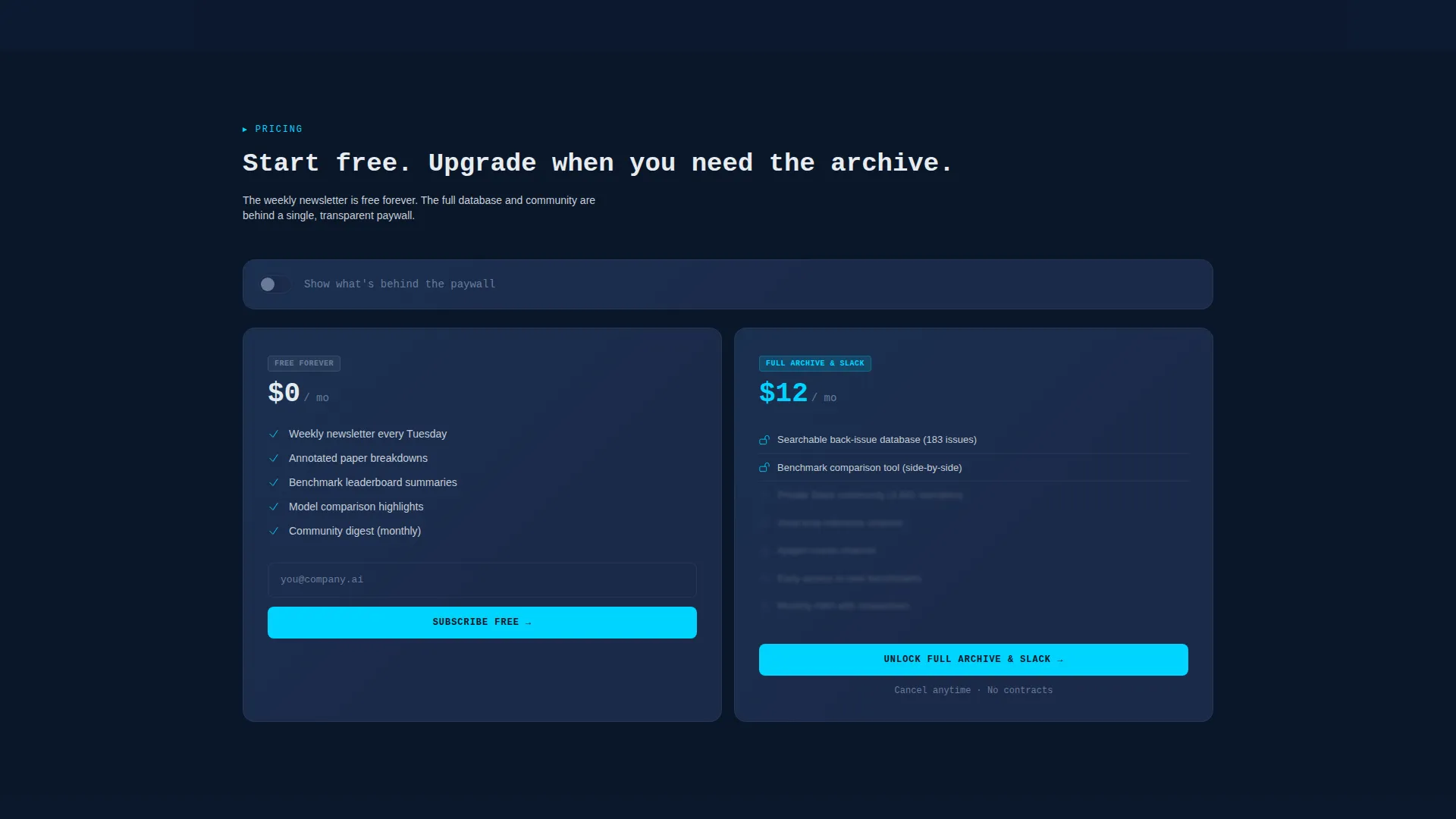
The primary call to action uses a single email input field with ghost-text placeholder styling. A secondary upgrade call to action sits below the community tiles, featuring a paywall toggle that lists exactly what paid subscribers receive, including a searchable back-issue database, a benchmark comparison tool, and private community channels.
Topic Taxonomy Heatmap Tile
One dedicated bento tile visualizes the newsletter's topic coverage across detection, segmentation, generation, and deployment. The heatmap format gives technically minded visitors an immediate sense of editorial breadth and recurring focus areas.
Community Preview Tile
A tile previews the subscriber community with a live member count and labeled channel names. Visitors can see the community's structure before joining, which reduces uncertainty and supports the upgrade decision.
Page sections overview
| Section | Purpose |
|---|---|
| Monospace Headline Bar | Opens the page with a bold credibility statement above the logo scroll |
| Subscriber Logo Bar | Displays company logos to establish social proof through recognizable names |
| Sample Issue Card | Shows a real issue preview with subject line, date, and topic tags |
| Bento Grid Tiles | Delivers stats, taxonomy, and community detail in scannable tile format |
| Topic Taxonomy Tile | Maps editorial coverage across key computer vision subject areas |
| Community Slack Tile | Previews the member community with count and channel name examples |
| Free Subscribe call to action | Captures email with a single field and clear free-tier value statement |
| Paywall Toggle Section | Explains paid tier benefits with a visual toggle and itemized feature list |
| Issue Preview Cards | Shows three real issue headlines and summaries to validate content quality |
Design & branding system
The visual identity follows a Directory and Discovery theme built on the Midnight Blue color system. The palette is deliberately cold and technical, referencing the look of a monitoring dashboard or a well-configured terminal session.
- Primary background uses deep terminal navy (#0A1628), card surfaces use desaturated slate (#1B2A4A), and body text renders in cool silver (#C8CDD5)
- Electric cyan (#00D4FF) is reserved exclusively for links, interactive badges, and hover states, keeping accent usage purposeful and high-contrast
- Typography leans on monospace styling for headlines to reinforce the terminal aesthetic and signal technical authority to an engineering audience
Mobile & speed optimization
The bento grid layout is designed to reflow cleanly across screen sizes, keeping tile content readable and the conversion section functional on smaller viewports. The layout prioritizes content clarity at every breakpoint.
- Tiles stack vertically on narrow screens while preserving their self-contained visual structure
- The email capture field and call to action buttons remain prominent and accessible at mobile widths
- Monospace headline sizing scales down proportionally to keep the opening statement impactful without overflow
How this template helps you convert
The conversion strategy is built into the page structure itself. Every section earns trust before presenting an ask, following a deliberate proof-then-prompt sequence.
- The logo bar and sample issue card establish credibility and demonstrate real content quality in the first viewport, reducing bounce before the visitor reaches any call to action
- The three real issue previews placed before the upgrade prompt let visitors self-qualify by reading actual newsletter content, so the paid upgrade ask lands on an already-convinced reader
- The paywall toggle makes the paid tier transparent and specific, removing uncertainty about what the upgrade includes and lowering friction at the decision point
Other information about this template
This template is categorized under Technology and Computer Vision Technology, making it well suited for operators in applied machine learning, autonomous systems, and computer vision research publishing.
- The Spec Sheet creative direction means every section communicates like a product data sheet, optimized for technically literate readers who distrust vague marketing language
- The freemium and trial landing page direction is a proven model for newsletter monetization, and this template structures that flow with clear visual separation between free and paid value
- The template style is Bento Grid, a layout pattern increasingly common in technical product and developer tool marketing, giving the page a contemporary feel that resonates with an engineering audience
- The page is built as a single-page landing structure, making it straightforward to deploy, test, and iterate without managing multi-page navigation

Theme
Directory & Discovery
Creative direction
Spec Sheet
Color system
Midnight Blue
Style
Bento Grid
Direction
Freemium/Trial
Page Sections
Bento Grid Scrolling Layout
Logo Bar with Hover Interactions
Sample Issue Card Component
Freemium Dual-cta Section
Topic Taxonomy Heatmap Tile
Community Preview Tile
Related questions
Can I use this template for a newsletter outside the computer vision space?
Does the template include actual paywall or subscription logic?
How does the bento grid layout behave on mobile screens?
Can I replace the sample issue card with my own newsletter content?
Is the logo bar limited to a fixed number of logos?



