Higher Education Digital Presence Careers Website Template
Tenure is a hub-and-spoke academic hiring landing page built for provosts, department chairs, and university HR directors. It opens with an animated code snippet and drops visitors into an interactive hiring cost calculator before guiding them through dedicated sections on applicant tracking, committee collaboration, compliance dashboards, and posting distribution. The Bold Brutalist design feels as serious as the work it supports.
by Rocket studio
Quick summary
Tenure is a single-page academic job board landing page with anchor navigation. It serves higher education institutions running high-volume faculty searches. The page leads with a live-typed code snippet, feeds visitors into a hiring cost calculator, and funnels them toward a free-trial sign-up. Every section is built for the weight of serious academic hiring work.
Who this template is for
This template is designed for higher education professionals who manage faculty hiring at scale. It speaks directly to the people sitting at the center of complex, multi-stakeholder search processes.
- Provosts and academic officers filling endowed chairs and senior faculty roles
- Department heads running faculty searches with large search committees
- HR directors at research universities managing concurrent searches and compliance requirements
What problem this template solves
Academic hiring does not work like corporate recruiting. A single tenure-track posting can attract hundreds of applicants, and the process involves committees, compliance obligations, and long timelines. Generic job board platforms were not built for this environment.
- Search committees lack structured tools and end up coordinating through shared spreadsheets
- Institutions have no easy way to benchmark their cost-per-hire or time-to-fill against peer universities
- Compliance tracking and affirmative action documentation get scattered across disconnected systems
What you get with this template
This landing page gives your higher education job board a structured, conversion-ready presence. It is built as a single scrollable page with anchor navigation connecting a central hub to five focused spoke sections.
- An animated code snippet header, an interactive hiring cost calculator, and four spoke sections covering core platform features
- Two conversion paths: a primary free-trial sign-up form and a secondary benchmark report download
- A Bold Brutalist visual system with a monochrome steel palette and signal yellow call-to-action accents
Feature list
This section describes the core built-in components included in the Tenure landing page template.
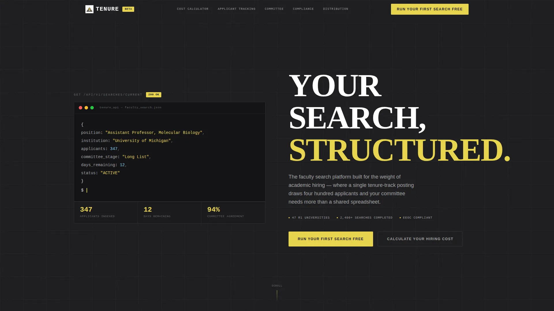
Animated Code Snippet Header
The header displays a monospaced, syntax-highlighted block styled as an API response. It auto-types line by line against a charcoal background, simulating a live database query for a real faculty job object. The blinking cursor and structured data format immediately signal that this platform is built for serious, technical users.
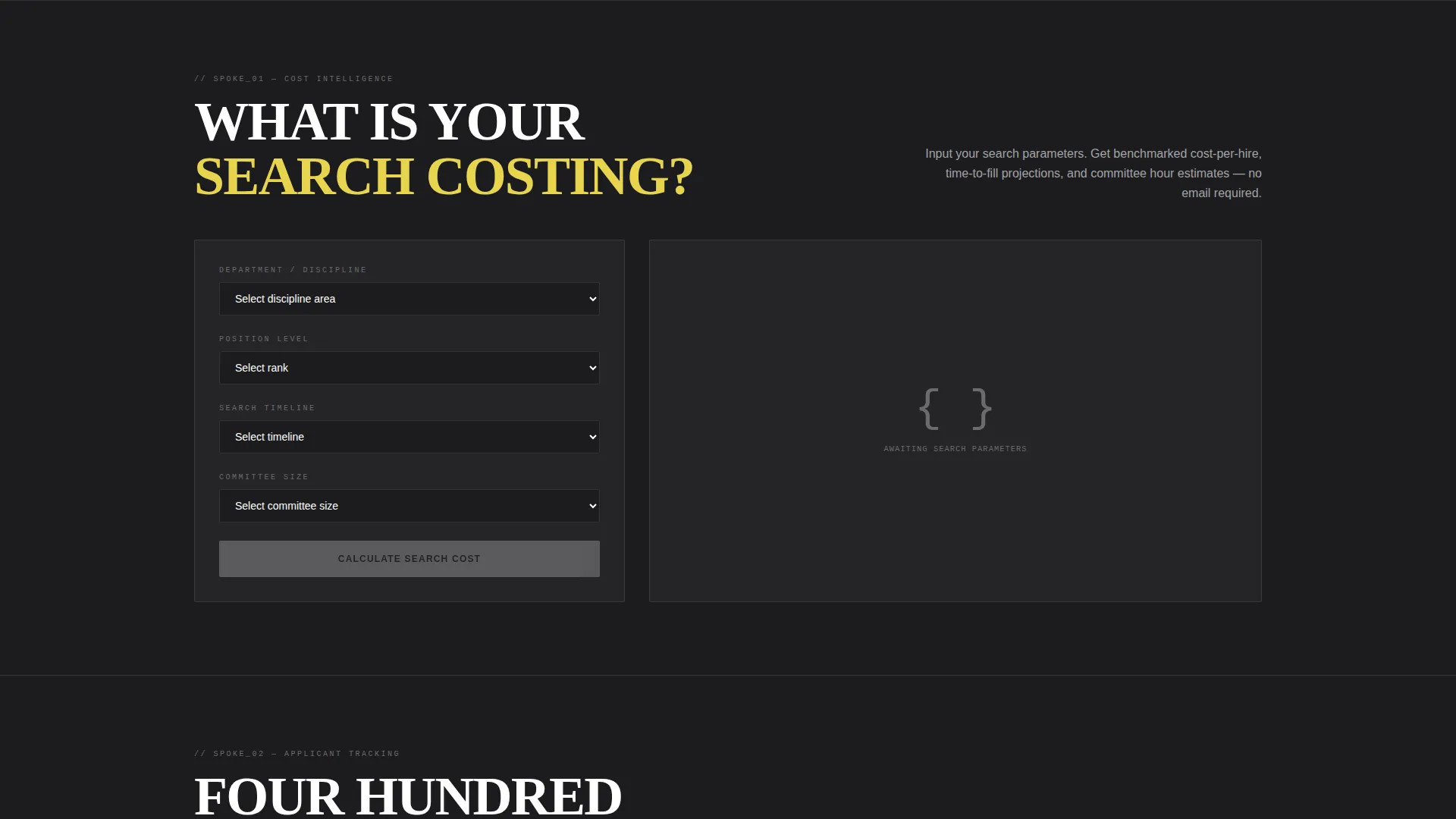
Interactive Hiring Cost Calculator
Visitors input their department, position level, and search timeline. The tool outputs estimated cost-per-hire, time-to-fill benchmarks against Carnegie Classification peers, and projected committee hours. This calculator delivers personalized value before the page asks for anything in return.
Hub and Spoke Anchor Navigation
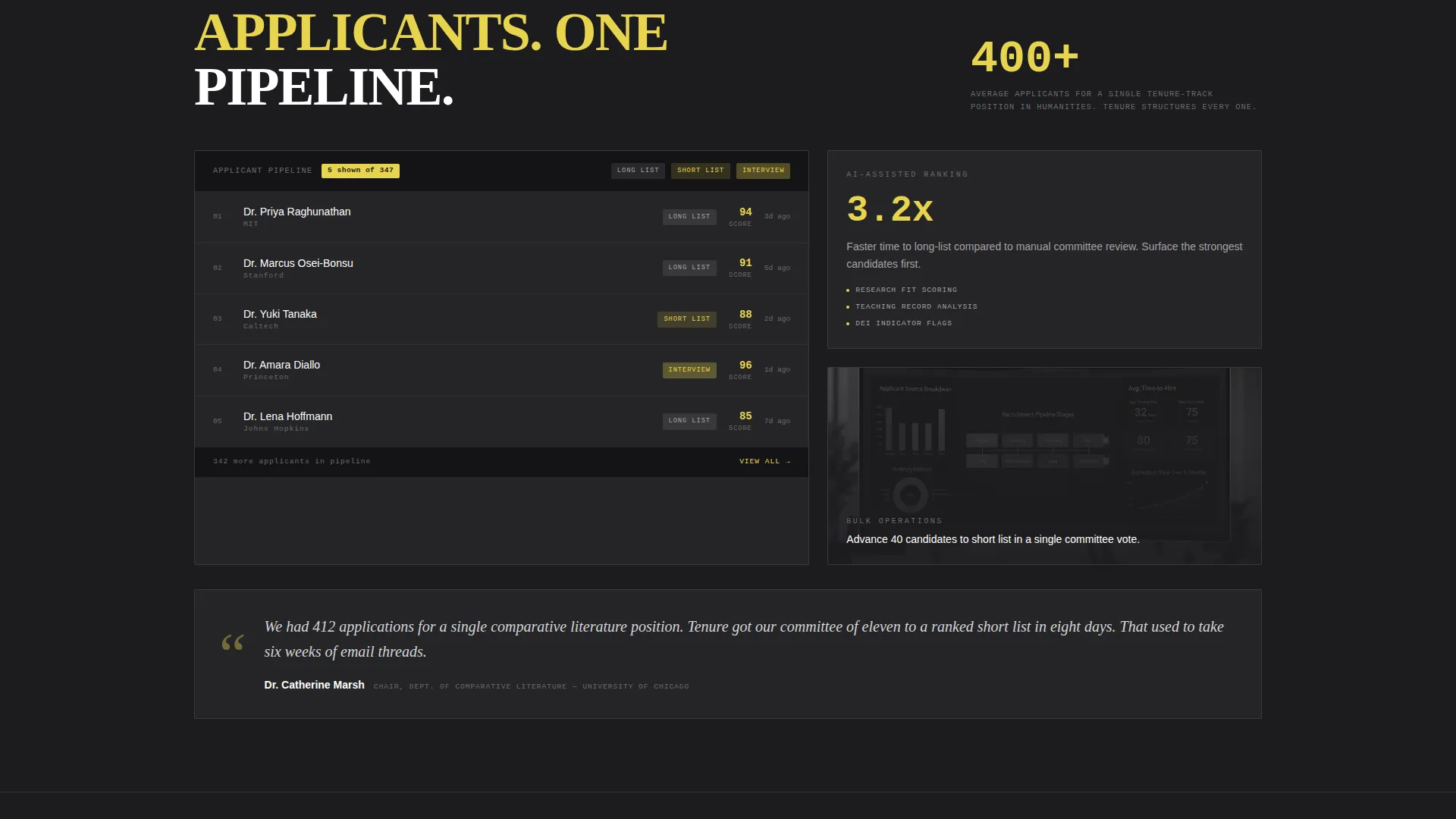
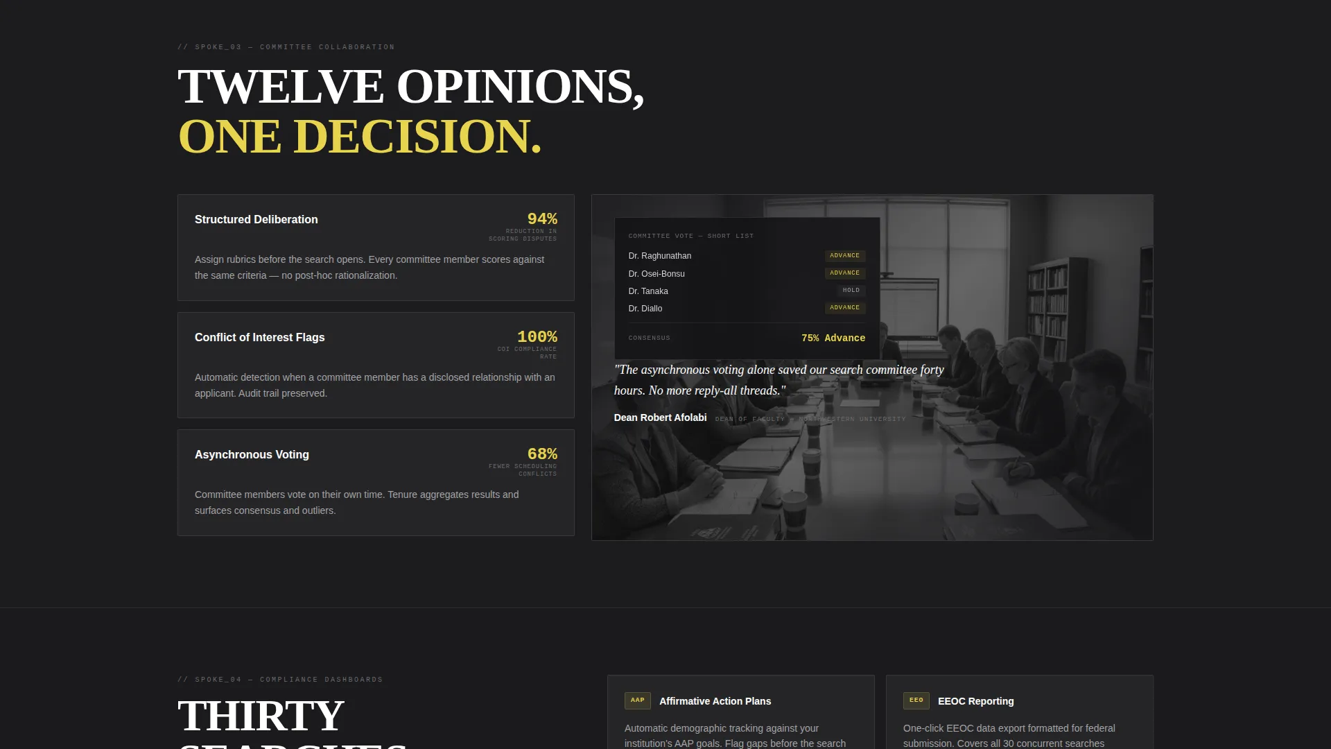
A persistent navigation bar links the central hub to four spoke sections: Applicant Tracking, Committee Collaboration, Compliance Dashboards, and Posting Distribution. Each spoke is a self-contained section with a brutalist card grid, grayscale interface screenshots, oversized statistics, and one-sentence testimonials from named deans and search chairs.
Dual Conversion Path Design
The primary call-to-action, "Run Your First Search Free," appears below the calculator results and again as a persistent anchor nav button. A secondary path offers a downloadable Academic Hiring Benchmark Report, capturing email and Carnegie Classification to deliver a segmented resource.
Segmented Lead Capture Form
The sign-up form asks for an institutional email address first, then auto-populates the institution name from the dot-edu domain. Visitors then select their role: Provost, Department Chair, HR Director, or Search Committee Member. This segmentation helps qualify leads at the point of capture.
Brutalist Card Grid Sections
Each spoke section uses a structured card grid to display platform capabilities. Cards show grayscale interface screenshots alongside oversized statistics and short testimonials. The layout communicates credibility and depth without visual clutter.
Page sections overview
| Section | Purpose |
|---|---|
| Code Snippet Header | Opens with animated faculty job data to establish platform credibility |
| Hiring Cost Calculator | Delivers personalized benchmarks before any sign-up is requested |
| Applicant Tracking Spoke | Shows how the platform manages large candidate pipelines |
| Committee Collaboration Spoke | Demonstrates structured tools for multi-member search committees |
| Compliance Dashboards Spoke | Covers affirmative action and regulatory tracking capabilities |
| Posting Distribution Spoke | Explains how job postings reach the right academic audiences |
| Primary call to action Block | Presents the free search sign-up after the visitor has seen real data |
| Benchmark Report Download | Offers a secondary conversion for visitors not ready to commit |
Design & branding system
The visual identity follows a Bold Brutalist theme. Every design choice prioritizes structural honesty over decoration, mirroring the serious, load-bearing environment of academic administration.
- Color system: structural charcoal (#1C1C1E) for primary backgrounds, exposed concrete gray (#A3A3A6) for secondary surfaces, cold rolled steel (#D4D4D8) for card faces and content wells, and signal yellow (#E8D44D) reserved exclusively for calls-to-action, active navigation states, and notification badges
- Typography: uppercase sans-serif headlines in brutalist style, monospaced fonts in the code snippet header, and high-contrast body text throughout
- Layout: raw industrial grid with no decorative elements, grayscale screenshots in card components, and oversized numerical statistics for instant visual impact
Mobile & speed optimization
The Tenure template is built with responsive layout behavior so the hub-and-spoke structure remains navigable and readable on smaller screens.
- The anchor navigation adapts so visitors on mobile devices can still jump directly to each spoke section
- Card grids reflow to single-column layouts on narrow viewports, keeping content scannable without horizontal scrolling
- The interactive calculator and dual conversion forms are sized for touch input and remain fully functional on mobile
How this template helps you convert
The page is structured around a deliberate lead generation strategy. Every layout decision moves a qualified visitor closer to one of two conversion actions.
- The hiring cost calculator front-loads personalized value before any commitment is required, so visitors arrive at the primary call-to-action already having seen data specific to their institution and search context.
- The dual conversion path means visitors who are not ready to start a free search can still convert via the benchmark report download, keeping them inside your funnel with a lower-friction offer.
- The segmented sign-up form collects role and institution data at the moment of conversion, giving your team qualified, sorted leads from the first interaction.
Other information about this template
The Tenure template was designed for a specific intersection of technology and higher education digital presence. It reflects the operational realities of research university hiring rather than generic recruitment marketing.
- The template style is Hub and Spoke with Anchor Navigation, meaning each section functions as both a standalone resource and a connected part of the broader page experience
- The Calculator and Tool First creative direction is a deliberate choice for this audience: faculty hiring administrators respond to data and benchmarks, not to aspirational lifestyle imagery
- The header concept draws on a Code Snippet format, which positions the platform as a structured, data-driven system rather than a simple listings board
- Carnegie Classification is referenced throughout as a benchmarking framework, making the template immediately legible to R1 and R2 university administrators
- The page is built for Lead Generation as its primary objective, with every section ordered to support that goal without feeling like a hard sell
Theme
Bold Brutalist
Creative direction
Calculator/Tool First
Color system
Monochrome Steel
Style
Hub & Spoke (Anchor Nav)
Direction
Lead Generation
Page Sections
Animated Code Snippet Header
Interactive Hiring Cost Calculator
Hub and Spoke Anchor Navigation
Dual Conversion Path Layout
Segmented Lead Capture Form
Related questions
Who is this landing page template built for?
Can I customize the hiring cost calculator inputs and outputs?
What are the two conversion paths included in this template?
How does the anchor navigation work across the page?
Does this template work for institutions outside the United States?



