No-Code Enterprise Software Reviews Website Template
Terminal is a split-screen landing page template built for a no-code point-of-sale builder. It targets restaurant owners, boutique retailers, and pop-up vendors who need a fast, codeless checkout setup. The template uses a Tech Glass visual identity, an interactive drag-and-drop header preview, and a comparison-driven scroll flow designed to move visitors toward a zero-field signup.
by Rocket studio
Quick summary
Terminal is a single-page landing page template built for a no-code point-of-sale (POS) builder. It combines a 50/50 split-screen layout with a Tech Glass visual identity and an industry-report scroll cadence. The page is designed to demonstrate the product immediately, then build an undeniable case for switching through data-led comparison sections.
Who this template is for
This template is built for teams and individuals who sell or use no-code checkout tools. It speaks directly to people who operate registers, manage rollouts, or sell at weekend markets.
- Restaurant owners, boutique retailers, and pop-up vendors looking to set up a checkout system without hiring a developer
- Franchise consultants rolling out multiple locations who need a persuasive evaluation asset for stakeholders
- Weekend market vendors who have recently moved from a cash box to a tablet-based register
What problem this template solves
Legacy point-of-sale systems come with long setup times, monthly software fees, developer dependencies, and rigid contracts. Operators have no easy way to show a prospect or decision-maker why a no-code alternative is worth switching to. This template frames that argument visually and structurally.
- Side-by-side comparisons make the cost and friction of legacy POS systems immediately visible
- A zero-field start removes the biggest early conversion barrier by letting visitors interact before they commit
- The sticky comparison bar keeps the core argument in front of the visitor throughout the entire scroll
What you get with this template
You get a fully designed, single-page layout that is ready to customize and deploy. Every section is built around a specific moment in the visitor's decision journey.
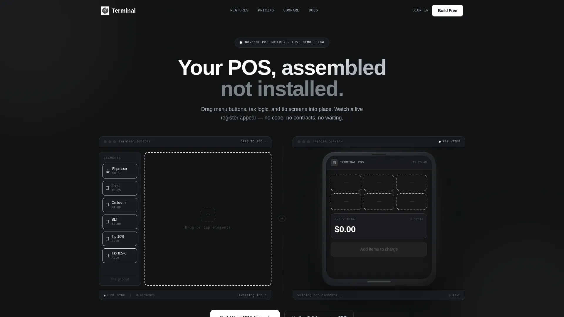
- An interactive 50/50 header with a drag-and-drop POS canvas on the left and a live tablet mockup on the right
- A series of split-screen comparison sections styled as data findings, each pairing a legacy pain point with a no-code resolution
- A persistent sticky bar carrying the primary call to action alongside a Legacy/Terminal toggle visible at every scroll depth
Feature list
This template is built around six distinct functional and design capabilities drawn directly from the brief.
Interactive Drag-and-Drop Header
The header is split 50/50. The left panel holds a miniature POS builder canvas where visitors can drag a sample menu button into a checkout layout. A micro-animation and glass-refraction shimmer confirm the snap. The right panel mirrors the result in real time inside a photorealistic tablet mockup.
Industry Report Scroll Cadence
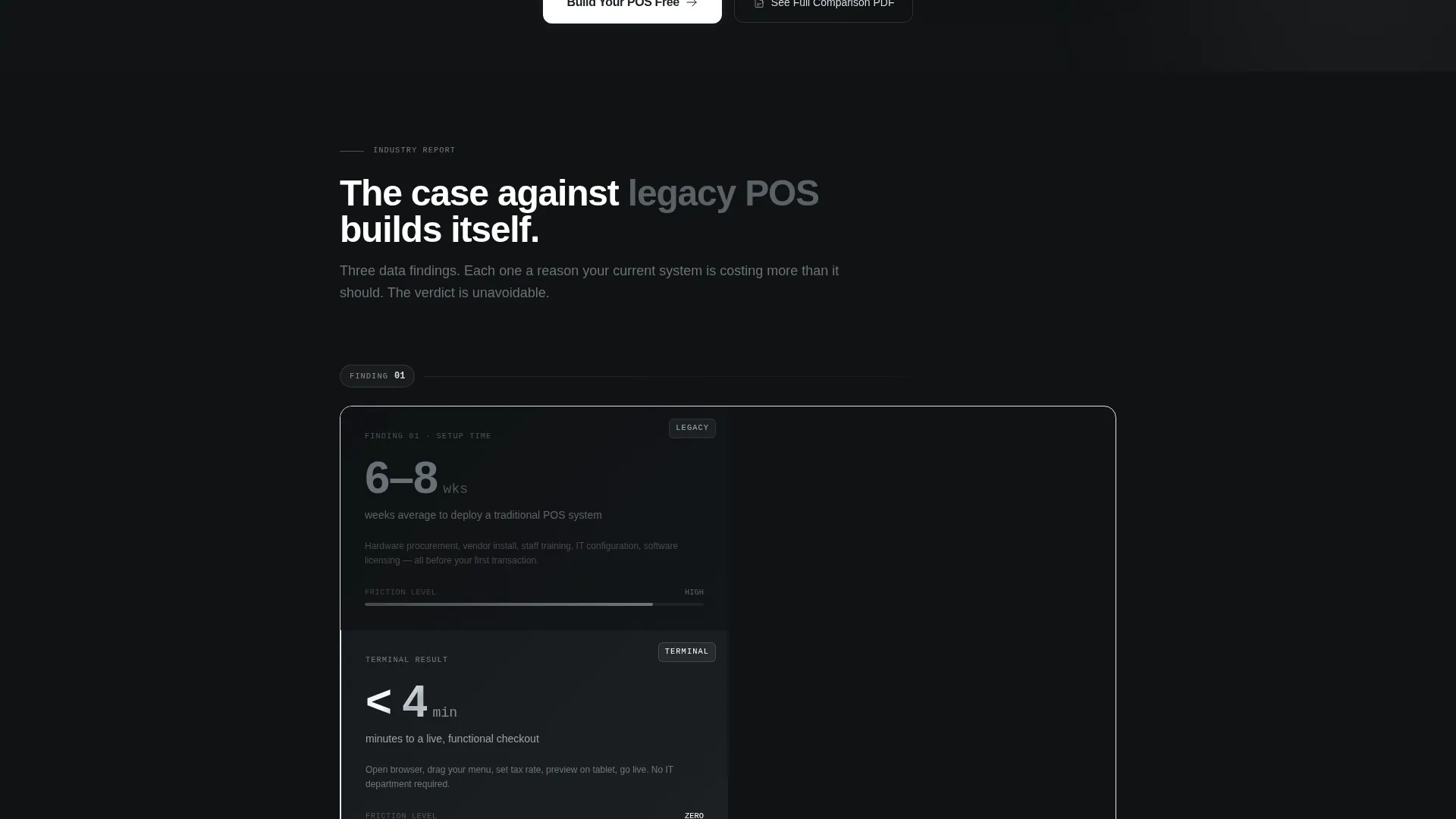
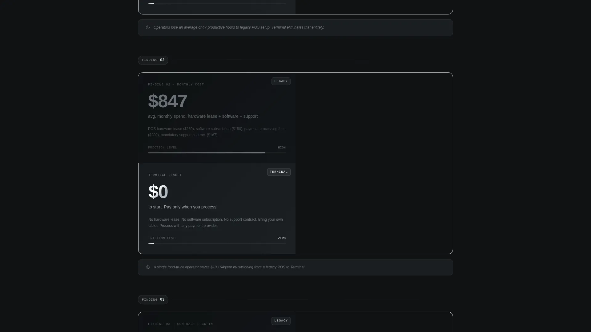
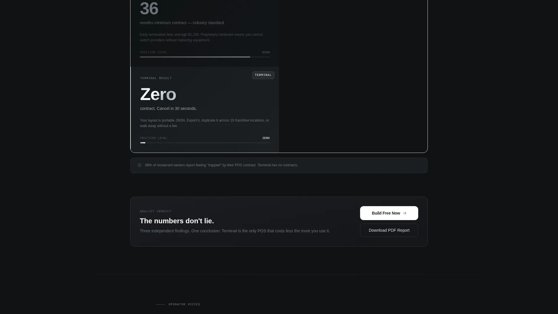
Each scroll section presents a split-screen comparison framed as a data finding. The left side renders a legacy POS pain point as a statistic or diagram. The right side resolves that metric with a live interface snapshot. The structure builds a cumulative, evidence-led argument across every section.
Persistent Sticky Comparison Bar
A sticky bar stays fixed during the full scroll. It carries the primary call to action alongside a compact toggle that flips between Legacy POS and Terminal columns. Visitors can reactivate the comparison at any point without scrolling back.
Zero-Field Conversion Start
The primary conversion path requires no form fields upfront. One click deploys a sandbox environment. Email capture is deferred until the visitor has already placed their first button on the canvas, reducing drop-off at the first moment of intent.
Secondary Lead Capture Gate
A secondary path offers a full comparison PDF gated behind a single work-email field. This path is designed for franchise consultants and enterprise evaluators who need a shareable document for stakeholder review.
Tech Glass Visual System
The layout uses a Monochrome Steel color palette: deep gunmetal (#1B1F23), brushed aluminum (#A8B0B8), polished chrome highlight (#D6DCE1), and electric white (#FFFFFF) for active states and primary text. The result feels precise, industrial, and purpose-built for a professional operator audience.
Page sections overview
| Section | Purpose |
|---|---|
| Interactive Split Header | Demonstrates product in real time within four seconds of landing |
| Sticky Comparison Bar | Keeps the Legacy versus. Terminal toggle and call to action visible at all scroll depths |
| Pain Point: Setup Time | Frames legacy setup friction against the no-code alternative |
| Pain Point: Monthly Fees | Compares ongoing software costs as a data-led split-screen finding |
| Pain Point: Contract Lock-In | Shows contract rigidity versus the flexible no-code model |
| Pain Point: Developer Dependency | Highlights the cost of code reliance against drag-and-drop autonomy |
| Zero-Field Sandbox call to action | Primary conversion block with one-click environment deployment |
| PDF Comparison Gate | Secondary lead capture for franchise and enterprise evaluators |
Design & branding system
The visual identity follows a Tech Glass theme built on a Monochrome Steel color system. Every element is calibrated to feel precise and immediately trustworthy to a professional operator.
- Color palette: deep gunmetal (#1B1F23) as the base, brushed aluminum (#A8B0B8) for secondary surfaces, polished chrome highlight (#D6DCE1) for accents, and electric white (#FFFFFF) for active states and primary text
- Micro-animations include a satisfying button-snap interaction and a glass-refraction shimmer on the header canvas, reinforcing the tactile, calibrated feel described in the brief
- No stock photography or illustration is used; the product interface itself acts as the only visual, keeping the layout clean and self-demonstrating
Mobile & speed optimization
The 50/50 split-screen layout is built with a mobile reading context in mind. Stacked sections translate cleanly from desktop columns to single-column mobile views.
- The interactive header canvas and tablet mockup reflow gracefully for smaller viewports without losing the core demonstration value
- The sticky comparison bar is designed to remain functional and readable on mobile screens throughout the scroll
- Section-level visual weight is balanced so that data-finding panels read clearly on any screen size without requiring horizontal scrolling
How this template helps you convert
Every structural decision in this template is designed to reduce hesitation and accelerate the moment of first action.
- The zero-field start removes form friction at the top of the funnel, letting visitors experience the product before they are asked for anything in return.
- The industry-report scroll cadence stacks evidence section by section, so by the time a visitor reaches the bottom, the case for switching has already been made across multiple data points.
- The sticky comparison bar and persistent call to action mean the visitor never has to hunt for a next step, regardless of where they pause during the scroll.
Other information about this template
This template sits at the intersection of the no-code enterprise software category and the no-code POS niche. It is well suited to technology-focused product teams building go-to-market pages for operator-facing tools.
- The template style is a 50/50 split screen, making it a strong match for product comparison pages, feature launch pages, or competitive positioning campaigns
- The creative direction follows an Industry Report cadence, which works particularly well for audiences who evaluate tools analytically before committing
- The header concept is an Interactive Preview, meaning the template is designed to show rather than tell from the very first scroll position
- The landing page direction is Comparison/Versus, a proven structure for product categories where the buyer is actively weighing a switch from an incumbent solution
Theme
Tech Glass
Creative direction
Industry Report
Color system
Monochrome Steel
Style
Split Screen (50/50)
Direction
Comparison/Versus
Page Sections
Interactive 50/50 Split Header
Industry Report Scroll Flow
Persistent Sticky Comparison Bar
Zero-field Sandbox Entry
Gated PDF Comparison Path
Monochrome Steel Visual Identity
Related questions
Can I customize the color palette and branding?
Does this template require coding to edit?
Who is the sticky comparison bar designed for?
What does the zero-field start mean in practice?
Can this template support a franchise or multi-location evaluation use case?



