Local Beauty & Salon Software & SaaS Professional Website Template
Terminal is a bento grid landing page template built for beauty and salon point-of-sale software. It pairs a Bold Brutalist visual identity with an Industry Report creative direction, surfacing sharp data statistics alongside live product proof. The Interactive Preview header lets visitors touch the product before clicking anything, making the path to a free demo feel natural and earned.
by Rocket studio
Quick summary
Terminal is a single-page, click-through landing page template designed for beauty and salon point-of-sale systems. It opens with a live Interactive Preview, scrolls through a confrontational data-driven bento grid, and closes on a repeated demo call to action. The Slate and Sky color system keeps every element sharp and purposeful.
Who this template is for
This template is built for software founders and marketing teams selling point-of-sale solutions to the salon and spa industry. It speaks directly to operators who are too busy to read marketing fluff and need to feel the product before they commit.
- Independent salon owners managing multiple stylists and a front-desk waitlist
- Multi-location spa directors tracking inventory and staff across sites
- Barbershop operators who need walk-in management that holds up on a busy Saturday
What problem this template solves
Salon and spa operators are skeptical of software promises. They have been burned by slow checkouts, clunky booking flows, and systems that buckle under real volume. A generic SaaS landing page with stock photography of smiling stylists does nothing to break that skepticism.
- Visitors leave before they understand the product because there is nothing to interact with
- Pain points go unaddressed, so operators do not connect the software to their daily chaos
- No clear next step pushes the ready buyer toward a demo or a pricing conversation
What you get with this template
You get a fully structured, single-page bento grid landing page ready to represent a beauty and salon point-of-sale system. Every section is pre-built with a specific conversion job, from the live preview header to the anchored demo call to action at the bottom.
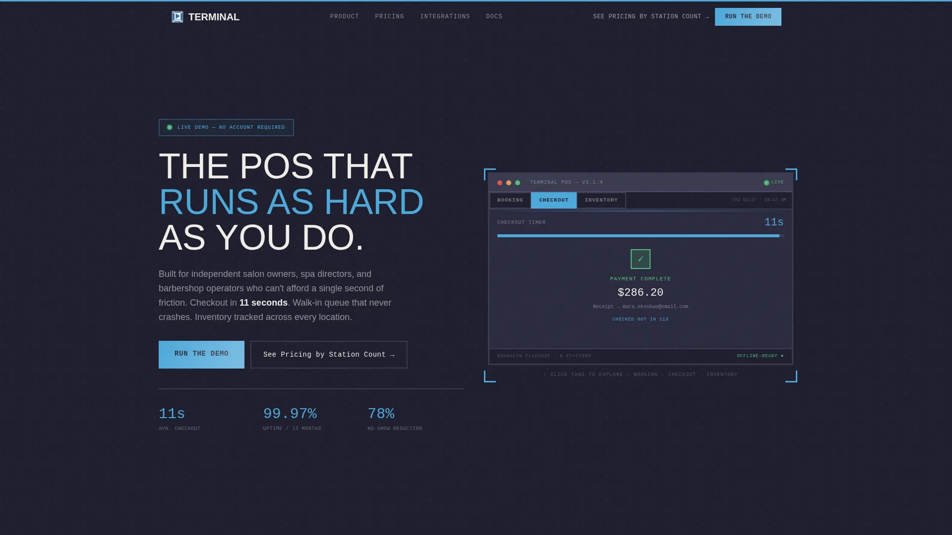
- An Interactive Preview block in the header showing the booking view, checkout flow, and inventory dashboard in a simulated terminal frame
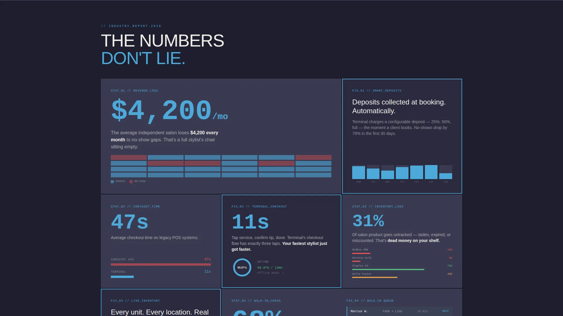
- A bento grid of data statistic cells paired with micro-interaction product proof blocks
- Three placements of the primary "Run the Demo" call to action plus a secondary pricing text link
Feature list
This section covers the core built-in capabilities delivered by the Terminal template.
Interactive POS Preview Header
The header drops visitors into a rendered terminal screen inside a brutalist frame. A simulated appointment books itself, a product scans, a tip screen appears, and a receipt fires. Visitors can click tabs to toggle between the booking view, the checkout flow, and the inventory dashboard without leaving the page.
Industry Report Bento Grid
The scroll is structured as a data briefing. Each bento cell surfaces a pointed statistic that names a real salon operator pain, such as revenue lost to no-show gaps or seconds saved per checkout. Every data block is immediately paired with a micro-interaction showing the feature that solves it.
Confrontational-to-Reassuring Rhythm
The grid alternates between a problem statistic and product proof in a deliberate pattern. This rhythm builds a logical case across the scroll so visitors feel informed and confident rather than sold to. The sequence does the persuasion work so the call to action feels like a natural next step.
Dual Call-to-Action Structure
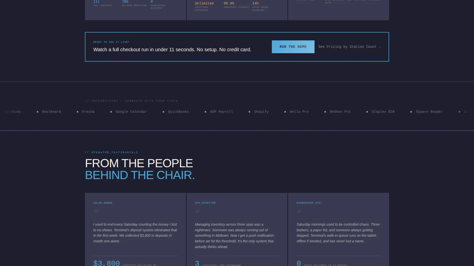
The primary call to action, "Run the Demo," appears in electric sky blue against charcoal at the header, mid-scroll after the no-show statistic, and anchored at the bottom of the page. A secondary text link, "See Pricing by Station Count," gives budget-conscious operators a lower-commitment path.
Bold Brutalist Visual System
Every design decision reinforces the product's professional, no-nonsense positioning. Borders are thick, typography is oversized, and the electric sky blue accent color directs attention rather than decorates. The flat, gradient-free palette feels like a matte black salon station under cool fluorescent light.
Bento Grid Layout
The page uses a structured bento grid to organize content into distinct, scannable cells. Each cell has a clear single job, whether surfacing a statistic, demonstrating a feature, or hosting a call to action. This layout keeps the page readable at a glance while supporting a dense amount of product information.
Page sections overview
| Section | Purpose |
|---|---|
| Interactive Preview Header | Shows the live POS terminal simulation and primary call to action |
| No-Show Statistic Cell | Surfaces revenue-loss data and triggers mid-page call to action |
| Checkout Speed Block | Pairs checkout time statistic with product proof interaction |
| Booking View Tab | Demonstrates the appointment booking flow inside the preview |
| Checkout Flow Tab | Shows the full checkout and tip screen inside the preview |
| Inventory Dashboard Tab | Displays the inventory management view inside the preview |
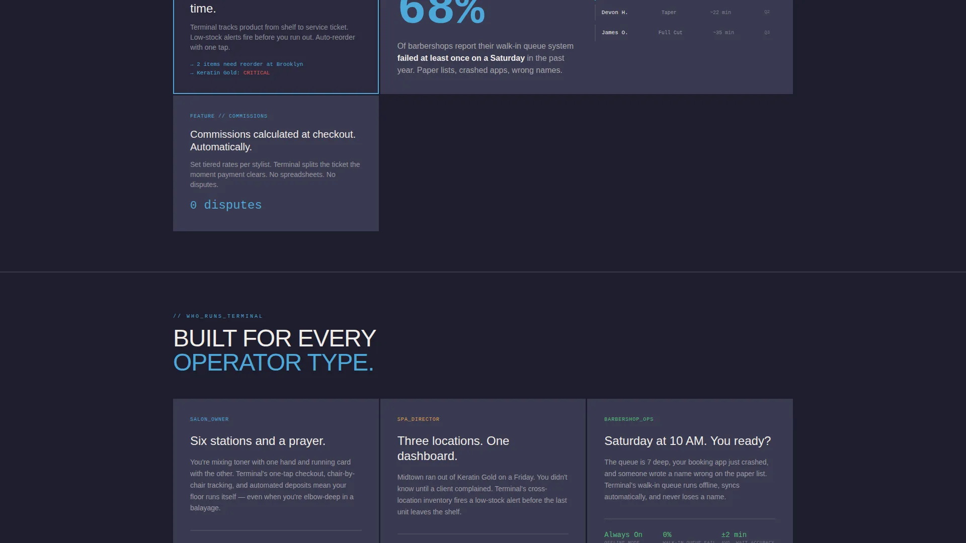
| Waitlist and Walk-In Cell | Addresses walk-in and waitlist management for high-volume days |
| Multi-Location Data Cell | Speaks to spa directors tracking inventory across sites |
| Anchored call to action Footer | Closes the page with the final "Run the Demo" button |
| Pricing Text Link | Offers a secondary path for budget-focused operators |
Design & branding system
The Terminal template uses a Slate and Sky color system built on four deliberate values. Deep charcoal slate forms the dominant background. Polished gunmetal surfaces cards. Electric sky blue cuts through as the action color on buttons and data highlights. Bleached porcelain handles typography and negative space.
- No gradients, no soft effects: colors are flat and hit hard, consistent with the Bold Brutalist theme
- Oversized, unapologetic typography with thick borders reinforces the professional, high-pressure salon environment
- Sky blue is used exclusively to direct attention, appearing on calls to action and key data points rather than as decoration
Mobile & speed optimization
The bento grid layout is structured to reflow cleanly across screen sizes. On smaller screens, grid cells stack in a logical reading order so the data-to-proof rhythm is preserved. The Interactive Preview tabs remain accessible without requiring a wide viewport.
- Grid cells are individually sized and do not depend on a fixed multi-column layout to communicate their message
- The simulated terminal preview is contained within a defined frame that scales without breaking the brutalist border treatment
- Call-to-action placements are repeated intentionally so they remain visible at every scroll depth on any device
How this template helps you convert
Every design and copy decision in Terminal is aimed at moving a skeptical salon operator toward clicking "Run the Demo." The page earns that click by letting the visitor experience the product first.
- The Interactive Preview lets visitors simulate a real checkout, booking, and inventory scan before any commitment is asked, making the demo feel like a continuation rather than a leap.
- The Industry Report bento grid confronts operators with their exact pain in numbers, then immediately shows the feature that removes it, building a case that does not need a salesperson to close.
- Three call to action placements plus a pricing text link catch visitors at different readiness levels, from the curious first-scroller to the budget-conscious operator who needs station-count pricing before signing up.
Other information about this template
Terminal is categorized under Technology, specifically within the Beauty and Salon Software and SaaS subcategory. It is purpose-built for the Beauty and Salon POS System niche, giving it a sharp intersection match with buyers actively searching for point-of-sale solutions in this vertical.
- The template style is Bento Grid, and the landing page direction is Click-Through, optimized to push visitors to a free interactive demo on the next page
- The header concept is Interactive Preview, which distinguishes Terminal from static product screenshots or lifestyle photography approaches
- The creative direction is Industry Report, using real-sounding data statistics to reframe the visitor's current situation before presenting the product as the solution
- This template is suitable for teams building a beauty salon point-of-sale landing page, a salon management software page, or a barbershop and spa software marketing page
Theme
Bold Brutalist
Creative direction
Industry Report
Color system
Slate & Sky
Style
Bento Grid
Direction
Click-Through
Page Sections
Interactive POS Preview Header
Industry Report Bento Grid
Dual Call-to-action Structure
Bold Brutalist Visual System
Bento Grid Page Layout
Multi-audience Messaging Cells
Related questions
What type of business is this template designed for?
What makes the header different from a typical product landing page?
How does the bento grid structure work on this page?
Is the primary call to action used more than once?
Can the colors and typography be updated to match a different brand?



